I remember there was a open spot for a UI/UX lead designer, hire wise
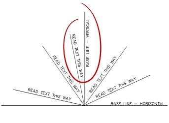
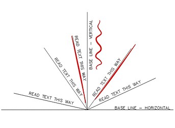
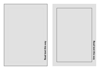
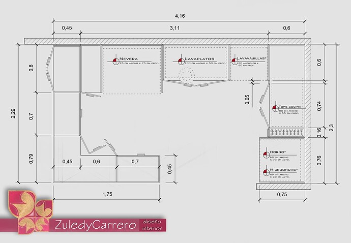
The issue here is not in the direction of the text, you can see in your picture two very similar vertical texts and see that there are no problems with reading in both directions.
The issue here is that this text is not just by itself but is a caption to some element. And there is some feeling of what this text is attached to.
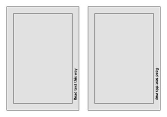
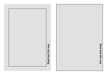
For an experiment, look at the following and answer which of the rectangles the text belongs to.
I am sure it will seem to you as follows,
and not as this last one.
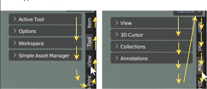
That’s why the tabs in Blender feel flipped.
Flipping text will not sovle anything, it will still be a verical text, but placed in the direction that contradicts vertical text readability standards.
There are no “vertical text readability standards”, no need to invent.
If you look at studies on the speed of reading text, you will find that both vertical directions are the same or differ slightly. But it is important to understand that there is considered just a text without context.
In reality, the text is surrounded by other elements (with some relationship logic), and there is some flow, the direction of how your eyes move and where you are looking for the next element. It’s very easy to imagine, you read line by line, the title and next the paragraph.
In the case we are considering (tabs are located to the right of the block, text from bottom to top), the glance tends to continue into the right, that is, in the wrong direction. This slows down, not the reading of the title itself, but the entire viewing process, if you want to talk about productivity. Besides, it just causes a feeling of discomfort and looks strange.
Those interested in design can read a lot of articles about all this, look at different examples, try to make their own mockups for comparison, and you will very soon begin to see/feel the difference.
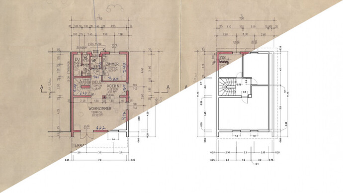
There are vertical text readability standards in technical documenting in disciplines that has a lot to do with documenting (architecture, engineereing and so one, we follow them daily in our architectural studio).
Studies show that the difference in perception speed is negligeble, so Blender follow the most common one.
I tend to look at it differently. All vertical text is a UI failure, regardless of direction. But if you have to choose…
Some languages have a primary direction of left-to-right, some right-to-left, and some top-to-bottom. The secondary direction is almost always top-to-bottom. In English the primary is L2R, and secondary T2B.
Our current output is indeterminate in the primary direction and is opposite to the secondary. Scanning words from bottom to top should just never be done in my opinion.
Your opinion contradicts international design standards then?
Cite references please.
- Tabs could be on top as well as on the bottom. So your example with boxes is not valid
- I know the ultimate answer. Most of people are right handed. Imaging sitting like this and reading vertical tabs. The mouse is in your right hand. The left hand holds your head. Which direction your head is tilted?
As an English reader, the image on the right is the one I prefer.
I propose to go even further in this endeavor.
There’s not enough more mirror Y
This idiocy would be a fairy tale.
Who gives such absurd ideas?
Good thing there is always a version 2.79 available
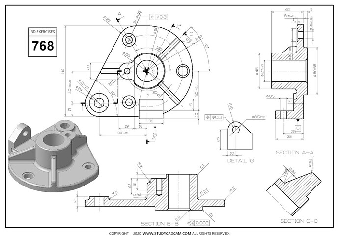
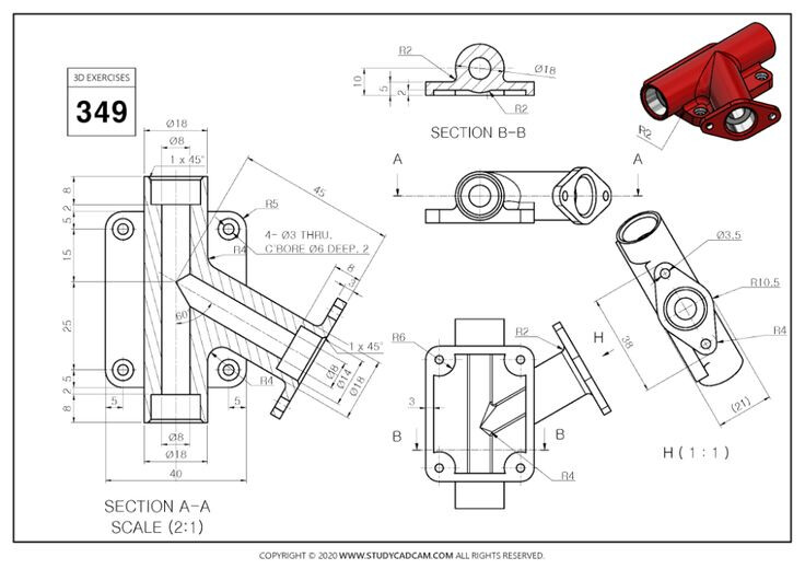
Every CAD program has it bottom->top direction. It’s a CAD standard from the very beginning of CAD drawing on paper. And believe me the ancestors did it not just because they flipped the coin.
Please, point your energy on something more critical in Blender. Leave vertical text as is.
There are accepted standards in design. The vertical text was always read with the head turned counterclockwise.
The reverse situation causes a lot of pain
As most of us right-handed, imagine you need to write a vertical text. You slightly tilt your head to the left, move your right elbow a bit further and here we go, you can easily write and read bottom to top. Now try to do this trick top to bottom.
And every book on my shelf is top->bottom. Every CD label on the rack, top->bottom.
As far as I know books and cds can be easily flipped and are region-dependent.
Also you are not supposed to look at books daily for several hours in a row.
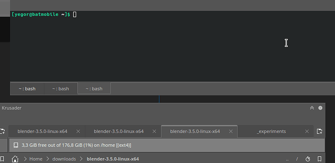
Why not have an option in the settings that gives you the option to align the text from either bottom to top, top to bottom, from left to right and from right to left, and done problem solved, you cater to every user in existance and no more complaints
Most people place books on the shelf with the cover facing up, not upside down.
I suppose Librarians are doing it wrong. ![]()
Because when a cd or a book is laying on a table you want to see the front of the book/cd and not the back as well as the side being not flipped, right?
