@pablovazquez Just like you told me, I remind you around here of the proposal we talked about.
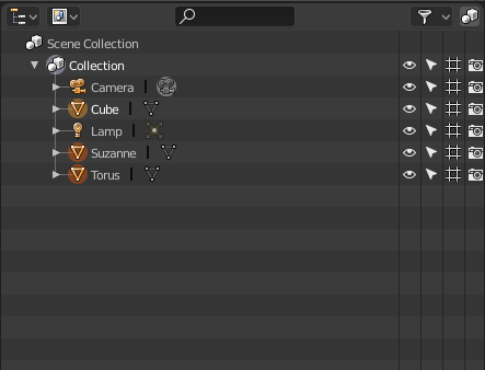
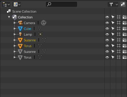
Right now it is too sutile to see what objects are or are not selected in the outliner. My proposal is with the new flat icons to put colors that stand out and that is more evident the active object (in blue) and the rest of the selected objects, in orange.
Current now:

The proposal:
