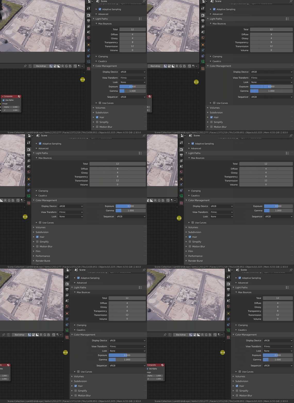
@Alberto Provide your vision to solve this.
2 column is no more, UI is going to one column standard.
Developers give us opportunity to be heard.
I took dimitar’s concrete case to show that is possible to display entirely 7 modifiers with 3 columns.
Of course, nobody will scan that thinking “I am going straight to the setting.”.
But I consider that I am able to distinguish 6 or 7 elements in an area, 2 or 3 elements per column and easily figure out :
“That’s the modifier I want to tweak. Now, where is the setting I want to tweak ? It is there.”
And I know that if you are the guy who set-up that area, who added modifiers one by one, who know their order ; after tweaking a setting, one or 2 times : you remember where it is for the rest of session.
You are considering that illegible.
Honestly, take a close look to the picture with smallest width.
For Mirror modifier, there are only 3 labels that are abbreviated.
Mirror Object -> Mirror … next to an object field.
Mirror U -> Mirror… above a V setting.
Vertex Group -> Vertex G…
For Screw modifier, that is more important. Half of labels are abbreviated.
Iterations -> Iterati…
Axis Object -> Axis O…
Stretch UVs -> Stretc…
Smooth Shading -> Smooth …
Calc Order -> Calc Ord…
For Bevel modifier, that is only 3 terms. 4 for Subdivision Surface, 1 for Simple Deform and 5 for Wireframe.
An abbreviation corresponds to the double of letters that were available in 2.4x,2.3x UI buttons.
I agree that is not a solution for somebody that is discovering Blender.
But for somebody who is working with Blender, everyday.
That is a piece of cake to complete the blanks.
And now, if you consider that some people with a second screen can fill it with such property editor … For that case, all labels would be clearly readable and people would not have to be long-term users.
That could help many people. But that would not be a default or something imposed to everyone.
You have to accompany that with a setting to determine amount of columns wanted by user.
I would just put a number field in header corresponding to amount of column wanted.
I think that would be more simple for devs and more flexible for users who may want multiple columns in areas with different width, at different moments, than a global user preference.
Anyways, that is not a mock-up for a default layout workspace.
That is not a call for removal of solo mode and unique column layout by default.
That is not a call to excommunicate author of modifier’s list addon.
That is just a call to offer another solution to people interested in building parametric set-up with modifiers until modifier nodes.
It does not matter to me, because I already know that I am going to use the modifier list addon that has already been adapted to the new modifier system.
But the list should be the way to work, it is what was always asked and what was said to be done when the UI of modifiers was changed, and if dev do not want to implement it they should at least add the addon that I comment by default and activated .
The three columns simply will not work, nobody will use it, to have to search that wall of text it is easier to use the list.
The grace of having the classic layout, which I do not think will return, is that everything useful is in sight and easily identifiable. That said, to have the column solution you propose, the grid flow well done is better.
What do you mean by well done ? It never was available for modifiers. And currently, it was mainly removed.
I already explained that Grid Flow we had was awful because it changes order of settings inside panel relatively to its width.
With columns, order of sub-panels and settings inside panel stays the same.
Me, dimitar and APEC, that does already 3 persons interested.
I made a proposal for the list, too. ( a synchronization between outliner and properties editor, with list inside outliner, by doing just some filtering of display, and that way, gaining space in properties editor).
I think that should be available by default, too.
But I would not use the list ; if I want to dedicate a session to experiment or animate a set of several modifiers settings.
I don’t see a competition, here. I think they should do both.
Yes, it can be another solving variant, if it allow to select modifier in the list and properties will shown only for this modifier, with feature to pin/unpin often used modifiers in the list.
This add-on should not affect what @RonanDucluzeau offers with a stretch panel for several columns.
But I think developers want eventually get rid of modifiers stack and turn it to nodes somehow.
and that’s another click added each time, now imagine the amount of clicking on each subpanel or the dropdown lists, the productivity will slow down & adds more fraustration to achieve the desired results…now this problem has cascaded to the constraints, smh.
The list could allow select various modifiers, at least give the option.
I do not think that is a competition, but we must to be realist about what devs will implement. If they had problems to implement some simple menus like “scene” menu list, or the list in modifiers tab… I don’t think that they will do various solutions for the different users opinions. And by tradition rarely we have seen them allow solution that could be considered “ugly” to the eyes of a designer.
We are not asking for enormous changes but something that is already there elsewhere in Blender.
Julian already said that modifier’s list addon should work with new layout ; and that they would help its author to upgrade.
They said that they thought that list in modifiers tab should be done as an addon.
I agree because I think that there is already a list of modifiers in Outliner.
IMO, there is no need to repeat it in a properties editor under the outliner.
You can tweak Outliner to better expose it and be synchronized with Properties Editor.
There is no problem to select several items in outliner and you can manage a lot of actions through right click menu.
I think that was already a proposal of William for 2.5x design.
Except by lack of manpower and time before modifier nodes, I don’t see why they would not go into that direction.
But for Properties Editor splitting, I am just saying : “There is already area splitting in 3D View to support Quad View. We want same thing for Properties Editor.”
Ability to switch from 1 to 2 or 3 columns.
OK, there will never be a perfect alignment of modifiers because of their length.
Truncated labels and squashed icons may look ugly.
But look, I made a mock-up to show how splitting to have 2 areas is ugly with duplication of header and repetition of halves of modifiers.
They can’t make things worst.
I am asking them to make things prettier by avoiding repetition of halves of panels.
This has already been finished in GSoC by Nate Craddock. You can test it on graphicall in the outliner branch. This was just finished this week, so there might be some bugs, but so far in my testing it works just fine.
OK. I just compiled branch to take a look.
So, yes, Properties Editor is synchronized with Outliner.
When you click on mesh item, it opens mesh tab in Properties editor.
When you click on material item, it opens material tab in Properties editor.
When you click on modifier item, it opens modifiers tab in Properties editor.
What is expected by users who want to manage modifier’s stack through modifiers list is that when you click on a modifier item, it opens corresponding modifier panel in Properties editor.
That is not there, yet.
They are also expecting to be able to re-order modifier stack through drag & drop.
That is not there, too.
When only line of modifier item is selected, you have access through right click menu only to 3 operations. (Toggle Render user, Toggle Viewport Use and Delete)
That is great but it is also expected to Apply, Duplicate, Open, Close selection through that menu.
When you select a modifier by a click instead of box select tool, it selects the object item, too.
That is problematic. Because when you do that, right click menu available is the one to manage the object, not the modifier.
So, that is a good start. But currently, that is not sufficient to really manage modifier’s stack.
What I had in mind is a synchronization that goes in the opposite direction.
When you click on modifiers tab in Properties Editor, it modifies filtering of Outliner to show only active object and automatically opens modifiers list in Outliner.
All the workarounds are nice, but nothing I’ve seen is quite as efficient as the old modifiers layout for modifier-heavy workflow. Best thing to do is to keep the layout as similar to the old one as possible, with minimal sub-tabs. Improvements would be great but keeping to the same amount of vertical space is more important.
Also, a simple option to enable multi-column layout in preferences and another option to set the column width would suffice.
@RonanDucluzeau I must say that what I am proposing is not the same as what you are proposing. A full two column layout where it’s possible to have to columns of different modifiers would be confusing. Scrolling through the long list would be confusing as both columns would need to be scrolling, if the list is longer.
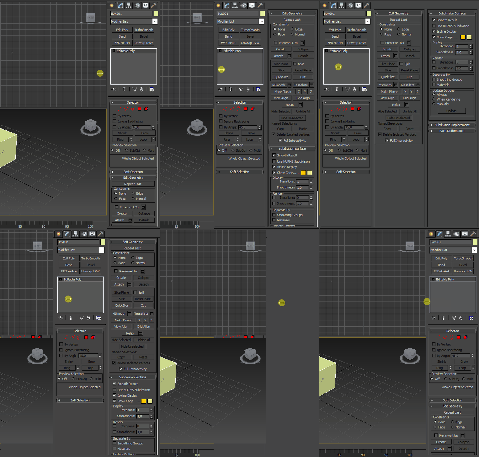
3ds Max has two full column properties layout, but the modifier system is something akin to modifier list addon, where the properties of only one modifier are exposed at a time.
A general multi-column layout everywhere in the properties would keep to the current ui more familiar, so so anything in a modifier or a sub-tab in other property tabs would get twice as short with two (or more) columns within its own area, just like a website.
Looking around the UI and 2.83, properties >rendering > column management is fluid. Nothing else in rendering seems to be. But that’s the way to go, including for modifiers.
Everything should follow the same logic, ideally with an option to set the column width in preferences, so the UI could transition to two columns in a narrower space, if desired.

I don’t think that would be obligatory confusing. There will be several columns but only one scrollbar.
I want the user to determine width of columns by saying how many columns he wants visible in area.
But when that’s done, we could imagine an horizontal scrolling like in File Browser for an horizontal list.
Imagine that you have a narrow area that can contain only 2 columns. But you have a modifier stack as long as 4 columns.
Instead of a confusing scrolling producing modifiers jumps, we could have a scrolling of columns.
You pass from a display showing column 1 and column 2 to a display of column 2 and 3 to a display of column 3 and 4.
Columns being less wide than modifiers are long. You would minimize time of scrolling to browse modifier stack.
Downside is that you would have to close some modifiers if you want to see, at same time, modifiers that are distant from more than 1 column.
But with a vertical scrolling, you would also have to do it. Difference is just that would be the case for a longer distance.
About grid layout inside modifier panels, that would not work for several reasons.
Many buttons and settings in modifier panels only make sense if they are grouped, together.
Take a look to data transfer modifier in 2.83 or 2.90. To gain vertical space through a grid layout, you have to break those groups of settings.
Settings would not make sense anymore if groups are broken.
Arrays of 3 XYZ values could pass from a vertical to an horizontal layout.
But for Curve Widgets, you will still need a minimal height and will not gain vertical space because of that.
You can also loose simplicity of an UI with aligned buttons. For example, buttons of Mirror modifier, they are becoming a lot less practical to use if Axis, Bisect and Flip buttons are all on same line.
two-column design is a big mistake. I am sure that this will be disabled or changed in the future. Because the interface must be consistent, the buttons should not change their position and should not be shuffled like a deck of cards. Now the two-column design changes the position of the buttons at different window sizes, and it is impossible to get used to their location.
A two-column design should work at least no worse than 3ds max Command Panel.
images


To each his own, hence why I keep suggesting having an option in preferences to enablemulti-column layout to those who wish to have it like myself and i am sure plenty others that prefer to scroll less.
I think that you compare different things.
When somebody work with a width use that width all time, not changing the size, so he don’t see jumping the interface, taht is equally ugly in max example.
I’m sorry, but a preference like this is probably not going to happen, at least for the foreseeable future. We’ve found that it’s just not possible to use the grid flow layouts consistently enough to make this sort of thing automatic, and manually defining a “narrow” and “wide” layout, while a noble endeavor, is just not the most valuable use of UI-developer time. I know it’s not everyone’s favorite solution but I hope you can understand.
With property search coming in the relatively near future using a single column layout, hopefully it will be worth it for you.
It’s a similar situation for the multiple panel columns.
So grid flow is officially dropped?
I would like to point that multiple panel columns layout does not imply a different layout of modifiers.
Because it does not change layout of properties, it would be compatible with a property search.
That is not same amount of work as a special grid flow layout.
That would be something closer to amount of work done on Quad View.
I don’t expect such work to be done before a list solution.
But I encourage you to finish work about list.
When that will be done, if there are a lot of months before modifier nodes : Please reconsider that proposal.
I don’t think they will drop it where it is employed.
They are just refusing to use it where it is not relevant.
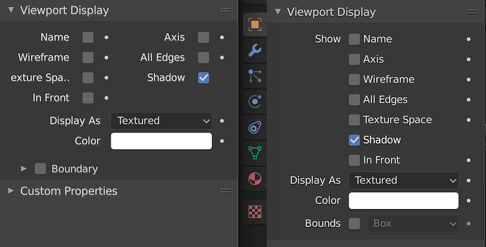
The grid-flow layout worked poorly in practice in many situations, and didn’t combine well with the left-aligned checkboxes or the headings. It also made lists difficult to scan, and made UI elements jump around when resizing areas. So, if you just wanted to make the area wider to read some of the text, the widgets would also jump.
Before/After:
However, Grid Flow layout is not deprecated, addon developers can still use it if they want.
This doesn’t look like an issue with the grid flow itself at all, but rather very poorly set up panel width threshold for grid flow to trigger. You are showcasing grid flow example on such a panel width combined with such UI scaling that two column layout should never ever occur there. It should be divided into two columns only when the panel is wider and UI scaling should be used as multiplier, so that text/UI element size affect the threshold value.

