I understand the desire to have a consistent UI, but at what cost to the the user experience?
As far as I am aware, exposing an option without worrying about the UI and how it would handle itself is no different than laying out a website - it’s nearly automatic as long as there are good rules in place - margins, alignment, etc.
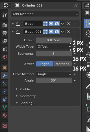
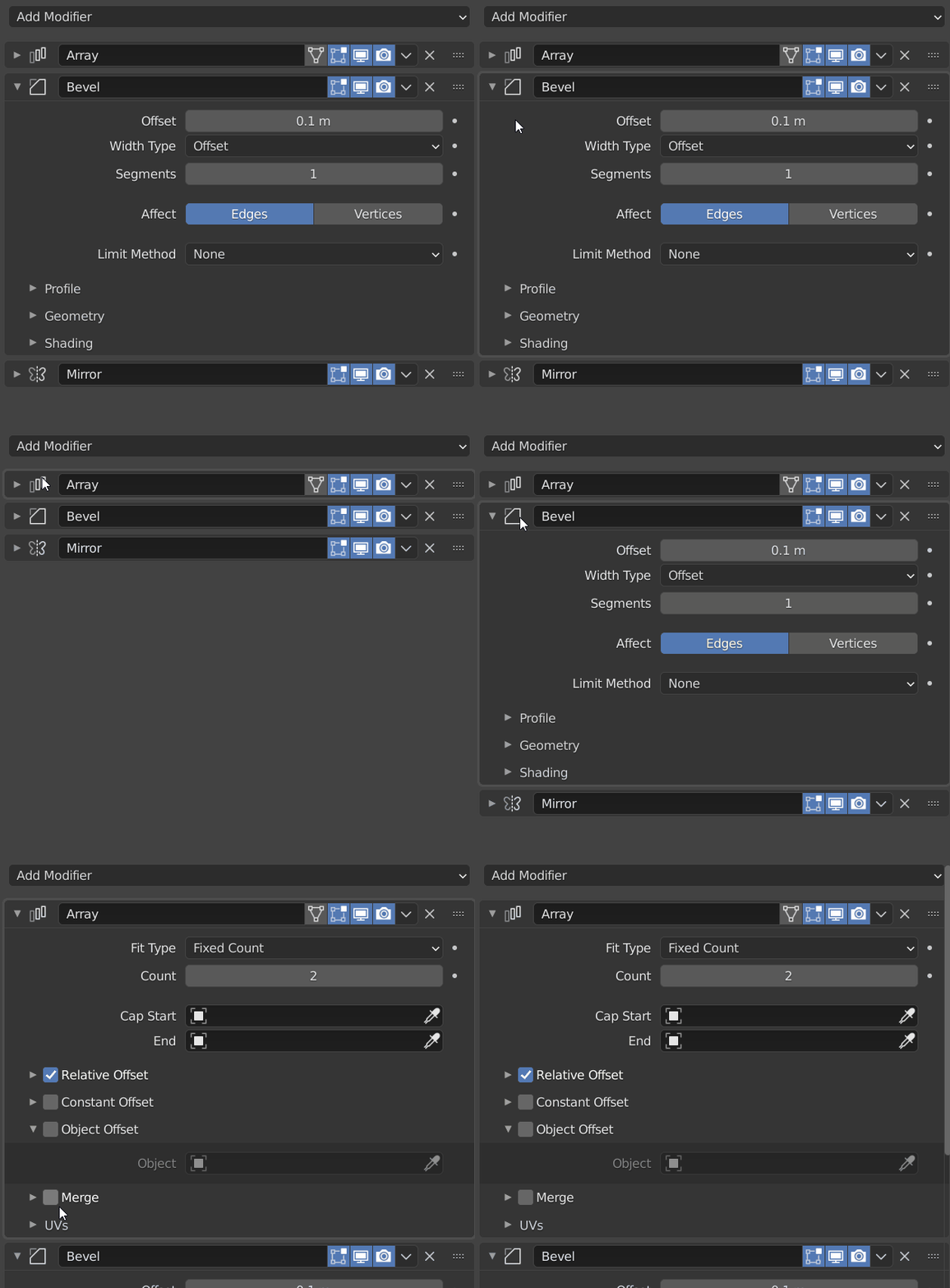
The only reason I keep bringing this up is because that current iteration of modifiers with a series of sub-tabs introduces additional clicks and significantly more vertical scrolling. Yes, allowing modifiers to be draggable is good, but for anyone that uses more than 5 or 6 modifiers, the current UI would be a significant hindrance.
One more point - in the default ui experience, the properties are below the outliner. With multiple sub-collections the outliner typically needs to be expanded wider. If the properties remains underneath, then there is significant amount of wasted real estate without grid flow.
Perhaps then what many are doing with showing suggestions of how the modifier layouts should look like with minimum extra vertical real esates and minimum number of subtabs may be useful to prevent extra scrolling and uniform ui fatigure (all options everywhere are continuing to look the same so it is becoming harder to find the right one).
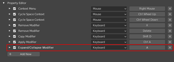
Let’s also talk about the new hotkeys. One of the intentions behind 2.8 was to be able to work with less hotkeys so new users can adapt to using the app quicker. Now, the user interface is changing in a way, where the speed of doing something that could be done before without sub-tabs and without hotkeys would either require additional hotkeys (clicks), more vertical scrolling, and/or additional mouse clicks.
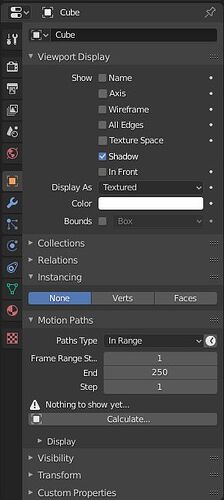
To continue with new users in mind. With everything sub-tabified and (in most cases) closed down (not only with modifiers but throughout properties), a new user would need to expand each individual tab, study it and figure out the necessary option. Case in point - in 2.79 i felt it was much easier to change an object’s viewport visibility from textured to wireframe. Now i need to scroll through a number of tabs, find the right one to expand, and select the option. I need to do that a lot and I am still not up to the speed of making this adjustment between 2.79 and current Blender versions.
Back to the modifiers, from a new user’s perspective, it may be more difficult to remember more closed sub-tabs that may contain the right option, than having a recognizable collective modifier UI layout (as in 2.83) and know where about in the interface is the right option.
This is starting to feel like a wider UI discussion, so veering slightly off-topic, but I feel that for a daily blender user that also teaches others, it is important to voice these UI paper-cuts, with the modifiers taking centre stage at the moment.


