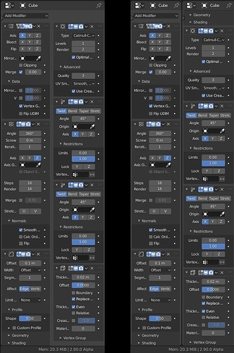
A long time ago … when the monitors were small and square, the developers made the interfaces for the programs as compact, convenient and intuitive as possible.
But what now?
1- most likely the developers are trying to turn compact convenient panels into panels with infinite scroll
2- Do developers try to hide all functions in awkward lists?
3- It is rumored that Maya developers change the names of functions, tools and their location so that each new version of the program just looked different. Perhaps the Maya developers crossed in to the blender development team, or Autodesk sent spys for sabotage and destroing what blender users like so much - a convenient, intuitive interface.
What need?
In order not to waste time on such experiments and not to anger users, changes of inteface must be put to the vote so that the community itself decides whether such changes are necessary or not. Or create a test group, which consists of experienced blender users, primarily 3d modelers, since they use the maximum functions and tools of the blender. And this group that will decide whether to make the changes proposed to it or not.
no offense, but it is very difficult to read your messages when they are composed of sentences and not of paragraphs. It is like reading a lot of unstructured ideas.
I notice an overwhelming dissatisfaction for the new modifier panels and would just like to express my support for them.
I was really happy with the UI changes coming from 2.79 to 2.80 which sped up my workflow a lot, so I trust in the developers’ decision to make further changes to the UI.
This is also a friendly reminder to be kind to community members and avoid personal attacks, even if you may disagree with their opinions.
Thanks
Oops…
@John1 Please keep this civil. This is about the arrangements of buttons in some panels, it’s not worth insulting people over. I’ll have to actually close the thread if this devolves further.
I’m reopening the topic, hoping that the discussions on a personal level can be avoided. Thanks in advance, and have a nice weekend everyone.
I patiently read all arguments and need to accept that all the UI now will be in one column (to get all UI in one standard), the only polishing things need to be done.
Here is what worry me right now:
- Example in Array modifier: when clicking on checkbox (or sub-menu label) it need to open the sub-menu also.
- Renaming Modifier by dbl clicking on the name (like other stuff in outliner, why not?). And then dragging by name also, would be nice.
- About hotkeys for Delete and Apply, how we determinate what Modifier active right now?
-
I agree with opening with the sub-menu label, like every other part of Blender (it just needs to be polished, other modifiers sub-menus work as expected).
-
Agreed.
-
The modifier it’s not active, the shortcuts should work on any modifier the mouse is hovering on. I say should because it’s the only new functionality mentioned by Hans that still isn’t implemented in the latest build, at least not as described: right now they work in a weird way, A applies the modifier and D duplicates it, but ONLY if you open the modifier header menu. Outside of the menu, the only shortcut that does something is A, which collapses/expands the modifier (@HooglyBoogly is this a bug or it still needs to be implemented?).
I will commit the shortcut patch soon. The A key for expanding panels has been around for a long time. It’s a little odd by I dont see the need to remove it. We can use Ctrl A for applying modifiers out of the menu (which makes it more purposeful anyway).
This is the best time to change this.
For example, in the nodes editor H - collapse / expand the node. In other places, a combination is used ctrl\shift\alt + H.
H - to collapse / expand the modifier would be logical. Like in node editor with nodes.
I noticed one inconsistency. The outliner uses H and alt+H keys combination to hide\show object or collection. But there is no need for hotkey alt+H, since the object / collection does not disappear from the outlining (like the nodes in the node editor). There we can use H to hide /show object or collection.
slowk1d, APEC Here is about opening the menu and submenu, this can be used for the proposed hotkey:
I only knowed the A hotkey
I made mock-ups to reduce a little bit size of long modifiers or make them a little bit more practical in my opinion.
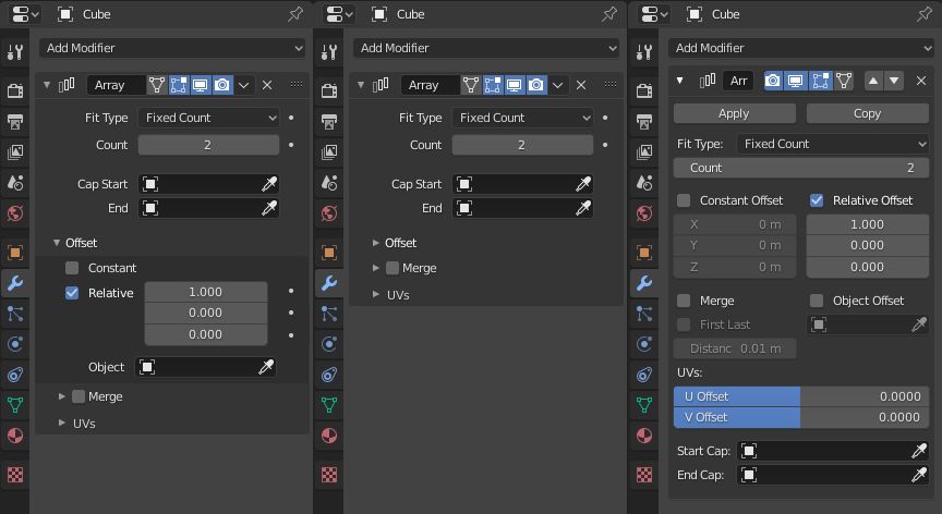
I start with Array modifier. We could have a unique Offset sub-panel.
And array of values would be only visible if option is enabled. (I know that has few chances to be approved because that goes against the rules. But here, we don’t make an exception, there is no way to make it shorter.)
In use, modifier would not be smaller than what is in master but there would be less clicking relative to opening sub-panel and enabling the checkbox.
All sub-panels closed, we would gain 2 lines. That would make difference with 2.83 more important.
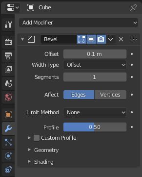
For Bevel modifier, I think that Profile sub-panel is not necessary.
Profile Shape is a setting that is present since a long time. Letting it exposed has a main setting would make modifier closer to what was exposed in 2.79.
This modifier had an enormous expansion in 2.8 series.
Old users would be less confused if what was there since a long time is apparent and recent stuff is under sub-panels.
Removing sub-panel would only add one line of modifier but it would avoid a lot of click by giving a direct access to custom profile curve.
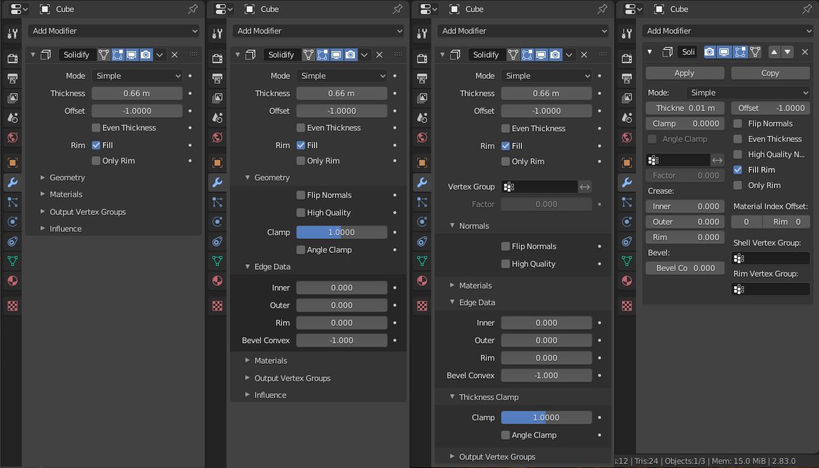
I reduced size of Solidify modifier by merging 3 sub-panels and adding an Influence sub-panel to contain Vertex Group settings.
Options about Thickness and Normals are grouped into a Geometry sub-panel. And Edge Data sub-panel becomes a sub-panel of this Geometry sub-panel.
That way , we are gaining 3 lines when all sub-panels are closed.
We could also imagine that some options of Complex mode like Boundary and Merge Threshold appears under that Geometry sub-panel instead of main settings.
For Array and Solidify I definitely likes your variant, and for Bevel my mock-up with a little tweak
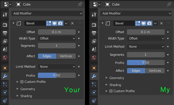
More organized in my opinion and why Custom Profile at the bottom cos it open large area below which it will be hard to perceive other parameters
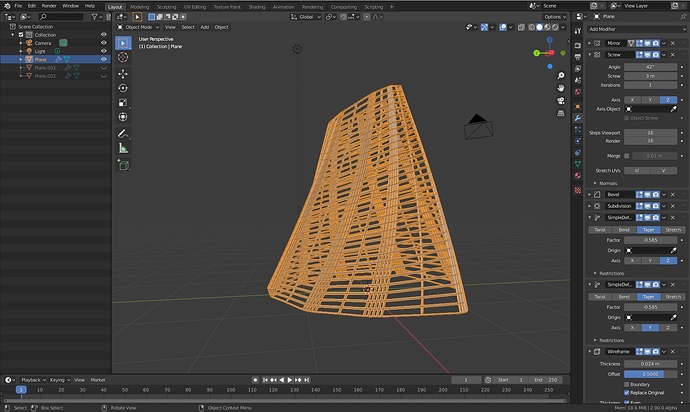
So I tried to redo this video that I’ve recently made showing how to model exclusively with modifiers. In Blender 2.9, it took me much longer to do, as I was disoriented with the new layout of most modifiers. All the sudden, I wasn’t sure what is the right option that I need to click.Sure the muscle memory will adjust, but in this case I am strongly for the mantra “if it ain’t broke don’t fix it”. Draggable modifiers are great, the new modifier layout is not.
I know we’ve moved on since then, so I would continue to propose to have an option in preferences to have multi-column layout and an option for the width of a single column.
To those that wish two have two columns, let them be, and those that prefer a single column let them be as well. This way we are all happy.
I really work with modifiers ALL the time, and it really is reducing my efficiency to work with a single column by a lot. Even with the new hotkeys, the time it takes to click extra buttons on the keyboard or with the mouse to expand the sub tabs AND scroll through a longer UI results in less efficiency. Again, with a simple option in preferences, we can all be happy.
This shows precisely why we need two column layout opiton. In solidify, which I use all the time for floor plates and other things, I have a thickness, offset, even thickness, creases, high quality normals, fill rim, material offset properties. With sub-tabs and single column, to enable all of those options, with this proposal, there would be 4 extra clicks and lots extra scrolling.
the control click shortcut opens/closes all the sub menus
I also had a little bit of difficulties to follow it in expected 10 minutes. But that’s because I could not stop myself to think that would be easier to set bevel modifier in vertices mode before screw modifier or that would look better with calc order option enabled.
To be honest, you only have to open 2 sub-panels following this example.
Normals sub-panel of Screw modifier to disable Smooth Shading option and Constant Offset sub-panels of Array modifier.
You will say that corresponds to 2 extra-clicks.
But if you choose a layout that looks like that, showing several modifiers open at a time ; you will have to make less clicks while playing with your parametric set-up.
In 2.83, you have to scroll to reach Wireframe modifier settings.
As you said, you are disoriented by something new. But eventually, I succeeded to follow tutorial because settings still have same name.
I am in favor of multicolumn ability for panels that have a single column layout.
If somebody was OK to allow a clean split of properties editor.
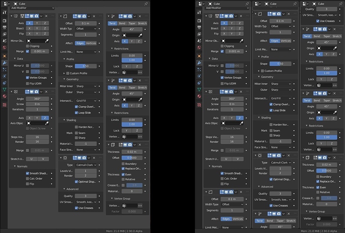
We could end-up with something that looks like that instead of current duplication of panels and headers.
Left is what we could expect. Right is what we have now.
With 3 columns, all modifiers with all sub-panels opened are visible.
That is same thing in 2.83. But with 2 columns inside panels, more labels are squished for same width.
With 2 columns at default width, by zooming out, we can read most of labels and settings.
That is valuable for 2.83, too. But in 2.83, you have to scroll to see last modifier.
But in 2.90, you can keep close 3 sub-panels, instead and see main settings of last modifier, too.
With current layout, that corresponds to 4 extra-clicks.
With my proposal for Solidify that corresponds to 3 and scrolling is less important.
In fact, if my proposal for Array modifier is adopted, too ; set-up of object of your video using an Array/Boolean/Solidify modifiers should take almost same length in modifier stack. No scrolling needed, in theory.
The way that during all video, you are closing opened modifier to access a new one. You can continue to do that. Take the habit to Ctrl click, that should help you to become more used to it.
2.90 is still an alpha. You will have months to get used to new layout before 2.90 release.
And you have time to try to improve it, too, instead of expecting from devs to maintain code of 2 layouts for 46 modifiers.
But if a multicolumn splitting of Properties Editor is done, a solution with no extra-clicking and no scrolling at all would be available.
There are 3 modifiers containing 5 sub-panels.
1 modifier containing 4 sub-panels.
2 modifiers containing 3 sub-panels.
5 modifiers containing 2 sub-panels.
11 modifiers containing only 1 sub-panel.
24 modifiers with 0 sub-panel.
In most of cases, you will just have to deal with 0, 1 or 2 sub-panels per modifier.
That does not represent many sub-panels.
In most of cases, modifiers are not longer than in 2.83.
There are 6 modifiers that have more than 2 subpanels (Data Tansfer, Array, Solidify, Ocean, Bevel & Wave).
I think that finding solutions to shorten those ones and reduce their amount of sub-panels should make 2.90 layout more efficient in all usercases.
Yes. That makes sense. I just did not pay attention to order of main settings.
But there are probably several modifiers that should have a different order.
That’s a pretty nice alternative, I like the idea of multi column for modifiers list. Only need to determine min/max modifier width for splitting on 2, 3+ columns.
I think it’s a win win for fans camps of one column and 2 columns.
I would like to hear what developers think about it.
That version is completely illegible It is a personal solution that users will hardly be able to use.
It’s silly, having a list of modifiers, wanting to use something like that.

