New modifier panel and list


something I noticed is that certain rows with a checkbox next to them do not open the panel by clicking on that row, instead it toggles the check mark. This is probably just an oversight but might as well bring it up.

edit: I realized the checkbox is toggled if you are clicking the text, while opening up the panel is triggered when clicking empty space by the row. I think that might be a bit obtuse. Either way,comparing to the hair setting I was clicking in the gif, the modifiers behavior doesn’t work like this, so there are two behaviors currently. Personally I think having to explicitly click the box to activate it, and clicking anywhere on the row should open the panel is better.

7 Likes

Array
Another small point, if there is a row with a checkbox, such as “relative offset” in array that is checked off by default, the panel should also probably be exposed, otherwise you need to open it up manually each time, even though it is considered the default state. I think array is the only modifier with this papercut currently, but I feel it would be wise to do this in the future if it arises.

3 Likes

There is a lot of talk over the “modifier list” addon and a node based system coming in the future, and I’d like to add my two cents. Firstly I would like to mention that I had never used the “modifier list” addon before, but I gave it a good look over. So feel free to take this with a grain of salt since I’ve not used it in a project before.

Recently I’ve had the mindset that since eventually there will be modelling nodes, that many of these UI issues we’re discussing will disappear. Not everyone agrees, but nodes tend to clean UI clutter up pretty nicely and I do subscribe to that idea. Specifically, I’ve been mulling over WHY nodes make things cleaner, and I think one of the key reasons for this is it limits the UI to a single “modifier/node” when it’s selected. I realized this is pretty much how the “modifier list” addon deals with things as well.


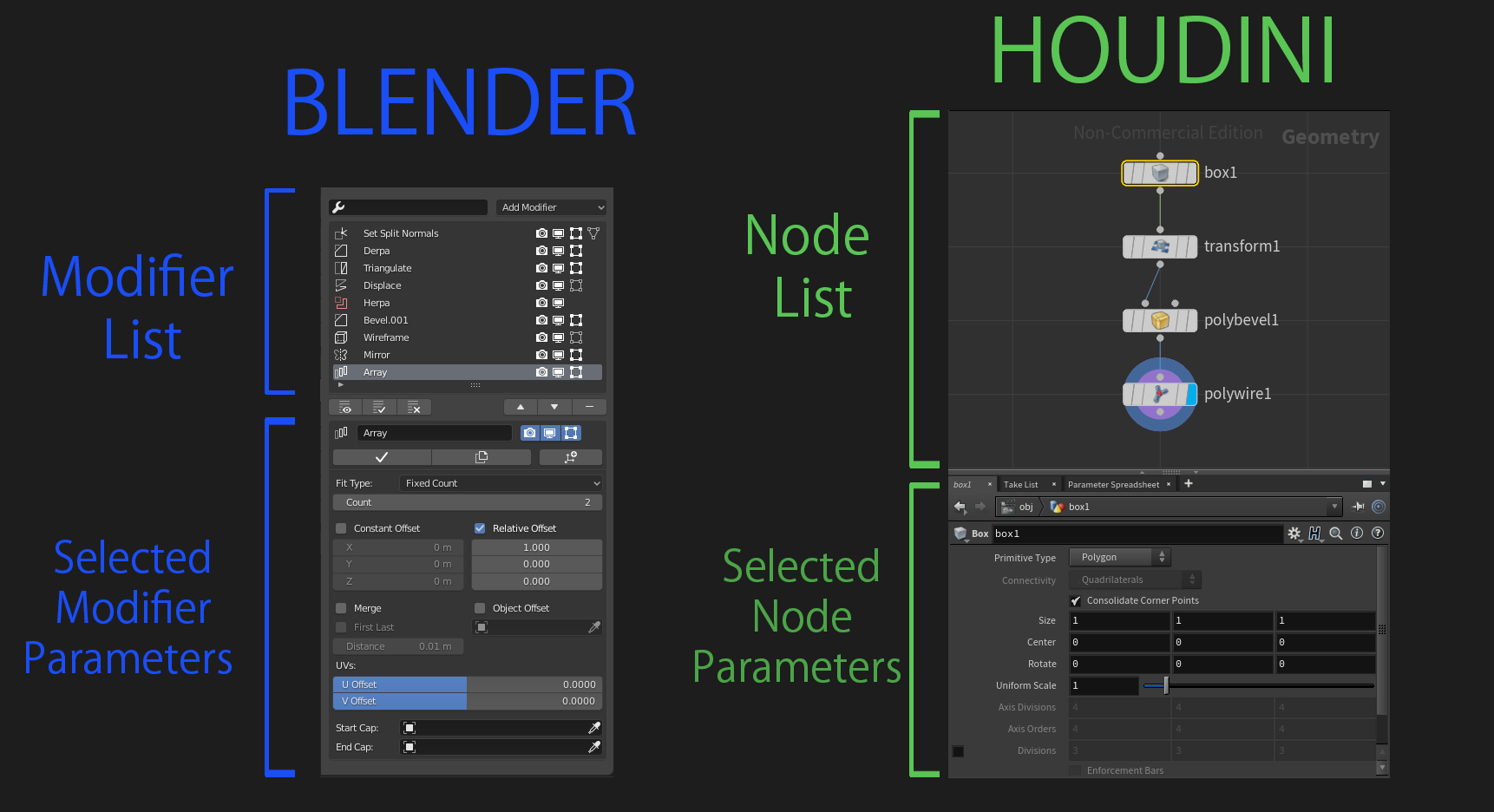
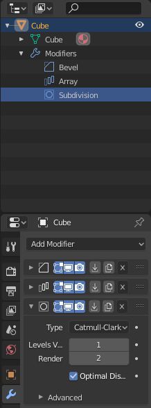
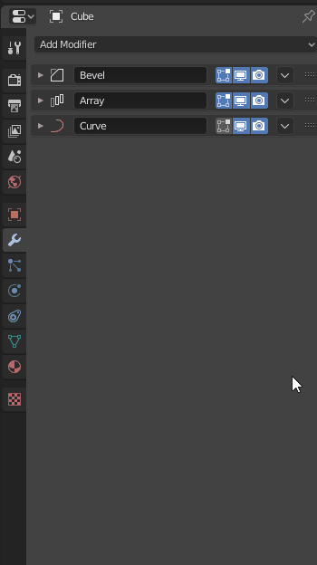
I’m using Houdini here as an example because I use Houdini and am familiar with it. From the picture you can see that basically the “modifier list” addon and houdini’s UI are virtually identical. Top panel to indicate the list of modifier’s/nodes, then a bottom panel for parameters.

I really enjoy this layout as it really reduces the need to wade your way through a huge list of collapsed modifiers to only have to re-open one to see it’s contents. It’s not bad per-say, but it’s unwieldy. On complicated objects with lots of modifiers I can definitely spend a lot of time opening and closing the modifiers I want to change parameters on. In Houdini or in Blender with the “modifiers list” addon it’s just a bit more manageable to deal with complicated objects.

There are a few cave-outs here I’d like to mention. As you can clearly see in the picture above, blenders picture is smaller, that is not from editing, it’s because above the properties panel we usually find the outliner. This scrunches things a bit more, leaving less room for the modifiers. In comparison Houdini’s panel has more vertical room because it covers the whole right side with no outliner to get in the way. I’m not saying the outliner should be moved, but this height difference should be noted if a “modifier list” approach were taken, as our parameters are in a vertical layout now (which I think is excellent and much more readable).

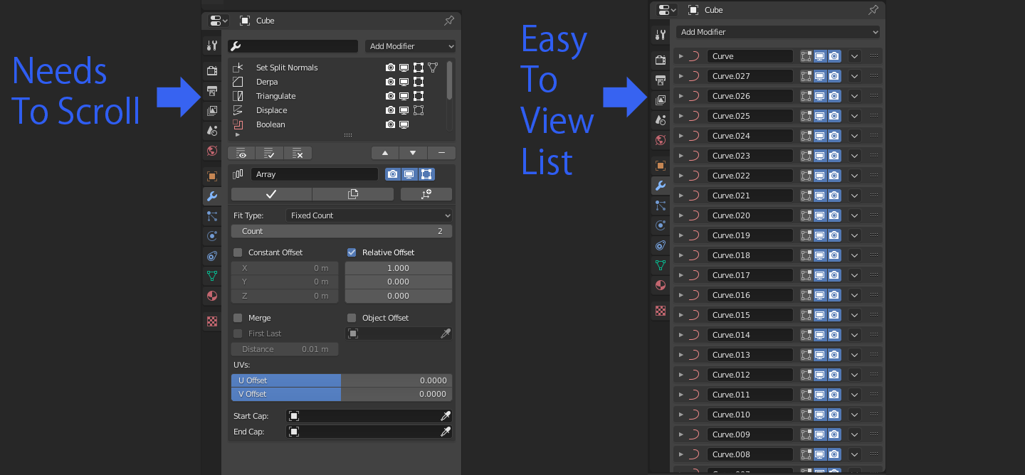
As well, since in houdini, the “modifier list” is just a node tree, you are capable or scrolling, zooming in and out and exploring it in a manner that feels more “free”. In blender with the “modifier list” addon you need to scroll a bit if the modifier list gets too long


This isn’t the end of the world, but with the outliner taking space at the top once again I just have to mention it does squish down the whole thing. Obviously you can move the outliner, but in terms of defaults you never want to make it difficult to use for beginners.

The “modifier list” addon approach might parallel what modelling nodes would bring in the future as well, just having a look at Houdini’s setup makes me think that, though it’s hard to tell since that is still merely talk of the future.

So all in all, I think I DO actually prefer the “modifier list” addon’s approach. It’s not without it’s problems, as I’ve listed, but I think it makes it more clean and efficient. That being said the UI of the “modifier list” addon could be better, I simply support having one area dedicated to listing the modifiers, then another for the parameters.

PS: sorry for posting 3 times in a row. I know it’s bad show.

14 Likes

About lists. Obviously modifiers interact with each other on the stack, therefore the user often needs to see the properties/settings of more than one modifier at the same time for better configuration of what one wants to achieve. I’ve only tried Modifier List addon for a short time and apparently you can’t do that, see the properties of more than one modifier at the same time (although I’m not sure if it’s possible to do it from addon preferences).
Lists is a really interesting concept, I hope that if this is implemented in Blender, the user still somehow has the possibility to see properties/settings of more than one modifier selected in the list at the same time.

Afaik one should be able to shift or ctrl click to select multiple modifiers and have all their properties listed below. If you select them all the stack would be like without addon.
If it doesn’t work like this… it should!

7 Likes

Yeap, this solution would be very useful.

I thought of “one hand” solution in the List like checkboxes or visibility icons like in outliner, and then the properties only of selected modifiers will be displayed on the Stack. But anyway, it should be possible to do it somehow.

This is one of the downsides of having the list on top, parameters on the bottom approach. That being said I don’t miss it that much to be honest. There are times where you hop between modifiers a lot but it doesn’t take that long to click between them in a condensed list. As well you can only see 2-3 comfortably at a time imo. It is a negative though, and if it were to have some steps to resolve it:

This would likely be it I think. Very good idea!

2 Likes

@YAFU, @Bobo_The_Imp @lsscpp

Not really. And while the addon even works without very well, that limitation is caused by blenders UIList Element. It currently doesn’t support multiselections. It would be very well possible to display more than one modifier below the list. That’s why dragndrop functionality and multiselection should be ported/brought to UIList. These as a general available features would be incredible helpful for many addons aswell as internal tools.

7 Likes

Interesting.
Has that feature been formally requested from developers? What was the answer?

Formal request? You mean like this on rightclick select?

I also know that the developer of the modifier list addon discussed here appreciated that idea explicitly. But thas was no formal request.

In fact it’s really quite common to support multiselections in lists in many ui systems out there. So I find it quite obvious to add as a feature. I don’t know why it’s not in there yet.

4 Likes

My main concern is that there is still no native way to easily apply all the modifiers.

Convert
Convert to Mesh applies all the modifiers, I assume you know this though; you’re referring to a button or something in the modifier panel yes?

Yeah, “Convert to” works fine for me, but from the perspective of a new user it wouldn’t make much sense to hide the option to apply the modifiers this deep. (Or requiring to enable an add-on to to that)

I made a mock-up reusing slowk1d buttons.

It can work with narrow columns if name of modifier is available in outliner.
I just used outliner filters to make this display (Collections Filter disabled + Object State Filter set to Active).
We could imagine an option in filter popover to synchronize Properties Editor and Outliner.
When user displays Modifier Properties tab in properties Editor, it could lock Outliner to same filter state I used for mock-up.
We could imagine selecting several items in outliner and applying or deleting them through right click menu.
Opened panels could be synchronized with items selected in outliner.
Currently, modifiers management through outliner is limited to renaming.

3 Likes

100% agree. The question is just because you have a drag drop control, do you have to use it? What is the majority of the use cases? I submit it’s moving up and down a single row at a time, which is accomplished much faster with a single button click.

This too is a valid argument. You may consider allowing for users to not have to everytime expand the various settings views, thus creating even more clicks.

Consider the overall cognitive dissonance trade-off of searching through and expanding lists for first time users as well as those who use the same tool day in and day out. There’s a reason bank tellers don’t use a modal ATM machine interface when processing transactions. The risk is turning the use of modifiers into a huge click-fest based on aesthetic desire to make it look simpler-- putting UI over UX.

A good idea is try and understand the frequency of specific use cases before making big UI changes.

In particular, the delete button should be on the top row. It’s important for new users and experienced alike.

Sometimes we end up looking for problems where there are none. The constant reshuffling of the modifiers interfaces from version to version would indicate to an outsider something else going on.

Yes, very nice. I really like this direction! Using an icon to communicate the type of modifier is smart. I assume the name is in the expanded list.

Sorry about the multiple messages, but I just got here after starting a similar thread about this topic.

I think we can all agree on a few things:

  1. From a UX perspective, we want the interface to work well for beginners and experienced users alike. Beginners shouldn’t be overwhelmed (progressive disclosure of features and use buttons and not keyboard shortcuts) and experienced users shouldn’t be forced to have to expend more time for the same result. Aesthetically pleasing is important, but only one component of all this.

  2. From a UI perspective, we understand visual clutter adds to confusion and a visually clean interface is easier for everyone to use.

  3. Maintaining some level of interface continuity from one version to the next is important. It helps existing users in that they don’t have to relearn everything everytime. It helps new users who continually struggle to keep up with the program. And, as a side benefit, changing an interface in each new version can obsolete many existing Blender tutorials-- of which there are many and the community depends on them.

  4. Good UX/UI describes the problem first, then acknowledges it AS a problem, then proceeds to iterate on a number of fixes. Too many times the problem automatically comes with a suggested fix. It’s always important to separate the two.

So then,

How do we replicate the ease of use for features that are being moved or deprecated for experienced users. Perhaps we can assume experienced users can suffer through more elaborate shortcut interfaces-- like keyboard commands.

Here are a couple of the problem / solution pairs I see. Please keep in mind the problem is my perceived problem as I am not privy to the original discussions. Likewise, the solution is just a top of the head idea-- and would hopefully be followed up with some more thinking and research.

1. Layer Reordering

THE PROBLEM
People want to move rows more than one row up and one row down. The two button approach becomes unwieldy when moving modifiers more than one up or down-- especially with long lists.

THE CURRENT SOLUTION
Drag/drop modifiers in-between rows.

THE PROBLEM WITH THE CURRENT SOLUTION
If, as I believe*, the vast majority of use cases is one row up or down, then this requires a much more difficult interaction for this simple process.

*I am happy to go into why I think that is the vast majority of use cases, but this post is long enough.

A PROPOSED SOLUTION
Perhaps it makes sense to Ctrl + click on the drag drop button to move it UP one row and Shift + click on it to move it DOWN a row? This allows for power/experienced users to be able to still move swiftly through a row at a time movement.

2. Progressive Disclosure of Modifier Controls

THE PROBLEM
Modifiers keep getting more and more complicated, thus creating more and more confusion on what controls do what and which are important vs ones that can be mostly ignored. Expand more than one modifier and it’s virtually impossible to see what’s going on.

THE CURRENT SOLUTION
Put less needed features behind drop down menus and collapsing control groups. Use a shortcut to expand all control groups at once. This creates a cleaner interface.

THE PROBLEM WITH THE CURRENT SOLUTION*

  1. Are the correct controls given the correct priority? Which controls should be available and which should be hidden? Do we have any data on this?
  2. Overall user confusion and cognitive dissonance as control groups are expanded and contracted.
  3. More use of screen real estate when expanded.
  4. Many times more mouse clicks to get to the same result.
  5. A continually changing UI affects the overall perceived stability of the product, while making it more difficult to learn.

A PROPOSED SOLUTION
Work hard to understand the frequency of attention to various controls. I can’t imagine the ‘x’ delete button not being on the top row-- IMO it’s one of the most used buttons in the modifier UI-- and it’s especially important for new users if they accidentally use the wrong modifier.

Perhaps it makes sense for new users to have a mode where the modifiers act as an accordian control, where only one is viewed at a time. This may minimize the need for progressive disclosure of control groups.

Well, that’s long enough for now. Thanks for your patience. :slight_smile:

2 Likes

I had never thought of this before, but that is a valid point.

I was thinking though, what with my comparison to houdini up a couple of posts, that if the “modifier list addon” approach is adopted, I think most fields could be immediately exposed. If you are only looking at 1 modifier at a time then you don’t need to conserve as much space, it’s fine to have it all open. I still do support the new vertical list layout, It’s much cleaner.

1 Like


Another small paper-cut, I noticed that that you can drag the modifiers way to the left, which I don’t think there is much of a purpose to. It’s blocked going to the right, as you can see in the gif as well, so might as well just constraint it to vertical motion I think. Pardon me if there is a reason for letting it go to the left.

8 Likes