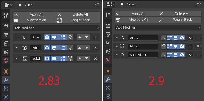
How about the idea of a comparsion window ??
You´re checking the modifiers you want. Than there should be a button that opens a comparsion window to work on… how about this ??
RalleE
How about the idea of a comparsion window ??
You´re checking the modifiers you want. Than there should be a button that opens a comparsion window to work on… how about this ??
RalleE
Really nice idea. You have my vote
Here is a small example of the solidify modifier, so even with the new layout there isn’t much gain in space when all the subpanels are collapsed but if they aren’t then it becomes even worse as it takes twice the size.
The old layout had better organization with the double columns and it’s much more practical if you have dozen of modifers, even the modifiers list addon can’t solve that.
My suggestion would be bring back the double column layout and keep the subpanels minimal to 1 or 2 instead of 5 - 6, just group them in a generic way(which options are used often & which not) doesn’t have to be for every single option.
I don’t have time to reply to everything, but here are a few patches I worked on today to address some of the feedback brought up here:
@HooglyBoogly Thanks for listening to the feedback, having the delete button exposed it’s already great. I like a lot the idea of shortcuts, maybe I would go with Shift+D for duplicating and add Ctrl+A for applying the modifier, as it happens with duplicating and applying transforms in the 3D viewport. The only thing I didn’t get: do these shortcuts activate whenever we click on a modifier panel? Does it mean the modifier is in a selected state?
Good idea, those shortcuts are a lot more consistent. The tricky part is not conflicting with any other existing shortcuts, but those might work.
There is no selection state, it applies to whichever modifier panel the mouse is on top of. I was really surprised by how quick it made operating on a bunch of modifiers.
And this one too:
UI: Ctrl-click on panel header to expand & collapse subpanels
A user preference setting would be nice that swaps the behaviour of ctrl clicks and simple clicks completely.
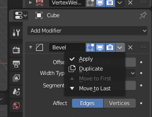
What I’m wondering though, do we really need 3 ways to delete a modifier?
x icon in headerx/Del shortcutThe concern with only having it in the menu was workflow speed and the extra clicks needed. With the shortcut (which is indicated in the menu and not as intrusive as the icon), this issue seems addressed.
So wouldn’t the menu entry + shortcut for faster/advanced interaction be sufficient?
Would like to hear back from people who were concerned about the earlier design.
Oops, I don’t think my combination of patches was totally clear. With all three of them, delete wouldn’t be in the header menu, just the header with an X button.
I think it’s pretty important to expose the delete button, so I think the two ways would be the button in the header and the shortcut.
Likewise though, I’m interested to hear people’s opinions on this, maybe just adding the shortcut for delete is enough. The benefit of that would be more space for the name.
My vote for Delete in menu (hotkey for this is optional), more space for the name would be nice.
It’s possible add the icons of visibility inside textfield? like in a list.
I definitely vote for this.
This also be nice, more compact and with Delete icon

but you can miss click and delete instead of dragging.
For me more important question about old 2 column layout, was more convenient…for some modifiers like Array
There was a nice proposal from @d-V-b to drag the modifier also by the name and use double-click to edit the name. This could solve it, but I don’t know how much it requires in terms of coding.
If it will be implemented then we could get rid of last icon(?) 4dots2rows and we get even more space
I definitely think that the UI needs further refinement as well. I made a suggestion on right click select for multi column UI as well.
The single column ui, with multiple sub-tabs takes significantly more space and requires more clicks to expand sub tabs to get to the right element. Here is an example of the array modifier.
It’s a bit outside the scope of this topic, but it would be great if the UI throughout non-addon windows in Blender can consistently be fluid, or user selectable 1 or 2 columns.
That is a old petition since 2.80, to go back to old layout. It’s realted to this that I do to keep the readibility of the layout.
But developers discard to do multiple columns.
Single column is so much cleaner and way faster to scan with the eyes compared to multi column. This outweighs any argument of using less space in my opinion. I’m glad Blender FINALLY moved towards single column. And there are good reasons for it. Lets not go back!
I assume you are not modeling in non-destructive with boolean/array and other 100500 modifiers in stack