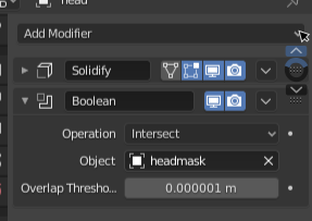
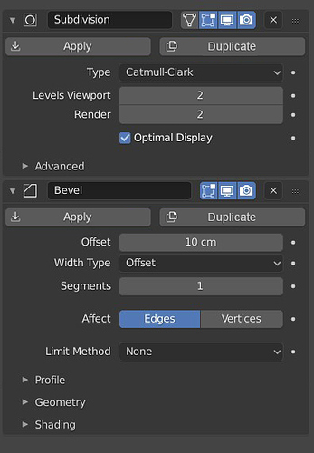
@HooglyBoogly Sorry for bringing my feedback late, I didn’t test all the changes but i don’t like Multiresolution modifier layout, ideally the button that we use the most should be more exposed, in the multires modifier context subdivide should be more visible.
If you wan to reorganize the multires UI, one thing to do is subdivide, simple and linear they are all doing the same thing, you can put them under one name and user can chose which operation they want to do.
Yes i agree with many people here the apply, duplicate, delete button should be exposed.
As i said i didn’t test all the changes but one thing that i like is the drag and drop. 
+10000000 on this. While modifiers get “nodified” we need a better way to read and manage them, and the Modifier List add-on is spot on. The most notable and useful difference is that you only see the info/settings of the selected modifier, so that means there’s more space available and there’s no need to hide things in sub-menus, sub-panels, dropdown menus, etc.
To those in charge of this, please consider the add-on as a guideline (or better, include it in master), it is very well thought and many people in the community already prefer to use it instead of the defaults.
Thanks for the feedback everybody. I know the modifier stack is a precious part of Blender, and to me too, I hope everyone at least starts with that knowledge. There’s a lot, but I’ll try to address everything. I’ll start with the rational for the decisions and then address the specific suggestions.
Apply, Delete, Duplicate Buttons
This was discussed among the UI team on the “user-interface-module” channel of blender.chat, that’s why it might seem like it came out of the blue. I don’t want to pretend that there aren’t tradeoffs here, so I’ll try to list off the benefits and downsides of this change.
Menu Pros
- There is a nice separation between the settings specific to each modifier and the general ones that apply to all of them.
- Everything general is in the header, meaning you can quickly access the general options for closed modifiers.
- It allows hiding the “Duplicate / Copy” and “Apply as Shape Key” buttons which aren’t used quite as often.
- All the modifier operations are in the same place, and menus are used commonly to show lists of operators.
- More space for the modifier name in the header.
Cons
- Although a quick “click and drag down” can be used to delete modifiers (and I’m not sure many people know about this), the delete button is less accessible, both visually and functionally.
- The apply function is similarly less accessible. Although it is accessible from the header now.
Suggestions
Thanks for the mockups @slowk1d. Having buttons below the subpanels in a footer is interesting, although it isn’t feasible with the panel UI system right now. And I’m really not sure about that giant “Copy” button.
I like your last mockup. That combined with a menu when the panel is more narrow could be interesting. Although I’m concerned that it would push people to make the properties panel wider than it needs to be.
@d-V-b A custom panel context isn’t currently possible (although it could be made to work). But I’m not sure it solves the problem, because it just hides the operators more. And the dragging with shift or alt is pretty much out of scope for technical reasons here.
You weren’t able to apply and delete multiple modifiers with a click and drag before, these buttons are operator buttons that only activate on mouse release. The modes are still toggle-able for multiple modifiers with a click-drag.
This is also not currently supported by the panel system. It’s an interesting solution, although I think it might break down the idea of the “Header” a bit. And all of the contextual displaying of toggles is interesting too, but it’s relatively unprecedented, and I’m not sure where those options would be stored.
Subpanels
I was resistant to the idea of using subpanels for organizing modifier settings at first too, but I came around. I think the improvements to organization, clutter, and clarity are just too good to pass up.
I think the subpanels will help new users a lot because they give every button much more context than it had before. But for experienced users it can hep too. It can make the panels take less space vertically, and also hide options that you never use.
However there are probably some possible improvements. One quick one I would like to make is a shift-click on the header could expand all subpanels too.
Modifier List
I think the modifier list is a great addon, and it makes sense for some use-cases. But there are downsides to this too. For one, you can’t adjust the settings of multiple modifiers at the same time. Personally I’m not a fan of selecting in UILists to display options for different modifiers. It makes more sense for particle settings because they all have the same options, particle nodes will even change that. The visualization of progress from one modifier to the next also isn’t quite so clear. The dragging also doesn’t work in UILists.
Also, I think you might find that having all the modifiers collapsed will give you many benefits of the list. You can ctrl-click on a panel header to collapse all the other panels besides the one you clicked on.
That said, the plan is to keep the list UI possible with an addon, and that the addon can use the new modifier panels or provide custom ones. I will make sure that’s possible on the Blender side. I’m also personally in favor of including such an addon with Blender.
Other
Interesting idea. I tried turning emboss off for the modifier’s name at some point but the panel expansion when clicking conflicted with the double click. I expect that problem could be solved though.
This would be a great improvement. A check-mark might work well too.
What you propose does offer more consistency, but it’s a bit more nuanced than that. For example, the bevel “Width Type” option has 4, possibly soon-to-be 5 options, expanding that is not really viable. I would be open to moving the “Affect” option up, but it’s really not used that much as far as I know.
The idea I had was to add icons for the other two subdivision types so that they take up space. Obviously it will take some time to do that though. What you’re suggesting is a drop-down, which I take it people aren’t the hugest of fans of ![]()
Actually you need a big monitor to see more than 1 or 2 modifiers with the new layout. And I think it is one of many axioms that cost a lot in designs due to strange situations as a user.
If the list does not allow drag and drop, I do not understand why that option is not implemented, which if it had been done so, we could have used in particles, UVs, constraints, … and it would help many addon designers to make an addon to paint layers like photoshop
This is a bit of a tangent, but it sounds like adding drag’n’drop and multi-select to UILists could open the door to an interesting hybridization of the current modifier setup and the modifier list add-on.
Yes that’s what I’d hope for too. ![]()
Well, yeah. That’s the point. Changing the settings of multiple modifiers simultaneously is why the current UI is a mess compared to the add-on. It focuses on a single modifier and there is no visual clutter while working. There is far, far less scrolling up and down the list as well because every single modifier can be viewed simultaneously with the settings of the currently selected add-on. There are no complications with opening and closing multiple tabs just to make the scrolling and management of the modifiers easier to orientate as the user.
While I understand your concern of wanting to look at the downsides as well, this to me is the reason why the add-on is so good. The only real practical upside with the new system over the add-on is that you can reorder your modifiers by dragging and dropping, but really now, is it worth throwing such a great design away for just one single feature? No, I don’t think so. Besides, wouldn’t it be possible to add drag and drop to the modifier list as well? I’ve seen other programs do similar stuff before with their UIs, so why not Blender?
Also, aren’t we getting node versions of all the modifiers down the line as well? That kind of node workflow is far more suitable for editing multiple modifiers at once over having a super long list of modifiers stacked on top of each other that you have to scroll up and down a lot just to work with. The current tab is supposed to be a simpler version of that workflow anyway, so let’s try to focus on making that workflow simple and to the point while making the node workflow the more advanced version.
With multi selection enabled in uilists it would be even better and would give you the choice to use it with a single modifier visible as it’s right now, or ctrl-select multiple modifiers to be visible in parallel. The addons general concept is better and things like this would have completed it.
I don’t want to downplay the current solution. The drag and drop is really well done for what it is. The scrolling feels nice, the swapping works smooth and flawless, but that doesn’t solve the existing problems. I wished that the drag n drop would have been implemented for blenders uilist instead.
An unfolded modifier list quickly tends to get too long, so folding/unfolding or extensive scrolling while searching for the right modifier or slot to place an element becomes mandatory and causes lots of unneeded steps.
A couple of things after trying this at 2.90 for a while.
When you need to move the modifier a single level up/down it is extremely slower than the old arrow method. Maybe with the new method there is a single click solution for this and I have not found it?
And the other thing is something that has actually always happened, even in menus of properties editor. It is about annoying jumps that occur when you collapse or expand menus in properties editor or modifiers. These jumps really make you lose focus of what you were looking at, wasting your time because there is a lot of change in positions when you collapse/expand and it makes you completely lose focus of what you were looking at and you have to again try to find what you were looking at. Also in my case, those jumps in the focus of what one was looking at makes me bring some dizziness problems with my tired sight.
Just my experience testing this, I am not against design. But if devs can improve these things it would be great.
Edit:
Proposal for the first thing:
Keep up/down arrows functionality. And at the same time it is the area to drag and drop when that area detects that you hold down the button and makes a drag movement. Perhaps this button/arrows area should be modified in its design so that it indicates to the user that it is also a drag and drop area/zone.
I think that slowk1d proposal is a better trade off.
It does not have the cons.
For me, point 3 of your Pros is a Con. That is a frequent thing to copy frequent modifiers (Subdivision, Bevel, Array…). And slowk1d mockup solve that, too.
Only con is space for the modifier’s name in narrow columns.
After a little time of thinking, that is not such a big deal.
We are talking about adding the space of 2 buttons.
The rest could be accessible through right click menu on modifier’s icon and grip.
User can zoom out in Properties editor and close Properties Editor Tabs bar.
Like I proposed in my mock-up, a tooltip when mouse is overlapping icon of modifier could be displayed when column is very narrow and temporarily make area wider to rename them.
If you still disagree and want to persists with the idea of button menu, please make an exception for delete button. That is pretty common to choose wrong modifier in the list or change your mind when experimenting with modifiers.
Name of modifiers are accessible in outliner’s list.
Actually, they can be renamed, there.
We could imagine that during this GSOC, Nathan could make drag&drop working for those items of modifiers list, too. That could be used to reorder modifiers and copy them.
Extra options could also be accessible through right click menu in outliner.
For partisans of modifier’s list addon, we could imagine a Modifiers display mode for outliner, only showing modifiers of active object and forcing solo mode in properties editor (only items selected in outliner would be opened panels in Properties editor).
Advantage of using Outliner for list is that would free vertical space in Properties Editor.
Several people seems to be annoyed by sub-panels closed when opening modifier, maybe you could consider a super-solo mode, accessible though a shift click, that would open all subpanels, at same time, modifier is open.
I think those jumps are simply due to modifier panel’s length. That is less annoying when modifier is closed.
Maybe, when dragging starts, modifier’s panel could be automatically closed during time of its route.
Probably my suggestion was not good but the way you have put the most important buttons to occupy smallest space in the UI is not good. in fact before starting to sculpt with multires you need to subdivide and from to time you have to use that button to continue working. The irony is “rebuild subdivisions” and “save external” are the least used buttons for most of the users and yet they cover the biggest space in the UI
That is right. Subdivisions operators will be the most used.
That will make more sense to make them buttons of the column closer to 3D View.
We could have as left column
Subdivide
Simple
Linear
and
Delete Higher
Reshape
Apply Base
as right column
Rebuild Subdivisions and Unsubdivide that are similar destructive buttons could be on same line.
And save external button could continue to take space that will be occupied by file path.
Pack button could be same as the one used to pack images.
Actually this will make many users happy, most used close to 3Dview and least used on the right column.
You’re right i was thinking about the modes but i do believe that delete & apply should be exposed and have this functionality.
Proposing a coexisting alternative that involves less dragging: On (right?)clicking the dots, there should be a menu for moving up and down. Scrolling or entering numbers would move the modifier up or down multiple times.

ignore that my mockup only has two modifiers. One of the arrows should be disabled here
While at first to me this seems counter-intuitive for the “standard” UX, I feel I’d get to really enjoy it as time would pass. It seems like a very unique solution.
Blender shouldn’t lose that, right? Inovation might be scary sometimes, but if done right, it can work.
I disagree, the experience became so bad that i personally don’t think it would benefit anyone especially that everything is hidden & the layouts of many modfiers are just awful, this is probably one of the worst things that has ever happened to Blender & the modifiers stack…why destroy what was already good & working?
I agree 100%. The workflow is terrible and slow now. ![]()
This all thing should be deeply tested first. ![]()
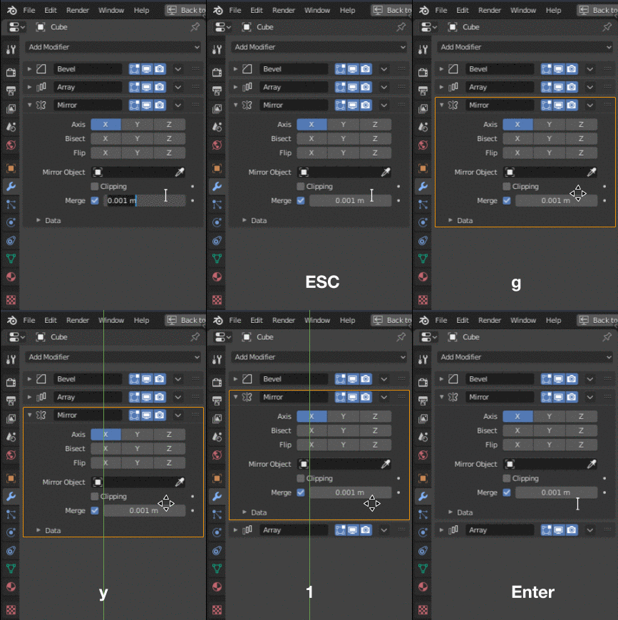
Yes, adding keyboard shortcuts would speed up modifier manipulation a lot. Actions should be available without using the comparatively tedious dropdown menu.
If no modifier inputs are in focus, these keyboard shortcuts should work on whichever panel the cursor is hovering over. Moving a panel would be as quick as Esc+g+y+1.

(mockup)
