Seriously, I think that a 2 lines solution for header of modifier panel I proposed would be less problematic than extra menu hiding very often used operators.
1 line with display buttons array + copy/apply/delete array.
1 line for label.
That way we could maintain click and drag to apply and delete several modifiers quickly.
If modifier icon is not clear enough, we could imagine one row above Add Modifier list with buttons to manage entirety of stack and what is displayed in header.
There could be something similar to Restriction Toggles filter in outliner.
When working in object mode, we don’t need Edit Mode and On Cage buttons but we need Copy, Apply and Delete.
When focusing on modeling, we don’t need Render button but we need Apply and Apply as Shape.
When focusing on animation, we don’t need Edit Mode, On Cage, Apply and Delete but we need Realtime and Render.
Pertinence of what is hidden differs according to task.
Current state is probably acceptable for animators but it is a nightmare for modelers and riggers.
I see no problem with those options being on a menu. Otherwise the user is forced to display those buttons constantly and open the modifiers to apply them.
I see it almost an obligation to have a drag and drop UI without a list
This is bad, we’re sacrificing speed for just a flashy way to drag & drop, you don’t change the stack order so often but deleting & applying are the most used ones. putting them in a menu is horrible and slow.
Either make the menu open on mouse hover or bring back their old layout.
That would not be a change for Apply and Copy if closed panels of modifiers was most frequent situation when clicking on those buttons.
But most of times, you are applying a modifier just after tweaking its settings. So, most of times, modifier is already open.
Most of times, modifier you need to drag and drop is a modifier created by duplication.
And I am making a proposal that does not force to display those buttons. That is a proposal to let user choose what buttons to display, like in Outliner.
Nobody is proposing to abandon Drag & Drop.
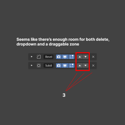
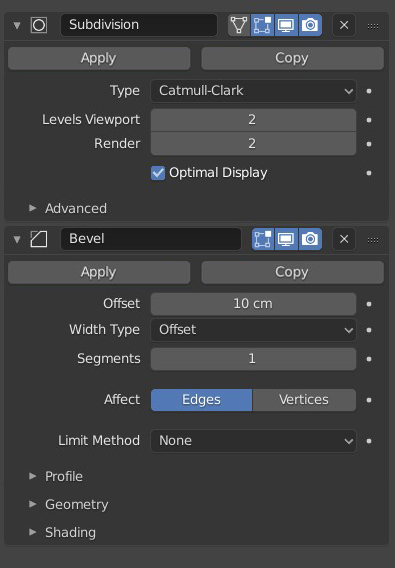
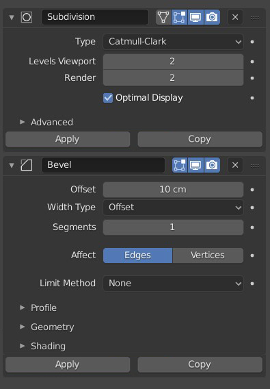
Space gained was used to make label more readable and add grip to move panel.
Delete button was removed to create menu allowing to remove row inside panel.
Problem is precisely that there is no space in 1 row for everything (icon to close panel, icon of modifier, label of modifier, display icons, apply,copy,delete buttons and grip of drag&drop).
Personally i think that those options could be under the context menu… But only with the possibility to select multiple panels to perform those actions on them.
OR
Showing only the apply button on the panel.
Duplicate operation could be performed when dragging a panel with a key(shift or alt) - no need for extra button.
And deleting could be performed when dragging the panel outside the modifier list.
I think that it should be possible to drag the panel by the name(lable) - double click to edit the label.
the modifiers don’t have a “select state” so it’s not possible to use context menu or shortcuts it would be nice to be able to drag the panel by it’s label or duplicate with a modifer key…etc that would leave room in the header but that’s asking for another big change.
the old layout made it possible to click drag across multiple modifiers and it’s just a single click, not hidden inside a menu where you have to access each one individually.
This comes from the code quest. The idea of putting the vertical properties editor tabs and all the column change is because they wanted blender to fit on mini monitors, up to 1280x720 so the column must to be narrow by default
A lot of the UI changes there were in 2.8 was because of that. Then the idea relaxed because obviously blender does not fit into a monitor like this in any way. But the origin of many of the changes was that.
Do you remember that blender 2.8 originally had a “dinamic” layout? was to solve the problems that create that paradigm. Nobody have seen that again.
Those software are using more tabs and less panels, sub-panels and smaller font.
They are often choosing to show less settings at a time.
But if you simply compare 2.8 to 2.79, 2.79 is showing more settings than 2.8 in same space.
I know that people are always complaining about cockpit’s dashboards.
But, seriously, when you are used to it, that is what allows to work fast, avoiding loosing time, scrolling and extra-clicking .
I need narrow columns to be able to display more than one at a time.
And a default column wider does not solve the issue. In same space I will continue to desire 2 columns instead of one.
That is needed just to work on simulations implying several objects.
You want to see more properties than just one object at a time, you need more than one column in your workspace.
I would have no problem with a wider default column showing everything in one row, at condition that gridflow layout works when I want a narrow one.
For that, header of modifier’s panel should be able to be drawn on 2 rows when column is narrow.
And seriously, very wide column could benefit of a gridflow layout re-arranging subpanels in 2 columns inside modifier panels. That would be better than current absence of gridflow layout for modifiers because it is not acceptable for panels of a stack.
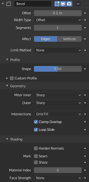
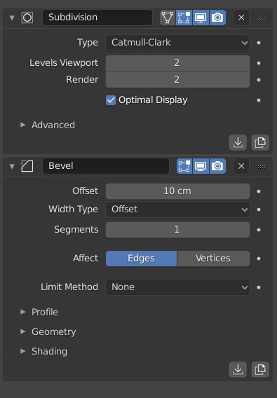
Except apply operator, all operators in menu has an icon.
We just need an icon for apply operator to be able to extend header’s row with everything contained in that menu.
Something like that but pretty.
While I appreciate that work is being done to make each modifier more readable with some promising progress being made, I just don’t understand why Blender can’t just copy the list structure of the Modifier List add-on. It’s more compact, it is infinitely more readable, and it is very, very practical.
It is honestly a big wasted opportunity to not take an already very successful idea that is widely embraced by the community and implement it into Blender itself. It would solve so many of the current problems with the current modifier list.
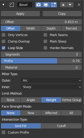
Hello, I made a couple of mockups for re-introducing the other buttons with the new UI.
The first 2 simply reintroduce the same buttons, with the 2nd putting them at the bottom of the modifier.
The 3rd entry follows a similar logic, but using icons instead of text: the reason why I put them at the bottom is for not creating visual cluttering with the other icons.
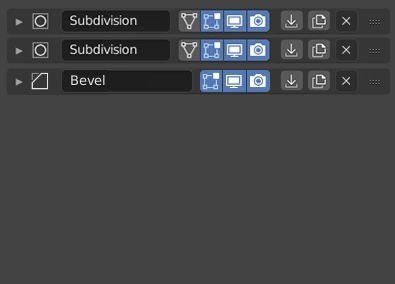
The fourth mockup represents the modifiers when collapsed.
@HooglyBooglyhere in one of the previous versions you designed, the delete, apply and duplicate buttons were still present, can I ask why it was changed for a dropdown menu?
I’m not completely against the idea of using sub-panels for highlighting the main modifier’s parameters, but now the problem is there’s some inconsistency between how the modifiers show options:
I’m very happy in general with the change but yeah, the remove, apply and duplicate operators need to be directly exposed.
And in my opinion, they should be push buttons with icons, without text, like in @ [slowk1d]
fourth mockup. These are generic operations, available for almost all modifiers, working always the same way, so an icon is very appropiate (the same way we have icons with no text for the render and display toggles for all modifiers), as oposed to the particular operations each modifier has which need text because they are specific to each case.