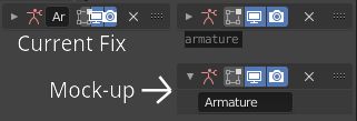
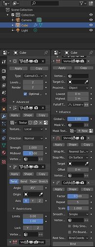
The main problem I see is lack of distinction between modifiers.
Adding a bubble style system like in the past would make things much easier to see, or even an alternation of light and dark, such as the type in spreadsheets sometimes.
I would also make the ions and text automatically size to fill the entire header. 
After my suggestions accepted, I can see that (even if all subpanels are closed or only 1 subpanel is opened) one column modifiers are still as long or longer than previous ones, in one column.
But in two narrows columns that works. User can play with settings of 5 or 6 modifiers.
Problem is that names of modifiers are overlapped by icons.
If header of modifier could become 2 lines (1 for icons, 1 for name) when area of Properties editor is narrowed ; that kind of 2 column layout would be usable.
Currently, it is unusable because names of modifiers are unreadable.
But that is pretty much the only thing that is unreadable.
Everything else (values, first word of labels) is sufficiently readable to allow a power user to manage most of modifiers without scrolling.
Ideally, allowing user to split vertically properties editor to avoid to deal with 2 properties editors and 2 different scrolling states, would be more efficient.
I made this proposal, a long time ago. People were more interested by Grid Layout.
Of course, for modifiers, there is no way : grid layout could be more satisfying than previous UI or bring something to 1 column UI with sub-panels containing only 3 settings, most of time.
But just fixing overlapping of names and icons would be welcomed.
+1 for having a list and only one active visible modifier from me.
Drag and drop is always a bit of a pain as soon as it involves scrolling, and modifier panels tend to be pretty long so I don’t think this goes well together.
This new mock up is much better in terms of readability. I love the changes being introduced here (dragging, the new checkbox layouts and general cleanup of the UI of individual modifiers, …). Great work!
Overall I like quite some of the new layout ideas for this, the more compact layouts and the subpanel idea.
But some critique is better brought up now.
I disagree on that. I personally don’t think that these both versions are on par. The addon handles the given space much better and is superior when it’s about navigating to a modifier in in a long list. It’s much easier to see which modifiers were used in which order, titles are much faster to read than it will ever be possible, eg while you are scrolling down on a list with the current layout. This is a big drawback. And the only advantage of having more than one entry visible at a time could be solved easily in the addons approach.
Another problem is, even if I generally like drag and drop behaviour as an intuitive feature for placing elements, if there is the need to scroll while you’re dragging it starts to get worse. Multiple control targets interfere then, the need to place the element and the logic for controlling the scrollamount. These kind of controls are always slow and feel clumsy, because tradeoffs are needed to make it controllable.
I can’t see how this would not continue to happen if multiple modifiers are used.
My concern with this is that the author of the modifier list addon already mentioned considerations if he will discontinue / won’t be able to continue the work on this addon caused by the changes currently planned (over at the addon thread on blenderartists). That should be seen and taken care of, especially if it used as an argument against choosing that route.
I currently fear we are steering towards a solution that still suffers from known problems and have a broken alternative.
Is it possible to have a better fix for narrow columns ?
Icon of modifier is already informative.
That would look less ugly if name was removed. Icons would not be squished.
Name could be visible as a tooltip by overlapping icon of modifier.
When modifier will be open, then, name will be entirely readable and editable.

That would not be so weird.
We are already adopting that kind of solution with Tool Settings bar and Header of a view.
That’s a good idea Ronan. I can look into this. Technically there’s no proper way for a header to spill over to a second row, but a more manual solution may be possible.
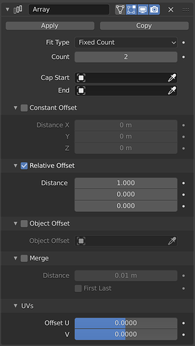
Looking at the array modifier from https://developer.blender.org/D7517#180764
the Relative Offset subpanel Distances maybe missing X Y and Z label
Thanks, looks like an oversight there. I’ll make that change
@HooglyBoogly
I may be missing something but are the Grease Pencil modifiers NOT getting updated to the new layout ?
Not yet, hopefully soon.
Before this change,
it is very easy to tweak/modify the modifiers interface UI, to what you want
“on the fly” with the “edit source code” and changing a python file in the text Editor.
This change seems to remove this.
I get “Active button is not from a script, cannot edit source” when I try.
My question is how do I tweak the UI “on the fly” with this change ?
The answer is that you can’t exactly do that when the UI is defined in C. Not without compiling Blender at least. It’s a tradeoff for sure, but there are benefits to it as well, mainly a more structured architecture for Blender’s codebase.
That said, I’d like to make sure it’s possible to define a custom UI for a modifier with Python by registering a panel with the same name as the one defined in C.
Ok thanks for all your work on this and Blender.
I guess I can compile Blender at home to use it at work (edit: no can’t do that at home i have a linux/mac system and at work it’s windows). I don’t have the right to compile anything at work.
Is the static void panel_draw function the one to modify for UI layout changes ?
Could you show an example or even better have a template for the blender text editor ?
Yes, that’s the one. Although below that you’ll see a panelRegister function that builds the panels and subpanels for the modifier’s UI.
Not yet, I haven’t tested that it actually works yet. But I’ll post on this thread then. Hopefully we could ship a template for this with Blender too.
Just curious, what changes were you planning to make to the layouts?
Could you update the windows experimental branch? https://builder.blender.org/download/branches/ it wasn’t updated since april
After using the branch for a while, not much.
I just don’t seem to see these red icons at any given time, so I wanted the red part to go back on the text box of the modifier name. ![]()
Ah, in that case the change you’ll want to make is in MOD_ui_common.c:
diff --git a/source/blender/modifiers/intern/MOD_ui_common.c b/source/blender/modifiers/intern/MOD_ui_common.c
index e944c80a77b..11d9322431b 100644
--- a/source/blender/modifiers/intern/MOD_ui_common.c
+++ b/source/blender/modifiers/intern/MOD_ui_common.c
@@ -303,7 +303,7 @@ static void modifier_panel_header(const bContext *C, Panel *panel)

   /* Modifier Name. */
   if (!narrow_panel) {
-    uiItemR(layout, &ptr, "name", 0, "", ICON_NONE);
+    uiItemR(row, &ptr, "name", 0, "", ICON_NONE);
   }

   /* Switch context buttons. */
I made the change to only apply the red to the icon because in many cases it’s no actually an error, it just means the modifier is “turned off,” but I see where you’re coming from.
While drag & drop changes are nice but now it requires extra clicks for simple stuff…I can live with the sub-Panels but not fan of hiding the Delete, Duplicate & Apply buttons.
You’re kidding right? Why on earth would someone do that?
I’d like to know if the people making those changes actually use the software on a daily basis.
Dammit.

