I’m new here so hello everybody.
I’d like to say that I support the new modifier design and to express my gratitude to the dev team. I know that It isn’t easy to to accept such heavy feedback from hundreds of different users, regardless if it may be warranted or not.
As someone who usually works with new users that are more art-oriented per say and really not into shortcuts as well as younger students I advocate for the return of the Apply , Apply as shape and Delete buttons. The buttons themselves wouldn’t in my opinion brake the design or contradict the single column mindset as they are just flat indicators, drop down menus while cleaner tend to be more mentally taxing on the users who are more visual in their speed modeling sessions.
Thank you anyway, sorry for the long post, keep up the great job!!!
I have a feeling that all of this heated debate will be for nothing when modifier nodes are added. We already have a great interface for branching node trees in the material editor.
That’ll depend on whether modifier nodes use a single graph, or a stack of graphs. I’m a fan of the latter, personally.
The material editor IS a stack of graphs. See multiple material slots in the Material Properties editor and top bar of the Shader Editor.
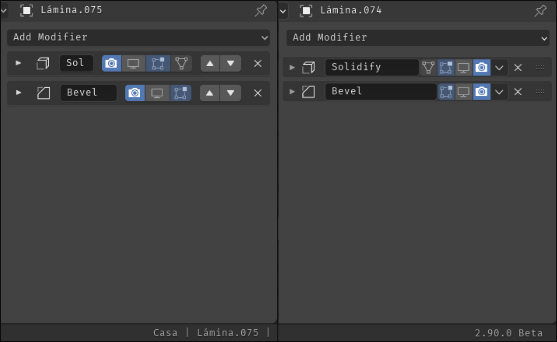
Sorry if this has been brought up… I think the modifier panels looked a bit more clean before 2.90. On 2.90 I think they lost a bit of finesse, they’re lacking proper padding on the sides, items aren’t vertically centered within the collapsed panel and they are just too thin if you ask me.
2.83 vs 2.90

But we have a lot of estate for names now, and also drag behaviour and shorcuts…
I really love the new panels!
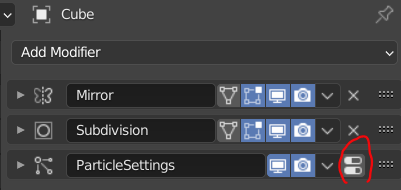
With the shortcuts, I don’t need to enter the particle tab just to delete it’s modifier.
The question is - why isn’t there a ‘X’ button like any normal modifier?

Thanks!
That’s a funny little oversight I guess. I didn’t add the delete button because there wasn’t a delete button there before and I figured there was probably a reason for that. But then I went and added the shortcut which completely nullified that anyway!
So yeah, I think adding a delete button there would be a good improvement.
I would also like to increase the panel header height just a bit for these panels, I agree that it looks a bit too cramped.
Unfortunately it’s a bit too late to be tweaking the UI for 2.90, but I’ll make sure to propose that change for 2.91.
Thanks, that’s awesome to hear!
Now that 2.9 is getting closer to release I am trying the modifiers again. I must say once again, the UI experience is awful. Something that would have taken a glance and a couple of clicks now takes 3 or 4 clicks (or hotkeys) to expand, and then the new need to scroll through the UI due to the lovely single column layout in order to adjust the right properties.
I sincerely hope someone makes a build of 2.9 with the old modifier UI layout
That’s unlikely at least.
For the downgraded layout argument, your voice is one amongst many opinions. Everyone finds caveats when a change is made.
Hopefully the average is happy with the innovation.
Hi Dimitar.
Have you tested the Modifier List add-on?
Its alternative UI might please you. 
Yes, I have. I think that’s the way to go indeed. Too bad it’s yet another addon to enable. But better than the base case.
Anybody else have troubles with ctrl click on modifier headers being unpredictable?
It seems like it alternates between showing one modifier / closing others and opening / closing all sub panels inside single modifier. Modifiers without sub panels like say Edge Split always have only second behavior.
Maybe operation of fully opening (with all sub panels) could be added to mouse wheel, then you could scroll through modifiers with minimum amount of clicks / ctrl clicks if you prefer only seeing one modifier open.
I have to say I’m very displeased with this new system. Sure in theory it’s nice to be able to drag modifiers around BUT 99% of the time this is not what I need. What I want 99% of the time is to simply move a modifier one step up, what I want 99% of the time is to apply a modifier with one click.
Now for me to move, let’s say a bevel modifier, I have to first parse a lot of empty whitespace in the modifier list, then find the tiny drag-zone, and then painstakingly move my mouse precisely to that tiny drag-zone and then slowly drag it up where I want it. That was usually 1-2-clicks in the old modifier list. The new system feels a lot worse and it’s a lot slower for smaller modifier stacks.
Dragging will be useful if you have a giant modifier stack but majority of the time I’m working with 1-3 modifiers. 1-2-clicks is way more efficient than precise maneuvering and extra cognitive load.
Secondly, I really want to apply my modifiers, that’s a thing you need to do. That used to be a single button press, but now it’s 2. Going in the wrong direction. Sure I could use the keyboard shortcut but there’s no visual highlight on which modifier you have selected!
Atleast make the modifier list customizable in some capacity so these needs can be satisfied. Applying and duplicating modifiers are not secondary features but things I do all the time. As actions they need to as clear and fast as possible to perform. This new system has good intentions but it has unwittingly made my workflow significantly slower and increased the cognitive load.
Dragging and dropping is a pretty intuitive way to deal with sorting, it’s a staple in video and games and in applications across the board. It mimics literally picking up something yourself, and putting it down, so it speaks for itself in my opinion. So when it comes to:
I feel I mostly agree, though 99% of the time is surely an exaggeration. But what strikes me is, “why create a system that is biased for moving only one step up or down”. Why not make it more robust, allowing the more intuitive behavior of dragging and dropping, which can accommodate both situations (moving it once, or moving it many). When you look at the old behavior, it was a real pain to re-order a big list of modifiers. Sure you could press the up or down arrow, then hit shift+R to repeat the action (which I must say very view people knew about), but it came with the huge downside of having to calculate the stack each time you moved it up or down. In cases where the calculations are easy, no biggie, but in situations where you have a subdivision modifier on plus other heavy modifiers, this just plain old sucked to be honest, especially on high poly models. It’s a great improvement to place the modifier where you want from the start so blender only needs to calculate once.
This is a good point I think, and I made a suggestion earlier about making a highlight here:
But, you said yourself, you can just press the hotkey, even without highlight, it is working. Why not use the hotkey? I know blender is trying to be a bit more beginner friendlier, and hotkeys aren’t always beginner friendly, but blender IS also a very hotkey based software, which I would say makes it very fast imo. And there is a method of applying without hotkeys with the drop down. Yes, it is less discover-able, but I wouldn’t call it hard to find by any means.
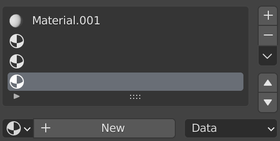
I really like how this has cleaned up the UI, it’s not that it was necessarily bad before, but this seems a lot cleaner, maybe even more professional. I think it will remove other ugly parts of blender too, specifically things like the material manager and the vertex group manager. Those both have those silly up and down arrows, the material manager in particular has this:

The up and down arrows with yet another arrow just above then, which is a drop down like the modifiers. But as a beginner, this vertical line of buttons is genuinely confusing! I distinctly getting confused by it when I started. One might say that it is clear that the up and down arrow move the active selection up and down, but honestly since it’s further away from the list, and part of a bunch of vertically laid buttons, so it can sort of be confused for just about anything, not to mention the extra drop down arrow throwing you a curve ball. Wouldn’t it be nice if you could just drag and drop the items? That would remove these little irksome things.
I understand where you are coming from, but I genuinely feel like this new system is a step forward, it’s not like it can’t be iterated on either.
Thanks for the specific feedback. I’m sorry it made your workflow slower.
The shortcut uses the modifier with its panel under the mouse cursor. Although that sort of focus is used very commonly in Blender, I don’t think it’s as intuitive as we expected. That specific question, “which modifier do the shortcuts apply to” is common feedback, I should probably work on making a highlight like @Bobo_The_Imp has suggested.
I do think you may get more used to the drag and drop. It may take a bit to learn how panels work in common situations, but I’ve seen most people find it pretty quick and easy, especially as they use it more. This may not be quite what you want, but it’s also possible to enable shortcuts in the keymap for moving the “modifier under the mouse” up and down.
This is mentioned before but I repeat,
why not to do renaming modifiers by double clicking on name like in outliner to be consistency.
And use all naming area for dragging modifiers not that tiny area at the right side.
Pity, that I can give just one heart to this very proposal.