I’ll give it a try once I am happy with the Rotate Tool Icon
1 Like
Last try on this. It’s sort of an inbetween of the first and the second one as I think in the second one the rotary aspect was too less visible.
2 Likes
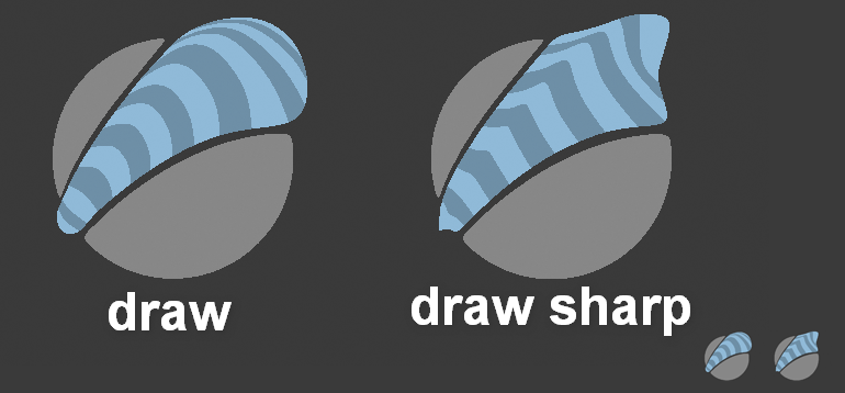
Quite difficult to visualize the brushes shape without shading. ![]()
I liked the strokes simple shape of the original design, so I somehow kept it .
8 Likes
Try some shadow without those strips
1 Like
I tried that first. It looks nicer, but in the end it’s a tradeoff, if we want it more aesthetically pleasing or do we emphasize communicating the brush type in the icon.
The problem lies within the basic conditions for these icons.
- limited palette ( for the brushstroke itself we have a basecolor and a darker shaded version of it)
- small icon size
- given shape (defined by the tool)
- sphere as the preferred object where it’s drawn on that also takes quite some percentage of the given space
In the old icon one could clearly see that it’s a brushstroke, but the difference between draw and draw_sharp is just communicated at the very far end of the brush stroke in an area of something about 5x5 pixels.
.
With the stripes the shape is readable across a much bigger part of the icon. Look at the downsized icons to judge on this.
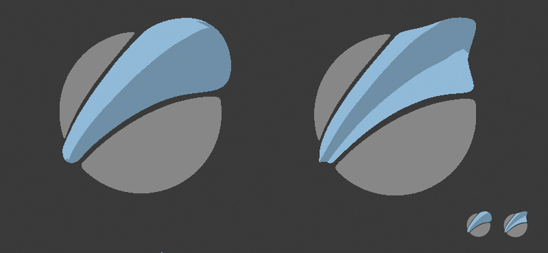
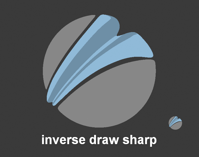
Anyhow here is the sideshaded version of it. I made the flat part at the sides of the brushstroke extra wide for the draw_sharp brush to be able to shade it with the brighter basecolor again and so to differ the look from the basic draw brush .
I inreased the brush size overall and changed the shaded side to the one nearer to the viewer as its the bigger one
Looks nicer yeah, but at the cost of the info mentioned
.
6 Likes
An other issue is that the Draw Sharp tool’s default behaviour is to create indentations, not protrusions. I am not sure why the person who designed the original icon chose to depict the tool in that way in the first place.
I also recognized that the inverse method is currently default. But till right now I thought this is simply a mistake. The main difference of the draw sharp brush was for me the way it builds up. In the sharp version the buildup dir isnt changed and that makes the stroke sharper. I personally hope this is just a flaw that it’s defaulted to invert right now. Makes no sense for me to call it a draw brush if it is in fact a crease brush.
Edit: Yes should be a bug. If you start a new scene with sculpting template it’s set to “subtract”, but with General Template it’s set to “add”
1 Like
I have downloaded the latest 2.83 Alpha build, and in both cases (General and Sculpting templates) the tool is set to “subtract”.
Hmm.Strange. From the initial commit it reads like what I said.
https://developer.blender.org/rB70991bfd94a0510c674678c7b49711157ab02c42
Still, Pablo mentions that the tool has a “much more pleasant crease/cut behavior”, so maybe he wanted the default option to be set to “subtract” himself.
Yes maybe that’s the case. And if it stays the icon should reflect that. But really it’s a draw brush. Now we have one draw brush that adds material and the interpretation of the second draw shall be that we remove material. I’d really say this should be reverted to how it was. This brush makes as much sense for getting sharper strokes in the positive direction. I have nothing against copying it and call it crease sharp, but this a change that makes no sense for me.
1 Like
There is a channel on Blender Chat that’s called “#sculpt-paint-texture-module”. Maybe you could post there to ask about this.
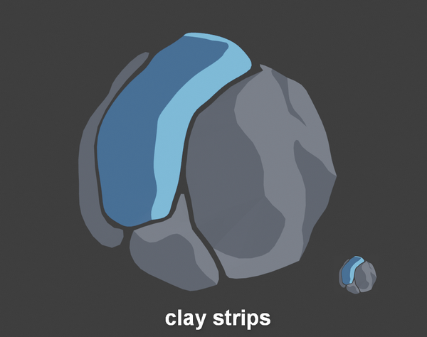
Tried out an idea for a new clay strip icon.
7 Likes
Hey guys, I wanted to request some visual icons be added to two functions, Expand Masks by topology and curvature. Both of these are extremely powerful tools that are currently hidden in a mask menu and I think it would be a shame not to give them both a spot on the T-bar. I did a quick concept of what I was imagining. This may have already been a part of the plan since the features are so new, I’m just catching back up on these threads. 
4 Likes
@Constantina32 @Debuk The default draw sharp is a somewhat failed attempt to replicate zbrush’s dam standard brush.
A proper draw sharp brush was in the works, but for some unknown reason it was never committed, and yes, subtract is the primary state for this kind of brushes. So the icon should reflect that.
Still, tbh, I wish all those icons could be replaced with icons similar to zbrush’s, they are far easier to read.
1 Like
yes the dam brush indents the mesh, but the word dam is rather a pun intended by Damien Canderle and not a fitting description.And Draw brush is as unfitting to describe the current brush. And yes it would be nice to have such a dam/crease brush. But what I mean is, could we embed this as a copy please.
The word draw brush, the icon are currently geared towards an material adding brush.
We have no alternative to get this done as sharp as with this draw brush.
I find these first two brushes somehow comparable to photoshops “hard round” and “soft round” brushes. These are basic unrealistic but very practical default brushes in photoshop. I find them placed well at the top of the list. And it’s the same way in blender sculpting tools currently. Having Pablo working on a dam brush based on this is nice yes, but we simply should not kill the current draw sharp. As I said. Make a copy.
When it’s a about the icon design. There are quite some points that could be said here. First I did these to fit into the existing design. And to be honest it’s not the most practical idea to have this shadeless design approach for brushes. Allowing shades would ease that a lot. 3DCoat and Zbrush both go down that road.
But there are more cases where we need icons here than just for “normal” brushes, they can be categorized into, basic draw brushes, clay brushes, and other common effects like inflating, pinching, smearing/shifting, cutting, bending, kitbashing,transforming and what not. All these need icons could very well be displayed in this design.
The mightier the tools become in terms of how you can tweak them the more the results will differ.Then stored variants will be needed. That’s the point where captured example spheremodel previews (screencaptures) should kick in.
I think at that point it will be more similar to what you hope for. We could still have sort of basic icons in the top left corner of these brush previews showing the tweaked source brush. And then it would be a rather cool feature that the current previews are not looking as realistic.
One last thing, I also think these screencapture previews should already be included in the tooltips right now.
2 Likes
Yes would indeed be nice to have these in the toolbar, but with the way they are currently working this makes no sense. The mouse position when you trigger that function has an influence on what will be selected/ from where the selection grows. It’s usage will have to be adapted.
I think the cobbly aspect of this icon looks great and suggests clay more than anything, you have my vote. However, this color palette is very limiting… why don’t you guys use regular shading instead of toon shading ? It really makes those shapes unnecessarily ambiguous.
1 Like
@ThinkingPolygons I was hoping too that we could have a similar brush to Dam Standard in Blender. I am not very fond of the current Draw Sharp brush, because its inability to generate geometry, with the Dynamic Topology toggle, can create jagged edges.
Also, for anybody interested, here is a very good topic about Brushes: The Tools/Brush Workflow.