@Debuk https://blender.stackexchange.com/questions/124614/how-to-edit-2-8-ui-icons/124627#124627 https://developer.blender.org/T64177
Thanks @ankitm. Will have a closer look later.
Found some time to make these. I designed them as alternatives for scrape and fill.
@ankitm @billrey: I am experiencing some problems with new meshes in the blend file. Using the shipped materials the mesh display turns black in my case. I guess I am doing something wrong. Could need some advice here.
Anyhow these are my two proposals for replacing the scrape and the fill tool icons. I designed them to be easier to read. They are less similar to other icons and reflect typical results you get by these tools.
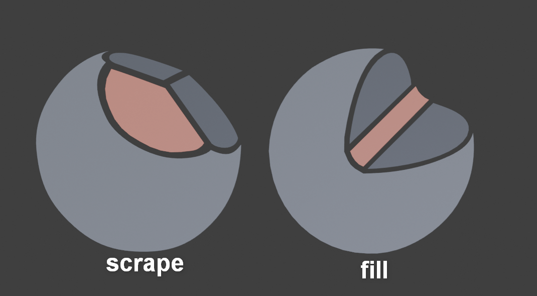
I did them because in daily usage I found they the can easily be confused with each other as described here:
11 Likes
You must add a Vertex Color layer to make the meshes visible, they must be parented to the correct icon object, and that object must be in the ‘export’ Collection.
2 Likes
I kinda like these icons better. The current icons kinda shows “Scrape/Peaks” and “Fill/Deepen” Yours only shows just “Scrape” and “Fill”.
Not sure if you now like the new or old ones more. But yes I tried to limit visuals to just that. I also simply don’t know if the current ones are meant to communicate other functionality, but most icons in the toolbar don’t, so I guess not.
The inverted function is also customizable in some tools (and thats true for both tools edited here) and it’s enough if an icon communicates the main feature of a brush as its mainly about find a tool without much thought. In almost every case the invert function is aiming to offer the exact opposite behaviour. For me personally it would be helpful to swap them. 

oooh, these are purty and very clear!
These icons indeed seem better. I can either set them up in the icons blend file, or you are welcome to submit an updated blend. Up to you.
Hi William,
Didn’t make a real checkout of the repo. Just exported the single file. So I simply uploaded it to pasteall.
http://pasteall.org/blend/index.php?id=52874
The icons are already in the icon_geom.blend For now I put the new ones next to the old ones with a name addition (.rework) Perhaps you want the old ones archived. I put them in the sculpt collection and export collection but wasn’t sure to what you wanted to have it parented.
So please have a look at it before you start generating icons.
Ok, I will update them and clean up the file.
@billrey: Thank you!
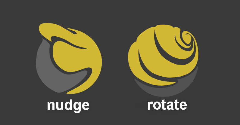
The similarity between nudge and rotate is also quite high and as I was motivated to tweak some more I reworked these two icons. as they could also be easier to distinguish.
I made the shapes easier to read on small scale and put it all more into perspective as the
other icons.
8 Likes
The only thing with these is I fear they are too detailed. Try to scale them down to make sure they are still readable.
I tried to keep the detail down overall. But I can try to make the negative spaces of the rotate icon larger to make it easier to read.
guys, don’t we have a paint bucket icon?
it’s quite an important icon in a lot of software


(example are references from google images)
no i meant as a standart icon and not as a Toolbar icon
maybe i’m not aware that it was implemented after 2.8 ? sorry if i didn’t
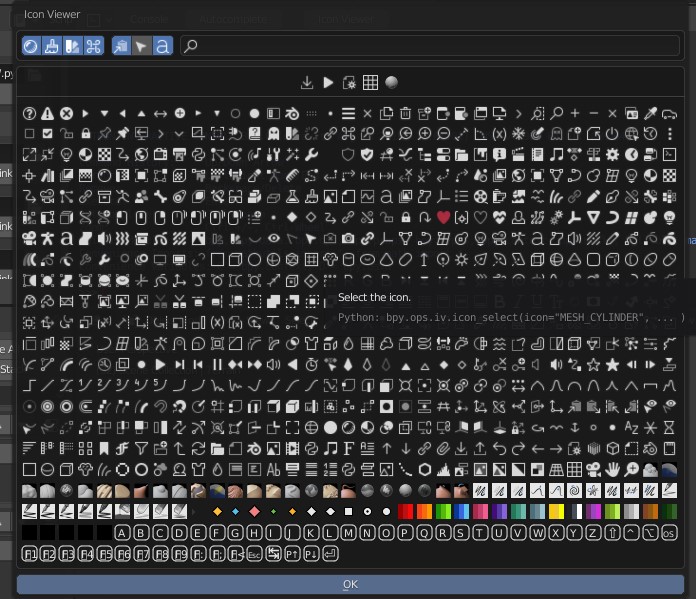
i was thinking about creating a particle “Fill” operator, and i just though that we didn’t had a fill icon within the icon list (as it seem ‘filling’ operation is quite an important task in a lot of softwares)
Ok tweaked both to some degree. The nudge has the upper part just slightly tweaked. The rotate is in the detail area designed differently to work better on smaller scales Tried to keep it’s look though.
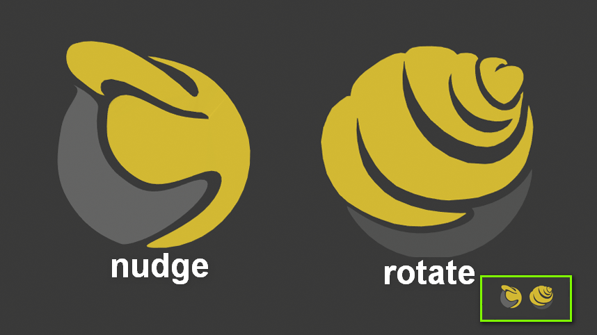
Btw. the small version is testwise scaled smaller than we use it!
6 Likes
Come up with something for draw sharp. Draw and draw sharp uses the same one.
In fact they are slightly different. But that’s hard to see.
Looked the same to me. Must not be much difference.