That’s no limitation that has to stay for very long. Yes you need a reference that doesn’t get updated during the brushstroke, but that could also be treated like this: https://developer.blender.org/D6594
Just interesting to see how good or bad the perfomance of such a solution would be.
Yes indeed nice discussion, good thoughts by quite some people. Just seems a while til we’re anywhere near.
Personally I just adapted to what the current style is, I made these because some of the sculpt workspace icons should really get an update. Technically these are flat 2d meshes with colored faces. Simple materials,no uvs used, so maybe that’s the initial cause. I read something that SVG support was discussed but the idea was dropped. Icons like these typically work well on small scale, but I could also agree having more shades at hand or use rendered images like other apps. But for now I hope they accept the updated ones.
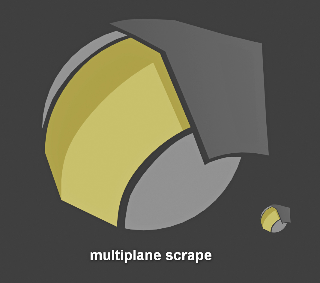
Kept the main idea of the multiplanescrape overall, but tweaked the appearance and added the editing winged gizmo as it’s the unique feature of this brush.
That makes sense and that’s awesome you also like the idea of adding them to the toolbar. I was originally just adding the image as a visual reference, I’m not sure if it would be helpful to share an updated vector file, but I would be very happy to help this process in any way I can. By the way, great work if you are general UI designer!
@ThinkingPolygons, Zbrush’s tools are functionally amazing but there UI, inconsistent naming convention, and aimless organization could be done way better. Zbrush’s brush icons are often randomly scattered replicas, for examplePolish’s icon is reused for Flatten, and Deco is Weave, extra. Their most recent tool is using flat vectors so I wouldn’t be surprised if that’s the direction they keep going in the future.
That’s a great icon, though I have always thought the name was a bit of a mouthful and for something that has a strong edge over other software, I would think its better not to advertise the secret sauce directly in the name. Maybe something more like Smart Sharpen or Dynamic Sharpen, something that describes the characteristics of the results (a Stylized Edge) rather than how it technically works.
@eobet Both are visually pleasing. Yes they break with the style a bit, but I like the idea. The pose key is also rather a literal interpretation. Such an approach might fit for some icons. If it fits in stylewise and transports the message clearly, I am with you. With reducing it to arrows there is a bit of a general risk that they are interpreted as something different as arrows fit so wonderfully to every kind of motion.
@NathanWondrak: Thanks Nathan. As it involves some programmatic changes, you could create a thread here asking if such an adaption is already planned and you might also create a topic at rightclickselect. These selection features are quite new so I’d judge that part as being under active development. With blender being an open source project contributions are always welcome, but there are people maintaining that process. I think these two icons would fit very well to the current design, but as I said it’s just a step too early for them.
Generally blender is organized in modules for development.
See https://wiki.blender.org/wiki/Modules for Module owners/developers.
I also think both selection tools deserve to be more easily reachable, I already talked with @billrey about integrating the missing shortcuts for these tools to the IC keymap as it’s currently missing there completely.
I still asking the reason why blender 2.8 doesn’t use classic brushes icons where we can see the brush perfectly and the “fight” about how to make icons doesn’t exist
Hi @Alberto, I really don’t know the exact reason and don’t want to turn this thread into a discussion thread, but in short both methods have advantages.
Stylized icons advantages:
easier to read on small scale.
Look at Zbrush and the icon size they chose to visualize.
some tools are easier described with abtract icons, like the move tool or the pose tool.
some effects are hard to visualize rendered strokes, like a brush that also pinches.
blenders ui elements are not just brush icons. And keeping one style for all has also benefits
Even if many ends concerning brush management are quite rough / not present right now in blender. Personally I somehow like the idea of having both styles at once. Stylized icons that represent categories or used features of a brush AND have shaded / rendered previews that can be used in the tooltips in big lists with variants and so on.
And if once all brushes become variants of a single uberbrush and we have a designer sort of comparable to photoshops brush designer, where we can turn features of a brush on and off and where we would definitely be in need of a more graphical representations then we could still use these icons as feature indicators in a row below the rendered brush preview in whatever form of library.
It is very debatable that these icons are clear because they are abstract. I, after months of work, confuse most of them. I suppose that’s why you’re proposing to change almost half of them.
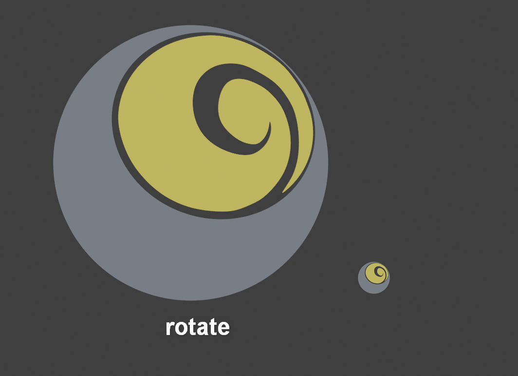
If the problem is the size I see no reason not to increase it slightly, because the difference between zbrush and blender is just over 20-30%. And it is already out of any screen 1080p, so the two columns must be a default. And above all because it is delaying the inevitable, that what you have in that toolbar is not the user’s custom brushes that will need custom icons.
I was talking of a design type not of the current ones used. And yes indeed I find quite some confusing too, other ones like the snake hook read perfectly. And your argument is equally true for bad designs with rendered previews or automatically rendered brush previews.
In the following example one is the draw brush and one is the blob.
Can you tell me which one is which. So if we had these on two icons as autogenerated preview, would that be better?
I could start arguing that we have multiple rows available for icons and that the amount of space needed grows in a squared order,but I also really see why you are arguing for the rendered brushes and to some extent fully agree, but I think they will be an integral part of the brush managing solution that will come.
And technically it currently is as it is and it has also advantages I mentioned above, so
That’s ok that you didn’t. I just said neither an automatic solution nor a bad manual design helps get rid of this. So with the current stylized ones being confusing it’s exactly the same.
I just mentioned automatic as it would also be benefitial. We’d always have the same lighting, the same crop and no additonal manual work with custom variants. And displaying some good stylized icons next to an rendered auto brush preview with the features being used like pinch, inverse draw, smooth and a custom name would really be a nice automatism.
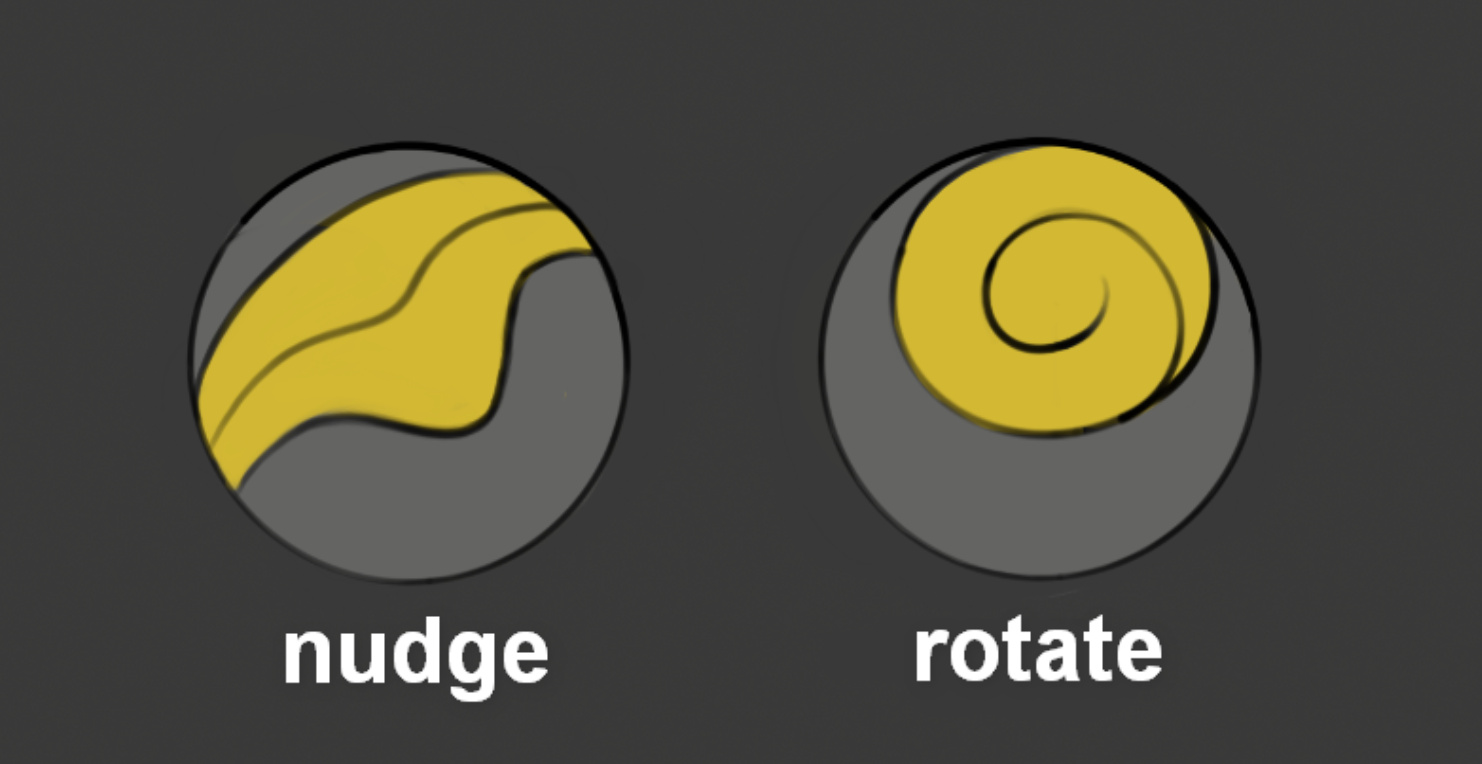
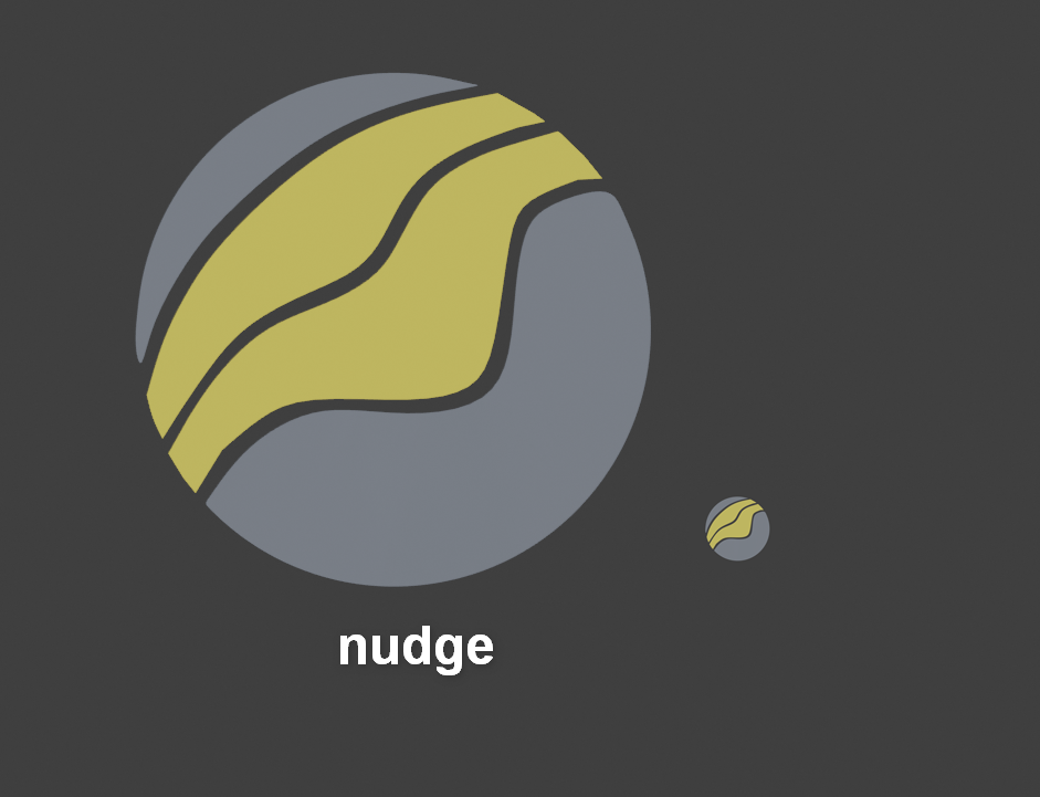
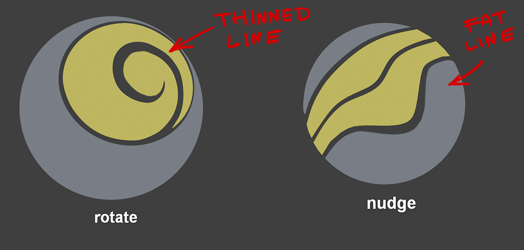
I like the simple approach much better than the arrow versions. But even if it looks much nicer we can’t work with such thin lines. Scale it down and have a look.
Hej @eobet, ok I made an adapted version based on your sketch. Fixed the lineweights, left out the outlines and changed the shape of the spiral a bit to make it look more 3d.
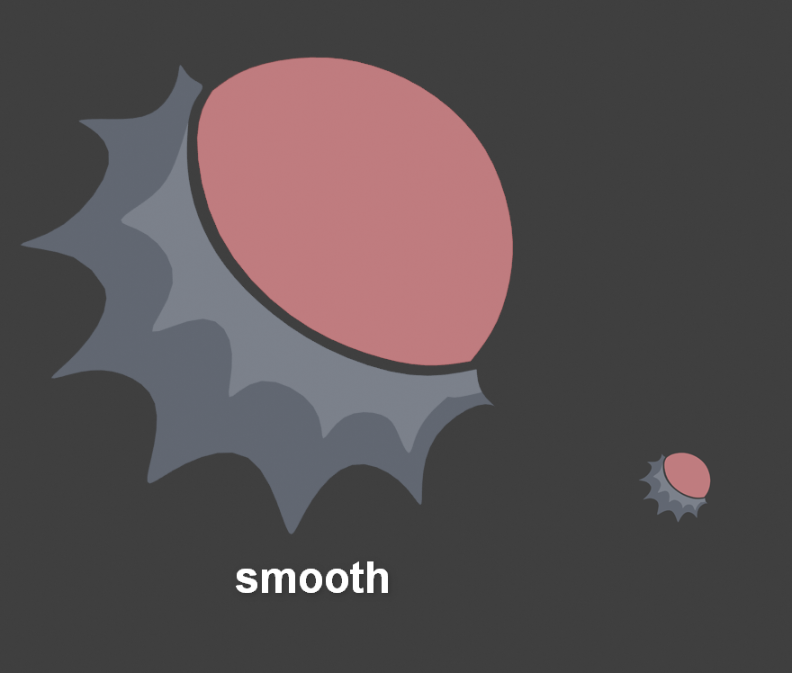
Here’s an adapted version of the smooth brush. Mainly redid it to fix the 3d rotation of the icon. Changed the lower half to be quite spiky, to be more clear what the brush did