They’re a bit off to make Clamped Auto’s silhouette different from Aligned. I Still don’t like those shaped handles - seem ok at first glance, but won’t work in original 1:1 scale (16x16 pix). All individual details will be lost - the diamond will look like a circle, for instance.
1 Like
Yeah, they’re probably not necessary. There’s already so much more information in the new icons than there was before.
Ok, it was just with the purpose to stress test the idea. Thanks for the feedbacks.
Auto clamped should probably have the handle placed in the middle, since this is what it does, it prevents the curve from overshooting. Currently it looks like the left hand side of the curve is shooting higher than the handle ?
3 Likes
Hey @jendrzych et al,
We might one day need a version of the small “folder” icon that indicates that it is a redirected folder.
While in File Browser and viewing a list of folders, double-clicking on a folder normally just moves one level inside that tree. However, there are some times when that folder icon might take you much further away. It might go to an entirely different place on the drive, a different drive, maybe even to a network drive. In cases like this it might nice to indicate that the folder is a redirection (alias, reparse point, folder symbolic link, or folder shortcut).
Ugly idea:
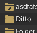
Might also need a matching “arrow only” icon that can be used to overlay onto the large folder images we use while in thumbnail view.
5 Likes
any update of the keep icons monochrome into the Properties only ?
In the brush properties, we have now a button with the World icon. It reads “all brushes”. When enabled, changing the properties will override all available brushes, by making the very setting ‘global’.
It’s generally bad practice to use an icon with a specific meaning to depict something different, so we need a better one for this very application.
“All brushes”… But what if we went another way? The “Shared Data” pictogram would match other similar cases. What the button does is simple turning on “share brush properties” or, in other words: “make the brush properties gereral”. “Shared”, “global” and “general” are very abstract concepts, but “shared data” already has some common depictions nowadays:

It’s still a very ambiguous concept, so maybe “many brushes” is the way to go?

What do You think?
3 Likes
I like the abstract ones, better, for a change. (Especially the rightmost one.) The three brushes side by side are a little complex to scan. Maybe it could be just two, stored in a bucket ? That would likely be too complex as well…

Hmmm… that’s kinda cool. But would it read as a “folder” if set among other ordinary folders? Maybe. Not sure.
@Harleya to me, the “link” or “redirection” in a file system isn’t a folder at all. It’s more like a shortcut, or sth. I may be wrong as well, if it was strictly limited to folders…
@Hadriscus - simplified “all brushes”. A bit more abstract (a brush “painting” another brush…), but it fits the best IMHO:

3 Likes
Yes, you are exactly right. My concern is mostly just that people recognize how to deal with them even if they don’t know.
If is possible that we might want to mark redirected files the same way, but not sure. In a practical sense, a redirected file behaves the same way as regular file in the context of a File Browser. But a redirected folder (as apposed to a symbolically linked folder or a reparse point) will change location from where you are currently browsing and so needs a bit more indication.

3 Likes
None of those graph diagram one make any sense to me for this purpose. I like that two-types-of-brushes-in-a-cyclical-shape one, I think it does a decent job getting the point across. Aside from that, the only thing that really came to my mind for iconography for this purpose is just the asterisk (*) because it is a catch-all in many computing contexts, and activating that icon makes it “apply everywhere”.
No matter how many times I think about this it makes no sense. Even if there was a pictogram that was universally known to indicate “Apply to All” it would still be clumsy there on the end. Is there some way to remove that button completely and do it differently, like having “selected” and “all” buttons above it?
3 Likes
The current icon is something I understood right away when I first saw it, because to me it doesn’t register mental as “The World.” The line through it says it is a globe, and therefor indicates that clicking on it will make the changes global. At least that is how it is in my mind.
None of the proposed shared data pictograms make any sense to me, but the ‘many brushes’ one does.
I think one with 3 brushes / “many brushes” is best one, rest are too abstract.
1 Like
Hej, I constantly fail to choose the right tool, when it is about using/distinguishing fill and scrape.
These icons aren’t exactly the same, but both look way too similar to me. And what makes it even worse for me is that if I look at them closer the fill icon reminds me on scratches of a cats claws, but it isn’t scrape and the other one looks much more like filling. It is af if they were flipped. Perhaps I am the only one who has problems with these, but I’d be very happy if you could have a look at these and try to tweak them.

I didn’t design them. Those Toolbar icons are completely different beasts, made entirely in Blender. @billrey - could You share a link to the source file with the Toolbar icons?
Oh sorry, I assumed you were involved.