Good catch - I thought I already did it, but I really didn’t.
EDIT - done.
The umbrella icon is quite nice aesthetically, but I don’t think it gets the point across in any coherent way unless it’s specifically explained.
I followed https://developer.blender.org/T61209 ( Always write unused IDs on save ) but now there is not any more activity: I’m very interested in the topic, where is the discussion going on now?
Thank you,
Rickyx
ps. I like the security pin, specially in comparison with shield.
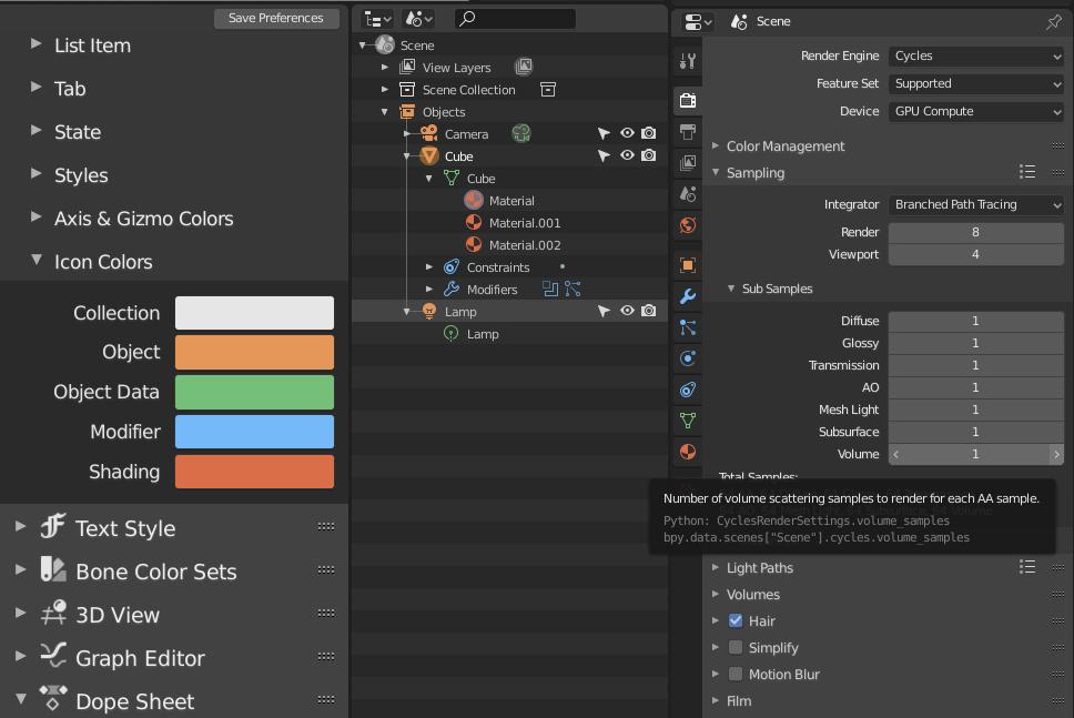
Why does the visibility of modifiers have a chain as an icon?
It is so similar to the share link of this post … ⇒ … ⇒ … ⇒ … ⇒… ⇒ … ⇘
After the last icon set update, the question ain’t valid anymore. Just wait until the repository update.
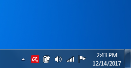
Inspired in Avira antivirus?
How shortly is shortly? My impression was this wasn’t happening for 2.80
Slightly off topic but still a bit icon-related…
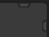
We have these little arrow things that show up when we hide a side panel or header. I’ve always thought they look a bit chintzy somehow.

How should they look? What kind of shape signals what they do?
And another question, but definitely icon-related.
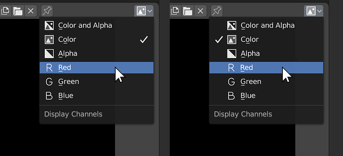
For Enum lists we are not currently indicating which item is already selected. If we were to do so, I don’t think that we should use our current “checkmark in a box” icon (CA14) because it would look like an icon beside an icon, rather than a separate indicator:
Not sure which way to do it, but I don’t think either of these options would look right with current checkmark. I think it needs something simpler, like this:
PS: I notice you made me a new “collapsed menu” (hamburger) icon! Thanks!!
I totally agree. Bright saturated red always looks like an error message, like, everywhere in nearyl every context. Just desaturating it already helps, I think.
I am wondering this as well. @billrey @jendrzych, is it really intentionally? The chain icon doesnt make any sense in most contexts.
As I already mentioned, the Monitor icon was restored. Fresh icon set sholud get its way to the repo soon.
Oh I’m sorry, I missed that.
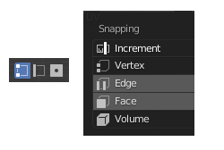
Icons for the object components selections and those in snapping options dont match. I personally preffer those ones form the snapping options so pls decide on one style and make it consistent.
Can you explain what is going on here?
The OUTLINER_DATA_SURFACE icon appears to look like a text paragraph? What is this meant for?
It is so old that I forgot about it … The purpose of this icon is “Complete Match (string search)” Designed based on this task: LINK
but where do we use that, and why did you replace the OUTLINER_DATA_SURFACE icon with it?
I created the icon at the very begining of the icon set redesign. Just after I found the task I likned above. Many things have changed since then, so it’s possible, that the veri pictogram ain’t needed anymore. Besides it looked like the OUTLINER_DATA_SURFACE isn’t used, since Surface ObData used (and still does) Curve ObData icon - T3. Shall the Surface ObData be restored in the T10 cell?
I think so, yes. Currently that is the OUTLINER_DATA_SURFACE icon, which seems wrong. I can make sure we use that for Surface object data
Ok then. I’ll fix it in a few minutes.
