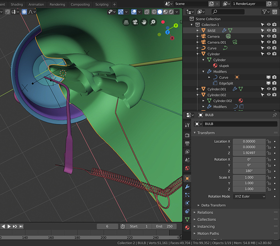
BTW, we’ve similar problem with Text ObData, which uses T3 Curve icon instead of its own T9 design, while the Properties tab calls W5 pictogram. I think T9 should be replaced with W5. Isn’t it?
Yes, I think you are right. It’s a bit messy 
Im not sure those saturated colors for properties editor tab is an ideal design choice. Plus the others still remained uncolored so the visual break is even more exgagerated. It looks funky but not that elegant. I wonder if the tabs couldnt be grouped visually by adding some space on vertical between the different groups or a visual separator like a frame/box around each group.
In my book making too much use of color should be the last resort in a modern elegant interface I understand Blender is aiming to.
I think it’s just a matter of proper use of colour. What we have now is less than optimal in terms of elegance.
Add Mesh >Bolt (that comes with boltfactory addon) icon is using a blue spiral placeholder icon it seems instead of the old Bolt that now should come in white line style.
Im new here and Im wondered who is responsible for the default addons icons. Those that come from Extra Objects adon could also make use of icons.
I think prehighlighting currently active item would be enough.

I really like the new shield icon suggestion, but isn’t it a bit insane that we still have the flagging of datablocks in 2.8? Has anyone ever liked this “function” (or lack thereof)?
When I close Blender, and my file is saved, I obviously want to keep ALL the datablocks in that file, no matter if they’re “used” or not.
The way Data is stored will change in near future. Not sure when, but there’re plans to automagically save Data Blocks with no need to F-flag them.
And the task: https://developer.blender.org/T61209
I love the ability to colour icons in Properties Editor’s tabs, but I’m not sure if defult colours are the best choice. They’re a bit oversaturated and they can create the impression of disorder, because they do not create a harmonious palette. I think it’s time to break some of the color-importance links, known from the pre-2.8x versions. First of all I mean blue for modifiers. The family is now much more broad - it swallowed Constraints, Physics and Paricles, thus I’d change their colour to something, that’s already used for tools related to transformations/changes/modifications - pale purple. Making the rest of colours less saturated and shifting them closer to Viewport random materials palette, will dim pictograms a bit, blend them into whole interface and turn less candy-like.
Status quo:
Dirty, raw proposal:
Mind the way Object and ObData icons become landmarks in my proposal. One more thing that can be done here is to colouring Active Tool icon somehow (turning it into visual landmark) and to make separate colour category for all five rendering related pictograms and set their colour as is. Grey, I mean.
The red for shading and World looks horrible.
It’s pink in my proposal.
I am not a fan of the candy or rainbow bar for the properties.
If I had the choice, I would either stay with the mono color setup as before or introduce a bicolor setup (toolbar).
The second one of course is too much work for now but if we have to have colors at all, may I suggest to reuse the palette already introduced in the toolbar?
How would these new defaults look in a light theme?
Light theme sould get it’s own colour palette. Otherwise I’d refrain from designing anything for bright themes until the solution of the automatic shadow / outline for icons is introduced.
I really like the color icons. That extra second it saves me to find the icon, really adds up in the long run. It also saves a lot of time when working with others that aren’t familiar with blender. As for the colors, I really like the proposal by @jendrzych, but I also don’t mind what we have now.
My (our) post on the fake user was flagged as off topic: I do not contest this choice but I would just like to point out that, under the icon, hides a feature.
All topics concerning icons, not just their physical appearance, should be taken into account in the discussion.
Thank you,
Riccardo
Anything regarding the fake user icon is fine, but all posts related to the merits of the underlying fake user system is off-topic.
For now you can only customize color icons broadly, so if I dont want colored icons for the tabs in the property editor I have to deal witht he lack of color all across the interface and where hurst the most in the OUTLINER. Here the color usage is of real necessity and not a personal taste so pls consider adding an OPTION to keep them uncolored on the properties tabs or separate custom settings for the main areas where they appear. This approach to turn on colored icons globally is like a shotgun aproachand it doesnt go well with super customability of Blender.


