Yeah, that’s not really a big deal is it ? However at some point I remember the plans were to cut those decorations, no ? What happened to that ?
It’s not trivial to do, and has to be done separately for each platform. We don’t have many developers with loads of experience using platform-specific API’s to do this kind of thing. But it would be nice - especially on Windows it looks fairly bad with the double Blender icons, and on Mac we should ideally support the native menu system. But it’s just not super high priority.
3 Likes
Hah yes, that would integrate nicely. However there are plenty of window managers on Linux, some behave kind of like Mac OS, some differently… and given the pace at which this ecosystem tends to change… anyway it’s a different topic - and like you said it’s not super essential anyway.
Is a simple answer possible? Just remove our icon if the platform is window? yes, it brings up the splash screen but we also have that (less hidden) on the Help menu.
if not sys.platform == "win32":
    layout.operator("wm.splash", text="", icon='BLENDER', emboss=False)
9 Likes
And to be fair, I have noticed many people talking about the eventual possibility of having a custom DWM frame on Windows, but have yet to see anyone make a mockup or even describe exactly how they want it to look.
Having a custom frame would allow us to extend some content into where the title bar is, but we can’t literally just remove it. The OS still adds min/max/close icons on the right, we need room for a title (and path), and also have space to move the app by dragging. So just having the ability to have content in the titlebar area doesn’t solve anything without some design that could drastically diverge how things are arranged on Windows versus other OSs. Otherwise just a lot of work to just add a little “save” icon up there…
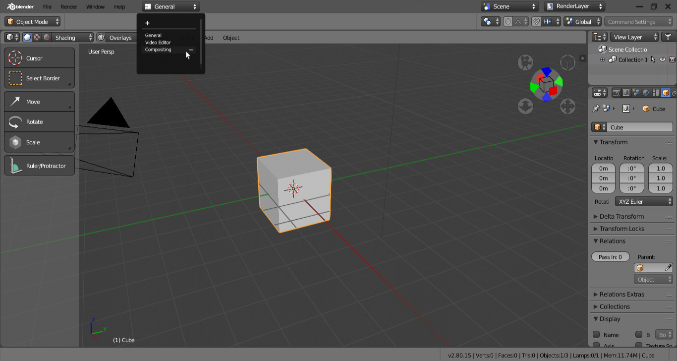
I did it last year, quite an old build of blender
I do remember that image actually, but there are still so much that would need thought through…
We are now (and I don’t like it) expanding out the workspaces into tabs so at very normal widths we are filling the entire thing.
We need blank space for window dragging. And also for current blend name (and/or path) if we want that - I think we probably find that necessary.
Personally I would love this too if would get rid of the workspace tabs and remove the scene and view layer widgets.
3 Likes
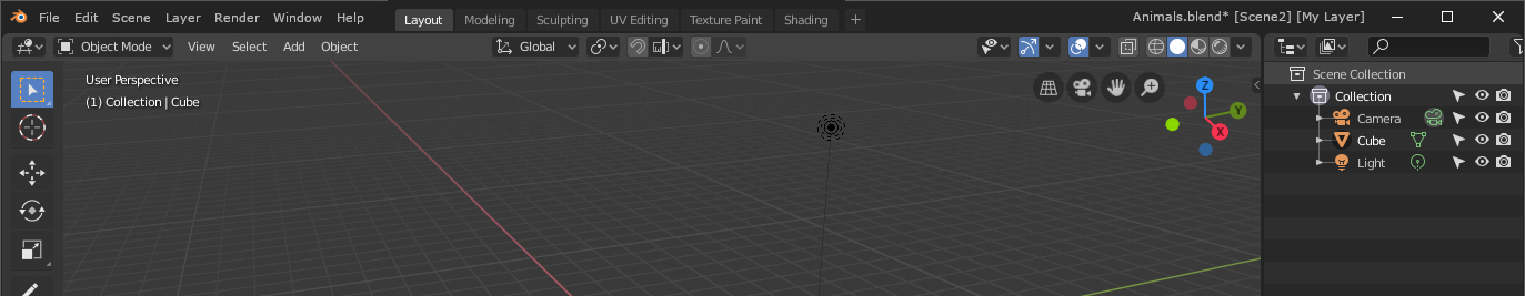
I also had this mock-up here, I think I’ve never posted it, for the decision to have tabs was already made. A pop-over like that would still reduce the space occupied by scenes and view layers though.
As for the blank space for dragging, that in my idea would have been between the view layers and the OS icons, basically a similar space as the one you have when you have a lot of tabs opened in Firefox or Chrome.
1 Like
I have a patch to do that here:
https://developer.blender.org/D4613
Preliminary conclusion was perhaps that, if we removed them from there, we should 1, add them to the Outliner and 2, also probably make them visible in the top bar if you have > 1 inside your document.
I just was not immediately able to find out how to make those changes - but maybe you might know how?
What happens with the new controls of this type? more clean without the + and X?
I understand the desire to make single-scene, single-layer in a simpler way but don’t personally like that type of change. Maybe. Have to give it a think.
Usually when I go down this road the “Layers” and “Scene” turn into regular pulldown menus that can live with the rest. Although that does not show the current one, I would address that in the title string if they were set to non-defaults.
That at least makes it so there is only two types of widgets up there, the pulldowns and the workspace tabs. We could shorten the current file string to just the file name, not path, plus optional scene and layer names. And you’d still have some room for some workspace tabs.
2 Likes
Yes, I also think that would make sense. Put the ID selectors into their respective Properties sections, and then just add simple menus to switch them in the top bar.
Takes up less space and is less cluttered, while still letting you see the current scene and view layer. They still could only show there if you have >1. In the vast majority of blend files, users are likely to only have 1 scene and 1 view layer, so this information is completely superfluous to the vast majority of use-cases.
I have essentially always used blender in full screen mode by default … so from my point of view, adding the two buttons that allow you to close blender and reduce it to an icon, are an extra convenience
In prior thoughts on this I also wanted a “Workspace” dropdown menu for managing those too. Not that removing that “plus” matters. But by having the management separate those tabs would just be shortcuts to the most-used or recent and does not have to be all of them. And they could be swapped out for other types of elements like buttons or icons or whatever without needing much redesign.
I think we definitely want to keep the workspace tabs. We want to encourage users to use them more, as a way to switch task, and it’s helpful to have them be a single click to switch them. We also use them to communicate the order of workflow from modeling > uv unwrapping > texturing > shading > rendering.
But the view layer and scene pickers are fairly esoteric features.
Something else that would help, is making use of popovers instead, so that at the very least we don’t add lots of clutter at the top level, and it can take less space in the top bar:

12 Likes
I don’t think relevant to remove the workspace tabs if we don’t have nothing to with that space. And if you don’t want to use it you can remove the workspace and only use the general…
I though that you will complete redo this menu for 2.8, it’s by far, the worst thing of the UX that blender have. Not only this two controls, all menus with that behaviour.
Each time that I teach blender to somebody I need to explain how works this menu…
To be clear though, I don’t want to remove the workspace tabs. I only was only saying that it would be nice to add a dropdown called “Workspace” to the dropdown menus for managing them. So just replacing the “+” to the left of them with something a bit more standard and more discoverable.
If that were the case then the way that that workspace tabs are shown could be altered if desired. Right now they aren’t really tabs so being shown more like a pushbutton might make sense.

Yes it would be nice to get this done. But it requires deeper changes than just on the Python level I think, so another developer would have to help implement it.
The current tabs are meant to be browser-like. Would also be great to implement drag and drop here, or even ripping out to spawn a new window.
1 Like
When I told “you” I wanted to tell “developers” not you in particular. Sorry, I have a lot of problems with subject in english. In spanish I is more free for that, and you can tell “you” to tell “somebody”