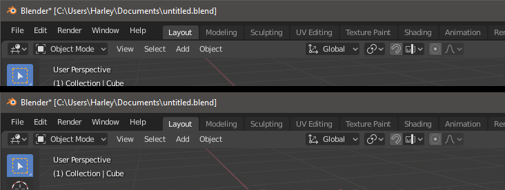
Hehe, that’s fine. Yes, I think we would like this. However it is less needed I think, if we don’t show these by default in the top bar. The fact that they add so much clutter here, for features that the vast majority of users will never, or very rarely use, I think is the main issue.
This could be addressed in several ways:
Put ID selectors in Properties and only text or simple menus in top bar
Make ID selectors into popovers
Only add the top bar ID selectors if you have > 1 scene or view layer
Put the name of the current scene and view layer in the Outliner instead (helps communicate the hierarchy too)
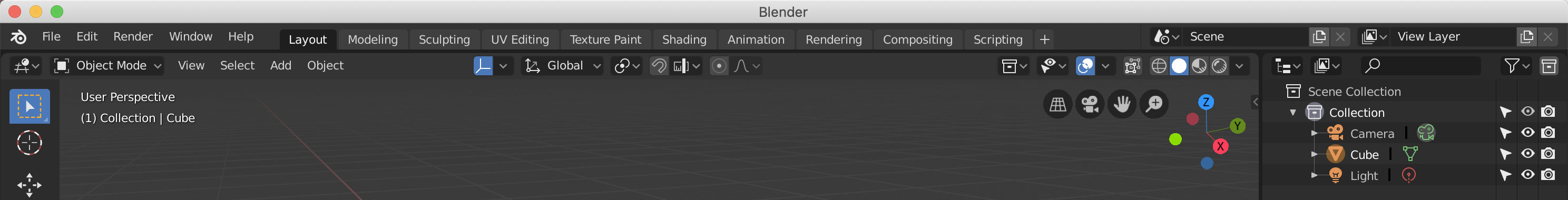
For sure. I don’t mind them there or how they work. But they don’t quite say “tab” to me yet. Tabs really need to connect with something below them that is the same color that spans the width of the application in order to communicate what they do. Without that they are just pushbuttons that highlight funny (rounded top and square bottom) and sit too low.
There might be ways to make them look more like tabs, but haven’t thought about that much.
I don’t think so. Because in reality we have this menu in front of newbies easily.
Material menu
Textures
Sculpt brushes
UV editor
Image editor
Node Editor
And it is really hard to understand the menu by the fake user button, the remove,… I always though that will be one of the first thing to solve in 2.8 interface redesign.
The fake user button specifically will be removed, and not something users will have to worry about. But even so I agree with you - that’s why I added the design task in the first place
But, I’m just saying that, if no developer is able to make that change, other related changes may alleviate the issue somewhat for the worst cases (which I think are the ones in the top bar)
So I’m not saying to do the following as there are problems with this too. But note the immediate change from wonky thing to Tab between top and bottom here:
Okay, I like that. Not only does it work with our separation line below them but it could also raise the text a bit and make them line up with the dropdown menu text.
I like that, BUT, we have forgotten taht if actuall the original topbar is unused… we could use it. for classic buttons. Not now, but in a future. Only a feature for newbies. Where we can see global options, like save, load, render,… and a part of workspace specific like Add mesh,…
Unfortunately this also changes the properties active tab, which doesn’t quite look as nice attached to the outline.
It’s just a small “bug”, the Properties Editor theme section has its own Tab colors, but for some reason the colors from the User Interface section are used.
Looking at my huge Gnome title bar nd wasted vertical space I wonder if anything has happened on this front?
People have been asking for this for a long time.