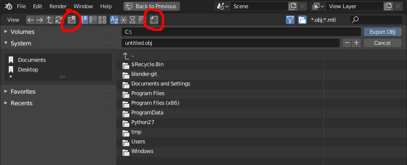
I find myself very frequently mistaking the Show hidden dot files icon for Create a new directory:
Could the design of the dot files icon be changed to make it look less like it implies “new folder”?
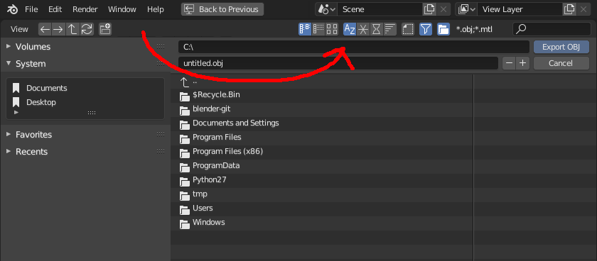
I think another large factor in my constant confusion with that icon is due to placement. The right of the icon group is just a sensible place for a “new folder” icon, so that’s where I assume it should be. When there’s a sensible-looking icon for that task, I frequently click it. If we can instead move that whole group of icons to the right, leaving the actual “new folder” icon exposed intuitively at the end, that would solve the problem.
(Perhaps the “View” label could be removed, since it may be less relevant then.)
Considering there is already a “filter” and “show folders” icon on the right, that seems to be the logical place for that whole group of icons related to the file system view options. At the very least, the “show dot files” icon could be moved to the right and put beside the “show folders” icon, because those are both the only two icons dealing with showing/hiding entire categories from the list.