Industry standards and keymaps

You may (I hope) be reacting too quickly to viewport performance. The devs are quite aware that performance is not where near where it should be. They’ve only done one round of optimization’s and it was minor. In developing complex software, it’s a bad idea to try to optimize before the concept is fully fleshed out. If they were to hyper-focus on optimizations at every step, 2.8 would never materialize. They would have some foo running smoothly only to realize that foo was not the way to go in the first place and that bar was the best option all along. Now all that time making foo smooth as silk is wasted. Wait until optimization’s are done before you decide you need to buy more hardware. Unless, that is, you just have an itch to buy more hardware.

The devs are also aware that the interface is getting crowded which is why they’re experimenting with making the tool settings a new editor type or tab in the settings editor. The most recent design proposals have the tool settings in the 3D View which I particularly like. It’s pretty common in cad and modeling software and guarantees that the settings you need are never too far away. Another plus is it saves on screen space. To be honest though, I rarely ever touch tool settings anyway. Most settings are available as shortcuts while the tool is active and if I do need to tweak a parameter after the fact, there’s always the F6 menu.

One of the driving philosophies in blender development is to make tools for artists not development for development’s sake. There’s an interview with Ton that Blender Guru did where he states exactly this. It’s why there are open movie projects and Blender Studios. It’s why the Spring team is trudging through the murky waters of using alpha software during production. It’s all about ironing out usability issues, finding performance and workflow bottlenecks, and squashing bugs.

I dont know what are you talking about… you dont read the thread, you begin to tell that the thread is about an option, so you didnt understand the topic, and now you talk aboutupset trying to avoid the fact that youdont know about what we talk here…

I am truly confused as to why you think I haven’t read the thread. Enjoy the rest of your day.

According to you this topic is about the optional standard industry keymap that blender will bring, and no, it’s not about that. What’s more, that topic only takes up four lines of the initial post and could easily be deleted.

Right. Well, have a nice day.

1 Like

Hi,
There are lots of things i like about 2.8. I dont care about shortcuts (i use them a lot but i can learn again). What I cant stand is new UI and absence essentials features professionals need.
For example:
More automatization for tools (do basic things for me).
Essentials features like:
Preserve UV with grap tool (something like Texture Lock in this addon. Feature like this should be in Blender)
Snap while sliding vertex on the edge
Multi - Object editing - Done Awesome
Snap 3D cursor to vertex, edge, face quicker (not /shift + s/ but more like in this addon)
Bridge, fill, extrude with automatic UV correction
Snap to any inner vertex in object mode.
Repeat texture by number not to infinity in UV editor
Grid options are missing in UV editor
And more, but i would write this all night long.
Nothing of this has changed in 2.8 (or is changing). Random colors, Shadows, X-Ray are awesome but for me, not as important as basic features above.
Well good luck guys. But trust me, Blender won’t be an industry standard (or part of it) if it CAN NOT do basics like its rivals (Maya, Max, Cinema, …)
P.S.:
I love Blender and i want it to be next industry standard. In my work (game company - more like 200 people) we are thinking about switchng to Blender from Maya. We are waiting for 2.8. Please, don’t mess this up. Make UI usable for beginners and masters and add those features. You can write me if you want to know more.
Cheers

I think there is a general misunderstanding going on here. The idea is not to change the default keymap to an Industry Standard Keymap, it’s to provide an option for users of other 3D software. This is to ease there trasition by integrating their muscle memory and making it less disorienting than it’s been in the past.

So far I’ve seen arguments for why WER is better/worse than GSR and how the changing of the interface is killing Blender and very little feedback about what can be done to help bridge the gap between the way Blender works and the way the rest of the 3D industry works.

It makes prefect sense to me and I fully support it.

There are a few users here who feel like things are changing to much and to rapidly. I feel your pain. I really do. But please, please consider opening your own threads that discuss the issues you have instead of hijacking every thread with your personally gripe lists. It’s so simple and easy and that way, you get your thoughts out in the open and everyone is clear on what you want.

1 Like

Hi everyone, here is my humble take on this…it’s true that blender is unique and shouldn’t try to ‘mimic’ other softwares in the industry in term of it’s setup, but there is one thing u all should take in consideration, millions of people who uses computers professionals or not are used to left click because the OS offers that, so if anyone who opens blender for the first time will be frustrated weather a junior artist or a supervisor or even a director…navigation is the most important one because the other tools are secondary, u can learn them with good documentation. so to me that should be offered at the splash screen to choose left or right, a

I’ve read this thread all the way from the start to the end, and I have to say I had to agree some of his points.

The whole revision to the blender keymap and UI points to a very high risk direction. And I can summary it with our recent history, Windows 8.

Windows 8, changed how the user first interacts and how the user uses their start menu with new settings and buttons. Cutting it short, a lot of long time users stayed away from it and only the most enthusiastic users went along. Not to mention under MS research even when the UI is supposed to be optimized to be friendly to users, it still didn’t maintain the users.

Similar Blender 2.8 has a new UI. A number of keymap/workflow changed. Even when I did my part in relearning, it will still discourage new users when years of web and video tutorials just doesn’t work anymore.

As just one blender user, all I could recommend is to ‘slow down’. When the list of changes is longer then the software splash screen, it really is too much. If blender developers must change the keymaps, do so with some backward compatibility. (ex: A for deselect doesn’t work the same in blender-2.80-60d4d583760, only dble A and alt+ A works) Also, extent the release of 2.8 beta as long as possible for user to try it for the feedback.

If blender developers can’t ‘slow down’, then please give this tool a new name. BlenderX or something just to let the users know this is a complete ‘new’ experience. In fact, Windows 8 failure and android success is because android started as a complete ‘new’ experience, while the Windows is expected by users to be the same Windows when it is not.

I hope blender for the best.

Background: I first picked blender out of 3ds Max, Maya and other 3D toos due to how fast it is to get something working because of the default keymap improve workflow. Personally, I don’t mind UI or features change in blender 2.8, but please do keep the same workflow or improve it. Otherwise, blender will lose it’s most important advantage from the rest.

1 Like

That’s why this keymap is not the default. So not to worry.

1 Like

i’ll ask this second time if any one can answer me, in blender u can assign the same hotkey multiple times but only one will be active. so u can assign two by mistake and not knowing the changes, would be useful to have something that tells you that the hotkey is already assigned and prevent you from overriding it…thank u.

2 Likes

A warning would be nice. It shouldn’t prevent you from still committing the key binding since there are useful cases for overloading a key. For instance my z key setup opens the shading pie menu on a press+drag and toggles wireframe on a click.

More useful options will open up when sticky keys are implemented.

2 Likes

Ok, no idea why people demand the option to have a maya like keymap with left click select and it all, when it is already implemented in Blender for forever. Just open your settings , go to the input tab and then there is a dropdown menu “Presets” and oh look there, a Maya or 3Ds Max preset…in 2.79 the option for it is in the splash screen when you open up Blender. Also there is an option to just switch to right click selection and keeping the Blender shortcuts.

Left click select is very broken in 2.8 at the moment.

related :slight_smile:

I don’t know about that. I can’t say I’ve seen many examples of apps where hitting Esc will activate the select tool.

  • In Modo, you press Space to ‘drop’ the active tool and return to select
  • In Maya, you press Q to hide the manipulator for selection
  • In Photoshop you hit M to activate the Marquee Selection tool
  • In Houdini, you use the S key
  • And in C4D you hit the Space Bar as well. :rofl: :rofl: :rofl:
2 Likes

edit*

there’s a misundestanding, esc for escaping from a tool.
Not as an activation for the selection tool.
i wrongly tried to express myself about this problem.

i just feel so wrong that after hitting escape multiple times, im still stuck inside of the tool.
that’s why the escape key is here, for escaping? isn’t it ? you use an active tool for a couple of seconds then when you finished with it, hit escape, and poof, back to basic.
this is the only and reason why i personally never use the active toolshelf and much prefer using regular operator, i feel stuck inside of this tool and and somehow it dont feel natural at all to use those tools.for me hitting escape to escape something is industry standard, even os standard. no ? when hitting escape, you simply go back to “default” which is in this case, the regular selection.

plus the fact that blender already use escape to cancel modal tools, it natural for every user to escape a tool using the escape key. no ?


i understand that this could be difficult to influence devs to put this in the master branch so i’d like to custom the input for my own build, is it possible to modify each active tools behavior in the input user pref, so that the escape key when no action is happening within the tool = going back to selection?

1 Like

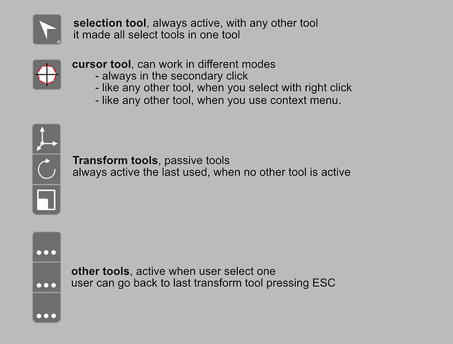
Maybe not, but it’s a really easy to understand behaviour. In others programs it’s strange that you cannot go back to “basic” mode pressing esc and confuse newbies.

i Still supporting the idea of basic passive tools behaviour, that it’s similar to @BD3D proposal

6 Likes

Sorry for my previously very rude post.

I really dislike the idea of Active Tools. I mean, these Active Tools are nice, and well made modal tools. It’s just the fact that users had to have one of these active tool ALWAYS ACTIVE, overriding the keymaps we used to customize as the default behavior in all situations.

People has suggested to me that I can just leave it on the Selection or 3D Cursor and don’t worry about it. The problem is, Selection Tool and 3D Cursor also behaves differently now. To maintain what I am used to for default mouse clicks, I have to disable or remove the hotkey settings for these Active Tools. And to prevent myself from accidentally clicking on one of them and mess things up, I have to disable all of them. But then, if I have them disabled and vow to never use them, there isn’t a point of having them show up at all. So I hide them. But then again, N panel used to be where all the addon options are, and having a place in general consensus for addon functions is quite useful and effective in production. Now we don’t have it.

The old operator buttons in the N panel, it’s also quite useless, so I don’t expect them to come back.

Please consider to give us the option to disable active tools and bring N panel back for a place for addons functions.

3 Likes