Industry standards and keymaps

I wanted to comment on the fallacy of the industry standard, which has done so much damage to blender. When I see new users trying blender and complaining that blender doesn’t meet the industry standard, they refer almost 99% to these changes.

  • Left click select
  • Classic camera controls
  • WER for move, scale and rotate
  • 1,2,3 for select vertex, edge and face
    end

People only ask for these four things, for a very simple reason, they are the four things that all users do when opening blender for the first time. One opens blender and tries to click with the mouse, it doesn’t work, and starts to move a cursor that you don’t know what it is for. Then you try to right click and it doesn’t do anything either, so they decide to move the camera to see what happens and the camera doesn’t move. Most of the users here give up trying blender. Some people get it right in how to select objects, even if it is by mistake, and try to do the basics, move them and since neither the W nor the E work, they don’t even get to the R. In these simple three actions we have lost almost everyone who tries to try blender. If you don’t get to edit mode and see that after what you have suffered, there is no need to select vertices, edges and faces with 1,2,3, you can directly close the program and forget it. It’s a completely frustrating experience, to the point that in 2 minutes it can take the edge off you.

Are these problems going to be solved in blender2.8? No, so far, they’ve gotten worse. To begin with, even with active tools, the first encounter with blender remains exactly the same. It is still the left click moves a cursor, the right click does nothing unless you hit an object, wer does not work, the camera does not move and 1,2,3 is not to select components. I mean, nothing’s been solved.

Why has it gotten worse? has gotten worse because for no reason are changing all the important hotkeys in the program. This makes blender now impossible to use following tutorials, online tips or comments. They’re all wrong and they’ve changed for no good reason. The change that has taken place in space and tabulation seems to me to be very unwise for these reasons. First the muscle memory of years of many people is broken and then blender users are taken to have two communities, the ones that continue to use blender with the classic hotkeys and the ones that the new ones use. This is very bad. The tab and space functions, and in general all functions other than those listed at the beginning, MUST NOT BE TOUCHED. Even if blender had made a bad decision in the past to put these functions in the space and in the tab, they should not be changed. There is no good reason for this.

Very few people have asked to change the rest of the hotkeys or workflow of the program. Everyone understands that every program has its own way of working, but they do expect that at least the selection will be the same as 100% of programs in the world with the left click. It is because of evolution that if a person visits a lost tribe in the middle of an island they will continue using to point the same finger. But all programs have their ways of working. No program in the industry wastes time resembling other programs like blender does. Because everyone knows that it is a waste of time, that all programs need to have their own identity to make their characteristics shine.

And the industry standard keymap?

Blender2.8 wants to incorporate a template for industry standard that won’t do any good, for a reason, nobody knows about it and nobody cares. If people saw it, then blender would have succeeded with its max and maya templates… and nobody uses them, even less in their first encounter with the program. So all effort in this template is a waste of time. Actually, only users with some experience will use it.

What is the fallacy of the industry standard?

I think this fallacy has done a lot of damage to blender, because it seems to me that it has affected blender development decisions, especially 2.8. It must be understood that except in the cases I mentioned at the beginning (and maybe 1,2,3 and the mouse movement would not put them in) there is no industry standard. Normally when one speaks of “industry standard” it is a fallacy of authority that only means "do the program as I like it" or “do it as the only program I have used” but that is not based on any objective fact. Moreover, this fallacy is used only when it is convenient and when someone wants to do something contrary to the user’s needs we magically forget the false “standard” and implement strambling ideas that no one has asked. Without going any further, at blender2.8 we are not going to have classic wireframe mode. Have we followed any standards? All programs have classic wireframe as a viewer mode. What is the reason to change this? I’m sure it’s not to please the new users who have been using the wireframe for decades.

As they say in my country and I hope in many others “If it works, don’t touch it.” and blender2.79 works perfectly in this hotkeys.

No two programs are alike. Cinema, Houdini, Maya, Max, Modo, XSI, Zbrush, Painter, Mari… all are absolutely different and some don’t even use WER. And above all, nothing matters. All are programs that have worked in the industry and have not had any problems no matter how strange their interfaces are, how different their ideas are, or how much information is displayed on the screen.

20 Likes

I totally agree with you.

Blender has very good concepts and things that I wouldn’t want to lose by trying to standardize it with other programs that don’t have those virtues.

6 Likes

I agree with some core points you make, but I will just stress several points of mine:

1, Industry standard keymap will not be default.
2, All the keymap stuff is still work in progress. The reason things do not work is that 2.8 is still in alpha, not even in beta.
3, Industry standard is not fallacy, it just does not mean what you think it means. You just misinterpreted the term. Industry standard, in this context, simply means core concepts other 3D apps use in terms of utilizing keyboard shortcuts and mouse interaction. Industry standard is NOT specific hotkeys, but rather general philosophy.
4, I agree with you that it doesn’t make much sense to do industry standard version keymap by randomly slapping together pieces of other different 3D apps, such as Max, Maya, C4D or Modo, because then, instead of industry standard map, you get a random noise map which will be equally as hard to learn for everyone, due to the lack of any logic behind hotkey assignment.

But, it’s a fallacy to assume these efforts are hurting Blender in any way :wink: You can not possibly judge that until you see the result. And given how bad 2.79 mouse and keyboard interaction model is, any step taken, no matter in which direction, will almost certainly be improvement over 2.79.
1 Like

Hi Rawlanche

I know, you can read in my post that.

The reasons are the same for beta, alpha or release. Nobody need to wait to see the problem in release to put the problems over the table.

Really? Do you think that houdini have same philosophy than Zbrush? Modo the same that 3DsMax? 3DsMax the same that Maya? all are completely different programs with different interfaces, different workflows and phylosophies. Nobody go to tell that Houdini, max or zbrush have some similar things, because it’s not true.

Of course industry standard is a fallacy, because it’s used in the terms that I writed.

  • Houdini didn’t follow any “industry standard” and made his own standard.
  • Modo didn’t follow any “industry standard” and made his own standard.
  • Zbrush didn’t follow any “industry standard” and made his own standard
  • Substances Designer didn’t follow any “industry standard” and made his own standard, now is a software that all industry uses.

All these programs ignored the “industry standard” to make their own standards.

That is not true. Blender is known for being the fastest modeling program, and it is because its iteration system with keyboard and mouse is very good. It is a program that has no problem being used by amateurs, people with little previous knowledge. The problem is only the simple hotkeys that everyone has been reproaching for years. And no, that doesn’t mean changing 100% of the hotkeys so that a particular user can save on configuring their hotkeys.

No direction should be taken, that is a fallacy.

6 Likes

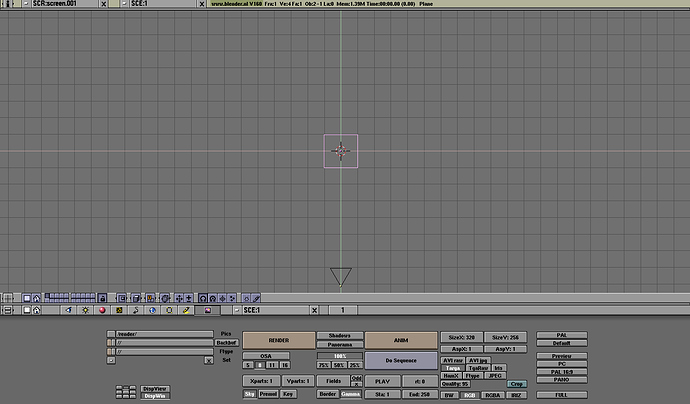
If such mindset was taken seriously, and used to drive the development, this is how Blender would look like these days:

7 Likes

Again, you’re using a fallacy as an argument.

Blender 2.4 was antinatural, using menus that no one understood, contrary text directions, that brain don’t know interpret. It didn’t follow any basic interface design rules. And design should always be based on the brain’s ability to read patterns and shapes.

The problem with blender2.4 was not the hotkeys or philosophy. In fact, both its modal system and its philosophy have been maintained in blender2.5 and this is what we users use without any problem. The problem with blender2.4 was the interface, something that was fixed in 2.5, and since then almost nobody has had any problem understanding the program.

6 Likes

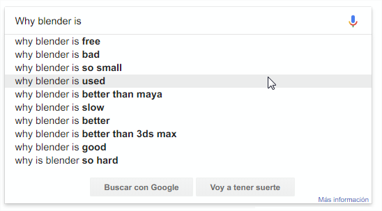
is that true though?

3 Likes

It depends of you bias

image

2 Likes

How is what google shows my bias? (also you changed the search terms) also having ‘bad’ as the 2nd suggestion instead of 6th isn’t really helping the case that ‘almost nobody has issues’ ?

i agree that “industry standard” isn’t worth going after.
my first experience in blender was a bumbling mess.
i had to go find tutorials after i couldn’t figure out how to do anything. i didn’t have real experience in any other 3d program back then either (just some experience with autoCAD playing with it’s 3d functionality a little bit and one time i played around a bit in 3dsMax) so it wasn’t as if i tried the hotkeys for another program. i just tried pushing everything i could think of and wasn’t getting anywhere.
a link on the splash page to some basic tutorials on the interface would be a great help there.
that’s been a long standing suggestion though and i do think the new interface will allow people to figure things out a little more easily. even if they still have no idea what the 3d cursor is lol.

as far as things getting worse… well, i think the number row being used for mode swapping is actually alright and in the long run will work better. so i do think it’s a worthwhile change. i do have a number pad on my keyboard though so i’m not using number pad emulation. the new hotkeys are probably going to be much easier for me to adjust to than for people who were using number pad emulation and i also won’t need the widget in the top right because i do have a number pad.

spacebar i do think has needlessly been swapped. i’m thinking active tool swap hotkey isn’t all that important as readily available as it is on the toolbar. i’m not going to be constantly swapping my active tool rather than just having it as something i use a lot. in my own testing i found that swapping the tab and space hotkeys so that spacebar was actually for search again worked much better and was much easier to adjust to.

if they did swap to tab for the active tool swap that would likely end up being a prime hotkey for people to change for their own needs, again, due to how readily available swapping the active tool already is on the tool shelf.

a lot of people have actually been asking for changes to things… not so much changes to hotkeys but when we don’t have layers anymore rather than collections and new features are added in some changes are bound to happen.

one change i’m not so fond of is the lack of hide in object mode. we’ve still got it in edit mode i just wish they’d add a menu for collection based hide in object mode. speaking of collections, i do think that in the long run that will be better than what we’ve got now as well but it’s gonna take me a bit to adjust to how hiding groups works and finding a way of setting things up in a hierarchy that allows me to easily hide what parts i want as easily as i used to.
the way that if something is in multiple collections it won’t be hidden unless every one of the collections it’s in is hidden and that makes collections a bit less usable than groups for hiding things.

A google search means nothing, it’s not an argument. And those results mean what you want. You also have to read in context, although I have said that nobody has problems learning to blender, also my first message says that the first approach to blender is absolutely frustrating. And who says that these results in google do not refer to anything else but that first approach I’m talking about?

Let’s see, I don’t think that changing the search bar from space to tab will change people’s impression much either, I don’t think they’ll understand the blender philosophy anymore because of that. I have taught about twenty professionals how to blender and nobody has reproached those hoykeys. Actually, most of them have loved blender and the way it works. many have used those hotkeys in other programs. The moment a user gets rid of the frustrating feeling of using blender for the first time, I have not seen any problems.

2 Likes

That’s not bias, that just shows that people worse at English (using incorrect word order) tend to google slightly different terms. But even in your search, the fact that “why blender is bad” is the second most searched string after this formulation says a lot.

I would go as far as to argue, that the reason so many people think (and google) that Blender is bad, is the way it handles keyboard and mouse input in version 2.79 and prior. The input methodology is so overcomplicated it creates a learning curve wall only a few can climb over.

The learning curve has not changed anything, nor will it change in blender2.8.

Changing the space for the tab will not change the learning curve.
Changing the tab to 2 will not change the learning curve.
Changing a key hotkey will not change the philosophy or the concept of the blender program.

It may seem strange, but google searches, as I said, don’t mean what you want to understand about them. Maybe all these searches are simply about the first impression I speak of, something very frustrating for everyone who uses blender. Why do you take it for granted that changing all these complaints comes because the search bar is in space? I think you’re making a lot of assumptions.

I Haven’t seen, in 7-8 years, in the community and among users, a single complaint with those hotkeys.

3 Likes

You are constantly focusing on specific hotkeys, which makes it hard to have any coherent discussion without fighting about specifics.

If Blender 2.8 comes with almost the same keymap as 2.79, then learning curve will change only a little. There are significant GUI improvements which will decrease learning curve even if 2.8 keymap stays largely the same.

If Blender 2.8 comes with improved default keymap, which at least to some degree aligns with common sense, such as LMB for selection, non-additive selection by default, and so on, then that will tremendously help new users adopt blender.

I mean, imagine a kid who has never used 3D software in his life, but knows how to use Windows and plays some strategy computer games, like Starcraft. Even such person will automatically assume that LMB is the button to select things with, LMB drag is the button to perform border selection, and performing another border selection will replace it with the new one, instead of adding it to the old one. That’s how Windows Explorer works, even Linux file explorer or Mac file manager. That’s how games where you select units work. That’s even how selection of the text in text editors works. It comes naturally.

Blender suffers from a bad syndrome, where new users have to do their first Google search on how to do something the very second they first click inside a viewport. And that is very, very bad.

2 Likes

Yeah, I have created a thread about that hotkeys, I want to talk about it.

Please, tell me what change in learning curve moving searchbar to the tab. and put in the spacebar the same toolbar that you have a few inches to the left.

In my first message I ask for LMB for selection, It’s the basis of my whole argument, have you read the message? and I don’t think that additive selection is a big change… :stuck_out_tongue:

1 Like

I think this is a bit unfair because it’s not really clear whether these “so hard”, “so complicated” comments are referring to relative difficulty (say Maya vs Blender) or absolute difficulty (say notepad vs Blender). For someone totally new to 3d software what software that was (Blender/Maya/Houdini/whatever) probably doesn’t change much, you will be very confused in the beginning.

There are also probably more hobbyists starting out with Blender since it’s free and these users will then run into more issues than if you started with some other software and changed to Blender (which will happen more with the release of 2.8 I think). Also some of these searches bring up threads/pages that are pre 2.5 Blender which doesn’t help either.

That being said, there are things that are just weird, one of them being right click select being the default. If other things (like keymaps) are changing in 2.8 anyway I would prefer left click select as a default too. Having right click select with a tablet feels awful, not sure how it is with a mouse but probably doesn’t feel too natural there either.

2 Likes

Hello, I teach children, and they learn in the first class that the way to select is the right button, and that blender has its own interface.
I do not think much change the fact of making a few changes in the quick keys and that with that they will not need to look for a tutorial to learn the software, because to manage this type of programs, it is necessary to look for a tutorial, in the software that be. I agree with the changes but without affecting the workflow of people we have been with for more than 10 years.

4 Likes

It really should be though. Here’s my reasoning on this:

  1. As a longtime blender user(since december 2003) I know where to locate the preferences and how to switch to what ever template I prefer, new users perhaps won’t.
  2. All the new tutorials created from 2.80 release forward would follow it. And as a long time user I can read release logs to find out about and learn to utilize new features. I rarely consume tutorials these days.
  3. Because it’s about bloody time. Implement this new keymap properly(i.e. what OP said), make it the default and we can finally all just move past it. No need to ever bring it back up again and fight inter-forum flame-wars over it all.

Lowest common denominator between all the different industry tools is the defacto industry standard.

1 Like

Then the only common denominator is that all programs have a 3D view and use left click.

1 Like

Which is where limiting our scope of applications to look at as reference for finding that lowest common denominator mouse & keyboard interaction set to say 3 or 4 most popular amongst them would likely net us the best results basically bringing us to, and I quote from your own OP:

Although for the third point I’d include Q and T as well.