I have proposition about making Outliner more consistent and usable with keyboard inputs.
Right now performing some actions like renaming objects/collections require moving right hand back and forth between keyboard and mouse just for selection/activation. That is very frustrating, especially when you have to rename multiple objects differently.
That could be solved with setting an active object with a key, like Enter - it’s intuitive and close to arrows used for navigation in Outliner. The additional benefit is that the user could easily perform many different actions with keyboard that are reserved to active objects only.
Simple case
(current state):
Rename one object (F2)
Move your hand to mouse,
Activate next item.
Move your hand to keyboard.
Rename second object (F2)
(proposition):
Rename one object (F2)
Move to the next (Arrow)
Activate (Enter)
Rename it (F2)
I have nothing against left column dedicated to current state of objects. But it can be used only with mouse input. That I feel is little limiting.
The above method could be expanded to multiple selections as well:
Select couple objects (Shift + Arrow)
Batch rename (Alt + F2, or F2 as I proposed earlier)
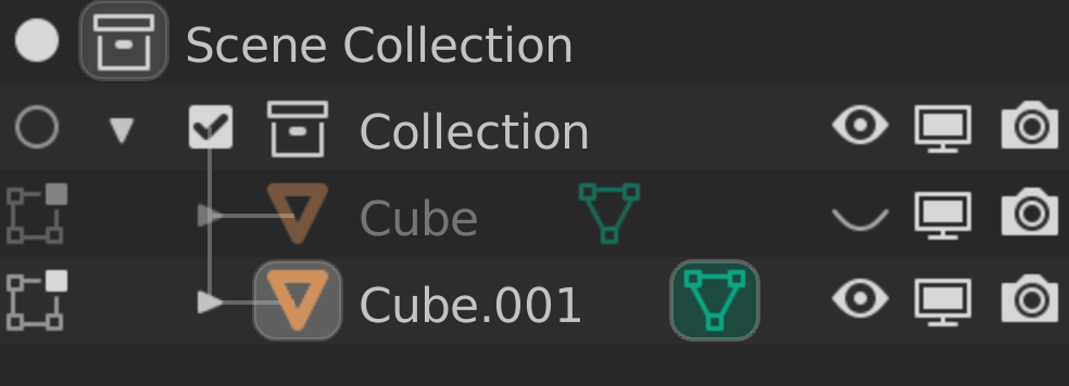
@natecraddock I just watched your video on the weekly report and I noticed that the Collection’s checkbox was replaced by the radio icon, the base function will remain unchanged that if we uncheck the radio icon the collection will be disable?
Hi Nate, beautiful to see progress going well! The new radio icon for activation already looks better, it’s definitely easier to understand its function. Still, I’m curious to see how a different camera icon would be.
I absolutely agree that besides the priority of collection, setting the active camera is a helpful and needed feature.
Regarding the mode toggling, as you wrote in the task, I also think that the icon for objects not in interaction mode should be different (and simpler), also beacuse in scenarios where we have a lot of objects in the scene it might get really confusing.
Thanks a lot for your efforts!
Great work, @natecraddock! I love what you have done overall up to this point for Blender, so thank you! That said, one concern. I just watched much of your video, and it seems problematic to have the same sculpt mode (or edit mode) icon repeated for line after line after line for each of the three objects with only the bolding of an icon being the differentiator between what is and is not included for editing/sculpting. Such a “wall” of icons (three might not be a wall, but if you had five or six or ten or etc, it would seem like one) would make it hard, if possible at all, to quickly glance over at the outliner and know what is and is not included in the edit or sculpt mode. One has to pause and verify that a particular icon is or is not bolded. I think it might be better to not show the edit or sculpt mode icon at all if it is not included, or have two clearly distinguished icons (although this latter option would again provide a wall of icons that would make it harder to pick out what is in and what is out). The easiest would be to have icons on the left column only for what is currently in the edit or sculpt mode and nothing for what is not included.
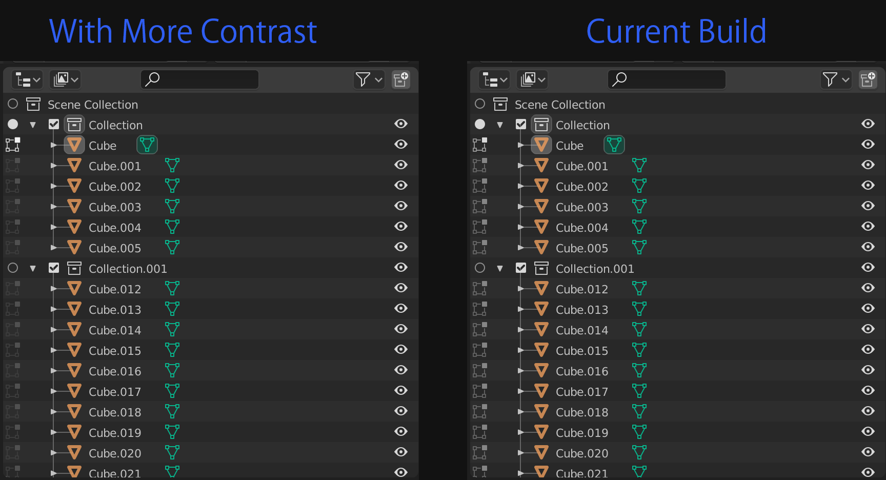
Yea, I tend to agree. There is a discussion on whether showing them at all times is good or not. I’m still unsure myself. I think with higher contrast though the current build would work better:
It’s a little more readable this way. I think the dots that were used before might have been better though? That is to say small dot to indicate its not activated, and then the corresponding icon if it is (sculpt, edit, weight paint etc).
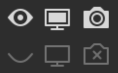
Another small thing I noticed when tinkering around. When inside edit mode, or other modes that use the left column, if you hover over an inactive icon, it lights up showing you that you are over it. I like that feedback, but the “hover-highlight” is the same color as when it is active.
Because of that it’s a bit hard to see when pressing it if you have in fact activated it or not. I feel there should be probably be 3 levels of brightness:
Inactive - dark
Hovered over - medium bright
Active - Brightest.
That way, the contrast between “hovered over” and active would make the state change easier to see.
Yea I think you’re right. An icon change is stronger and it’s more consistent with the rest of the outliner
An eye to a closed empty eye, a full screen to an empty screen, and a camera to an empty camera with an x by the lens. The icon goes through a complete visual change making the state change bluntly obvious.
This means if Nathan decides to go with the route where the icons are always displayed, that would mean we would need inactive versions of all the icons, which is more work, but overall it makes more sense.
I still like the highlighting idea that is present though, it just needs tweaking I think. Perhaps if the brightness level of “Inactive Hover” was closer to inactive, then the contrast to active would be more obvious. You could also apply it to the eye, screen, and camera icons as well for consistencies sake, since currently they only highlight when hovered over when they are active, but not when inactive.
Basically the left side and right have slightly different behaviors. Not a big deal but always nice to be consistent.
An icon change with such a stark difference as you provide in these three examples would be ideal if one does not simply have no icon for items not included in the respective mode. I would prefer the no icon route, but I don’t have a two-icon set with such sharp differences to compare it with. Although I think that the example of @xingyzt is good in providing a somewhat different icon, my concern would be that there still is not enough visual difference between the Active and Inactive states. The difference needs to be much greater, on the level of the viewport visibility eye closed/open and render/no-render two-icon sets. I think that the creator of many 2.80 icons was Andrzej Ambroż. Maybe he could come up with some two-set icons for this (if he has not already).
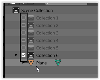
ive been using the collections now for a bit and one thing that i started using was the exclusion from view layer to isolate what im working with
what would be great is to have the option like we do with tabs to ctrl+lmb on one of those and disable all except the one that was clicked on, this would really speed up the isolation of a working collection in complex scenes:D
im a bit confused about the extra icons you are discussion here to be added on the left side, this feels like something is wrong and you try to fix it by adding some duplication of the icon to the other side of the outliner so it stands out more. this feels like something fundamentally is not working with the outliner, i assume its highlights and pattern recognition of items and adding more on the left side does not look like a great idea to me at all.
Agreed, it makes understand that it’s a changeable state but it doesn’t create visual clutter. Although your mockup with more contrast does a very good job too.
Yes indeed, and a ctrl-lmb to restore everythins as before.
the biggest concern I have is if all this work is worth. I mean append/remove objects to edit mode via the outliner. It could be done in 3dview with some context menu or modfier key.
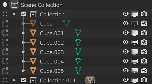
when i look at this
I kinda feel the same way. Maybe its something to get used to but I’m wondering if it can be simplified.
So if an object is in edit mode we will see an indication of that in the left column, highlighted orange icon, and highlighted green icon? Do we really need 3 indications? Can’t we just remove the green icon or make it an option to not show whats inside an object? I cant remember if this was ever useful for my work(flow), kinda doubt it actually.
This image finally made me realize what doesn’t feel right about the left column: It goes against the hierarchical layout of the outliner by neglecting the insets.
I can see this being fine for the active collection toggle, as the active collection should be visually easy to identify, but filling the entire column with icons doesn’t sound like a good idea to me.
I agree that we should avoid duplicate information. But rather than putting everything in a new column, I would prefer extending the functionality of what is already there.
The green icon already indicates and toggles Edit mode. Why should there be a new icon added to do the same?
I would like to see similar functionality to the green data icon be added to the other colored icons.
When pressing the modifier icons inside an object in the outliner for example the properties window could switch to the modifiers tab for that object and maybe even highlight the selected modifier, but I’m not sure that is within the scope of this project.
I am still undecided, but I think I am leaning towards it being a negative element. It is indeed a bit crowded. That being said, I think what is important is important to note is that it is optional, you can turn the left lane column on and off in the options. There are just just some cave-outs right now:
1. Active Collection Indication
The active collection indication is genuinely nice, and imo it is welcome seeing as there is already a space on left of collections in 2.83 and down. It’s always been there. Might as well use the space for a good cause, and I think it would be a shame to have that unused if we turn the left lane off.
2. The Object Data Icon
I think this is the stem of this whole debacle no? People thought it would be nice to go into edit mode by pressing the object data icon, but others wanted to make it so that a press of the icon would open the properties panel to the object data. That was what in big part led to the decision for the left lane, to split these functions. Correct? I was one of the people who leaned more towards it opening the properties panel, but I didn’t mind the edit mode choice. However, after using it a bit in the test build I do find the left lane a bit crowded when you go into edit, sculpt mode etc. I’m also, to be honest, not even sure if it’s that helpful. I am pretty much fine with just clicking everything I need in the outliner then pressing tab in the view-port to go to edit mode. Pablo dobarro also made an operator to switch between objects in sculpt mode: https://developer.blender.org/D7510
So I don’t mind simply taking a viewport approach with a hotkey for this for every mode.
There are use cases for sure, make no mistake, but I’m not sure if the usefulness of this lane outweighs the added visual elements to the outliner to be the default state of the outliner. I think leaving the left lane as an option is smart for the time being.
I feel that it would be cleaner to keep the collection indication “out” of the left lane, as a default behavior of the outliner, then if you want to add/remove things from modes you could active the left lane column to do that. Lets all keep in mind this is still work in progress and improvements can still be made as well
I’m very positive about the overall road-map of the outliner!
The outliner visibility is complex. there are a few things:
enable/disable collections - seems like finally subcollections maintain their state pre/post
temporary visibility (also when pressing H). This is the eye and it’s meant to be very temporary
disable in viewports. (the screen icon) this is like the eye in 2.79 like what we may be used to. hence the confusion.
After many discussions and thinking about it, I do understand the new system why the eye is temporary. I wish the change were better communicated or the eye icon was kept for the 2.79 condition and the new icon for the new temporary hide/isolate. In any case once you get used to it logically, it should hopefully start to make sense.
@silex About that renaming with arrow keys: I want to fix it in master (2.90). I am just waiting on a review of the cleanup still). The issue is currently activation is tied to edit mode toggle and others (like collections) so it’s impossible to make walk actually activate for renaming until the cleanup is reviewed. Hopefully soon
These are two separate things, and the checkbox was not replaced. The radio icon is to set the active collection where new objects are created. The checkbox is for excluding from the view layer.
This is why I have gone back to using the dot. Adding a new middle state for all mode icons would be a hassle and probably isn’t needed.
Did you read my post above? GSoC 2020: Outliner Discussion and Suggestions - #113 by natecraddock I tried to explain clearly the current issue with outliner selection and why this is needed (for consistency and new features). If you don’t understand still, please ask a specific question. But yes, ctrl+click on collection exclude to solo a collection would be great!
Yes. Ctrl+click is select-extend. Right now selection is tied to activation, selection (objects and data like materials), mode toggling, scene switching, etc. It also becomes annoying when trying to make other modes of selection (like walk/arrow key selection) do activation. When I tried, walking over collections was changing the active, and walking over the object data toggled edit mode (very confusing). We want to add features, but with all this confusion a separation of selection needs to be done. Besides, the column already was there.
We want to make the green data open a properties editor on select. Currently only object data (meshes, curves, etc.) and armatures have an action tied. It would be great to support materials, modifiers, data, etc. for opening a properties editor tab so this green data is actually useful. But yes you can hide contents in the filters.
The restriction icons (on the right) also aren’t nested. One benefit of the icons all in a vertical line is you can click+drag down to add multiple objects into edit/pose mode very quickly. Also, in my branch the green icon no longer toggles edit mode.