That sounds good to me, to be honest it is a pretty huge design task, so when you wrote it down on your proposal in the “extras” I thought that sounded about right; a time permitting thing, but probably not. So when you started working on it I was surprised! I think that all the chat generated from it has been good though, I hope it will be helpful for you and the UI team to consider. Also thank you very reading them all, it’s always nice that the GSoC projects are usually so open to the community, it really is appreciated.
I definitely agree that bringing it up with the UI team to see if a conclusion can be reached is the best way to continue. If colors don’t make it it into this project that is fine in my opinion, it is a big decision. Thanks for all the work so far.
Fully agree with @Bobo_The_imp, huge thanks to tackling this project and reading through all the comments.
Color tagging is a pretty hot topic, when we got it done internally for Katana it was a pretty heated conversation and opinions are still split. Tricky subject as there’s no solution out there that’d make everyone happy.
Same here by the way, no biggie for me if it doesn’t make it in. Custom sorting should hopefully be more straight forward . I’m still curious what the UI team thinks so keep us posted.
I agree with @wevon proposal, we should use color more objectively, just to represent object states (selected/active) and for collection colors.
In this case, making everything coloful sometimes doesn’t help the readability.
Btw I always found that those squares with round corners around icons in outliner a little dissonant from the rest of the blender ui.
I have made a few small adjustments.
1-Separate the Object and Edit Mode options to better approximate the final result.
2-Show active collection with rectangular frame to contrast with the color circle.
3-Add a circle in the Scene Collection to be able to activate it.
Note: In Edit Mode there is no option to deactivate the collections to improve reading, it can be a good design option, but if you wanted to keep it it would resemble the original Mockup.
Usually, when the proposals go wild in all the directions and the opinions are split, implementing options and theme colors makes everyone happy (except the developer, maybe )
To draw the attention from the colors, I’m suggesting another subject: vertex groups. I’m using them quite intensive and I would love to have the ability to select them using the Outliner. Do you think it is possible without too many complications? Is anyone else finding this useful enough to worth the implementation effort?
Good idea. Custom attributes in general are going to be more prominent very soon, and it is likely that we’ll get a spreadsheet-type editor to go along, so it would make sense. @wevon I like your mockup
I don’t doubt that collection color tagging can be finished this summer. It’s a really easy feature to code, and I believe the UI team will make a good decision.
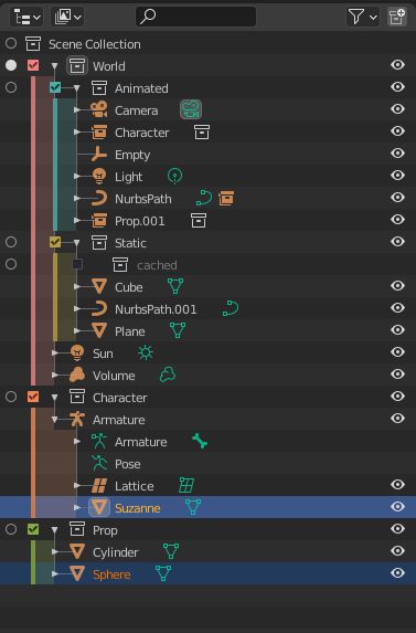
There are different restriction columns for different levels of “hide” control. The eye (shown by default) only hides the object. It is still calculated. If you had a ground plane with collision physics hidden with the eye toggle it will still be used in the physics calculations. The eye visibility toggle is per view layer, which is why it is labeled “temporary” in the UI tooltip.
The viewport restriction (monitor icon) applies to all view layers. It hides the visibility of the object, but also disables it completely from the view layer, using the same example, the collision physics would not be calculated with any viewport restricted objects. These objects are still rendered though.
The collection exclude (checkbox) applies only to the current view layer. It restricts the viewport and render visibility and removes from other calculations.
I’ll admit the manual isnt super clear on these distinctions. I’ll see if I can add more details today.
Thanks for your answer, it’s much clearer. It seems as though “disabled” objects are still “calculated” in one way or another because they can still be used in modifiers at least (as shrinkwrap target, for instance). I then tried a quick soft body sim and what you said about simulations checks out exactly. I have to say, all this seems extremely convoluted. Back to the topic…
@wevon , you are cheating a little bit.
You remove the triangles. But they have a goal. You can’t get rid of them.
You are absolutely right about checkboxes : they should be on the left.
But as Nathan is explaining , it does not have same purpose as activation column that is showing different dots in object mode to define active collection.
But that point in your mock-up interrogated and inspired me.
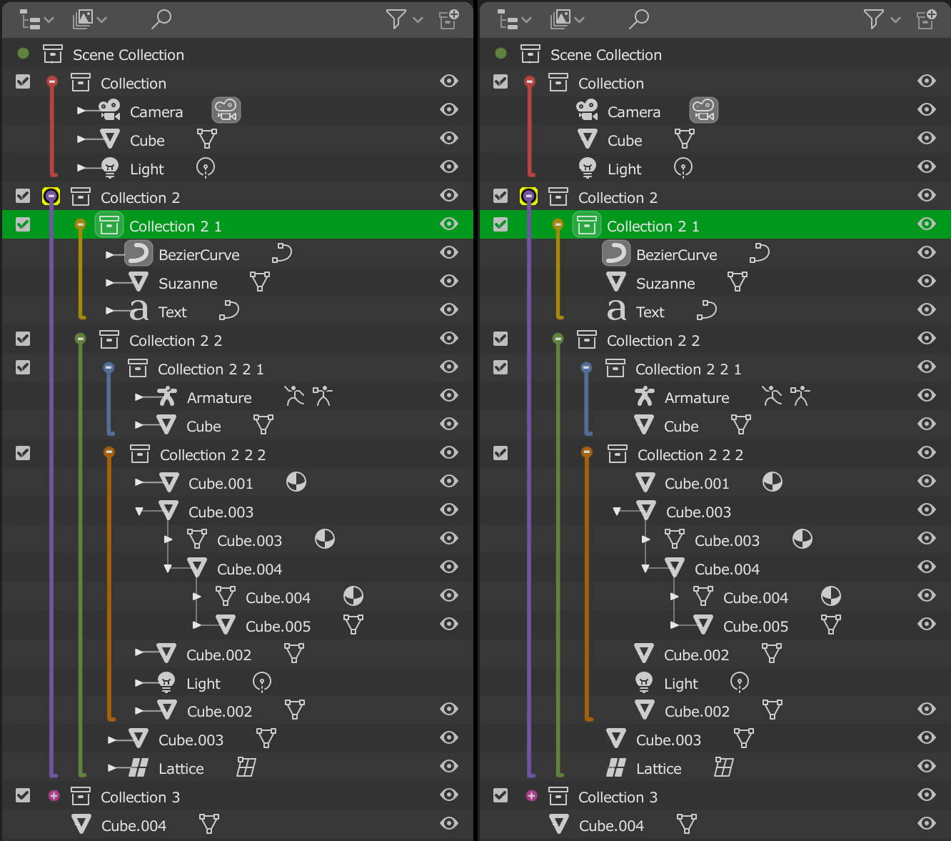
I think that design of hierarchy lines in master and 2.83 is simply incorrect.
Triangle to close/open collection is at the left but origin of hierarchy lines is checkbox.
If we invert those things, we have something that works a lot better for color tagging without taking more space than what is currently used.
I think that could also satisfy people who want colored icons.
At early state of 2.8x, first idea was to have monochrome icons.
But people complained. Without colors, they were lost in Properties Editor’s tabs.
Edit :
I tried just with lines and a white checkbox. You have to color names and icons of collections.
This one is one is the cleanest one so far while staying functional. The line is not over the triangles so the noise is reduced and is close enough so it can be scanned easily. The dimmed highlight doesn’t cover everything so is not overly colored and it doesn’t clash with the colors from the other icons as well.
Also some proposals:
The two request above could be done with shift + double clicking as well adds it to current selection ctrl to deselect so on.
I would also like an option to automatically open or close collections when selecting object in the viewport
It’s unclear what objects are from wich collection as there is no icon, it seems as if the collection inside is the one that has objects.
I substituted the triangles for the balls with the plus and minus symbol, and I moved the vertical lines one step to the left. In this way the hierarchy of collections is separated from the hierarchy of objects. I think the tree is simpler, and the hierarchies are separated. An object can have a parent but be associated with different collections, it is a way of representing it.
I upload a more complete Mockup.
By the way, your proposals are good.
Edited:
Yesterday it was late and I made a mistake. Part of the reason you had RonanDucluzeau. The proposal on the right only shows the triangle when the object has children, although in order to explore the shape it is surely also necessary.
I love much about this solution. It communicates very well the scope and hierarchy of items in the outliner just by color alone. I do have two concerns about it, though.
By making the collection icon vertically aligned with its children object/light/curve/etc icons, the outliner no longer communicates the scope of the hierarchy by horizontal indentation. That is a problem if colors are not used. Imagine your mockup without colors added, and it would be much easier to lose one’s place in regard to where a collection starts and ends and what belongs to what.
By contrast, in the current system, the horizontal indentation of the children makes it immediately obvious what the parent is. So for someone to get the same quick ability to perceive what parent collection object/light/etc icons belong to, you lock the user into using color. I don’t think the outliner should be locking users into using color. Give them the choice to use color, but don’t take away functionality/punish them for not using color.
Can you do a mock up with indented collection icons (as they are in current versions of blender), with your beefier vertically-colored line, that sliver of vertical colored highlighting that you have, with the currently used triangles (I would be fine with white or colored if you have your thick line and sliver of color)? I would love to see what it looks like.
I would still like to have the right-side toggles of collections (just for the line that the collection icon is on) be colored. With this mockup (as with the current outliner), if one is looking at a collection in the center of the outliner and then looks to the right to find the associated toggle, one is met with a wall of same colored icons. One would thus have uncertainty regarding a particular toggle icon belonging to the collection one wants to do something to, and might then look back and forth to confirm.
Having the toggle icons just for the lines that collections are on would provide an instant recognition by color that the toggle icon is the right one. The smattering of colored icons would also break up the non-colored ones into little-walls of varying sizes, which would make it easier to find even non-colored toggles for specific objects
All that said, for the most part I love your proposal.
@natecraddock This is a small thing, but it’ll make Blender behave in a standard manner with other software: could you make it so holding the Alt key while collapsing or expanding makes all descendants collapse or expand also? So if you click an expand arrow while holding the modifier key, it expands but also makes every descendant in the tree fully expanded also (recursively). If you click a collapse arrow while various children and sub-children are expanded, it collapses them all so everything is collapsed next time you expand that item. This is standard for lots of other software.
What this thread and project of @natecraddock shows us, is that the Outliner still needs a lot of love, to make it into something more useful to the more advanced user.
It’s not -just- colored Collection icons, it’s working with large datasets, quick selection of hierarchies, removal of large chunks of data etc. that still is a pain to use compared to other 3d applications.
People who used large CAD datasets in Blender will probably agree instantly.
It’s -also- about making the Outliner more readable.
For now it’s really hard to read when things get a little bit more complicated with Collections, instances, Duplicate Linked copies etc. It all becomes one jumble of similar text and hardly any icon distinction.
The colored Collections are a great step to differentiate things visually, and the one thing I would love to see is a more distinct visual difference between original objects & anything instanced or duplicate linked.
It’s the one thing that’s tripping me up every time I start creating more complex scenes. It’s really hard to keep track of what is what exactly.
Having a visual distinction in the form of bold or italic text for these objects would tremendously help imho.
I applaud Nate with all this, and keeping a leveled head with all the suggestions.
I’m sure we get a better and more refined Outliner when the project is done for this summer, and we still have wishes left.
 . I’m still curious what the UI team thinks so keep us posted.
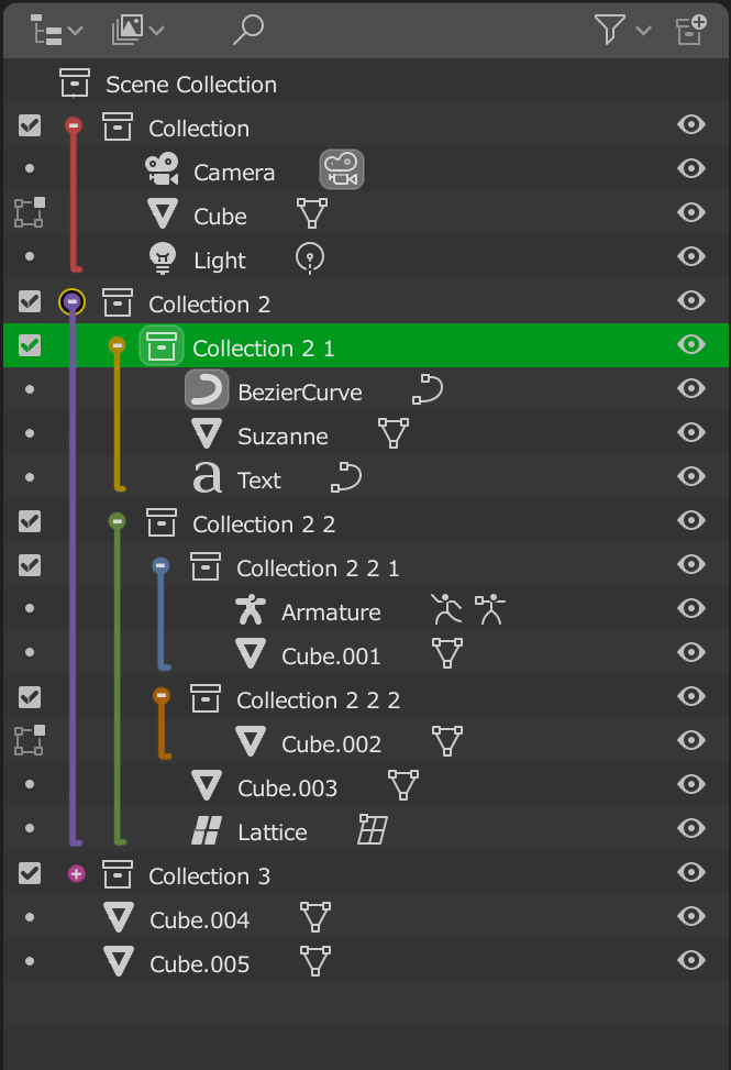

 )
)