GSoC 2020: Outliner Discussion and Suggestions

Looks nice.
One thing thought, are the dots always present, or they are toggleble From the filter popover?

For me this is the most readable option.

I also agreed, mute colors could work, and everything more simplified can work also, the only thing I would like we pay attention, is the coloring of the subcollections …
for me, especially when I imagine I’m dealing with many subcollections it’s important.
(I’m reusing the old mokup just to make it evident, the intensity of the coloring is not a reference point)

screen

5 Likes

Not sure about that. Toggling on/off different buttons makes this task quite difficult.

One option would be to put the coloring behind the eye (hide in viewport icon) but that can also be toggled off. I think it could color all the togglable icons on the right side, as I can hardly imagine a use case where you’d toggle all of them off?

So, everyone moved on to collection colors now, but the basic problems with the outliner still persist and so many of the color proposals just add to the visual clutter!

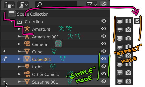
Yes! This is maddening to me. The default 2.8 layout is neither setup for beginner use nor for expert use. It’s some useless thing in between that everyone must make adjustments to in order to get full functionality out of.

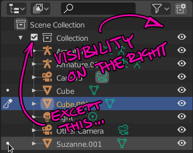
Also, that checkbox that’s visible by default drives me crazy because:

  • All other visibility options are in columns to the right
  • The chexbox breaks the visual stair stepping of hierarchy

vis1

I’ve posted about this before (heck, I’ve posted this in the 2019 GSOC thread), and I’ll keep trying…

  • The “eye” should replace the checkbox functionality and toggle ALL visibility on and off. Why? Because that’s the only thing that a new user see by default!

vis2

8 Likes

Yes. But I don’t think that is a real problem.

I disagree that 3 levels of nested collections is a simple scenario.
Currently, nested collections are not well handled. That should not last.
But I think that more than 3 levels of nested collections would be a really rare case.

We are not talking about object hierarchies. That is rarer to need a nested collection.

Nathan rejected the idea to color triangles and checkboxes.
That would only end-up with line of collection name colored. If this line is out of sight because of a collection containing dozens of objects that does not work, anymore.

Honestly in most projects I worked on since the introduction of collections I’ve used at least three nesting levels. It’s very handy using such a granular hierarchy for anything remotely complex comprised of several sets, hundreds of objects, or even nested instances (instances of instances of instances…). I believe this should be considered a common case. Collections allow for that kind of workflow, so let’s support it to the fullest instead of going for a solution that only works when the scene has only a couple nested collections.

1 Like

Not sure what department you’re working in, but in layout and lighting for example you’d usually go way beyond that. You can look at a simple katana scene graph from basically any production -

Be that is it may - I’m just trying to solve an issue with having a color tag on the far left, and trying to disable selection/visibility for a given collection related to the color tag way over at the right. There’s a huge visual disconnect. If people are not using alternating colors in their themes it’d be tedious and prone to making mistakes.

2 Likes

working like that will be in a dedicated workflows like layout and lightning as you mentioned, in that case it’s going to require that you have the outline in a really wide view to do any actual work.

I think maybe if the design itself should cater to Both scenarios independently as they have a different requirements .

a simpler view of the outliner for quick changes and whenever you increase it’s width beyond a certain point you get more advanced view and decrease it when you’re done that way you don’t have to compromise on both of them and end up with something that doesn’t work in either

Yup. Every department will have it’s different needs. Rigging may require complex hierarchies but might not necessarily need as much color coding, modeling (especially if it’s not that technical) could work with a much simpler outliner, and like you said, lighting may need something way more complex.

The current outliner can be tailored to a lot of scenarios, I can’t see why many of these things couldn’t be optional, just as they are now. You can choose to display toggles, set the sorting to whatever, display certain types of objects or hierarchies, and change the width as well to your liking. You can even have different outliners doing different things at the same time which is awesome.

Just saying that it might be better to go from a fairly complex production based scenario to a simplified one - checking what can be enabled/disabled from a dropdown - then the other way around.

Many studios are looking into Blender, as soon as USD has matured it’d be great to be at a stage where the outliner can accommodate production scenes. We’ve already come a very long way, not so long it was close to unusable with selection not being in sync, and having to box select multiple items.

1 Like

From my point of view, the outliner has two basic functions: 1. to organize and find things (objects, lights, mesh data, bones, etc.), and 2. to do stuff to those things (hide/unhide, render/don’t-render, exclude-from-scene/don’t-exclude, etc). Colors themselves don’t change the structural organization of the outliner. Only collections, toggles, and ordering of items does that. So the only thing left for colors to do is to help with finding things and to help with doing stuff to those things.

When it comes to finding things, one consideration is whether the colors help with determining what might be called the scope of a collection - that is, not just what line the collection icon is on, but how big is the collection vertically and how it relates to other collections. This scope can be communicated in two ways.

In the proposal of @nokipaike above, a collection within a collection gets its background colored starting from where the collection checkbox is and going to the right. This allows to see very quickly, just by a quick look at a color, not only how much of the visible outliner belongs to a specific collection, but also to see if that collection is contained within another collection. When it comes to the collection just below the scene collection, he has that collection’s color also extend out leftward to a color bar area, which I don’t think is necessary. If you look at proposal #1 of @natecraddock above, the color bar on the left side just by itself is poor for the task of using colors to actually do things to stuff in the outliner. There is some empty space that one has to track from the location of the left color bar to the collection checkbox(es), and a LOT of empty space to go even further to the toggles on the right of the outliner. Those bars also can not adequately communicate an arbitrarily large number of sub-collections well. So I think that colors bars on the left just are not helpful. I think that @nokipaike includes color to the left of the collection box of the topmost collection under the Scene collection because he wanted the color to connect up to the color bars on the left side, but if those bars are not helpful and are removed, that topmost collection should also have its color go no further left than its own checkbox. If that is done, his proposal captures the scope of particular collections very well, and the horizontal spacing needed for communicating the relations of colored nested collections to other collections is built into the outliner hierarchy.

Further, when it actually comes to doing things to the stuff in the outliner, the fact that the color extends from the outliner items out to the toggle area makes it very easy for the eye to immediately move from the targeted collection or object item in the center of the outliner out towards the toggle that one would use to do something to that collection or object item. So for usability - finding items in the outliner and doing things to those items - I think that a modified version of the proposal of @nokipaike is one of the best out there.

That does not mean that this would be what I would prefer, and I indicated that there is a second option. That second option is to color the collection lines, checkboxes, triangles, and collections names and also to color the toggle icons on the right. Then one can still see the scope of a collection and its relation to other collections, and when one has found the collection that one wants to do something to and thus needs to move the eye to the right towards the toggles, one simply knows that one is looking for the same color as what one just looked at.

Nate objects to coloring the triangle and checkbox on the grounds that “Those are different from the collections themselves”, but there is a one-to-one relationship between a checkbox and a collection. Every time one has a line with a checkbox, one can be assured that there will be a checkbox there, and vice-versa. So in that sense, the checkbox and a collection are not two but one, just as two sides of a coin are both two and yet always one.

The problem, though, is that just coloring the collection icon gives the eye very little color to latch onto. If coloring the vertical line is valuable to point the user to how big the collection is and how it relates to other collections, it too faces the problem that it is still a small sliver of color. Coloring the triangle and checkboxes, in addition to the collection icon and the vertical line, makes it much clearer at a quick glance what color the collection is and how much of the outliner it is taking up.

Look at @dan2’s proposal with the colored checkboxes, triangles, collections icons, and collection text, which does not have the vertical line colored, and it is pretty clear the vertical scope of the collection. Further, if the only two really good choices for communicating vertical scope and for connecting toggles on the right to the center of the outliner is a modified version of the proposal of @nokipaike or the proposal of @dan2, the proposal of @dan2 has much less visual noise and clutter, coloring just small icons already there than changing most of the background to various different colors. It is in light of this that I would sincerely hope that Nate reconsiders his objection to coloring the triangles and checkboxes. It (or something close to it) seems to be the best option for making it easy to find items and to do things to them with the least visual clutter.

And if a modified version of the proposal of @nokipaike does win out for what becomes default, I would hope that there would be options in the preferences area for users to color collection checkboxes, lines, triangles, collection icons and names and to leave the background a neutral color. I would rather have the colored icons than a rainbow of background colors covering much of the outliner.

2 Likes

Although the color coded for Collections is a really nice thing, I would prefer seeing Manual sorting implemented.

Being said that I’m not sure if the current color choices are the best, take an example the purple one, you can’t make any difference in what is happening there:
image

1 Like

I think the third one hits the mark. Subtle, but still gives you a proper separation of things.

I had in mind, that we were only talking about color tagging for collections.

How many level of items of same type are there in your screenshot?
For groups, Root _ World_Geo
Next level are assemblies.
For assemblies, Env_master_Sixave_Full_Sixave_Ground.

Blender is not Katana. It does not display Collections_Instances with Overrides at a different level of hierarchy.

So, If task ambition is just to color collections, I don’t think that my proposal was out of scope.
But if the idea is to color tag any type of hierarchy, I agree that would not be re-usable for rigging.
Although I don’t think that is pertinent to tag any level of hierarchy mixing all types.
IMO, Hierarchy tree indentation is already communicating that clearly.

I agree with that.
Triangle is designating presence of a hierarchy. (A parent with children or an object with datablocks.)
An object may be part of several collections. A child may be part of another collection than parent.
Currently, we are using dashed line and greyed out item to communicate that .
But if all hierarchy lines are colored those cases would be more obvious.

We could use white line to indicate that an object is also present in another collection.
And black line to indicate that child is out of parent’s collection.

And if hierarchy lines are colored, that makes sense to color triangles, too, to avoid discontinuity.

We can clearly see that reason of confusion with mock-ups, showing collection icon colored and white checkboxes and triangles, comes from discontinuity introduced by white elements.

I agree with GeorgiaPacific. That would be cool to have both options.
nokipake’s proposal as a soft color tagging and dan2’s one as an hard one.

As a simple case example for a layout scene we could look at a collection hierarchy like “cityLayout - Buildings - Midground - roofElements - Pipes - largePipes - rustedMetal”. It can get a lot more complex with shot specific variations or bigger assets.

While some companies integrate materials, color and placement in the object naming other companies are using group naming for a meaningful sorting. Many big VFX companies have to internally script softwares to be able to color tag in the scene view/outliner.

The more limiting or convoluted color tagging is going to be the less it’s gonna be used.

I’m happy to see any solution, and for my personal needs custom sorting would be sufficient in 80% of cases for my day job. I’d just like to see people used to other softwares look at it and say “hey, that’s really cool, I wish my go-to package had that”

1 Like

What if we thicken those lines ?

With solid collection icons ? not sure if it’s really more readable

Bit more saturation…

4 Likes

@natecraddock,

I’ve been fiddling with the build from Friday, and have some suggestions (again). :wink:

First, please add the material icon next to a collapsed object, like all the other icons (constraint, modifier, vertex…) that are already there.
It will save some clicks.

Second, I’m slowly warming to the functionality of a left column. :wink:
But with color coding of Collections, I like the proposal from @Jaydead to combine his suggetions with the colored Collections.

Three, regarding Color Tags, Is it possible to show a color grid instead of a list?
Also, if you’re going to make default & custom colors possible, make the default tag colors not swap on a custom theme to keep consistency. And 12 to 16 default colors would be fine by me.

Four, I agree with @eobet on the checkbox of a Collection.
With all the visibility options, it should not be there. It’s confusing and UI inconsistent now that we have the left column too as well.

Five, I’m more and more convinced we should keep this KISS.
All of the examples with overly colored lines and arrows, side bar colored line blocks, colored collection blocks (top/bottom) etc. will make the Outliner look like a carnival.

And at some point it will create situations where no color rule will apply:
Objects in the scene colored by the Collection color. So what happens when it’s in a colored subset?
And with the objects in several Collections all with their own color tags?
Collapsed collections? What color will be shown here, do we need to show all in one think sub column as @Bobo_The_Imp suggested?
I think this will only make it all less clear and more annoying to work with.

Six, I would love to hear on your proposal to start differentiating (duplicate) linked objects with various font sets. Also the addition of a number next to the vertex icon if objects are linked that way.
Also, as discussed before, I would love to see the ‘linked’ icon next to the top root of a linked Collection, not just the linked sub object. Any plans on getting that in too?

Seven, can we get a little bit more wide scrollbar? Working with a pen & tablet makes these small slivers a pain…

And what I would love to see is some more icon colors, so there’s s little bit more room to fiddle with colors. But that’s not on you, and I know it sort of contradicts my ‘carnival’ comment a bit. But I have all my colors very desaturated, so it’s not that bad… :wink:

Phew… Done :slight_smile:

3 Likes

Solid shaded Collection icons are now reserved for linked or instanced Collections.
Funny enough there’s no distinction between the two…

Making - all - Collection icons solid shaded, will create even more visible confusion.
It’s hard to read as it right now. I suggested having slightly different icons or have the linked icon visible at all time.