I think it wasn’t directly in scope for this project, but I wanted to mention most of the functionality isn’t working with the Industry Compatible Keymap, eg. the different multiselections with keyboard modifiers haven’t been adapted. Box selection is also not available.
Especially frustrating with this keymap is that the folding of child objects can’t be uncollapsed, what might be bug ( in your branch )
Do you have some insight on what is the general roadmap for this branch
Will it be included in 2.81?
Will it be part of the main development build before that?
Ah, scratch that on [Ctrl]+box select. Nothing happens with [Ctrl] pressed down, but I’m able to replicate what I want without [Ctrl].
Regarding [Ctrl]+[Shift]+click, I think I may have to clarify the behavior I mean. In Windows, this allows you to extend from last click to current click (like [Shift]+clicking) without neglecting previous selection.
Currently, [Ctrl]+[Shift]+click literally does nothing on my end in the Outliner Branch.
Hi, very new to Blender and very late to the party sorry.
In the first 2 days of using Blender I struggled with…
Honour whatever is set in keymap to delete objects (x, delete key, backspace, whatever)
If a collection is deleted, then everything inside is deleted
All items display in creation order, until dragged to re-order
Shift + Click selects a range of consecutive items
Command + Click selects separate but multiple items (or Ctr + Click for Windows)
Change ‘Selectable’ to ‘Lock’, make icon a padlock, and display by default (Searching ‘lock’, ‘lock layer’, or ‘lock object’ in the manual returns nothing obvious)
Be able to set the active camera from outliner (like C4D)
Thanks for pointing out the other side of this. I’ve made note of the potential issue and your solution.
Now that my code is reviewed and in master I’m going to resolve this and a few other small issues. Thank you for the reminder. And I think that answers your other two questions about 2.81 and dev builds
Ah that makes more sense. Thank you for the image. That should be an easy addition. I will do it!
hi @Imre and @cmscss. most everything you have suggested is already in 2.81 builds now!
Good idea, noted.
This is being discussed. It could be improved for sure. Though there is the . operator to show active in the outliner.
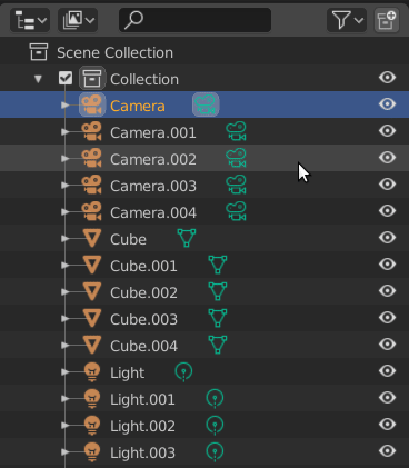
Since we have now the ability to click on the Object data icon to enter into edit mode without unfolding the object, I would like to suggest if we could streamline the whole hierarchy edit mode.
Currently we need to right click (in my case) to select the whole hierarchy and then go to Edit mode, but what if for example we Alt+click on the Object Data icon and this will enter into Edit mode the whole hierarchy at once?
nice to see this, I instinctively had to do this action, but it didn’t work and then I saw that someone created the post to mark this lack and now you’ve already added this possibility!
a question:
is there already a combination of some shortcut + click to directly select an object? this fact of having to enter the menu and then select, makes me a little nervous … from always …
what about the double click on the object icon?
… it’s a bit annoying that you can enter edit mode with a click on the mesh icon, but you can’t select the object easily, with the object icon
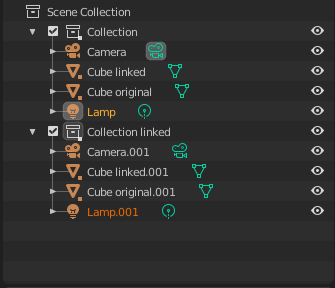
Visually indicate linked instances in outliner
Now we have possibility to link objects and collections and have multiple levels of instancing, but there is no way visually distinguish which object is instance (linked) and which one isn’t. It could be something simple like little square next to icons indicating that this object is an instance(linked). Also name could change to indicate the linking accodingly + “name + linked”.
Someone before suggested using italics for instances, it’s best solution so far imo. Differently colored object name could work too I guess, but just modifying name is not visually distinct enough. Plus end of name usually truncated in complex scenes with nested hierarchies.
Maybe italicised name with a different colour. It is done this way in Modo, and it is clear enough. Also when you highlight one instance all instances get a slight highlight just to show the correlation
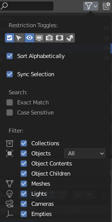
There seems to be a lot of “whitespace” in the top half.
I would try something like squishing all the first four options together and removing the Search header, for example:
Sync Selection
Sort Alphabetically
Case Sensitive Search
Exact Match
That ordering and the addition of the word “search” seems sufficiently descriptive and highlights Sync Selection as the most major mode setting.
What happens when “Sort Alphabetically” is off? Is it creation order, or what? There should be a tooltip that explains this (currently there’s no tooltip for this option).
The currently un-checked options in this panel are too dark. They actually appear disabled and it looks like you should not be allowed to select those search options for example. I was actually surprised to discover that across Blender selected checkbox text does actually get slightly brighter but it’s a very subtle effect that should be used here as well.
When Objects is deselected it makes sense to show the sub-options below it as “disabled” but the drastic dimming should only be used to indicate something is actually disabled and currently not applicable and potentially not enableable.
With “Sync Selection” as well as the search options, the “filter” icon feels less and less appropriate and maybe it should really be changed to a settings “gear” icon. Having filter options in settings feels more right than putting non-filter options under “filter”.
In the latest few master builds of 2.81, with a lot of added Outliner merges, I can’t seem to select an object in the Outliner. I’ve tried single-clicking and double-clicking, but I can only select objects in the 3D viewport. Has anyone else encountered this issue?
I noticed some issues with the industry keymap (can’t expand hierarchy/box selection not working etc…), but with the default blender keymap it’s working fine…