Same space that consume in any monitor 1680x1050 or laptop…
here the space that we lost
Or in a normal monitor

No doubt an important reason
Same space that consume in any monitor 1680x1050 or laptop…
here the space that we lost
Or in a normal monitor
No doubt an important reason
You keep ignoring factors in these comparisons, go back and look at mine.
As I said I have designed a proposal for ALL USERS, not for you. Laptop users, users in the third world, like many I know, I also care.
That has nothing to do with not measuring the right areas for comparing things, biasing things to make it look like you waste less space than you do.
An actual comparison would be
As I said, I compare the right things from ALL users.
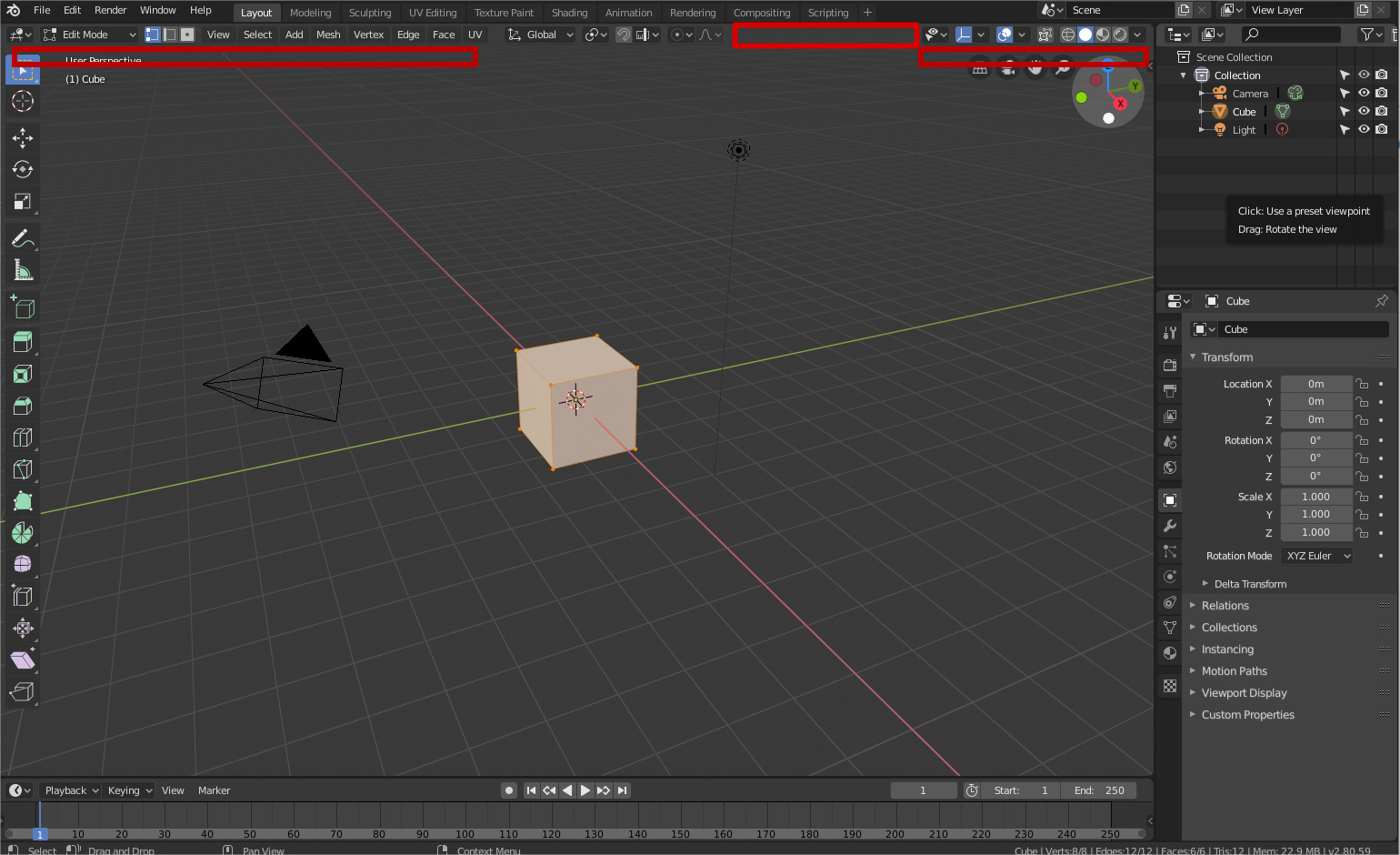
Here you have the one that according to you is a header without problems, in a laptop of 15 inches with screen retina. In other computers will be worse.
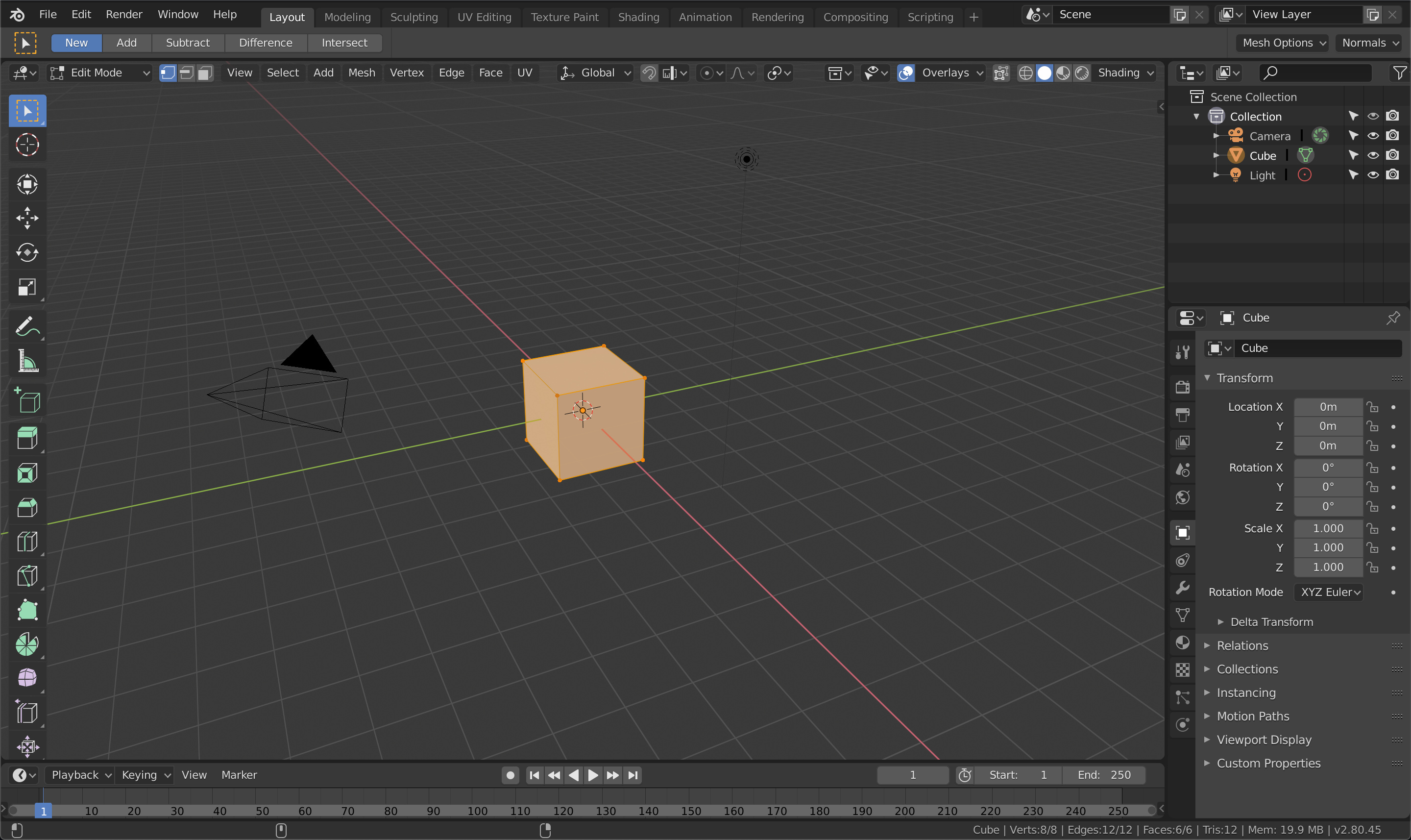
Same computer with the proposal
Like you can see, we don’t have space for new elements in the header, or move a few the properties, all a button soup,… and a lot of space lost to use the topbar.
here the solution with the patch
same space lost in header, worst button soup, lost the vertical space of the N-Panel, no space for new controls, no space for modeling options like mirror automerge,…
First off, the menu is collapsible for this specific purpose.
Second, The first picture there has more free space now since the text was taken from overlays and shading.
The devs make space and find solutions for things that actually need to go in the header, they recently did with the gizmo button. Not having a ton of empty space promotes not filling that space with junk. If something has a use on the header, it’ll find a space.
You seem oblivious to the fact that even with the header at the bottom, you’ve now got a ton of wasted space at the top, which you can’t close, because you need the orientation/snapping/etc settings.
It’s probably going to get it’s own tab, which will mean no accordion menus, which means it’ll take up less space than the in-editor-topbar when there’s few settings.
Also would you please quit it with this button soup nonsense, it means nothing, the buttons are organised fine, clear groupings and everything.
I did not invent the button soup, I read it to a dozen people in this forum complaining. Do you care? I know that you don’t care about everything that is not for you. As I said, I designed the proposal for EVERYONE, not for you.
I have explained perfectly all the pros that the proposal has, all the possible improvements, … and you only say “I want it out that I lose a hole in the header”. A new user does not hide anything, much less the menu where are all the things you can do as basic as creating a box. Do you want to think that a newbie hides it? Ok
I don’t think there’s anything absolutely to discuss, you don’t care about all the damage you do to new users, active tools users or blender future while you recover a hole in the header.
Go and look at the comparisons, you lose an entire toolbar’s worth of vertical space. Throwing the header buttons down the bottom doesn’t negate that.
On the contrary, you seem to only care about new users. I care about everyone, hence why I initially just wanted the snapping and orientation settings to pop onto the header if you hid the active tools toolbar.
Now we have Campbell possibly working on a better solution, that has benefits for everyone, is hideable for people who don’t use active tools (with a hotkey, no less), just like the active tools on the left are, but would be active/open by default for new users, and in the end would take up less space than an entire header bar and could possibly organise the active tools settings better by virtue of being in a vertical format.
I have already explained to you why the Campbell solution is not better, do not insist on repeating it more times. Could be better if it is complementary, but it is exclusive. And if you read the Campbell’s patch, you’ll see that the patch itself admits that this solution has not been accepted in the study.
You can’t lose a little space inside the header, but any other user can lose 10 or 20 times that space without problems.
That’s selfishness, not care about everyone.
And I’ve explained that in the iteration that would result from considerations Campbell is already thinking about, new users lose less space, and no functionality.
And that your proposed solution loses much more space for a modal workflow than you seem to be able to understand.
It doesn’t matter how you want to sell it or count it. Losing a little space of the header is not the end of the world and neither “much more space”, space that is not usable because it is surrounded by buttons, and less when you are asking the user of active tools to lose the space of a whole new header, which will be empty, or to put the panel N that consumes 5 times more space.
Damn, I’m sick of optimizing the interface, but this is absurd.
And the worst thing is that you lose with what you ask, because you will lose all the possibilities of the tool-header and because blender did not grow so much among the public, which means less money for development, fewer addon creators, fewer implementations, fewer ideas,…
You’re still measuring the space incorrectly, because
Every user loses this space, since the topbar has modal tool settings in it.
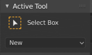
The N panel, once the active tool settings get moved to another tab, will consume only as much space as it needs to fit the settings it needs - which is much less than the entirety of an empty bar that the topbar has to consume in order to work.
No reason you can’t still have a tool header, even in Campbell’s patch, it’s still there, and used for sculpt mode. Though it’s use for that means it can’t neccesarily be used for “all the possibilities” you keep talking about, because the space has to remain reserved for being potentially filed with active tool options. Unless you like moving buttons around and off-screen when you select a tool that has a bunch of options?
The difference? You can hide it and still work.
Don’t you know that the N-shelf needs a full column for tabs?
So much that you say you know and you don’t even know the interface…
Funny you should say that when what I was proposing was exactly to reduce the reliance on menus and adding a top bar to fix this problem for the people who cared, that could be closed for the people who didn’t want it.
A column, thinner and shorter than the topbar, and this
as opposed to this big chunk of bar
Let’s not forget that for either user, the column and panel are easy to hide and open on a whim via hotkey.
And that horizontal space is at far less a premium than vertical space, as our monitors are widescreen.
So, this consume space
And this doesn’t consume space
Seriously, what nonsense are you talking about?
with the topbar you have both of those consuming space. And one is actually full of useful (for everyone) buttons.
If you are such an expert, you use blender with hotkeys,… Why do you need the other header? can’t you hide it and only use the tool-header? do you need a menu to access the basic functions? do you need a menu to move between wireframe and solid? to activate xRay?
I just don’t know what movie you’re telling me. You are an expert that don’t like any visual control, but you can’t to hide basic controls that any user with two months of experience knows the hotkey and doesn’t need any icon to use.
Only a fool thinks they have nothing to learn.
Similarly, only a fool thinks their idea is flawless.
Why would I only use the tool header? It’s got almost nothing on it, I’d rather have a header with all of the useful functions in it.
The menus are the go-to place to find operators one doesn’t frequently use, besides searching, and thus don’t memorise the keyboard shortcuts for - One can switch them to hamburger easy enough If they run low on horizontal space and they’re still good for what they’re meant for. The shading, overlay, gizmo etc menus don’t have hotkeys, and even if they did, most people don’t go memorising esoteric hotkeys for things you don’t use at speed.
The point is, there is a general split in workflows - active tools vs modal tools. Typical users of either sets of tools will find the header settings, menus and shading settings useful to have accessible, along with the snapping/orientation/etc options. However, users of modal tools won’t typically find active tool settings useful, and given that they take up a lot of space, it is better to have them disconnected from the settings and header items that both groups find useful, so that modal users can hide the active tool settings.