I think that you didn’t understand the proposal and that it’s a in development feature.
But tell, why do you want to hide the tool-header if you don’t use active tools and like you accept, you can move the menus bottom and it doesn’t annoy you?
I think that you didn’t understand the proposal and that it’s a in development feature.
But tell, why do you want to hide the tool-header if you don’t use active tools and like you accept, you can move the menus bottom and it doesn’t annoy you?
Compare it properly.
If you’re going to count transparent space as useful when promoting the idea that corners don’t take up a lot of space, then treat it as useful elsewhere.
For anyone using modal tools, this is the difference.
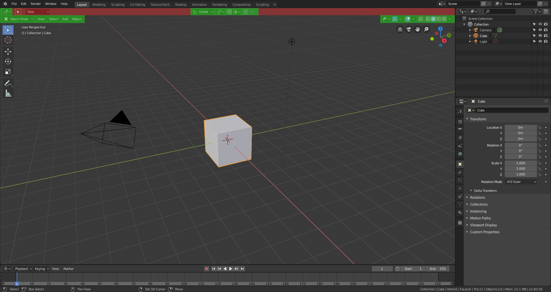
Before
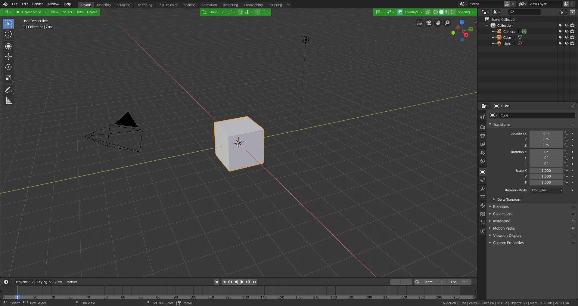
After
Overlayed, red is freed space, essentially an entire header’s worth (And actually the right side should have the same width in both examples, but the build used for the single-header includes text which is no longer there.
“For anyone using modal tools…”
I only use modal tools.
Move the header bottom or hide it when Campbell implement that… problem solved.
just a special effect trick …
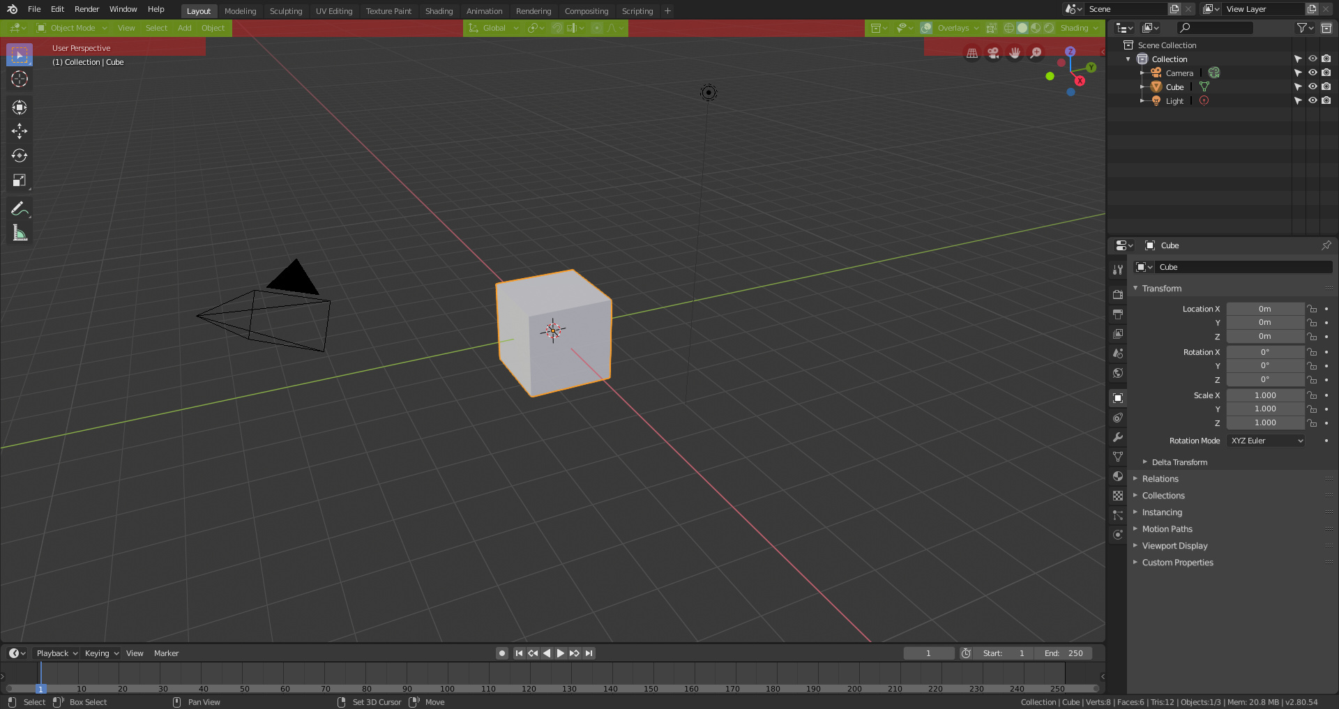
it would be nice that when you hide the active tools, the Active tool setting bar is automatically hidden
hehehe
a)
yes, I specified that in case anyone wanted to point out that the topbar space is useful for active tools.
b)
Moving the header to the bottom doesn’t change the amount of space it takes up. And hiding the header is much worse than hiding an active-tools-toolbar, because the header actually has a bunch of useful settings and features on it, for either workflow.
Why would we hide the header when there’s all this useless space that had been taken up by the active tools settings that either don’t exist, or we’re not using, within which we could move those useful header items.
Which, is what the devs (or at least Campbell) realised and did.
Look, I’m not going to discuss this bullshit…
This proposal with a minimum loss of space allows new users to have the topbar and whoever wants to configure it to lose the same space that previously lost.
Asking for a change is logical. Asking to destroy the improvement for not wanting to configure the workspace or for losing a space you didn’t use seems to me to be between a little boy’s tantrum and an absurdity.
Maybe some users should stop being selfish and think about an interface that works for everyone, not just them.
No, because anyone not using active tools before could close the topbar - the change and proposal here had modal tool settings on the new topbar, meaning it couldn’t be closed. Further, wastage of space was an issue with the previous topbar (when tools had few settings, for example), this proposal didn’t do anything to address that, and infact made it worse.
Campbell’s patch attempts to address all the previous issues, and is a step towards providing a place for active tool settings that actually does work for everyone.
The patch really fucks up the life of new users or users who want to use the active tools, which will be the majority. But since you don’t care about them you don’t give a damn if they have to add an empty bar, if they hide the active tool in panel N or whatever happens to them.
Instead of thinking about the community you think about yourself.
The proposal here solves dozens of problems that many users have mentioned, alsoa lot of new possibilties. All that is lost just because you don’t want to hide a bar and it bothers you that there is a header that we call topbar.
And most people have loved it. Including many people like me only use modal tools and we do not start to cry if we should have a header as we had in 2.79 (and by the way we are still alive).
Here you go: https://developer.blender.org/D4721
Do you think that it’s a good solution hide the active tool options under the N-panel? that people that want to use it must be forced to use the N-panel or add a empty bar? screw the newbies UX?
only to what? to avoid three guys that don’t want to have the same that they use 20 years in blender?
It’s not finished.
FYI I’d prefer the active tool settings in a T-shelf style popup similar to the shading or overlay settings, openable via hotkey that hides with the tools. If I didn’t care about active tools, I’d just want them gone, instead, I want a better solution that actually works for everyone.
I do want to hide a bar, now I can. Before I couldn’t because in a modal workflow both bars were useful but mostly empty.
THIS PROPOSAL IT’S ALSO NOT FINISHED and you want it destroy before end it.
What you are defending is that users of active tools are second-rate users, who should be fucked if it suits you and their workflow hidden from view in panel N.
That if, to us, the superheroes that we use hotkeys, that we do not occupy not even 100px of a menu, that we get angry.
None of these outlandish claims reflect my sentiment or the sentiment of my posts, nor that of others.
Note my initial proposed fix:
Your proposal here had/has flaws. Edit the proposal if you want to fix them. In the meantime we and the devs are looking for better alternatives.
I’m not angry. The tone of your posts would suggest that you are, and are projecting that upon me.
you are screwing up the work of weeks on a proposal, without wanting to understand it and only because it consumes you a minimum effort. Putting you above everything and giving you the same what happens to other users, and if they screw their workflow or worsen it significantly do not say anything. Obviously it makes me angry.
are you both funny when the polemic march starts, how the ■■■■ can you write whole meters and meters of texts in a few minutes? 
I’m doing none of those things. It’s not my fault if a proposal has flaws. And Campbell’s patch addresses the fact that it still needs some more changes to be friendly to new users, I’ve pointed this out, obviously I care about it, I even literally stated and gave a couple examples that I care about it but I suspect you skimmed through my last couple posts.
I assume that when in object/edit mode users can activate the topbar and hide the n-panel (or close just that panel), so that you can have tool option on top.
this is not an attitude for this forum, please calm down
The proposal has no flaws, I simply keep it simple to make it easier for developers to implement. If it were up to me I would start asking for all sorts of things to customize the interface, I keep the proposal simple and easy to maintain. And once that is already being implemented then it can be improved.
It’s not like that, and even if it was implemented it’s a terrible option for new users, who are just the target of topbar and active tools.
And I repeat, all for what? because some that use modal controls don’t like the “new” menu in the topbar, because it have a BG color?
We’re saying we should lose
An entire header worth of wasted space as was demonstrated, not simply a ‘new’ menu.
As for things we would “lose”