I think @MeshVoid is unhappy to have pivot/orientation/snap options moved to the topbar from the header, making us forced to keep the topbar on (assuming we want to always have them visible)
3 Likes
I did not understand
well, in some cases, it would be advisable that when hiding the top bar, the snapping tools appear in the other bar …
I write it only so the dev can read it and maybe if they think it appropriate they will take it into account
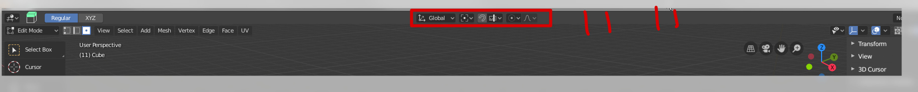
I know that it’s just a minor change, but it’s not the best decision IMO. What I’m losing is precious vertical space, even if it’s 15 pixels, vertical space is very important as we all have widescreen monitors. Having a solid line that separates topbar from viewport is unpleasing to the eye too (but it’s my subjective opinion). I really liked that transformation orientation and pivot control buttons were overlayed as small icons on top of the viewport, as it allowed me not to have that topbar in edit mode as that it is not necessary and became completely rudimental in edit mode in 2.8 (which I perceived as a step forward to a better UI compared to 2.79), especially with all those buttons in the viewport that are there anyways. Now I basically have two rows of buttons and have no option to just have one row and nothing else in edit mode. As I have stated, I am nitpicking, but it’s not the best decision IMO. I will still get rid of that ugly topbar and will have to bind Transform orientation and pivot centers and snapping as pies, to my already hefty custom keyset, but it would be cool if I didn’t have to.
2 Likes
That is exactly what I was trying to say, thank you for making it so clear and concise.
hehehe there is telepathy between users and devs
I still without understand the complains about space used…
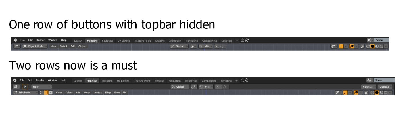
This was blender2.8 before
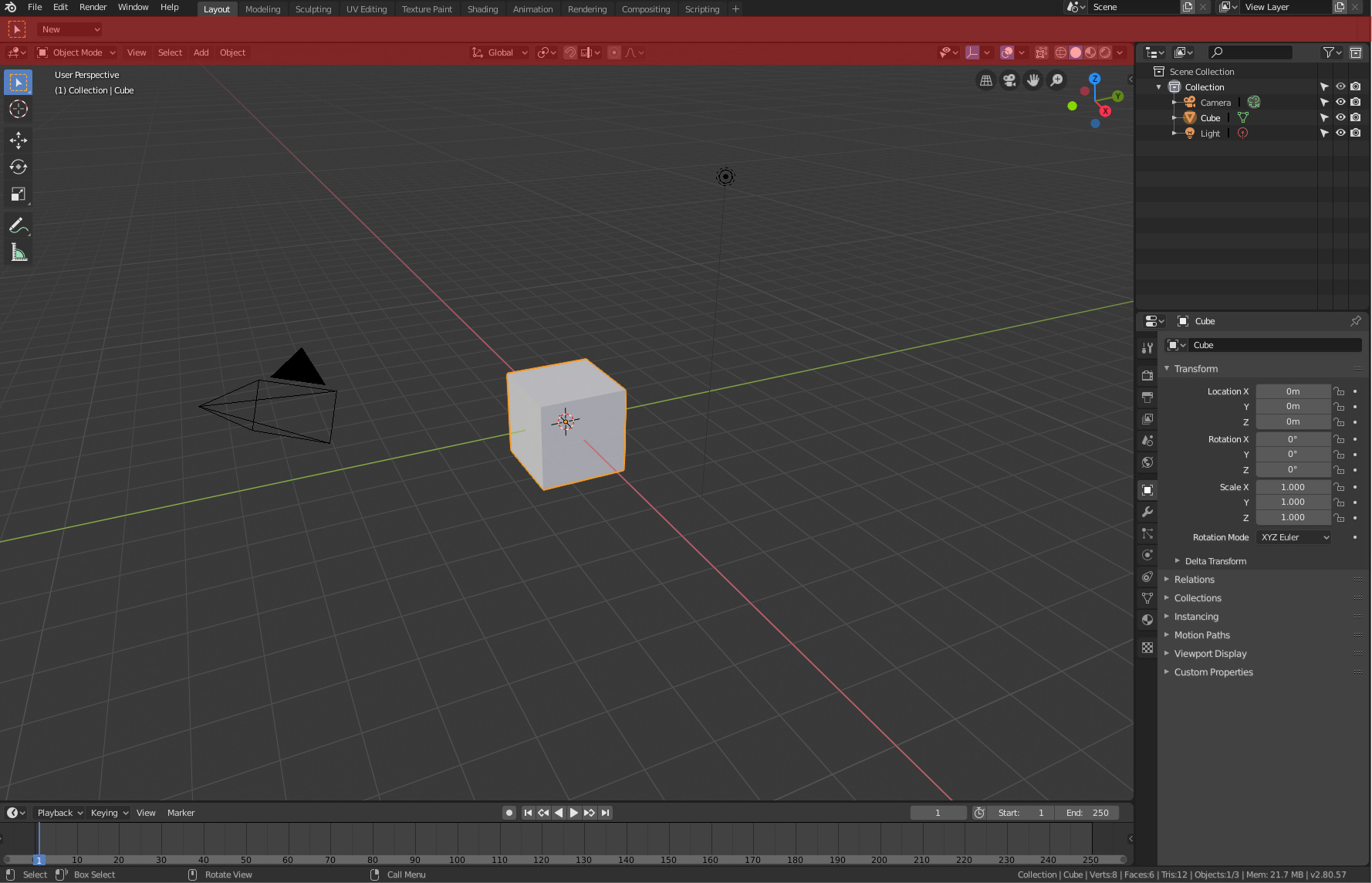
This is Blender2.8 before with topbar hide
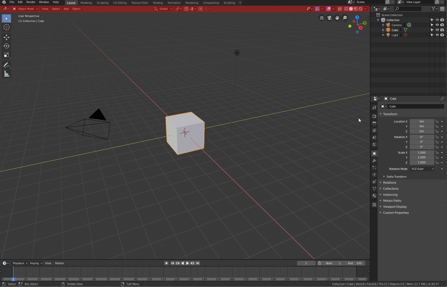
This is with the new topbar in the 3D view
The pivot/snap options still in same place
And if developers implement the proposal completely we will hide the menu bar and left it in one bar.
1 Like
Try switching header to the top in preferences as it is it’s default position and notice the difference.
What space do you lost? the corners?

By default blender2.8 before showed the topbar and you are able to hide it…
1 Like
Exactly, read my post carefully, hide it now and lose Transform orientation and pivot centers and snapping buttons in the middle completely.
I don’t tell that, I tell that you complain that I don’t use the default position, and I told you that you can configure that in the same way that you configure the topbar few day ago…
1 Like
As Lsscpp said: I think @Krayzmond is unhappy to have pivot/orientation/snap options moved to the topbar from the header, making us forced to keep the topbar on (assuming we want to always have them visible).
That complain don’t have any sense, with the change the topbar is converted in a only necessary header… is like complaining that the header is now not called header, it’s called topbar…
That is your opinion and it’s totally legit, it does make quite a sense to me and I am more than sure some other users too that preferred having topbar hidden in edit mode and not being forced to have top bar turned on all the time.
2 Likes
If you don’t have the active tools you only have a menu that says “New”… Do we complain about having a menu button to hide the types of elements? Do we complain about having a new shading menu? Are we going to ask to have them removed because we are bothered by the 20px that consume each one?
Would you be complaining about that new menu if it didn’t come from the old topbar?
silently there are interesting improvements … these of the last build, now the tools are seen entirely in halved windows

just test it for a few hours and its not a problem at all, the only thing that may be weird its that when a tool (probably addons more than anything) consume all the space the central bloq its going to jump to the side, besides that, i can even see adventages in this implementation as shows @nokipaike in the split view.
Not sure about the other editors at least seem to be working in the 3dview
I don’t understand the reason for your concerns, you think users shouldn’t provide feedback about anything at all, even if they find some decisions questionable? And I have given several reasons why they were questionable, you might not agree with them, this is your right. As other user has stated and given the link to the dev thread, the problems that I’ve described were noticed by developers too, I am sorry if you don’t see a problem there, probably you will be okay with further UI changes too then, and hopefully those changes might get implement with that patch: https://developer.blender.org/D4721 .
1 Like
I think it’s a bit of a fuss to complain about not being able to hide a menu that occupies 100px, when the new header has new elements that occupy twice that space and we don’t see anyone asking to hide those elements because they bother him.
It seems that the only reason to complain about this menu is that this element has to do with an active tool and that’s why it must be absolutely defenestrated. And we have to start lying by saying that we lose a lot of space, that if the controls stop being centered,… All in order to eliminate that menu that doesn’t bother you at all.
According to your message, I still think you didn’t understand my feedback, hopefully someone will. =)
2 Likes