with the new color coding the themes must be arranged …
Hi jendrzych! For me this “B” mockup of candy crush outliner is the best!
With the rounded shaded icons and the text colors I can easily read all the content of the outliner.
I think I could have a problem because, it’s really difficult to me read anything in the outliner mockups with few colors.
I don’t know what the plans are, but I’m working on a new set of modifier icons, I started it more as an exercise but I’m quite happy with some of them.
@billrey have you seen them on BlenderArtists?
If so can you tell me if something like that (with more polishing) could work or if a definitive decision on removing the icons have been already made?
just to see , link it
Sorry for the wait, yesterday there was quite a raging discussion there and I preferred to post the update now. 
1 Like
I think addons tab also must have icons instead of text labels. They are difficult to read because they are turned at 90 degrees, and often shortened
here my mocup:
6 Likes
I also dislike with every bone I have “vertical rotated text” but I don’t know if icons is the way to go, because as @jendrzych already said, an I agree, complex subjects (like add-ons that can do a variety of stuff) are dificult to represent in such a tight matrix.
Maybe a dropdown? Or a horizontal scrollable buttons?
P.S. don’t know if this should be discussed in this topic…
1 Like
Sorry for the dumb question, how can we control the color of an icon in python?
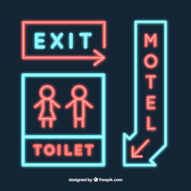
I think we could also aspire to labels written vertically …
…like motel’s signs …
I wonder why no one has thought of it until now ![]()
1 Like
I was thinking of a dropdown at the top instead of tabs. That was an annoyance in 2.79: lots of addons=unreadable tabs.
1 Like
Now back on subject:
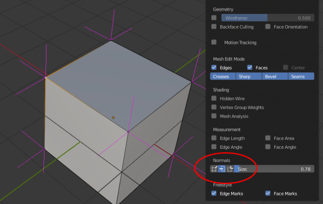
Two of the normals display icons are reversed in the Overlays dropdown. The Face normals as lines and the Vertex-per-face normals as lines have the correct tool tips and function, but the icons are incorrect.

2 Likes
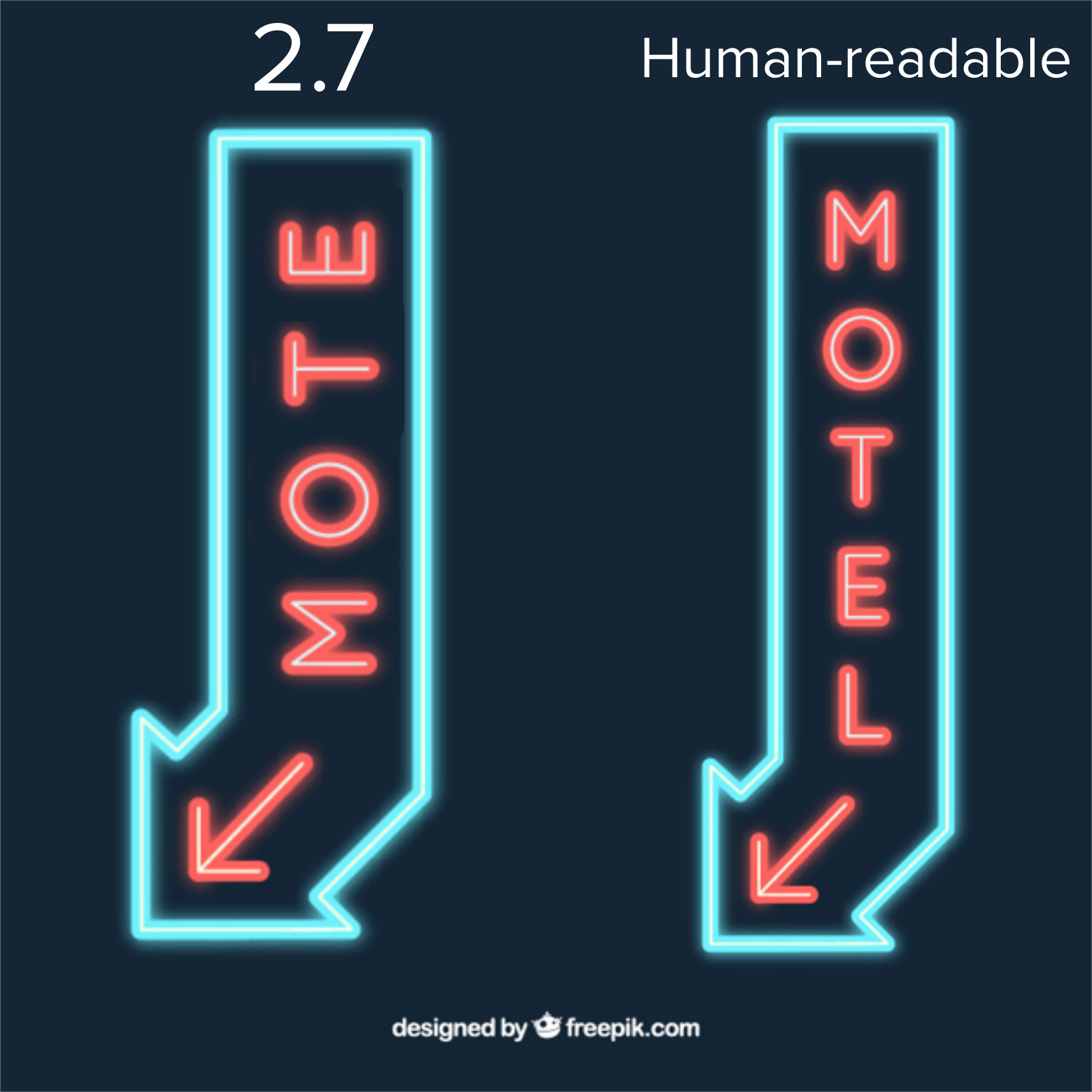
No, its certainly not that no one thought of that but everyone discarded the idea because its the worst solution to the problem! Everyone that knows a thing about typography can tell you that. Letters weren’t designed to be read like that. The Motel sign is working because its only a few letters, all caps, and mono-spaced. For everthing else it fails horribly and looks aweful. Humans, most of the time, dont read every letter of a word but subconsciously recognize the shape of it. Writing vertically breaks this completely.
If you don’t believe me, please try it out yourself, make a mockup with all tabs from 2.79 written in that way …
2 Likes
Dropdown will waste time; 2 clicks instead one
1 Like
Love the color coding of the icons. The only one that seems to not work well, at least with the default theme, is the red ones when selected:
(Source)
They start to lose clarity in context of the light gray fill.
2 Likes
@ManuelGrad
man, that’s exactly what I wanted to point out: human readable “motel’s”.
What do you think, that I have not suffered from stiff neck in the earlier blender versions?
hehehe
True. I feel like you’re going to run into the same issue with tabs no matter what. If you have too many tabs with text, you can’t read the text. If you have too many tabs and icons, you have indecipherable icons. I also don’t change tabs that much in the T panel in 2.79. It’s definitely not as often as I’m switching tabs in the properties editor.
Maybe the real solution is making the tabs scrollable like the properties editor tabs are. So the tabs may not all be on the screen at the same time, but at least they can all be read.
1 Like
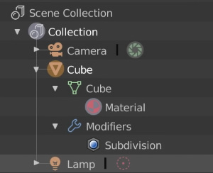
I really like the new icons, but one really bothers me. It’s the object icon. It’s used all over the interface and it just doesn’t make me think “Object” it looks more like an axis or an empty. I feel like it should match what is being used in the outliner, or even better, it should be changed back to a cube. A cube refers the user to the default cube - the first object a user sees when they begin their journey into the world of Blender.
Right now, the mesh data icon in the Outliner matches the mesh data icon in the Properties Editor, but this is not true for the Object Icon in these places. It seems like the Edit mode icon should either match the icon used in the Outliner or vise versa.
5 Likes
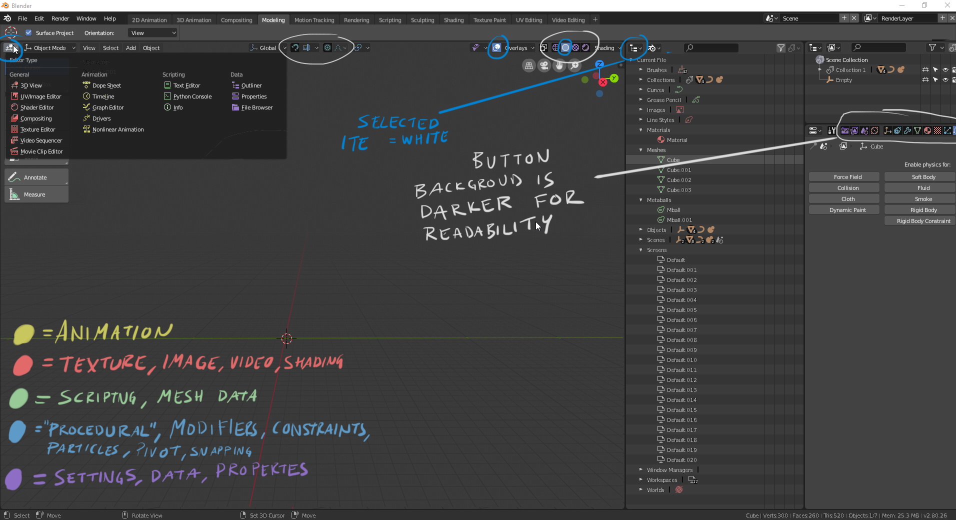
I like the new icons! The UI looks a lot more modern, which is a great improvement. The only thing that I think has been lost is a quick readability based on colors. I made a quick mockup of how colors could look like and where colors are needed and not needed.
I’m not 100% percent sure if I like it better with more colors or not. The UI feels a bit “warmer” and approachable with colors. Also it feels easier to find the material tab etc.
16 Likes
Hi. I love the shapes of new icons, they give feeling of talent of artist, that created them.
Excellent work!
But there is an issue about monochrome I would like to clarify.
As professional artists we all remember Types of Contrast scale by Sam Nielson
So current situation is looking like this
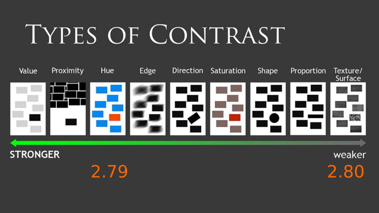
As we can see from this scheme, colored icons are pretty much more simple to hanlde, because their contrast type is much higher on the scale.
This can be tested like this:

Colored icons are much simpler to handle even with blurry unconcentrated view, so
that’s why so many people feeling loss of comfort with monochrome icons interface.
Because you have to pay additional attention to recognise shape.
We can remeber GIMP experiment.
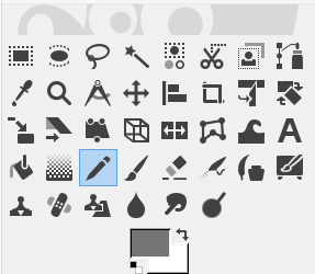
Steril monocrome design compels to search proper tool every time it is needed, that hurts especially if they are packed like this.
And, of course, that issue brings especially strong pain here, in file manager.
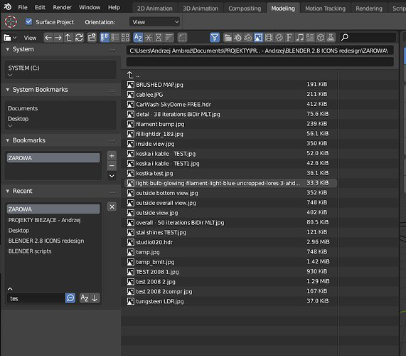
It tooks seconds to realise, that folder don’t contain blend file in every folder that contains images, if it doesnot contains it, because user forced to view through every single icon to recognize it’s shape, while there are no any problems at any other file browsers with colored icons. Just because there is no problem to find an orange in a bunch of potatoes.
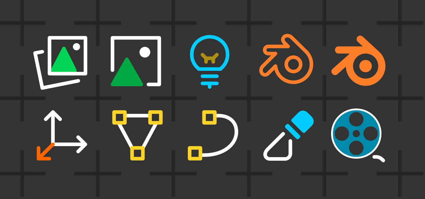
There were nice solution - put some color in a part of icon, that will be enough to bring acceptable amount of contrast into the scheme.
So, monochrome scheme, like in GIMP, must necessarily be optional to avoid cognitive overload.
Thank you for attention.
48 Likes