I like it, the selection is more evident and above all it is not confused with icons, good work.
One more with filled selection backdrops - more standard look, but somehow aggresive at the same time.
3 Likes
Personally I prefer without filling, I think it is less striking, the Outliner should not attract much attention. And better represents the selection concept.
I had to. Just to make sure.
Id Still prefer a slighty cleaner version
Even more toned down:

1 Like
Last one for tonight. With seperation lines:
Thanks jendrzych for your huge amount of high quality work and to have shared the svg so we can play with it.
Here is a try of mockup of what i had in mind. I play with different values of underlines,dotted lines and italic font.
Thank you @jendrzych for the svg mockups! Based on that, I thought I would give it a crack as well:
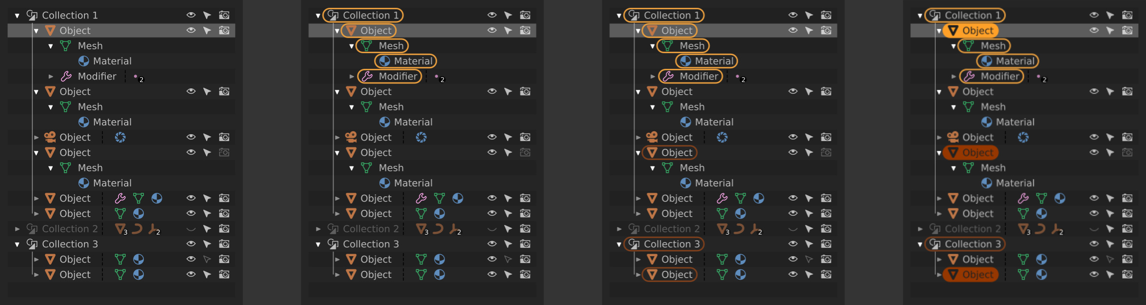
Left to right:
- Nothing selected in viewport, first row selected in outliner
- One object selected in viewport, first row selected in outliner
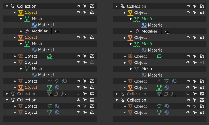
- yellow = active object/data blocks available in the properties panel
- Three objects selected in viewport, first row selected in outliner
- orange = selected objects that are not active
- Three objects selected and in edit mode in the viewport, first row selected in outliner
- solid yellow/orange = object is currently in edit mode
Modifying the currently edited objects via the outliner would look like this:

Left to right:
- Three objects selected and in edit mode in the viewport, sixth row selected in outliner
- A right click menu would have the option to “add selection as active,” or something to that effect
- Four objects selected and in edit mode in the viewport, sixth row selected in the outliner
- The previous active object remains in edit mode, but the border around its datablocks goes away since it is no longer the active object and its datablocks are not accessible via the properties panel
- The newly added object is now active and its sub-datablocks are denoted with yellow
These principles are held to for this design:
- The outliner always displays a one-to-one synced representation of the viewport state via “highlighting”
- Selection, edit mode, and datablocks that are currently accessible via the properties panel are taken into account
- Only object datablocks are highlighted for non-active, selected objects (rather than all sub-datablocks) to prevent clutter and provide a hint to the user as to what data is available via the gui
- Selection in the outliner is decoupled from selection in the viewport and is used to stage “targets” for potential actions (such as the example of adding to the current set of objects in edit mode)
Pros of having outliner selection decoupled from viewport selection:
- Allows for modifying the active selection without having to leave edit mode (thus updating the datablocks in the properties panel)
- Do not have to select objects in order to change their hierarchical configuration
Cons of having outliner selection decoupled from viewport selection:
- Not the “expected behavior”
- Can be slightly slower (have to select target in outliner, and then apply action)
- Perhaps clicking the icons directly could allow for more immediate actions?
I realize that changes like this are probably outside of the scope of what is going to be worked on currently, but I felt motivated to share since this is a personal painpoint for me with Blender’s UX.
guys, where the preference that changes the tonality of the new icons in the themes ???
p.s. @jendrzych congratulations, the icons seen in action are very beautiful
If by ‘tonality’ you mean the colors, the new icons now follow the text theme color of the UI widget it is in.
The icons in the Outliner uses colors set in Preferences > Theme > User Interface.
Where can we find the list and names of the new icons so we can update scripts? They look great, BTW! And very excited about Modifiers in Edit mode!
Hi, is there a way to change the brightness/color of the new icons without change the text next to it.
To make them more visible I needed to crank up the text color to full white but the icons are nowhere near to full white. I’m confuse.
Thanks.
I think it’s because inactive buttons have icons a bit dimmed.
For now the easiest way to see the icon names are in UI_icons.h in Blender’s source code.
Edit: It appears that the Icon Viewer addon works in 2.8, so you can also use that if you prefer.
1 Like
Thanks for the quick response, excited to dig in!
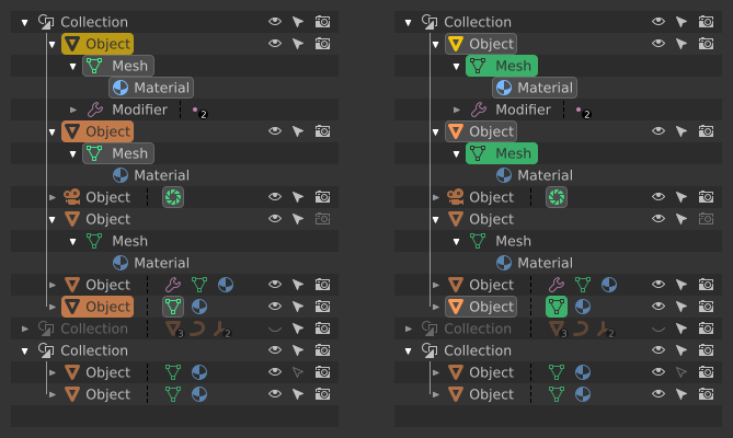
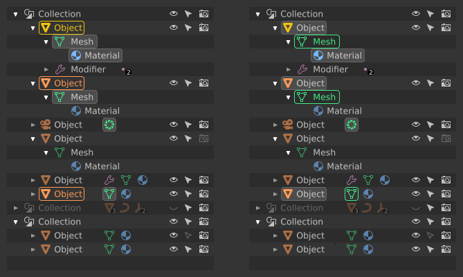
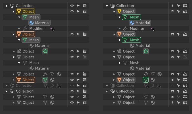
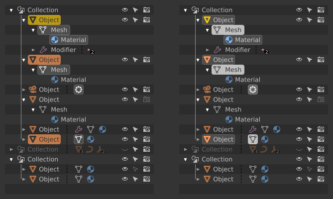
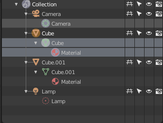
the basics of color coding have been implemented. Otuliner looks a bit too colorful now. What seemed appropriate on the mockups does not really look good in a real environment - that’s why implementing the concept is so important. It shows what actually works and what just looks good on sketches.
I would remove one of the additional information - the color assigned to ObData, as in the attached pictures:
-
that’s how it looks out of the box:
-
my proposal is to get rid of one of colours and to change two others. Each Object has an ObData block, so I do not see a reason to emphasize that fact with colour - let’s get rid of the green. It is more important to emphasize de blocks of data that are somewhat exotic and occur less frequently: modifiers - purple, like deforn/modification tools in Toolbox; shading related icons - light blue just because it remained unused and isn’t red, which is bined to delete/remove. Much cleaner and easier for the eyes:
-
green I’d leave for Vertex/Bones Groups and such. Those icons are apparently less present than ordinary ObData, so it won’t be as agressive as it’s now:


The Christmas tree will disappear, we will not lose readability, and the relevant information is distinguished at first glance.
Then I’d go this route:
6 Likes
@billrey
I found a bug, when I save a new modified theme, the colors are reset to the default theme and the new theme is saved with the default theme colors
(after I changed the colors of the icons starting from a non-default theme)
Hmm, so I guess there’s no a workaround to remedy that.
I wish the icons were the same brightness as the text so we could have more flexibility when changing colors.
Unfortunately It seems like I’ll need to make most of the text full white so I can see the icons better. ![]()
Thx.
Yours looks a lot better, because for now icons on highlighted rows and in circles looks very bleached out and unreadable
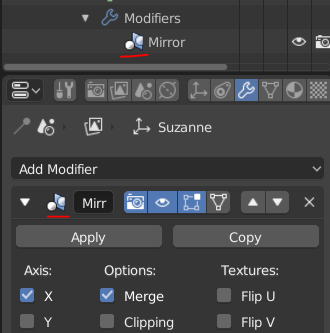
By the way, what’s planned to this old icons of modifiers?