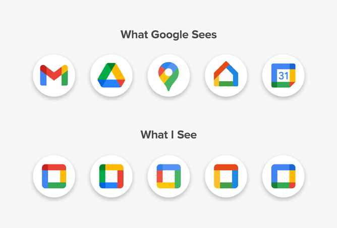
The problem of a monochrome interface is something we call a visual perception deprivation effect.
This effect can be easily reconstructed in coding by turning off code syntax highlighting, so the entire code will look sterile. Nothing will snap your attention, so you will have to read the entire code block in order to recognise the context of its parts and keep them in mind to work with them instead of just seeing them.
The same way, when entire interface elements are graphically equal you have to read it all in order to find the desired one, instead of percept it, which require more efforts and results in working speed loss, miss-clicks, etc.
In general, the control of a reading/perception speed is an important aspect of a UI design (icons, elements blocking and arrangement), since reading (shapes recognition) always consumes much more energy than perception.
