Just turn on a *.blend file in filtering options - You’ll realize that it’s easy to spot if a *.blend file is there, or no.These icons were designed the way to minimize use of colours. You’re not familiar with them yet.
Although making *.blend files orange would be super helpful, since it’s most important data IMHO. I’d leave the rest of icons just white.
1 Like
An idea for color coding the icons
Use the color channels (R,G,B) to separate elements. Technical example:
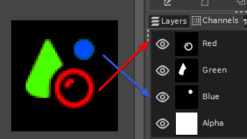
That should make it easier to keep working with Inkscape & the parsing process in the build script for Blender. For developers its just a matter of using a shader that binds the channels to theme coloring.
The next debate then would be what separation for most icons is needed. For example perhaps just 2 information channels with:
- base (basic pictogram in ui as it is now)
- context (selections, active, center,…)
2 Likes
There is a difference between familiarity and the characteristics of a person’s physical perception.
Familiarity is about shape and style, perception is about health.
Like subitizing.
3 Likes
That will not work, because of the same issue - color contrast should be between icons, to distinguish one from the other. That means no color mixing.
This mockup’s great. Some key elements consistently colored across all icons would help make things very readable. I guess a hard part would be coming up with what elements should be colored.
I really like what’s happening with the viewport tools where what they do defines colors:
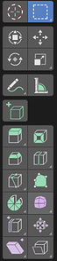
It would be great if something similar can be done across the other icons, but I’m not sure that’s possible.
6 Likes
The thing about the tool icons is that the colors actually communicate something - green means add, blue means modify, etc… The way color is used in all the colored mockups here is basically at random, without any meaning.
It is true that colors help with visual distinction and make each individual one “pop”. But Blender has a crazy amount of icons, and if they all stand out it creates a lot of noise (may look great on a small section of icons, but not when applied to the whole interface).
So if the colors are actually communicating something (type, hierarchy, function, etc…), I’m all for them. But if it’s just a rainbow of meaninglessness, it’s better to stick with monochrome and let shape do the talking.
2 Likes
If I may I like this idea, however I would suggest that the active tab in the properties instead lights up with its color when active. Where I would implement this Idea of colored icons is in the modifiers tab where could be of most use , we could easily distinguish what kind of modifier we are using at glance.
I hope your proposal is taken into consideration
I also like the new icons, but my buggy brain has serious difficulties with monochromaticity
2 Likes
and besides my brain buggy has serious problems with monochromaticity, at the same time my brain buggy loves the recognition of the various categories divided into colors
2 Likes
reasoning on monochromatic and colored icons, I understand that the monochromatic icons make it easier to manage the themes, the colorability of them.
with the colored icons if you want to keep this ability to color the icons based on the themes you must make the code a more complex piece, so that the icons have 2-3 layers of coloring that can be modified by preferences in the themes.
i saw this suggestion on the blender artist forum and it seemed pretty good
4 Likes
thats already great, i love to drag and dropping the object name to the material and the obdata
The reason icons need color is to be easier to read against each other, not just the background. Easily identifiable, easier to find, easier to read. It shouldn’t matter if the color itself is related to a higher meaning or not, although it would be better of course. Users should come before maintenance by developers and much earlier than aesthetic at a distance. Ideally these colors would be controlled by the theme, a limited color pallete could work on multicolor flat icons, like 1d’s proposal. Calling a couple of selected colors a rainbow is just chromophobia, as if the best way to avoid a tasteless use of color is to avoid color at all, but nothing further from the truth. Although I’ll take a rainbow if it improves usability any day
“You’re not familiar with them yet” is an Apple level explanation of the likes of “it’s not the antenna, you’re holding your phone wrong”
Speaking of shape, shapes could also be improved. 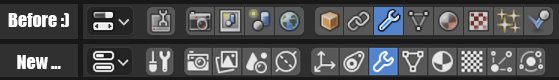 World is hard to understand as a world, it looks like a topspin, a continent wouldn’t hurt. And physics and particles are much harder to understand, nothing wrong with the stars, and a bouncing ball is easier to get than… planets, gravity?? Constraints are ok but seems like an arbitrary change.
Here’s a link with more users complaining. x.com Better to design with an evidence based approach rather than by some school of aesthetic
7 Likes
acually a chain, makes much more sense for constrain.
1 Like
Love the Apple level explanation 
Agree on that one, the new one looks like envelope around bones. It’s subjective and most of us will probably not notice the icons after a while.
I’m also surprised to find that muscle memory takes me to the same position rather than relying on the icons as much as I thought. Particles and physics are on the right etc…
1 Like
While I did laugh when Apple came out with that statement, not being familiar with a new way of doing things is a valid reason for not liking it. If there are two sets of icons, and half of a population is used to one set, and the other half is used to the other set, if they swap, they would both say the original one was better. Illogical but true.
I appreciate discussion on Outliner and File Browser but I think Properties bar is huge issue now. We need to navigate fast within those panels and new icons took away couple of ways to communicate what is what. We will get used to places with few icons like mesh element selection or shading pop-overs. It’s the matter of amount of icons within same area. If we have 3 of 5 of them, easy. But strip of ~15 gray icons is impossible to navigate quickly and this will for sure slow down our workflow.
Something like @DanielBystedt mockup should solve this for Properties Bar. Color coding icons by context is one aspect, based on logic. Whats really going on here is relation between colors and order of those icons. After a while users will subconsciously know that Constraints are first blue icon on right from orange one, Modifiers are blue one close to green one etc. Old icons worked that way but that wasn’t so obvious. I think new icons + color coding should work even better than old icons.
What Daniel proposed for Editor menu won’t work for the same reason. Information he tried to convey with colors is already there. We won’t be searching for the 3DView in Scripting column and won’t look for the Timeline in Data column. It also doesn’t make much sense from context point of view. 3DView, Properties and many others editors are used for all kinds of things.
2 Likes
drag and drop also works well with the outliner, which is even more natural and intuitive than it is …
That said, my proposal to improve that area does not include that this drag and drop feature should be suppressed
read among my comments that I wrote later, I explain better the reasons for an improvement
the summary of the current state about icons:
sense of modernity … pro
icons colors themes … pro
monochromaticity … … against — instant recognition and focus of tools is fallacious
I continue to argue that the icons must have 3 levels of colors that can then be customized through the themes
2 Likes