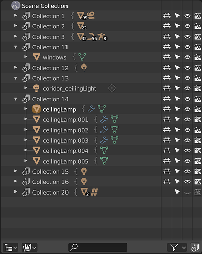
I absolutely do not understand what that is meant to illustrate.
I think it would be better to keep the discussion as simple as possible for now, without talking about the clicking behavior or new features.
I would start with a list with everything that get currently highlighted, why it is so and if there something that should be changed or added. (Just trying to avoid yesterday’s errors  )
)
Proper design decisions underlie the visual representation of the object being developed. That is why I see an urgent need to determine how the selection should work in the Outline and how it will be associated with the content of the editors. In addition, you must determine which of the visual states presented by Outliner are indisputably necessary and which can go away. It turns out that I either do not know enough about it or the Outliner’s way of functioning is flawed to the point where its use frustrates.
In my opinion, the selection in the Outline should be absolutely reflected in the editors and vice versa.
Yes - many users have suggested this, and I tend to agree. The fact that selections can be different in the viewport vs Outliner is madly confusing. Esp because selecting things in the Outliner does set the selection in the viewport, just not the other way around.
The other thing we should do, is make it so selecting a datablock in the Outliner sets the correct context in the Properties. If you select Lamp data in the Outliner, the Lamp data tab should be enabled in Properties
this is what I imagine, obviously done much better and well studied of this fast draft that I did
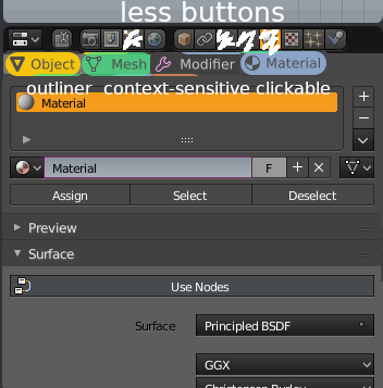
I can’t see the point of that. It’s literally just the same tabs already in the Properties header.
at the moment is currently it’s just a visual list, they’re not buttons.
the purpose of this proposal is above all to make the list of buttons properties shorter
so it is not forced every time to enlarge the interface to see them all
moreover, the list-contex outiliner is dynamic and obviously linked to the outliner itself and to the object on which it is assumed that it is working being selected
moreover, this emerges in my mind at the moment,
the buttons and panels of the properties could become more dynamic and linked to the work context we are on … for example if we are in sculpting mode or paint mode you would see properties regarding this working mode
divided into several tabs and not all listed in one tab as it is currently
sorry if I make this list of possible changes here, but I’m afraid that if they are not written they are lost in nothing
Let’s keep this on topic: color coded icons.
This type of context sensitive relantionship between the outliner and the properties editor is something I’ve been dreaming of since forever. So yeah, +1000 to that workflow.
Will we see anything of that approach in 2.8, or will it be taken care of in a later release?
It’s actually more complicated than it sounds. Users may have several Properties Editors open at a time. How would Blender determine which one gets affected when you pick datablocks in the Outliner? You would think it would be the one just below the Outliner, but in Blender you can subdivide the screen however you want.
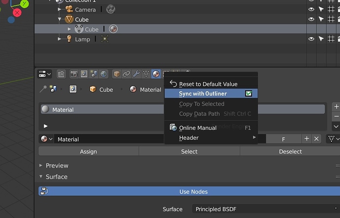
A toggle “sync with Outliner” will do the job.
I was going to write an improved pinning system but I think it’s the same thing
I find the vertical better and easier on the eyes. The mockups shows to much attention goes to the group or the curly brackets. Perhaps softer tone or color would be better. But why not drop the last one, 2 is taking more space than one. And use a single curly brackets also shows its a collection of something. You see this done in many design items. They use curly brackets to show a group or a gathering of objects or items. I think that will look great in a soft grey tint.
See quick adjustment
This would do the job! A user who is experienced enough to change the layout for any special needs, should understand the concept of using a toggle to “sync with Outliner” .
It could be a RMB option of each icon in the properties manager, or a RMB option for a full properties manager.
Toggle for each icon (RMB) would be handy, because you could set up a single properties manager to have a switching behavior when clicking on materials in the outliner, and at the same time to have a non switching behavior when (accidentally) clicking on a modifier or something else in the outliner.
That solution is not unreasonable IMO. I wouldn’t have it as an always-visible toggle, but in the contextual menu like that it could work I think.
Does Blender use a common font for GUI? I’d like to recreate the look in Inkscape to bring my mockups’ appearance to the original as much as possible.
If so - is the font avaliabme for download?
This is a major issue for new users of blender. I know it was for me. Even now after using Blender on many projects, I don’t see a need to have a separate selection for the outliner and 3d view.
I assume we came to a conclusion, that separate selection in editors and Outliner will go away. My sketches will from now on illustrate the state in which the object selected in Outliner will be selected in the editor and vice versa. In this context, we will deal with the postulated state “selected” = “editable / under editing”. We can distinguish two states: “selected and editable” and “edited (activated appropriated edition mode)”.
And now more pictures of Candy Crusch Outliner!
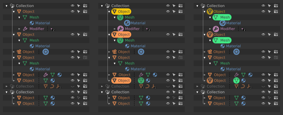
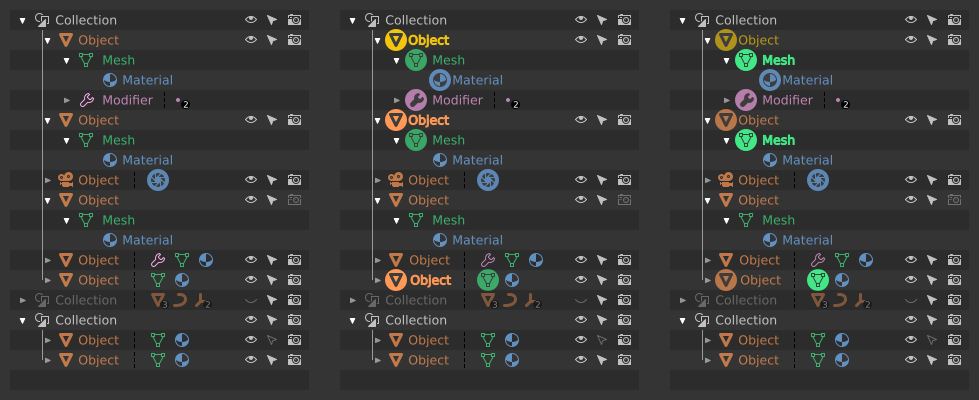
From the left: nothing selected, Object mode, Mesh ObData in Edit mode.
I made many iterations with different visual accents, but with only three of them I was pleased enough to share them:
A - the clearly underlined edition modes dominate over the other marked blocks of data:
B - edition modes less prominent, but it’s still my favourite one:
C - kinda like ver. B, but edition modes are more extragerrated but somehow messy:
Mind that on all sketches Modifier and Material blocks are highlighted only for the Active Object. It’s like that, because I can not imagine editing of different Materials / Modifiers / Constraints, at the same time.
After synchronizing the Properties Editor with the Outliner, it should be possible to automatically switch to the Properties Editor tab corresponding to the clicked Modifier / Material / Object / other data. Clicking on Modifier or Material assigned to another Object, should change this Object to Active, highlight all materials assigned to it: modifiers, constraints and so on and finally open the appropriate Properties Editor tab.
Same thing with ObData - taping Mesh ObData block should mark its Object as Active. Double click should do the same and then enter Edit mode. Double clicking on a ObData shall work with multiple Objects selected as well. Klicking more ObData with Shift-key should add them to current Edit mode session.
