There are many more.
With an Object selected, one can double click on its ObData and Blender triggers the Edit mode (in 3D View!). Then it’s possible to add to the current Edit mode session or remove others Objects ObDatas by clicking them in Outliner. But after a user is back to the Object mode, it’s impossible to enter the Edit mode with other ObData just by clicking them in Outliner. One has to select Object in 3D View first, then double click its ObData in Outliner. Or better hit the Tab  Totaly counter intuitive.
It’s a topic for another conversation though.
Exactly! It is absolutely counter intuitive. Should this be adressed? Can we make a proposal or something? Or is everybody fine with the current behavior?!
I’m not. Overcomplication and lack of intuitive usage patterns- to me this is main reason to not use Outliner at all.
Yes, that’s what I thought at the beginning, then at some point I completely lost the thread. 
Using an app should be straightforward and intuitive on a basic level. Steve Jobs knew that well and that’s why his products were so good.
Outliner is just a part of Blender and deffinitely doesn’t have to present all information of what happens with a data block at the moment. To get complete info of what’s up, a user has to pair it with 3D View or other editor. It’s like an analogue library catalogue - it collects and shows some info about library’s content - what’s a book’s title, who wrote it, where to find it. But to get more detailed info, You shall go to librarians desk, he/she’ll present You more details - is the book loaned, how many people had it read, what colour is it…
Number of information within Outliner is limited and it must stay like this. You click a data block and You instantly edit it in another part of the app - in an Editor. The very Editor clearly shows the mode. No need to reflect it in Outliner. Moreover, adding things to selection in Outliner, must add the selected data to current mode in Editor. Selected=edited. ObData has just two states form Outliner’s point ov view - it’s edited or not edited. Oject data block is editable always when selected, but can be active at the same time or not. For time being most editors affects only Active Object, but after MultiObject editing will be completed, things will change and I propose renaming the Active Object to Last Selected.
my usual 2 cents …
I take this opportunity to point out that this area is a very useless waste of space that could be revisited in a better way
That’s how I imagine what @billrey states for:
-
Nothing selected
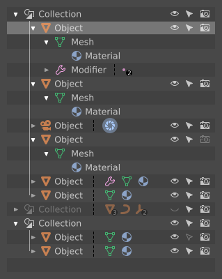
-
One of Objects is chosen. It’s Active and in Object Mode/Sculpt Mode/ Whatever Paint Mode. Generally speaking in every mode with exception for Edit Mode. All bined data blocks are highlighted as well, but their look shows, that they’re not under edition now.
I don’t really know what should Material look like, since it has no edition mode at all, but currently Outliner higlights the material bined to Actove Object, do did I.
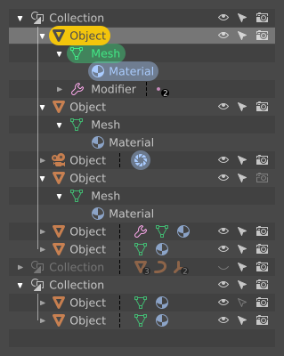
-
The same with multiple Object selected.
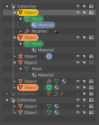
-
Mesh ObData is double clicked - Edit Mode triggers.
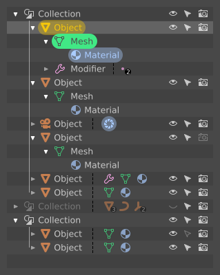
-
The same with multiple Object selected.
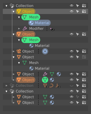
Have a couple of remarks about Material Data - does it have a corresponding edition mode? No idoesn’t but it can have one. Double clickingin could throw a User into Shader Editor. Bam, and highlight style changes the way it does with Mesh ObData Edit Mode. Besides - how will it handle Multi Object editing?
candy crush Outliner?..
Something like that could work, I think. Question: why is the first Object highlighted when it’s not selected?
How so? In what way could it be better?
So, highlithing a row in Outliner is impossible without selecting a data?
I thought that those are separate things - data blocks and outliner rows. Maybe that’s the reason for our misunderstanding?
If so, could one of states go away, like in my previous mockups, with the row higlighting corrected?
I’m not completely sure what you are saying. Datablocks and Outliner rows? All the rows in the Outliner are datablocks 
You seem to have two types of highlighting, and I don’t understand exactly what is going on there.
The whole thing with selecting and highlightning in Outliner is confusing as hell. At least for me, which isn’t a good thing, since I’m ought to propose You a hint of a design of colour and icon use.Things are higlighted in an unpredictable way. Higlights in Outliner does not have reflection in 3D View and vice versa. Total mess it was and it still is. I tried to sum up its actions, but I gave up for the reason of so many combinations possible. The whole thing is functional grotesque in my eyes.
For instance - clicking on rows in Outliner adds Objects to selection in 3D View. Then I can use A-key shortcut in 3D View - all Objects are selected in 3D, in Outliner icons are highlighted, but no row is selected. After deselection in 3D View (double A-key), I go to Outliner and tap A-key - all rows are highlighted, but no Object is selected in 3D View. But when I click a row in Outliner, the very row is highlighted, Objetc’s icon in Outliner gets highlighted and the object in 3D is selected. Clicking on an object in 3D View highlights proper Object’s icon in Outliner but not the row, moreover previously highlighted rows stay unafected. No consequence. No sense.
I’m totally confused…
You’re also lost, even though all I’ve done is a simple reproduction of the snaphot of a real Outliner but with different visual style/accents. Looks like my previous mockups were somehow valid. This one is too:
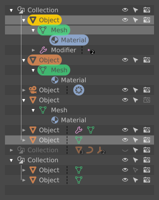
It shows a common situation - a state of Outliner, that I can easily recreate. Here’s the proof, a screenie:
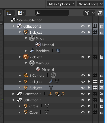
Both - my mockup and the screenshot - depict real state of Blender’s Outliner, but it seems that nobody understands what’s happening there, and why things are highlighted. It means that the design is broken from scratch.
I give up - can’t work on a thing that I don’t understand. Unfortunately I have neither free time nor free resources to dig into it as deep as it deserves - simple colour coding won’t fix it.
I don’t like those colored sprinkles. Would it be possible to just highlight the text and icon without that color capsule?
Out of interest, what use case does have selecting in outliner but not objects themselves in the 3d view? I only do modeling, scriptong and a bit of texturing/shading - so I might not be familiar with all the other areas of blender.
Well, I’m confused too - this has been a very confusing exchange.  It seems that when we were talking about the ‘selected’ state earlier, you meant something else? I thought selected meant that, well, something was selected in the Outliner?
I agree that these latest version are too much like a Christmas tree. It’s not necessary for it to be that visually complex.
AFAIK we have these states in the Outliner:
- Unselected
- Selected in Outliner
- Selected in Viewport
- Editing
It’s always been confusing that selections in the Outliner and Viewport are not always the same. There are arguments for keeping them separate, but I’m not sure if it’s really necessary. If they were combined, it would be so much simpler.
I throw down two tips that come to my mind at the moment …
creating a list more compact and clickable, making sure that you access the various panels from that list, so doing some property buttons could be removed by making the list shorter since the panels are accessible all the way down just below …
I know it would take a well-reasoned image that demonstrates better what I mean … but I hope that at the general level makes the idea
I am not sure what you mean.
Do you mean that the Properties should be more context-sensitive to what you select in the Outliner?
it should be reasoned and studied well
but roughly yes, when an object is selected
you have the clickable list of the various properties of the object from the properties of the geometry to the modifiers to the properties of the materials etc …

