First off, i didnt read through the thread yet, but the mockups posted here look awefull, sorry.
Looks like Las Vegas at night, its wayyyyy too noisy.
1 Like
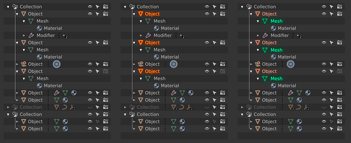
Other fast mockup
I forgot to highlight with another color tone the active object, but I think you can understand the idea
I think it’s more elegant than using circles that dirty the visibility.
Unselected | object mode selected | edit mode
2 Likes
I agree with You about the cleariness, but ther’re many situations, when only an aicon is visible, with no text - I tried simple making it just lighter and didn’t find it sufficeint enough (No 1).
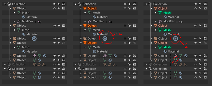
Besides No2 doesn’t follow the rule.
The Las Vegas effect gbothers me as well. It’s kinda ugly, I must confess. -We’re still in progress! It looks like some more research has to be done.
Even if it’s just an icon it’s quite saturated with respect to the rest and it is most luminosity I think it could work, anyway that would be almost an exception, it would happen very few times.
1 Like
It’s not an exception - in heavy loaded scenes You muyst be able to spot at a glance, that an ObData is selected, even if it’s inside collapsed Collection.
In any case with so many colored circles I don’t distinguish anything at a glance, the other way is most clear. Difficult to distinguish between a round icon and a selected icon
1 Like
Anyway wait untill tomorrow - now I can’t work on this, but I deffinitely will take Your ideas into consideration.
2 Likes
I’m not sure if could do something, but is more elegant and subtle like that. Like the typical corners of a boundinbox. Is another idea.

2 Likes
I think a mixture is the way to go - round 100% opaque backdrop under actually edited data and 100% opaque saturaded icons with bold coloured text for the rest of selected items. Backdrops can be remarkable and easy to spot highlight of the most important data blocks, until you overdo it with the amount, as I did.
Something like this (I devoted my coffee break to make those mockups):
A - the candy is crushed a bit now
B - less colour (grey text)
C - selected but not edited data blocks have icons slightly scaled up, to make them more prominent. A mixture of A and biggers icons form C is acceptable as well
P.S. @billrey You liked the post before I uploaded the mockups. Hope the heart icon is still valid…
1 Like
On a side note, maybe we could also think how to better highlight the active camera, right now it doesn’t make much sense, for what gets currently highlighted is the camera data, that can though be shared with multiple camera objects.
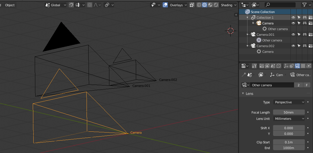
Maybe Zebus’ “parenthesis” idea or something similar could be used for this.
While the outliner and its selection system could use a big overhaul, all I have time for in 2.8 is to make sure the icons work at least as well as before. A bigger refactor is not going to happen soon unless a volunteer steps up to do it.
2 Likes
Is an individual icon local scaling possible?
@brecht
Current Outliner focuses on presenting colored icons, so finding specific data is quite easy, but finding objects in the editing and general way of underlining the objects selected in 3D View is tragically bad.
I am trying to improve these gaps, but you have to realize that with the amount of data and describing the properties that the Outliner needs to display, taking into account the different colors for different blocks of data, designing a clear interface will always be somehow reminiscent of a Christmas tree or Las Vegas lights .
All my sketches, regardless of whether they are good or plain ugly, fit in the way the Outliner works now. The difference is all about removing the additional backlight of the rows, indicating that a row is selected. No need to remove it now from the code…
Every mockup can be implemented now without the need for refactor of the way that Outliner is working.
The colors are debatable but they are secondary and it will be best to choose them on a working prototype.
Personally I’d go this way, If only individual icon local scaling was possible:
I understand there are simpler changes that can be done to improve the outliner. But we are focused now on finishing 2.8 and it’s unlikely there will be time to work on this in the next few months. I just wanted to clarify that I do not consider this part of the basic color coding that I’m adding.
4 Likes
Could You share, what route You’ve chosen? Or exactly what help You need now?
It may save all of us some time for other acivities 
It’s just like the screenshot I posted above, with the colors configurable as part of the theme. I’m not looking for help with this at the moment, it’s a simple change.
2 Likes
BTW it would make things clearer, if backdrop cirlces were more solid, then selection would be more prominent agains the rest of Outliner’s content. Moreover circles should be a tad (1~2 pixels) bigger, otherwise, the icons will overwrite the circles or even obscure them, denying the idea of backdrops.
Anyway I am waiting excited for the results of your work!
The only thing I see at a quick glance with that outliner is this:
I think something simpler like this might work better:
That’ why my very first mockup had uncoloured icons. I still don’t like colours for every icons. Will share my *.svg tomorrow to help you, guys, making tests and proper mockups. Now I’m in qite remote place, far from the computer.
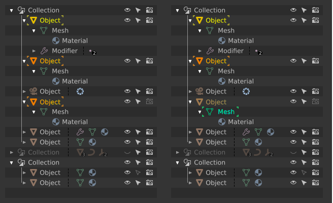
P.S. @zebus3d Your second sketch doesn’t exagerrate selected but not edited items at all. This is particularly evident in the case of data blocks in collapsed branches. Two states must be clearly visible and distinguishable at first glance against the rest of content: selected data vs data in edition.
I promised, I share: LINK.
All layouts depict the actual layout of Outliner. In mockups, please repeat the layout faithfully.
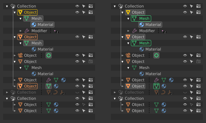
WARNING - I just spotted a bug! Camera ObData icon should be green, not blue.
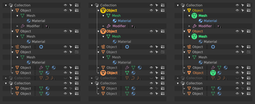
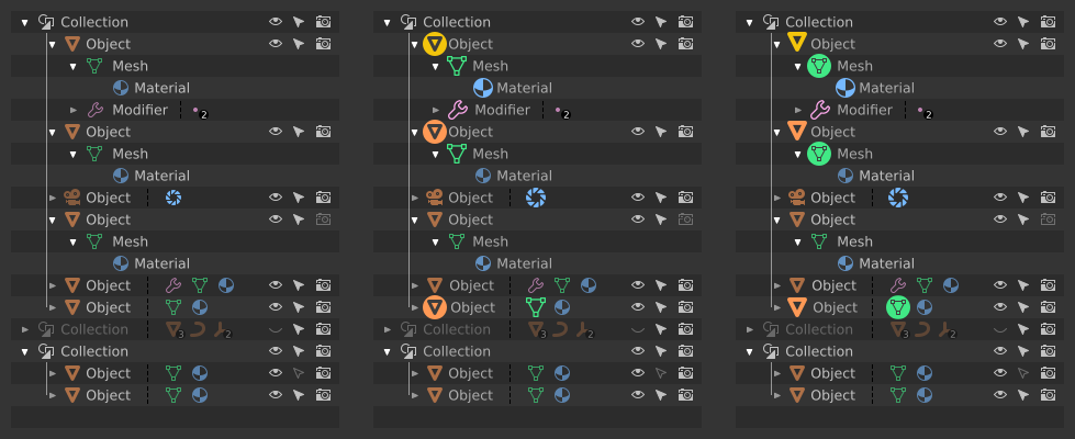
Meanwhile another shot. As usual - Object mode on the left, Edit mode on the right:
7 Likes