I for one was very annoyed with the new GIMP monochromatic look, suddenly everything looked the same and I literally spent seconds looking for a tool that previously was spotted in the first second at most. Sometimes I resorted hovering over icons to get what they represent…
Photoshop has the liberty of using monochromatic because what the icons show is very straightforward apart from like 3. I also think that if they introduced colored icons a lot of people might start using them. I definitely would like that.
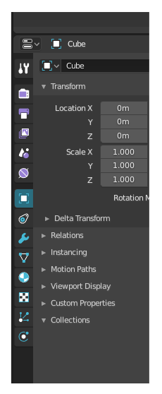
I still like the monochromatic look visually though and it’s hard to color flat icons (tried) so what I proposed for Blender UI (especially the properties editor) above about a month ago is my approach to solve this issue…
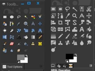
Here you can compare Gimp colored vs monochromatic. I think though that if icons were grouped together somehow it could improve. However monochromatic really suffers when there’s a 6x6 grid of different stuff.
IMHO, Gimp is quite a funny study case because the colored icons have a quite poor shape clarity, as well as a noisy, flourished color scheme. Individually, they look very nice, but stacked together it’s just noisy to read.
While the flat icons have a really nice shape clarity, but no color at all, which makes it slightly better, but it could be even better IMHO.
I felt the same with blender’s flat icons. Just the addition of colors to some icons groups made them more readable. Doing some color constrast inside the icons is also a nice way to improve the readability IMHO, like in the tools bar.
I also felt that some color distinctions like this one below are a quite smart way to go further:
Summary
But yeah, it’s a question of balance, as always. Am I repeating the discussion here? x)
Imagine if Adobe started to add colors everywhere in their tools, people would complain because they are simply not used to it.
Reality is that you get used to these changes pretty quickly. it feels frustrating at first, but then it just becomes natural.
Not saying that I’m a particular fan of the actual icons because I belive that some needs at least one extra color, but the UI looks way cleaner than before.
Actually would be amazing to be able to customize your icons, maybe implementing a system that allows you to do it without much of an hassle would be kinda awesome.
GIMP does manage its icons in themes, though. If the classic theme would still be available as an option I would see no problem. Unfortunately it is currently incomplete in regards to new functionality in 2.8.
Why the debate between bw/colored icons cannot be solved by introduction of a slider in preferences which could change the saturation of the icons? don’t like colors - drag slider to the left, or drag to the right if you want those icons to become colored. Problem solved! no need to redraw anything.
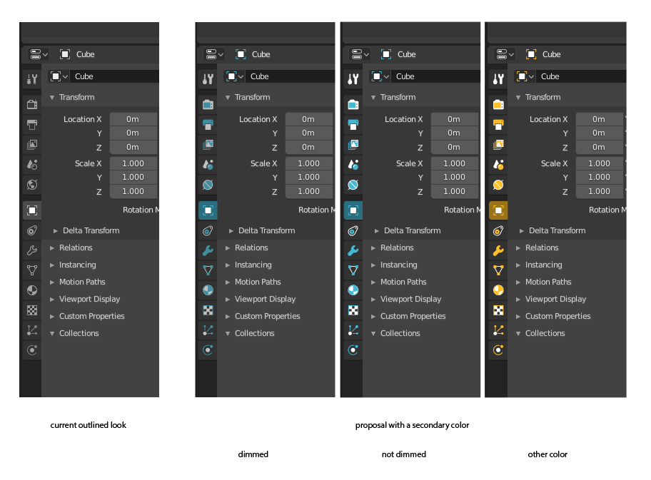
I follow the icon topic for months now and when we talked about color I always thought white plus a secondary color. If I remember correctly Pitiwazou wrote about the same thing then. 1+1 color everywhere.
So I’m super surprised that I haven’t ever seen that as a solution here. If I missed it sorry, but I can’t wait more and I still would like to propose it:
This is it. More fills - mostly with the secondary color, easy theming, and - oh God - so much easier readability.
Instead of searching for line-line-line-line-line with this I could search for the blue sphere or the blue diagonal line etc.
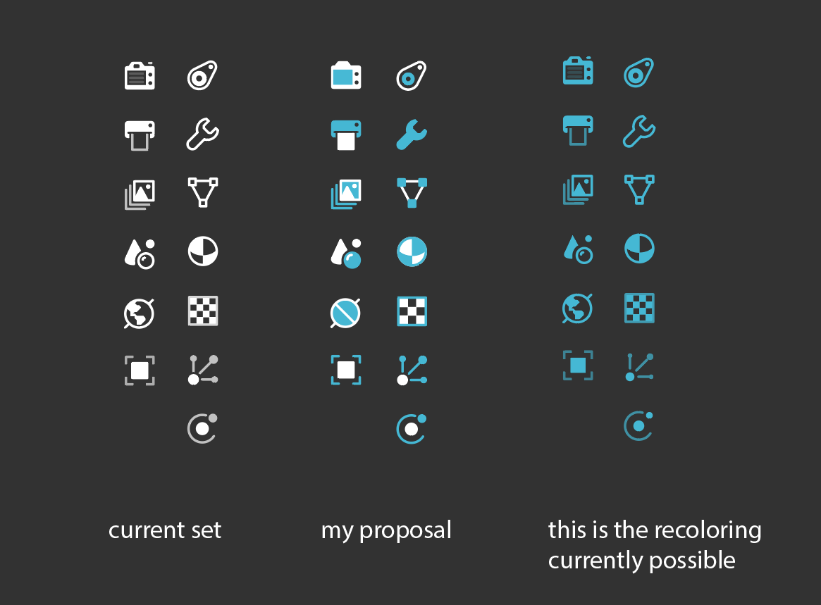
I changed 3 icons (back) - I don’t like the details of the current world icon (and in blue I don’t miss it) and I think the texture icon’s squares are too small. Also I simplified the tool properties icon a bit. Oh, and removed the shutter of the camera icon.
(as an additional note: particle and physics icons look a million times better and fun with this little color splash)
If it’s doable I’m gladly contributing with editing the original svg to include a colorable layer.
Those bi-colour icons look awesome. They should be (colour)grouped by category though, otherwise they are discoverable just as much as the monocolour ones are.
Something more like this (quick photoshop hue and saturation job):
I do agree with the other designers here in that I wouldn’t like to have a carnival of colors there.
If you compare the monocolor with the bi-color though you’ll see that your eyes do have an easier way to stop at certain landmark icons.
The World, the Object and the Modifiers being the key ones.
The way I always navigated in 2.79 properties is searching for these landmarks unconsciously. I reeeally didn’t need any additional color. Just good discoverability of a few key ones. With my proposal you got that back with the added benefit of a theme-able coherent look.
I understand the sub-categories you colored - as with the line beside the icon proposal - but I think it’s too much. It doesn’t help enough to justify the rainbowness.
If anything I’d only color-differentiate the big different categories - but I don’t see the need for that either.
I know you are of a different opinion but bi-coloring with same color helps really just a tiny tiny bit. When everything has the same new information it’s not really relevant information. While I agree that since some shapes are colored fully and some are not which makes a slight difference it’s really not much better than mono-color.
It’s not a carnival of colors anymore if the groups share the same colors they have in the Outliner for example.
There’s a difference between having Scene and World both blue as opposed to coloring the Scene blue red yellow and coloring the World green blue as the earth for example… The first is color coded the second is rainbow encoded.
Bi-color icons with the same color only help them stand out against the UI but not among other icons. You can achieve the same thing by making them other color than white.
I have to disagree with this wholeheartedly. The whole point of this is that you don’t choose from lineart-lineart-lineart but different 2 colored shapes which have different proportions compared to each other.
Your brain can remember those shapes better because of the bigger flat surfaces. There are actual surfaces to remember.
Recoloring them to one color gives no advantage - only the disadvantage of lessening contrast against the BG color
if enough people like it and the devs feel the same I can update jendrzych’s svg in the Christmas break to have 2 colorable layers in it. Just tell me the proper way to set it up.
I’m quite with you on this. Maybe two colors are enough. But for the sake of a more immediate categorization I’d take into consideration @Harleya idea which is a simple thin line dividing, so grouping, tabs:
Well if you put them in a box like that then sure. But if your UI i monochrome and the text is white, making the icons different color can help them to stand out: