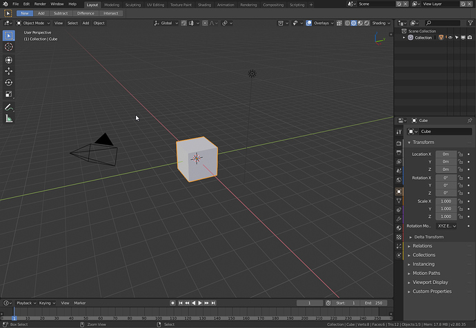
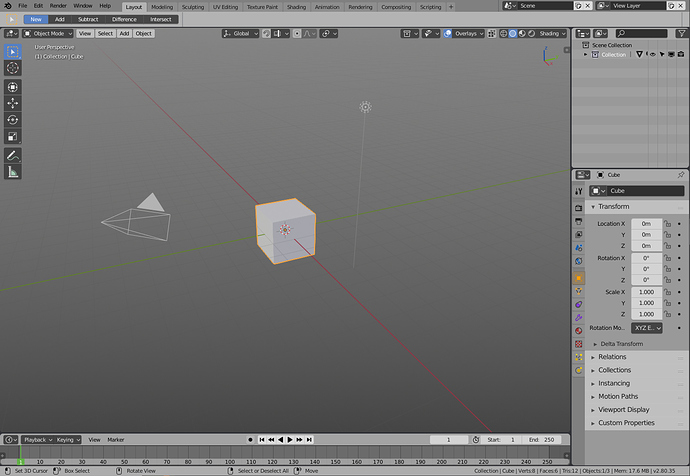
Well I think both options can be integrated and the ribbon one fairly easily I presume.
As for the icons you could also have 3 different areas of the icon mappable to different color all through Themes in User Preferences.
So you can map 2 of those to white and one to orange for example. Or 1 to white and 2 to orange for different icon or you can map one entirely in one color with setting all 3 to orange.
There needs to be careful thought put into this approach though to make it useful. I presume the icons would be saved as multiple svgs each containing one layer or maybe somehow in RGB bitmap mask format? Not sure about the technical standpoint here.
But for me the ribbon approach will always be useful enough with pinpointing the location of the correct icon and also looks more classy when compared to extensive coloring of the icons themselves. It could simply be turned on with a checkbox in Theme settings that moves icons 1px to the left + adds 2px vertical ribbon on the right with color set according to the user in Themes. For me it would follow the coloring I would choose in the Outliner.
Dark Theme:
Colored Ribbons
Colored Icons
Light Theme:
Colored Ribbons
Colored Icons


