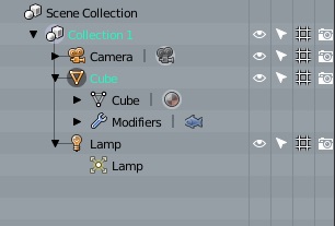
If you exclude brushes and collections, there are five colors. Collections can, like in Brechts image, stay white.
Brushes don’t need color coding I don’t think.
1 Like
I think we can use green - it’s a different context here. Red maybe not, but orange I think is ok.
color icons based on context … I love this choice
I understand the need for modernity with the flat effect, but I admit that as soon as I used the latest builds with the new flat icons, I immediately missed that “golden and somewhat metallic and comic” effect of the old icons
I immediately became nostalgic 
1 Like
Hi.
Other times that topic icon colors have been discussed, people with difficulty to distinguishing colors such as colorblinds have been mentioned. I have no idea exactly how those conditions work, but I only mention this in case it is possible to choose color combinations that also satisfy those people.
Anyway, I understand that color code is going to be a Theme option, so maybe a whole better color combination could be created for those people later on.
That could be great, but as there are several types of color blindness it’s hard to have one set of colors for everyone. I don’t know if it would difficult to have something like in new video games that are shipping with color presets for colorblind people, maybe we could have presets only for icon colors ? But it’s maybe over the top haha
edit : could be an addon maybe
Exactly. It’s one of the nice things about this being a theme option. Various types of color blindness can be accounted for by adjusting the theme.
1 Like
I know it’s marginal, but in the bright backgrounds, currently the lack of black contours to the icons gets this effect … and I’m picky but I do not like being forced to use black icons ![]()
Specifying readable icon colours will now be a theme setting, and so part of the theme itself. It’s up to whoever creates a theme to make sure that icons are easily visible by picking colours with enough contrast.
I will be silenced to make other comments on the icons until the next level of more solid development
as much as I wanted to point out I have already highlighted it
Somewhere in between, a quick code hack to see what it would look like. I’m working on a proper implementation
It seems like a good idea to use more saturated colors and text colors to indicate selection and active object, but that would be done after we get the coloring to a good enough level to commit the new icons.
3 Likes
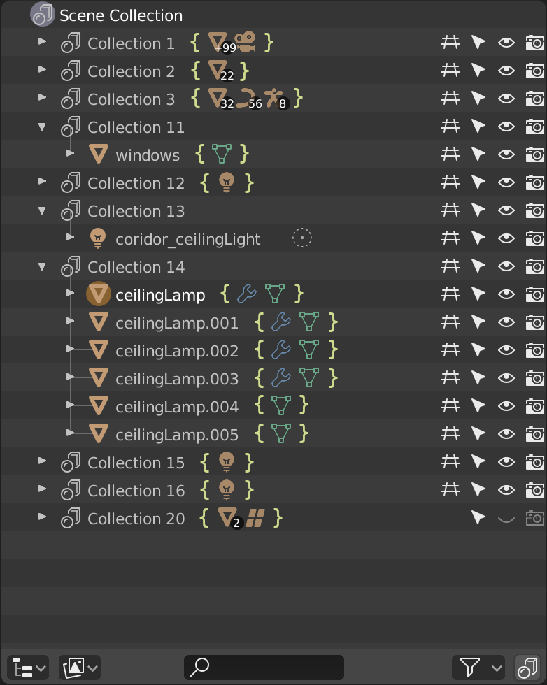
I think the use of Curly Braces might be a better clue than the “|” character for people to guess what that collapsed item means, they have things inside. It’s just a mockup test (use Brecht’s capture as base image).
What do you guys think?
1 Like
Nice and solid design ! i agree with most of your ideas but understand the need for color,maybe something very subtle.
Im affraid that those bars (especially the culy ones) add unnecessary visual noise with no purpose, since arrows on the left sufficiently indicates if the stack is expanded or collapsed.
1 Like
Maybe because of the color?, something more tenuous will attract less attention, is that I think it is more clarifying those signs than a vertical bar, but it can be that it is killing flies with cannon shots.
The idea of using braces isnt bad, it feels kinda good visually. But I think the shape is too busy and the color is too bright.
Try simple brackets [ ] and a more subtle color!
2 Likes
Well - sorry to say so, but I find it as a problem that doesn’t really exist. We should focus on reducing additional
info rather than adding new decorators. Outliner is overloaded with information right now.
I’m trying hard to figure out how to manage all the necessary information in pleasant yet efficient and unobrtusive way. Not an easy task.
@brecht or @billrey - is it possible to get the font Blender uses in Outliner? I’d like to make some mockups, and it will be faster to draw them directly in Inkscape, than to paint over in Gimp.
2 Likes
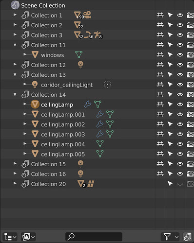
Tried to make a quick mockup and in the process I found that using nothing at all looks really clean…
4 Likes
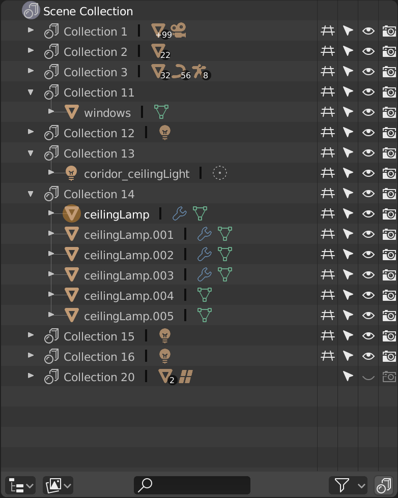
That’s the way to go! Although You should keep an eye on me, just to make sure I don’t remove too much. Colour for instance
2 Likes
Maybe some removal is a good idea, it cleans things up!

1 Like