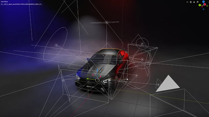
Maybe there should be a consideration for some visual distinction for different type of wire-design elements in the 3D viewport? I noticed they could look like a jumbled mess and just not look visually pleasing:
(Source)
There’s a color coding discussion for the icons, maybe color coding these widgets is a solution.
Or perhaps just visually distinguished designs in general utilizing various line thicknesses and fills. Maybe even having some of these elements dynamically changing by z-depth from camera (e.g. having lines be slightly thinner/transparent as they become further away from camera).
