@billrey Maybe instead of a view lock there could be a per-workspace option to change the MMB behaviour, switching from rotate to move?
With this you could work comfortably with a tablet both in 2d drawing and 3d environment, depending on the current task
1 Like
That could work, too. But that would mean each workspace would get it’s own customizable key presets. Not necessarily a bad idea, but potentially a lot of work…?
Yes that could be a way to do it, yes. Workspaces can AFAIK have custom keys that are overridden. We just have to be careful we don’t overuse this, because then Blender will potentially get quite confusing, if shortcuts change too much.
Grease Pencil overlays have been created but they are only visible if a Grease Pencil object is selected.
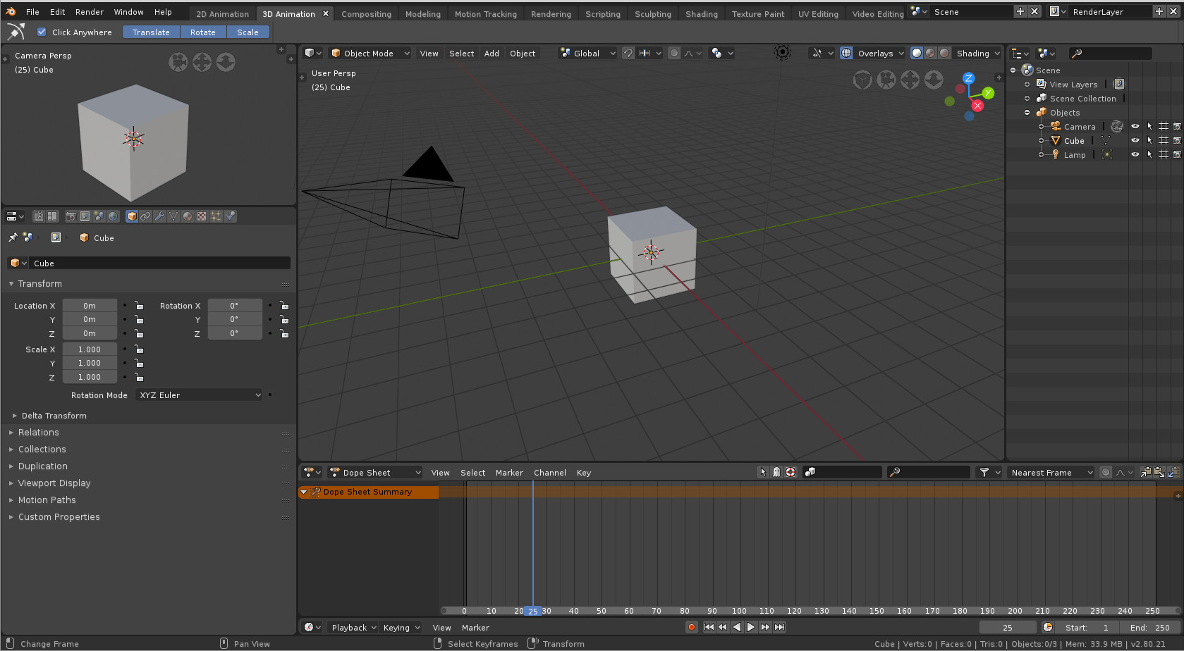
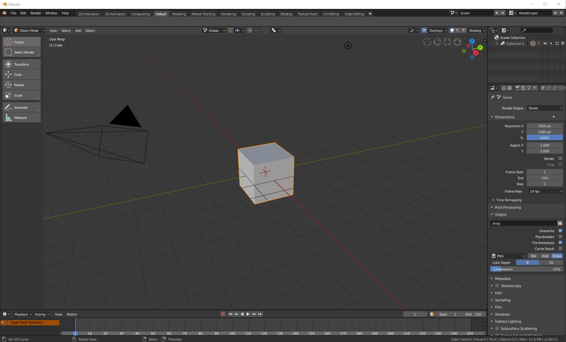
It makes me think that starting 2D animation with a default cube with one face visible, a default camera that does not correspond to default view, a 3D Lamp that has no effect on Grease Pencil objects and no Grease Pencil Object is not ideal.
A 2D animation new project should start with a completely different startup.blend.
What happened to 2.7 templates ?
Is there a way to have them back and keep a pertinent 2D workspace for a pertinent 2D startup.blend ?
I agree about Outliner but disagree about Properties.
You will just not use Object Properties, you will switch to Object Data, Modifiers, Constraints tabs for meshes and Object Data, Bone Tabs for armatures.
You can solve that by moving Properties under Camera View.
Toolbar with nodes categories is pretty common in applications using nodes.
Because it is intuitive. You just pick a node from a visible region.
You don’t have to know in what menu and submenu the node is.
A problem is that focus is not appropriate. Categories are not readable.
Properties are really useful to set performance options and edit nodegroups sockets.
Outliner is also needed to set collections inclusion/exclusion of a View Layer.
Backdrop is enabled by default but a viewer node is needed to make it work.
Modifiers are used a lot by meshes.
But for other types of objects, also used for modeling, Curves, Surfaces, Metaballs, Text, Empties Image for reference; first properties, you will edit are Object Data.
Yes. One should be set to Render. But another one, to modify properties of objects, lamps or world of rendered scene is not superfluous.
It is not true. you are using modifiers : Multiresolution, Decimate, Remesh …
Yes, no need to display objects that are not rendered or does not have an impact on shading.
The Workspaces are different from the default scene setup. You can’t have different objects for different Workspaces, because the idea is that you’ll be switching between the various Workspaces as you create your project.
You are thinking about application Templates, which makes it possible to make a version of Blender that is wholly different from the default version in more fundamental ways.
As for your arguments in favour of often having many Properties open, remember that you can still switch the Properties tabs while using that Workspace. Yes, there might be certain situations where you might sometimes need to access other Properties sections, but if we were to accommodate all those corner cases in each Workspace, we’d have no space left for the Viewport.
The Sculpting Workspace is a good example here. We really want to optimise for having as large a viewport as possible. In most Sculpting situations, people don’t use multires, and even if you do, you don’t need an entire bar with the full height of the screen to change its settings. We could subdivide the current Properties area in the Workspace and easily have enough space to fit both Tool Settings and Modifiers.
In order to accentuate that they should not be arranged by alphabetical order but by shared interest.
For example, Modeling and Sculpting workspace should be next to each other.
I propose to arrange them as is :
2D animation | 3D animation | Scripting | Modeling | Sculpting | UV Editing | Texture Painting | Shading | Rendering | Compositing | VideoEditing | Motion Tracking
I know that is not possible to display a different scene in a different workspace without creating another main window.
To be precise, I was thinking of having templates like in 2.79 or master.
It would be possible to restore a sub-menu Application Templates under File or Edit menu that would launch a template startup.blend file with different workspaces and to suppress 2D animation workspace from default startup file.
Default startup.blend file could contain less workspaces removing motion tracking and video editing ones, too. And specialized templates could contain more than one workspace.
And the purpose would be to show that user is not forced to keep all workspaces that he will not use.
To sum-up, yes, I am talking about application templates because it could have an impact on Workspaces choosen for default blend file.
And that will solve the fact that 2D animation workspace is not immediately useable with default scene.
But we could solve that in another way.
Default startup.blend file could contain a scene for 2D animation with a Grease Pencil object, a camera aligned to drawing plane and a viewport in Camera View.
That remark was just about 2 workspaces and not a suggestion to generalize that.
It was for Rendering and Sculpting workspaces.
For the first one, to go back and forth between Render Tab, World Tab, Lamp data Tab, View Layer tab, Scene Tab to set-up indirect lighting, exposure, color management, passes are not a corner case.
It is just a fact that when you start to modify a setting for rendering, it implies to modify a lot more.
User will probably also switch one of these Properties to Outliner from time to time.
Maybe you are also talking about Compositing.
I am not against closing Toolbar in Compositing editor.
I just think nodes are more discoverable with that than with Add menu.
But I am against closing Properties in Compositing editor.
Renaming a frame node or sockets of a nodegroup, editing properties of a node that is minimized by a focus on the whole nodetree that is very common practice.
Maybe in this workspace, Dope Sheet could take less space.
You are also forgetting that a user can maximize or minimizing a view. As a switch that is working in all cases by using a shortcut, it is more efficient than switching tabs of properties editor.
I did not just talked about multires modifier.
I quoted Remesh and Decimate than are common if you are using dyntopo.
It is also common when using dyntopo to make a boolean operation between 2 sculpted meshes.
I could have talk about skin modifier to create base shape and armature modifier to pose it.
Of course, it is often one modifier at a time and it does not need a lot of space.
But who said that the one that are taking the full height of screen should be for modifier. It should be for brushes. It is the one under outliner that should be for modifiers.
But if Modeling workspace is next to Sculpting workspace and user just have to press Ctrl Page up / Ctrl Page Down to see its modifiers, we don’t need 2 properties editor. We don’t outliner either.
I dont agree at all. The more workspaces you have, the longer the search if it isn’t ordered alphabetically. What to gain from listing the more common workspaces first? When the users wants to switch the workspace the mouse curser could be anywhere on the screen. And if i have to search for one (lets say Scultping) and its ordered alphabetically, i know its somewhere on the right side. Dont you agree?
I don’t agree at all.
And your example is not true. Half of workspaces have a name that starts by a letter from the end of alphabet. If you search for Scripting tab it is in the middle just after Rendering.
This is not a vertical list hidden during most of time blender is open, that you will pop-up occasionally.
It is something that does not exceed 12 words, scanned from left to right and that is constantly visible during the whole session.
It takes 5 seconds to scan for the first times. You will quickly memorize if used workspace is at left, center or right of topbar and quickly, it will take 2 seconds.
On the contrary, if it is organized by center of interest, you will not have to search to jump to next workspace. In most cases, it is supposed to be already next or not too far from the one you are using.
So, you just have to press Ctrl Page Up or Ctrl Page Down, once to jump from Modeling to Sculpting or Shading to Rendering, instead of cycling through 3 or 4 tabs that you are not interested in.
I am talking about using the shortcut to be fast and not bringing back the mouse pointer from center of screen.
The Workspaces are currently organised alphabetically, because there’s no ability to re-organise the workspaces tabs. This is on the todo list.
The workspaces will be organised in terms of the most common workflow, meaning something like:
Layout -> Modeling -> Sculpting -> UV Editing -> Texture Painting -> Shading -> Rendering -> Compositing -> Video Editing
I’m missing some, but you get the idea.
This gives users, especially new ones, a hint at where to start, and what to do next.
4 Likes
Hi,
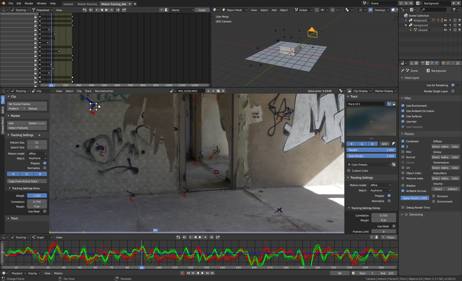
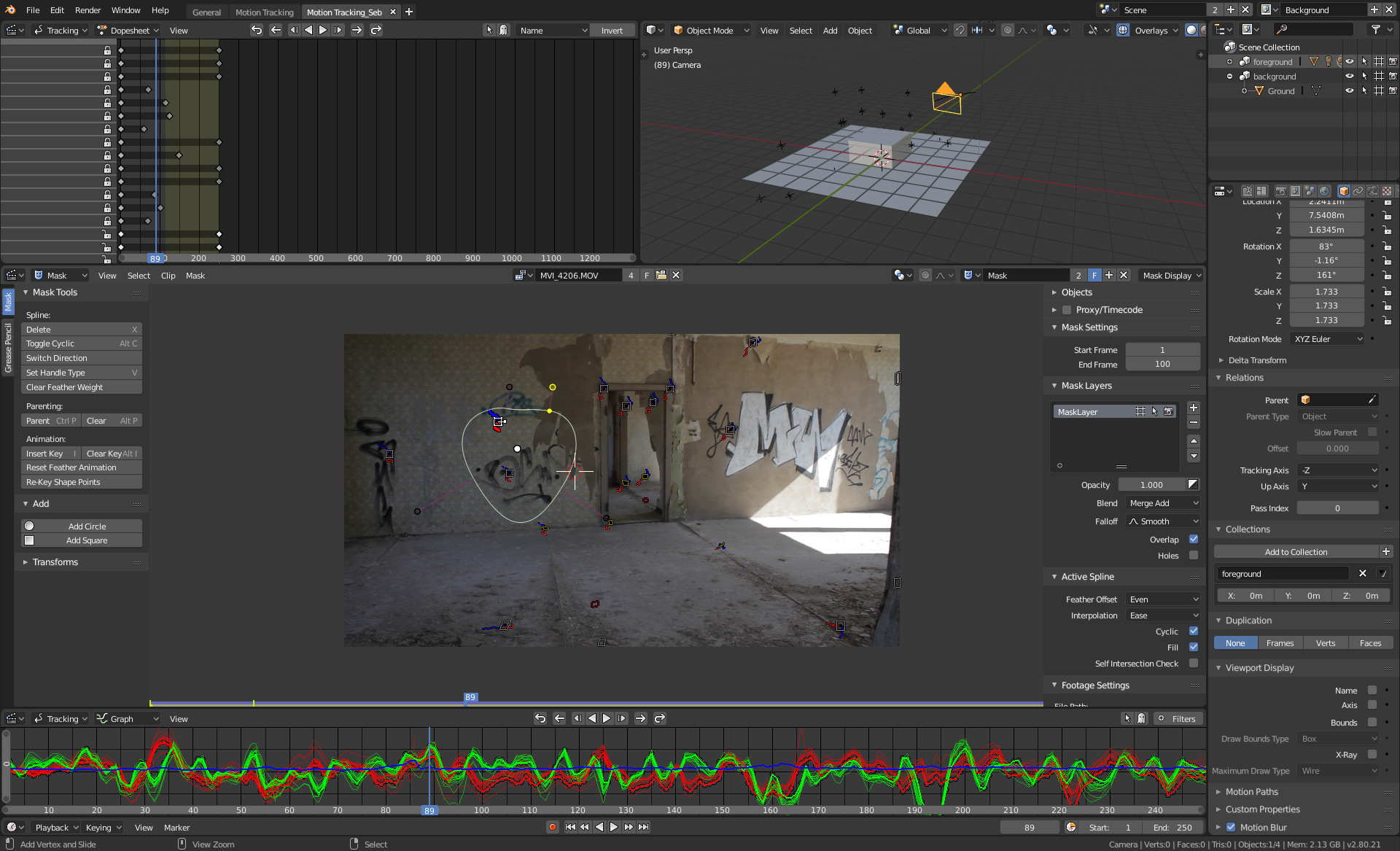
Here is my proposal for the Motion Tracking workspace.
It includes changes to space_clip.py, to make the Clip Editor UI more similar to the rest of 2.8 (the new property arrangent by using layout.use_property_split). Also, the Display options are now a popover, like in 3d Viewport.
I have moved the graph view to the bottom and put the tracking controls in the center of its header, which should make it more convenient to use than in the tracking panel (even though I have kept them there). If you are working fullscreen with the clip editor you can still use the controls from the toolshelf, or the shortcuts, or the tracking pies, which I am planning to include as well.
5 Likes
3 Likes
place this comment here because relevant directly with the workspaces …
the current menu and workspace bar has minor design flaws
1 when we move the workspaces the menus are also influenced, it would be advisable that the menus will always remain fixed and only the workspaces should be moved.
2 on the right the “+” icon should remain fixed, as the menus should not be influenced.
3 the two menus “scenes” and “render layer” are too large … you could recover some space in favor of some other workspace visibility reducing the width
7 Likes
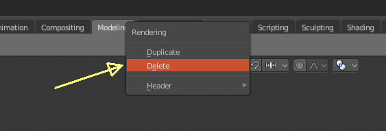
@pablovazquez Hi…
“Delete” seems to be a very strong word for that, perhaps “Close” would suit it better? Basically it just closes the tab, since it’s still available in the + button.
3 Likes
@pablovazquez Hey man! not sure which is the best way to send the workspace layout, so maybe a link here will do? Dropbox - motiontracking_workspace.blend - Simplify your life
Crossing fingers that everything is fine with that workspace. 
A few thoughts on the current 2.8 workspace. I know the timeline controls are at the bottom for consistency with the other screens, but I feel they should be close to the video-playback. When playing you’re not looking at the sequencer, but at the video-playback, so the playback functions should be close to the video-playback. Above I’ve suggested to move the timeline controls up under the video-playback - and save some horizontal space - by only giving it the width of the video-playback, however I understand the need for consistency, and therefore timeline controls must be at the bottom like the other workspaces. Just for trying it out I tried to do a workspace swaping the video and the sequencer. This is how it looks:
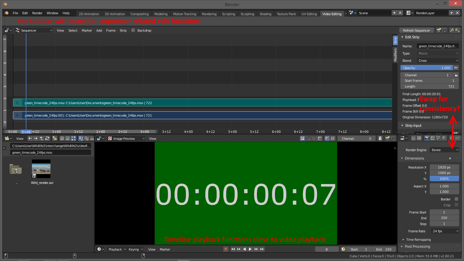
The good:
- Showing that Blender VSE is not a normal NLE

- The playback controls are close to the video-playback.
- The top toolbar may actually be useful for the VSE this way, because it could be filled with icons for vse edit functions close to the sequencer.
- The area where most of the work will be done is in the top center part of the screen like the 3D View, compositing etc.
The Bad:
- People familiar with other NLEs will think it is odd.
- The Properties are not in its usual place but could be swapped, but having the strip properties that far away from the strips would be strange.
Anyway, now I tried it out.
Another way is to add the playback controls to the Sequencer-menu-header. This way the controls would be close to the video-playback, and the timeline would not be needed at all anymore in this workspace, because many of the functions are double anyway. This is how it would look:
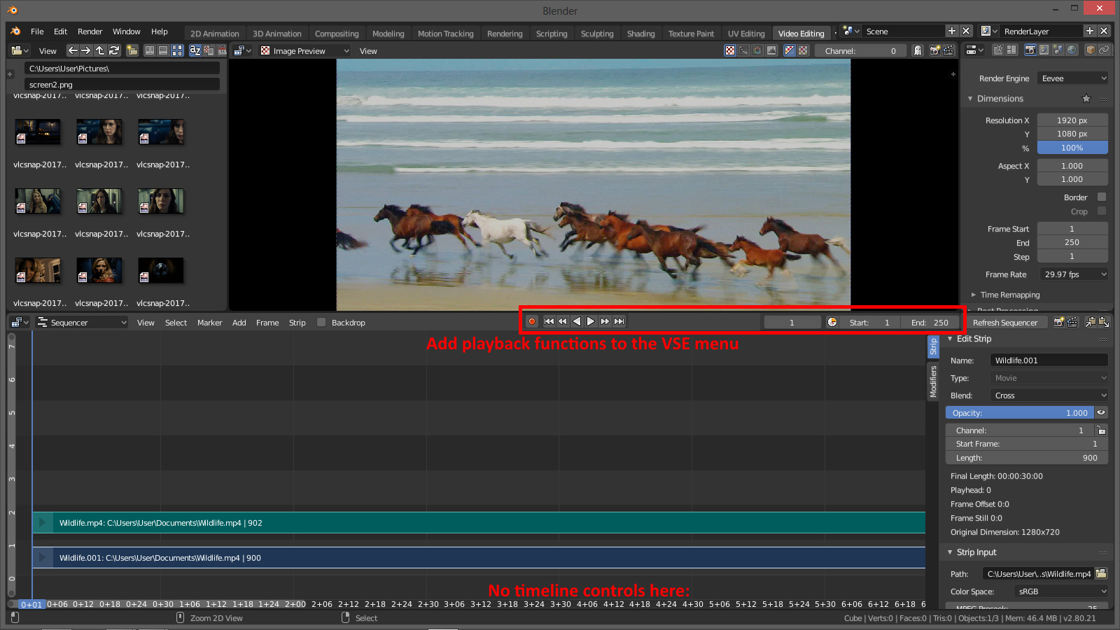
And if that breaks the consistency, the vse menu with the playback functions could be flipped to the bottom.
BTW. the F5 “Flip region” function from 2.79 is missing in 2.8, as it is now - I personally prefer to have the strip properties to the left.
1 Like
Although the timeline window does show keyframe indications, while the VSE timeline does not, so it is handy that way. I generally prefer to have the dope sheet exposed so that I can see the keyframes for the current strip but that’s only helpful if you zoom to fill the timeline with the current selection.
I post this, here for the record.
People are annoyed by order of layers (Top to Bottom) in default 2D animation workspace for Grease Pencil.
Since 2.69, there is a filtering feature made by Bastien Montagne to invert order of this list and make it a Bottom to Top list.
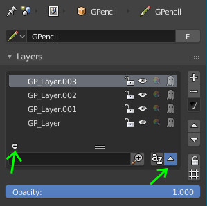
This order is used as a standard in 2D drawing software for layering.
It would be appreciated by artists used to that order to see the same order used by default for Grease Pencil Layers.
There is a little problem to solve relative to this list order.
When bottom to top filtering is enabled, addition of a new layer happens at Top of list as expected.
But arrows to move Up and Down, this layer are still relative to Top to Bottom order.
This mean that pressing Up Arrow button is moving active layer down in the list and pressing Down Arrow is moving it up.
Unfortunately, that is something that was not solved since 2.69.
1 Like
Could modeling /default workspace have timeline?
Its not in the way and you dont need to look for it when doing simulation.
Btw. Will we able customize workspace tabs like in the browser (move them for example)?
2 Likes
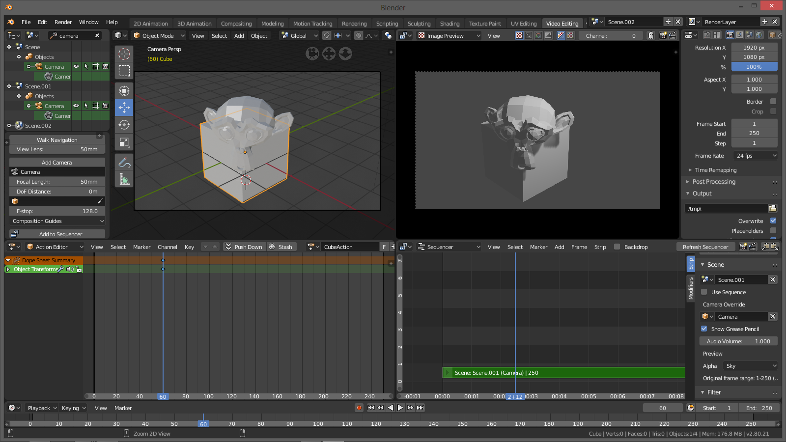
Mise-en-scène/Blocking/Shoot & Edit Workspace
Here’s a workspace for setting up, adding, selecting and animating cameras on one side and on the other side adding and editing the cameras in the sequencer. The timeline is at the bottom, though I don’t like that. ![]()
When adding new window, for example for modeling, something strange happens in outer workspaces.
All of them except scripting, sculpting and shading in new window are copy of 3D animation workspace. The S-named worlspaces copies scripting workspace.
So my question is, if I add new window in one workspace, is it mean that this window automatically adds in all outer workspaces? If it so, maybe it is need to be blank, or predefined in some way.