hehehe did not realize that it was so easy to bring out nuke and fusion in blender … 
1 Like
This is a pretty awesome configuration I think. The addition of an unobstructed viewer is nice, and so is an animation editor for changing values over time. The fact that the current Compositing Workspace has an outliner is pretty silly because it serves almost no purpose here.
IMO this is a big improvement for the Compositing Workspace.
2 Likes
Can workspace not force mode change?
^ I only need worksapce to change UI layout, no idea who decided to make it change mode type, perhaps it ok when there is one object in scene, but outside of that it’s miserable experience.
I think it was the same person who thought it would be helpful for new users to see that they can save a default mode with each workspace. It’s a pretty good idea considering most power users will want to make their own workspaces anyway.
Want to fix it?
Open Blender.
Switch to the offending workspace.
Properties Editor>Tool Settings Tab>Mode
Change it to the mode you want it in when you switch to it.
File>Save Startup File
1 Like
Except it’s not and only make confusion and more unnoticeable mistakes for new user not to mention other problems that was listed above.
Or how about making it “human” out of the box, or that no longer focus of 2.80?
Only it is because having a configurable experience for the various humans that use the software, each with their equally varied backgrounds and expectations is absolutely the focus of 2.8. It’s called Blender 101 and has been a major part of the 2.8 road map from the earliest design documents. It would be a shame if one of the major focuses of 2.8 goes unnoticed because it’s not emphasised enough. Especially since the preset work spaces can be so easilty changed. I guess my personal reaction to it has been quite the opposite of yours. I started seeing what great possibilities there were with the new configurable workspaces the first time I saw the autmatic mode switching. Maybe I had a lighter object selected the first time I switched to the modelling layout which made it less of a frustration, but wouldn’t this theoretical beginner that we’re talking about most likely also? My guess is that the default cube will still be selected the first time a new user switches to the modelling or UV tab.
I just feel like this is a unique and incredibly useful feature that should be demonstrated to users new to 2.8, Blender, or even 3d in general. Having said that, I will definitely not use any of the prepackaged Workspaces that shipped with Blender, but I’ve already started messing around with the possibilies that this feature brings to the table and can see it fitting into my startup file.
2 Likes
this is not offtopic
this concerns its own
“blender” and “the role of workspaces in the future”
only that someone still does not want to see it or is too scared for the future.
I can understand, but it is an inevitable that takes shape by its very nature,
anyone can get there by reasoning.
@pablovazquez The Color Manager (Filmic, Exposure and Gamma, etc…) should not also appear in the n panel of the rendering layaout?
I can answer why it works this way. Workspaces are not just UI layouts (ie ‘Screens’) as we had in 2.7x, they are intended to make Blender’s UI task-oriented. Switching between the various Workspaces is meant for switching tasks.
For example, if you switch to the Sculpting Workspace, but don’t see your sculpting tools, the workspace isn’t doing much to help you. You haven’t really changed your task - in fact it will then always be slower than just switching into Sculpt mode, because what is now a one-step action would become a two step setup to first switch to the Sculpting Workspace and then switch modes.
That said, all this can be customized, so you can set up your own workspaces however you like.
2 Likes
Yes you are right. But Modeling and UVEditing Workspaces need to be in Object Mode, Always in Object mode.
For Modeling Workspace:
- Modeling its not only Editing geometry.
- It is also moving, scaling, rotating objects, matching and placing.
- Additing objects
- Using spaines, text etc.
- Using modifiers
- Using addons for generating meshes and objects
- etc.
This Workspace need to will bee naming like “Edit selected object Workspace”
For UVEditing Workspace:
- Same like in my last comet. I need to be focused not only on my work, but on choosing the “right” geometry before switching on this workspace. Because if I accidentally will select height density geometry (10-50 mln polys mesh for retopo from Zbrush) or will select all scene, I will get crush or spend couple minutes for waiting.
Yes, we can create our custom workspaces. But I think it’s good workspaces, only Edit mode ruin everything. I think 90% advance users will delete this 2 workspaces, and will create same workspaces but with object mod.
sorry for my english
1 Like
The default Layout workspace is meant for manipulating objects. That’s why it’s set to the Object Properties so you can adjust the placement and orientation of your objects.
As for Edit Mode, we should make it easier to switch which object you are editing without having to exit and re-enter Edit Mode.
1 Like
It’s a good idea to create workspaces not only like windows ui presets, but also to orient it for tasks. But You hard pushing this idea, even in place where this not needed.
Starting with Edit mode for Modeling and UV Editing workspaces is superfluous, this can be a little confusing. Object mod for this workspaces will be more useful and isier for understending. imho.
sorry for my english
it’s not a bad idea, even if I’m used to editing one object at a time, that isolation gives me a sense of concentration on that object …
thinking about this, in the last few days, in conjunction with other things regarding the editing of objects in edit mode … I think that the whole way of managing editable objects should be redesigned: I thought in particular of this:
when entering edit mode, especially in objects with a high density of geomentry, blender recalculates the position of each single vertex, so if we select a nest of few vertices to move them, blender, when moving these vertices, calculate in the loop all the geometry and vertices contained in the whole object. this is bad, because it creates that famous lag that makes objects with a high density of geomentry practically non-modellable.
a simple solution to which I thought is this:
when moving the vertices, (during the execution of the function: movement or rotate or scale) blender must only calculate the vertices involved in the displacement, and must consider the rest of the geometry of the object as if it did not exist, and only at the "mouse release - execution confirmed " then it calculates the new position of all vertices of the object
I do not know how complex it is to insert this change but I think it is of priority importance … I really did some tests and the geometries are unmanageable, even hiding the vertices of the object that are not needed, the situation does not improve much … in some ways it’s even worse than how things work on blender 2.79
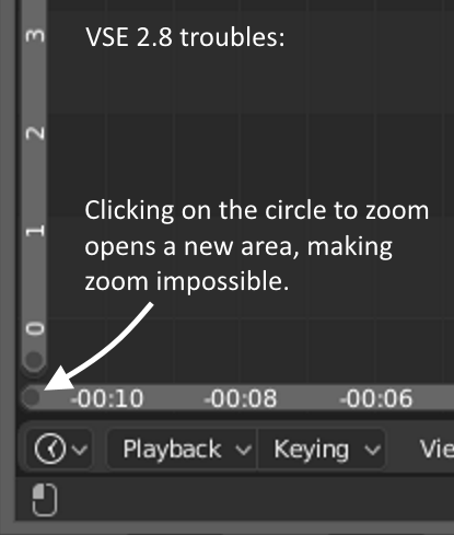
NB. The VSE zoom/navigation bar handle is in the area manipulation zone, and can’t be used:
2 Likes
Comparison of blender 2.79 vs 2.8 in a macbook pro 15, same workspace with same info and tools in the screen (I have expand N panel to show the addons that old T-shelf had).
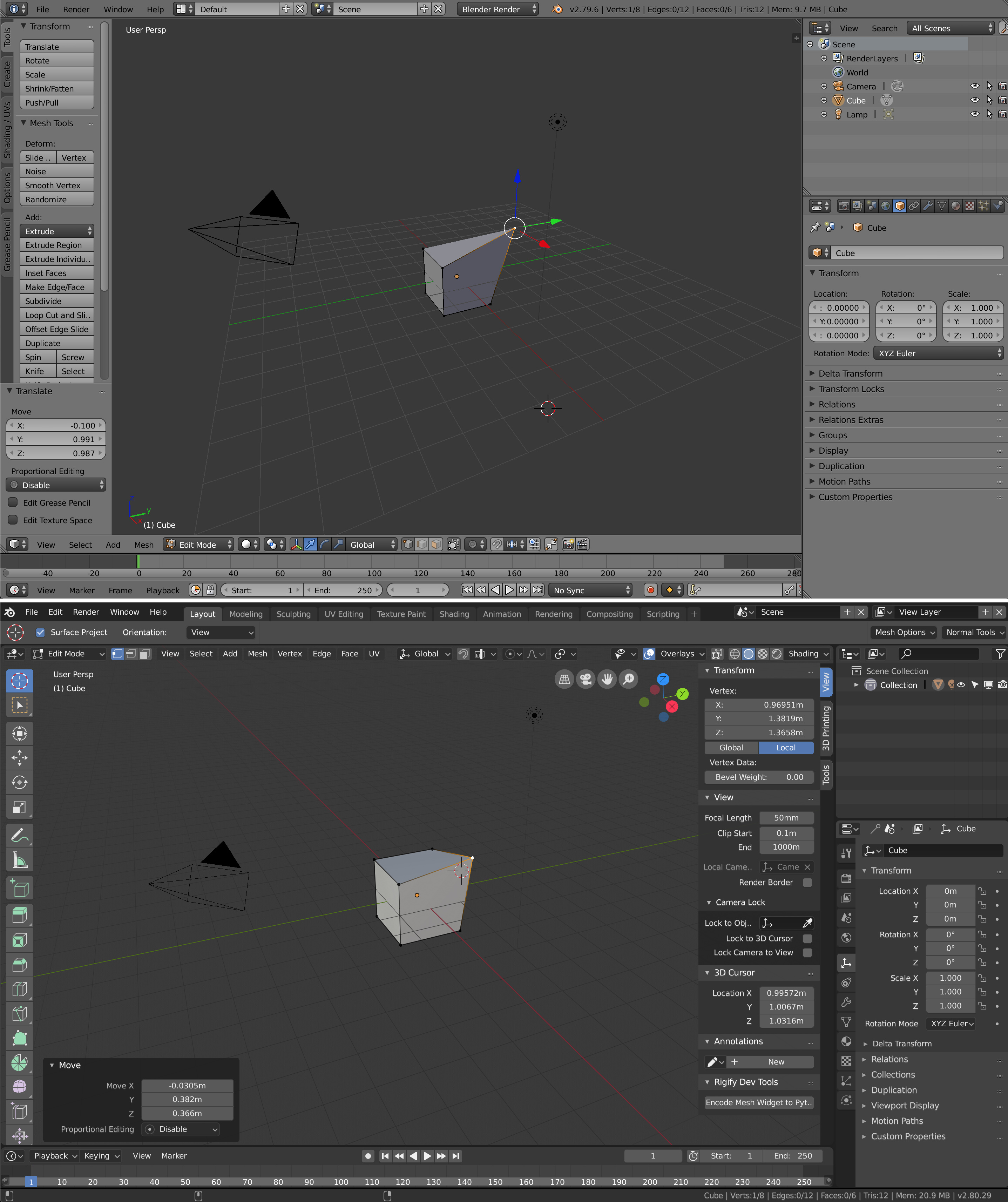
Huge improvement [/irony]
zero interface design and user experience, basically an amalgam of buttons, letters and icons that don’t have enough space in the viewport.
I think this way of placing the areas would be more balanced and I think it is better with the new vertical tabs
5 Likes
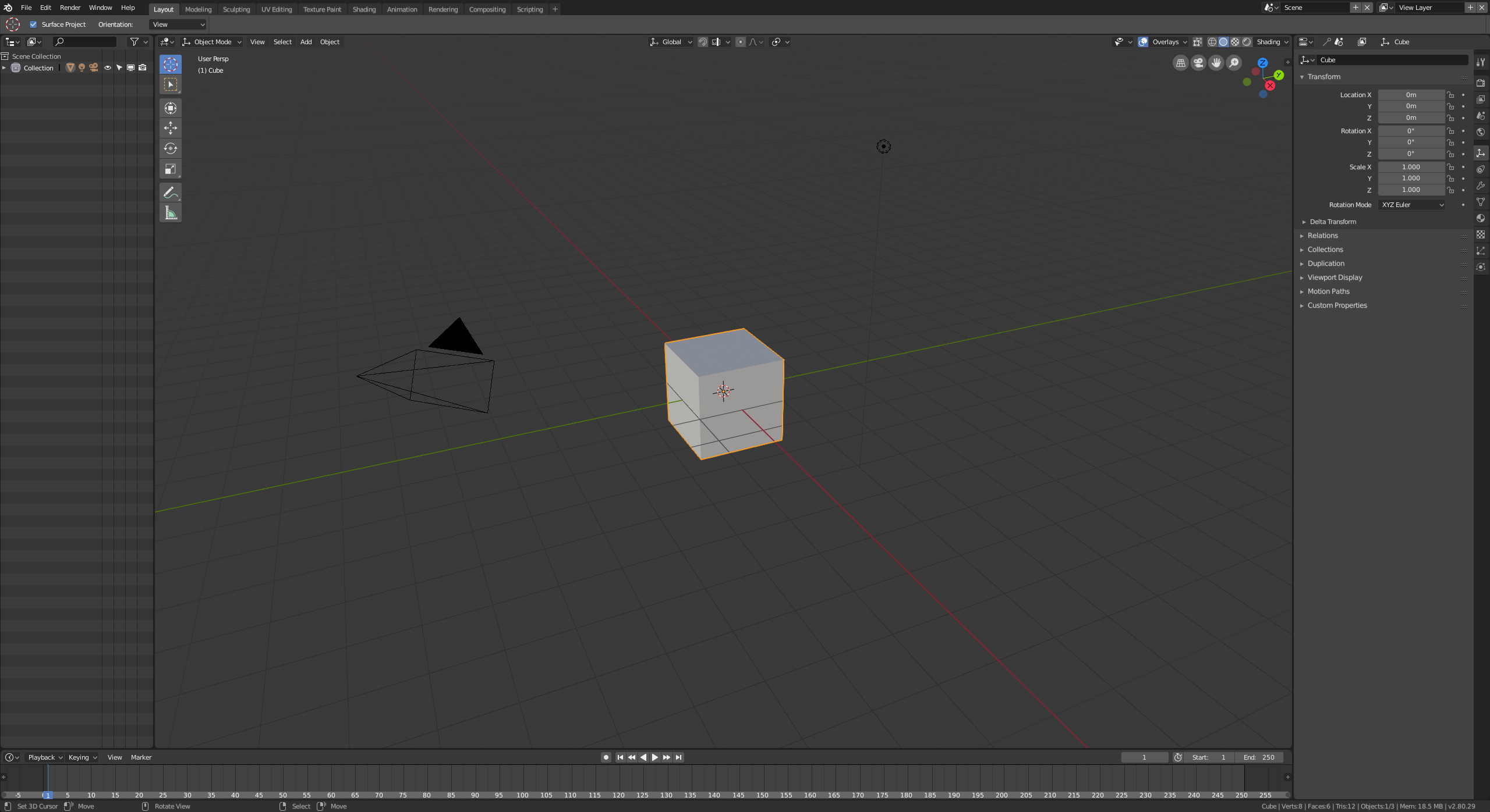
this workspace makes more sense as a default and simple first workspace.
still makes me think of the need to evolve and make closer and more interconnected the relationship between the objects in the outliner, the property panels, the objects that can be selected in the 3D view and the “working modes”
the time to make this reorganization is mature.
Outliner on the left and properties on the right?
Sorry but this is the worst thing ever. Just imagine the mouse traveling. 
1 Like
not if you take the logic:
outliner: select the object
3d view: edit the object
travel on pannel edit parameters
a long outliner immediately becomes comfortable when you start having a lot of objects to process and so you do not have to spend time looking for them or sliding and widening and tightening the window and so on
1 Like
Which most of the time is not the case.
The general workflow is, you select something in the outliner and edit it in the properties below. Quick and fast.
When I have lots of objects my workspace turns into something like this:
which I think is most effective.
I can’t have them separate, just make things difficult for me, but ofc, people have different workflows. ![]()
2 Likes