Call for Content: Workspaces

I made a comparison between blender 2.79 and blender 2.80 and I have to do a critique of the “speed workflow” on the use of workspaces …

  1. in blender 2.8 waste of space, loss of time for search and select non-visible workspaces.
    The menu of blender 2.79 workspaces was thought of with a view to optimizing the space, and you can quickly edit the name of the workspace.

  2. the lack of the shortcut crtl + left or right arrows greatly slows down the switch between a workspace and the next; that was instinctive and fast to use in blender 2.79.
    why deprecate this shortcut ??

  3. People who know the shortcurts and do not need the visual feedbak and hide the bottom bar lose the precious information on memory and geometry, while in 2.79 blender it was always well accessible and visible on top,

I understand that making the workspaces more visible, is a new approach to highlight the less known features of blender for novices, but what about the workflow speed ??

in general, on blender 2.8, an evaluation must be made to find a compromise on speed workflow, always one of the best sides of blender, and easy usability for novices.

1 Like

Not sure if this is still on @pablovazquez but here goes my default of defaults. It’s 2.79 but the gist is the same anyway. Don’t mind the cube, the camera or the active layer (^_^)… Important is window choice and position of course.

Basically I omitted the Timeline and the Outliner and added the Node Editor. Also I made everything vertical as users have an easier time with content split vertically than horizontaly (example: entire internet). Also because displays are 99.9% horizontal.

I find people usually first need to do the model / materials anyway and they get very confused with the way materials are setup inside of Properties window and have no idea what a Node Editor is. Even though it’s better when wide, I think Shift+Space can serve very well. And once I need to do UVs I just switch that Window to UV/Image Editor. Also the Properties window serves as a nice divider between the two. Nicely adhering to the golden ratio principle.

One other thing I keep doing and it would be cool to implement it somehow is collapsing the Properties window so that it’s at it’s minimal width (I usually widen the Node Editor aka the UV/Image Editor)

Here I have a Diffuse BSDF but I Strongly recommend Blender 2.8 to change the default to Principled BSDF!

Maybe it’s good for people interested in it to add the Timeline as they please? It seems everyone has different ideas about it… I think it should either be underneath the 3D view or maybe underneath them all continuous across the entire horizontal space - for the sake of minimalism, although it’s harder to collapse it if it’s across the entire length and most people will never do it, even under supervision it takes about 3 minutes to explain multi window collapse (and people forget) as opposed to a couple of seconds it takes to explain between just 2 windows.

Also Outliner is not present for one simple reason which is that you don’t really need it unless your scene gets complex. Basically all novice users don’t care about their Cube.001 Cube.002 Cube.003 Plane.001 Plane.002 Plane.003 Plane.004 Sphere.001 Sun Sun.001 (oops) … It mostly confuses as they couldn’t tell where Properties window starts.

It might be the way Outliner works in 2.79 but honestly I haven’t used it much even on 1000+ unique objects scenes. I saw your video that a lot has changed about it now with grouping similar together and it’s connecton with the collections so it might become great.

My 2 cents

I’ve just seen the new separation of the workspaces in sections based on the type of work that starts …
good work, now we have less workspace, easier to select.
excellent synthesis.

Just a point of discussion for the Sculpting workspace: Should the default “Orbit Style” for the viewport be Trackball instead of Turntable?

I don’t sculpt much, but I know some sculptors prefer that. I’m not even sure if it’s possible to change orbit style per workspace, but I feel like it should be an option.

when I deal with the management of the nodes for shading I need a lot of space and i need to see the result, nothing else … so for me the ideal wokspace for shading is this:

3 Likes

Great to follow the developments of the workspaces. On the VSE workspace as it is now I think the file-browser needs to have the import settings visible, because casual users will experience bad playback performance if ex. the fps of the imported clips doesn’t match the project properties. So I think those options should be visible:

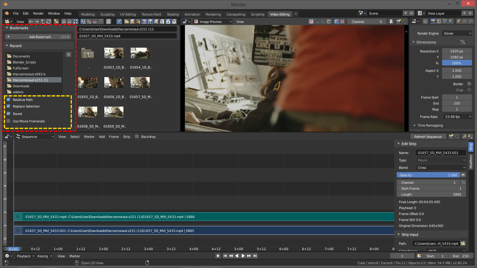
The import properties doesn’t show these options in the file-browser unless you add > movie, and it shouldn’t be like that.

I know I should not request features, but I think that at least ‘Use Video Ratio’ should also belong there and maybe ‘Use Video Colorspace’ too? Or maybe just one checkbox saying something like: “Set Scene Properties” containing fps, ratio etc.

Some further suggestions for the defaults of the VSE here:

Does anyone have ideas for a Rigging workspace? I’m far too new to rigging to come up with one, but I can see that this constitutes a glaring omission from the drop-down list of new workspaces.

You would need constraints and drivers visible, at the very least. Rigging though, is a more complex task that can touch on many technical areas. Sometimes scripting is involved, sometimes not. Some rigs are made with higher level tools such as Rigify, which has a completely different workflow.

Activate edit mode when switching to Modeling and UVEditing workspaces is not the right solution, I think so.
What if I accidentally select very heavy geometry (5-10 mill polys), or all scene? As a result - crash or very long not responding.
Even if you deselect all objects, it will still enter the edit mode of the last selected object. You have to specifically select non-editable objects (camera, empty, lamp, etc.). Or exit from edit mode each time, when you turn on Modeling or UVEditing workspaces.
Using Blender will be very painful.
sorry for my english

2 Likes

Hi, folks!
I’m new here on devtalk.

Just wanted to leave my suggestion for the Compositing workspace.
It’s based on the Nuke/Fusion/Natron UI but has the Dope Sheet open.

Details:

  • Dedicated Viewer(Image Editor) on the top, with the Viewer Node selected;
  • Timeline is in between the node editor and the viewer because you’re usually working between the two;
  • “Use Nodes” is ticked on by default;
  • On the node editor, a Render Layers node(or more, if more render layers available) is present, configured and connected to both a Composite and a Viewer node. The Composite and Viewer nodes are added inside a Frame labeled “OUTPUT”.

Let me know what you think and I can make adjustments and provide a .blend file, if needed.

Cheers!

3 Likes

hehehe did not realize that it was so easy to bring out nuke and fusion in blender … :grin::grin:

1 Like

This is a pretty awesome configuration I think. The addition of an unobstructed viewer is nice, and so is an animation editor for changing values over time. The fact that the current Compositing Workspace has an outliner is pretty silly because it serves almost no purpose here.

IMO this is a big improvement for the Compositing Workspace.

2 Likes

Can workspace not force mode change?

^ I only need worksapce to change UI layout, no idea who decided to make it change mode type, perhaps it ok when there is one object in scene, but outside of that it’s miserable experience.

I think it was the same person who thought it would be helpful for new users to see that they can save a default mode with each workspace. It’s a pretty good idea considering most power users will want to make their own workspaces anyway.

Want to fix it?
Open Blender.
Switch to the offending workspace.
Properties Editor>Tool Settings Tab>Mode
Change it to the mode you want it in when you switch to it.
File>Save Startup File

1 Like

Except it’s not and only make confusion and more unnoticeable mistakes for new user not to mention other problems that was listed above.

Or how about making it “human” out of the box, or that no longer focus of 2.80?

Only it is because having a configurable experience for the various humans that use the software, each with their equally varied backgrounds and expectations is absolutely the focus of 2.8. It’s called Blender 101 and has been a major part of the 2.8 road map from the earliest design documents. It would be a shame if one of the major focuses of 2.8 goes unnoticed because it’s not emphasised enough. Especially since the preset work spaces can be so easilty changed. I guess my personal reaction to it has been quite the opposite of yours. I started seeing what great possibilities there were with the new configurable workspaces the first time I saw the autmatic mode switching. Maybe I had a lighter object selected the first time I switched to the modelling layout which made it less of a frustration, but wouldn’t this theoretical beginner that we’re talking about most likely also? My guess is that the default cube will still be selected the first time a new user switches to the modelling or UV tab.

I just feel like this is a unique and incredibly useful feature that should be demonstrated to users new to 2.8, Blender, or even 3d in general. Having said that, I will definitely not use any of the prepackaged Workspaces that shipped with Blender, but I’ve already started messing around with the possibilies that this feature brings to the table and can see it fitting into my startup file.

2 Likes

this is not offtopic
this concerns its own
“blender” and “the role of workspaces in the future”

only that someone still does not want to see it or is too scared for the future.
I can understand, but it is an inevitable that takes shape by its very nature,
anyone can get there by reasoning.

@pablovazquez The Color Manager (Filmic, Exposure and Gamma, etc…) should not also appear in the n panel of the rendering layaout?

I can answer why it works this way. Workspaces are not just UI layouts (ie ‘Screens’) as we had in 2.7x, they are intended to make Blender’s UI task-oriented. Switching between the various Workspaces is meant for switching tasks.

For example, if you switch to the Sculpting Workspace, but don’t see your sculpting tools, the workspace isn’t doing much to help you. You haven’t really changed your task - in fact it will then always be slower than just switching into Sculpt mode, because what is now a one-step action would become a two step setup to first switch to the Sculpting Workspace and then switch modes.

That said, all this can be customized, so you can set up your own workspaces however you like.

2 Likes

Yes you are right. But Modeling and UVEditing Workspaces need to be in Object Mode, Always in Object mode.
For Modeling Workspace:

  • Modeling its not only Editing geometry.
  • It is also moving, scaling, rotating objects, matching and placing.
  • Additing objects
  • Using spaines, text etc.
  • Using modifiers
  • Using addons for generating meshes and objects
  • etc.
    This Workspace need to will bee naming like “Edit selected object Workspace”

For UVEditing Workspace:

  • Same like in my last comet. I need to be focused not only on my work, but on choosing the “right” geometry before switching on this workspace. Because if I accidentally will select height density geometry (10-50 mln polys mesh for retopo from Zbrush) or will select all scene, I will get crush or spend couple minutes for waiting.
    Yes, we can create our custom workspaces. But I think it’s good workspaces, only Edit mode ruin everything. I think 90% advance users will delete this 2 workspaces, and will create same workspaces but with object mod.
    sorry for my english
1 Like