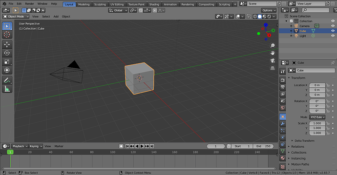
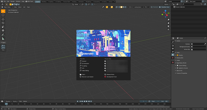
To truly get the layout feeling modifiers (shift+f9) should be to the left side of layout. Outliner should be divided and material view should be on the left side with tabs. 
I’m wondering if the majority of the theme creators here even use their own themes. 
Looks like nope!
I don’t think there is a Call of Content for templates or is there one? Because all layout things are stored in the startup file^^
I use my xsi winter pro daily, and I guarantee you that it took me almost a month to debug it, because during the workflow you often realize that the colors that looked beautiful, then they didn’t work well on while you use it in a heavy way
@billrey I’d love to see the Fresh Snow theme included too, it’s pretty high quality and it’d be nice to include more than just one light theme (not counting the one made for printing)
Yes there was. Search for “workspaces”.
Check https://YouTube.com/c/activemotionpictures all of those videos themed with XSIMOD theme.
@billrey I replied to the 2.83 call for fixing the XSIMOD theme on this thread: https://developer.blender.org/T74360
And there are a lot of issues to be resolved in Blender for better future themes. I will describe them in the link when I finish doing this (took 12 hours).
I believe sharing themes fit better in blender.community .
No one has a standard theme from 2.7 for 2.8?
This is something I had from some time ago, if you want to look at it.
There are probably some bad values here and there, most likely in the outliner and file browser, since those had some big changes. 27x_2.xml (42.8 KB)
Is that the same as your theme “blender medium” here? Call for Content: Themes
No, it’s the actual 2.7 theme with some corrections. As I said though I haven’t really worked on it much, so it’s far from perfect.
It’s very odd to see that theme in that context, but I like it. it would be nice to have historic themes like that included in a release in the future.
Hi, I maintain these themes, please let me know if anyone interested
@billrey the XSI theme was changed for someone else besides you. The “EDIT” mode now has all colors changed and it’s not reflecting “last selection” as I originally intended to be on the XSIMOD theme. I will take the XSI theme and further fix all of those inconsistencies from the outliner, editor, and other areas. It is clear that the second person (not you) modified some things to “taste” but forgot that color-correlation between viewports in Blender DON’T EXIST and that I had to go through lots of hours to create them. I am glad there were other zones correctly fixed, but multi-selection and last selection is crucial to be identified by the new user or the experienced user immediately. The subject is too long to explain in pictures, I already took the time to post it here>>
Overall, if there’s a call to “maintain” the theme, I would like to do it so under the coherent design ui rules that were already presented. It is true that I left some things hanging in the air because I didn’t know where in the theme colors I was to look, so I take it this will provide basis to maintain the theme from here on? So if I further modify the XSI theme as it is now, I take it no one else can overwrite it?
hey @DavidRivera , I hope that with this “same one else” you are not referring to me, in the comments of the built-in themes task I proposed an xml of the xsi theme with small corrections, but in the end it was ignored, and in fact, at least in the xsi theme there are still those errors that I had corrected, and yes, I noticed that in edit mode there are colors that don’t make much sense, especially yellow segments are now pink
you can check the theme that I corrected in the comments here
Hi Nokipaike, I didn’t know your name, sorry to not have tagged you.
I understand, then, the inconsistencies from the UV editor and Edit mode were not created by you?
@billrey how could I submit a fixed. xml for those things? Also, I don’t know if those changes were made from someone else?
I would like to go through channels, mixer, and every other possible part (including maybe Grease Pencil workspace)… because of those inconsistencies: Last selection highlight in the outliner reflecting in all viewports is a PRIO.
David, i was just trying to correct some minor mistakes i had noticed on what had already been prepared, but it was preferred to be ignored.
I just wanted to let you know in case you thought it was me who made those kind of changes.
I don’t know anything else.
No problem. I think this can be carried out in coordination with collaboration if that’s the general idea. This theme scrutiny was rolling fine a week ago.

