Hi! this theme is really awesome, but it seems that is not selected by BF team, will you keep it up to date?
@billrey Please consider this theme, is really good! Thanks!
I would like to contribute with some of my blender themes:
(upload://u35xhxhIfvgUZw7NFmBaPqGtaSs.png)
![lightwave_5|690x365]
the *.xml files can be downloaded here >
1 Like
Hi, thank you for your support. If there will be will, I’ll keep it updated. Did you discover something to be fixed right now?
Hi, i don’t discovered something to be fixed right now, but in recent builds of Blender the team has included new options for theme designers. Great job thanks!
I use these themes everyday - I haven’t found anything to be fixed.
1 Like
thanks and ….with pleasure !
1 Like
Hi guys,
here i tweak this one which was inspired by MODO, i tweaked it more to grey.
Hope you like it:) https://files.fm/u/h36em8kj
8 Likes
bravo , i love that . the best light theme
This is totally Modo. Amazing work.
1 Like
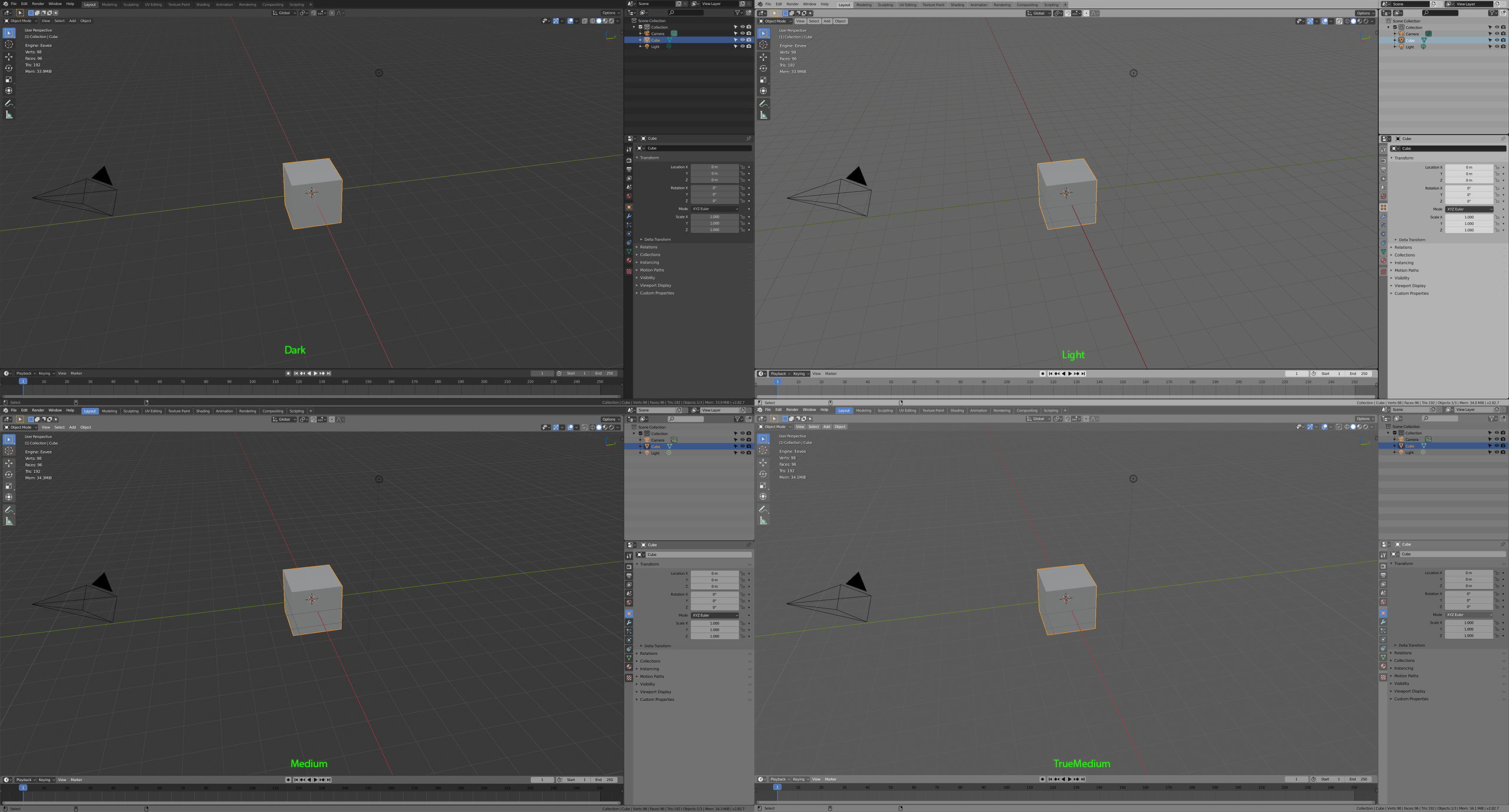
I created a True Medium Grey version, because to me the Dark version is too dark, the Light version is too bright, and I also downloaded a “medium” version which I also thought it was too dark, not exactly a middle ground.
To me the most confortable is something closest to 100 gamma value.
This is how the theme looks:
(I opted for a lighter grid, which can be easily changed in the theme settings)
This is it compared to Dark, Light and Medium:
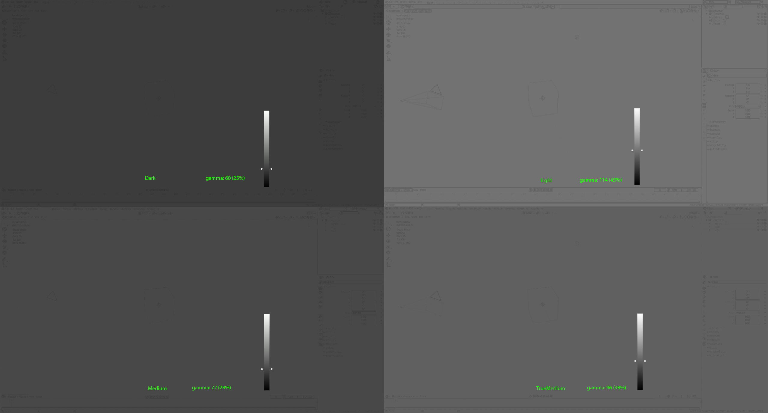
And the gamma comparisons:
(Light grey is pretty close if not for the Properties, Outliner and some other editors, which are very bright, but still light grey if compared to the Snow White theme here)
Download: TrueMediumGrey.xml (42.4 KB)
Funny enough, blender 2.79 default theme had an average gamma of 82 (or 32% between B & W) which is maybe why my theme’s 38% is what I find most confortable (my almost entire work experience with Blender is with this light level, except for my first year using 2.49b a decade ago).
Obs: If you averaged what would be the middle luminance between Blender’s Dark and Light Themes it would be 87 (34%). Therefore mine with 38% is indeed the closest to a true Medium grey theme.
5 Likes
Yes, finally! Someone else looking after correct color values in compression for video stream and video tutorials! Thanks Evandro. Looking great! -Have you considered rebuilding 2.79 theme for 2.83? I think it would be awesome, and you’re already half way there 
1 Like
Thanks David for the compliment and suggestion!
While I loved my entire time with 2.79 and it’s interface and color scheme, I’m not really wishing or trying to replicate that exact experience here on 2.8. I’m only trying to adapt the light emitted by the interface to be what I find most comfortable… so that I can keep working dozens of hours without eye fatigue, which was the case with previous versions.
This happens to be very close to what 2.5-2.79 had… is it due to habit or coincidence, I’m not sure. 
So I’ll leave the task of adapting a nostalgia version of 2.79s color scheme to other more willing people like @a.monti here.
Regards!
1 Like
Are you going to maintain this theme? Because it looks awesome!
1 Like
6 Likes
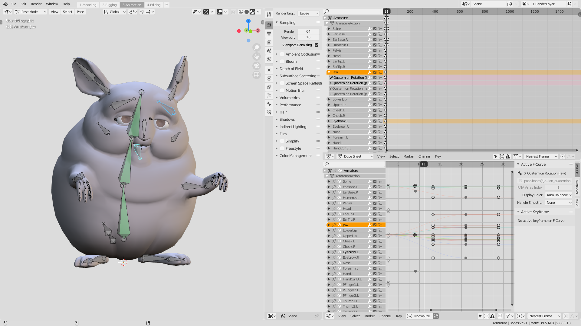
Hi, @billrey here’s the updated XSI theme for Blender 2.83.
Log: The complete list of changes will be uploaded later in the month.
Here’s the preview:
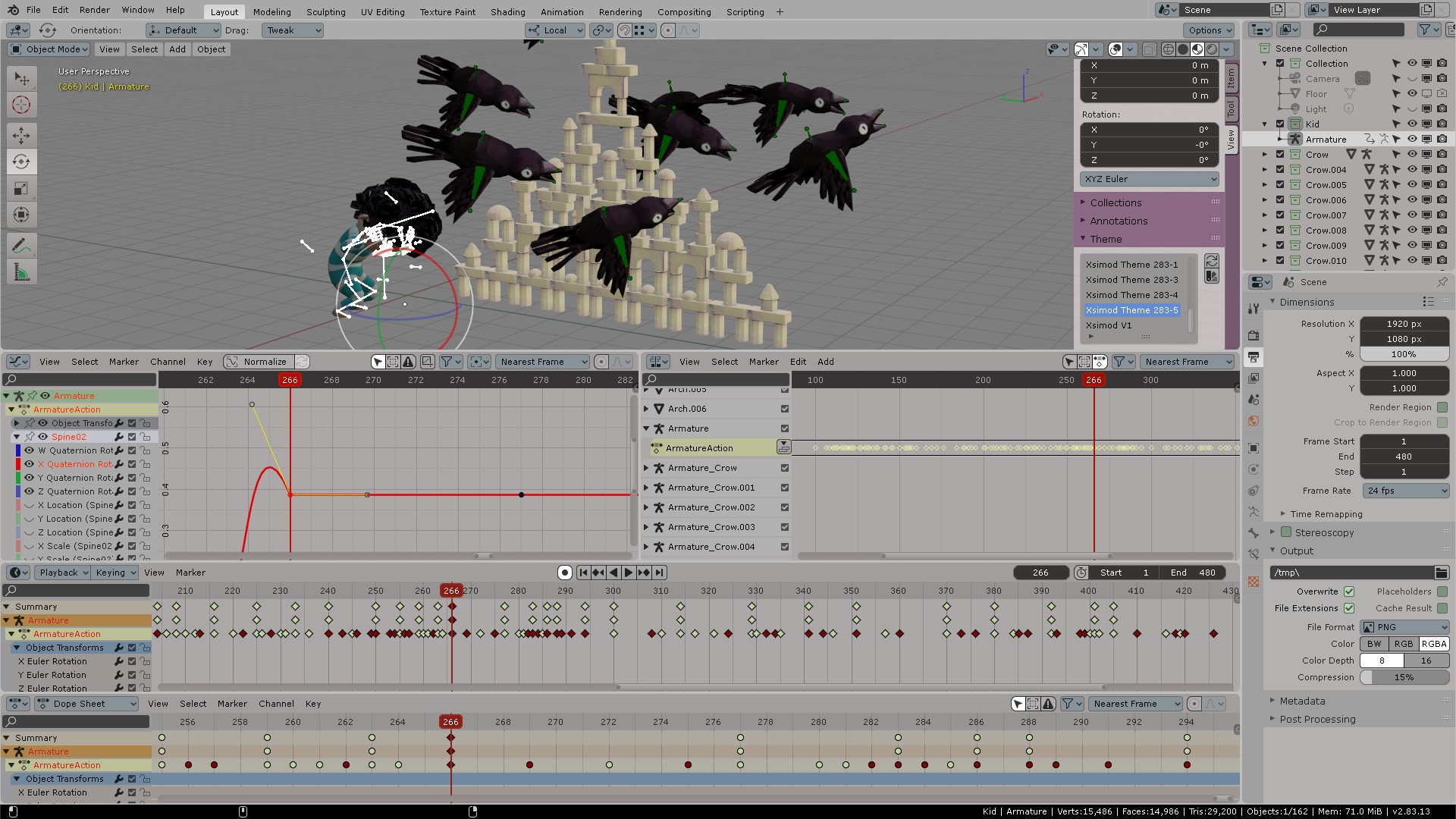
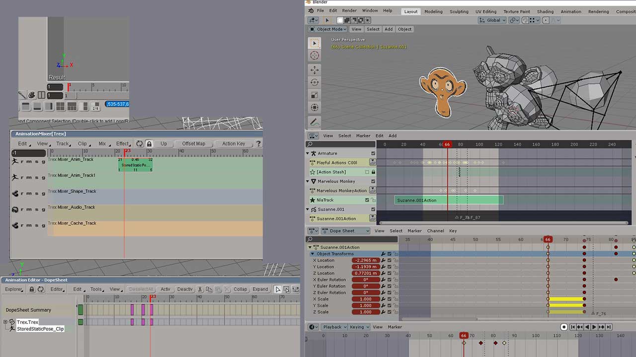
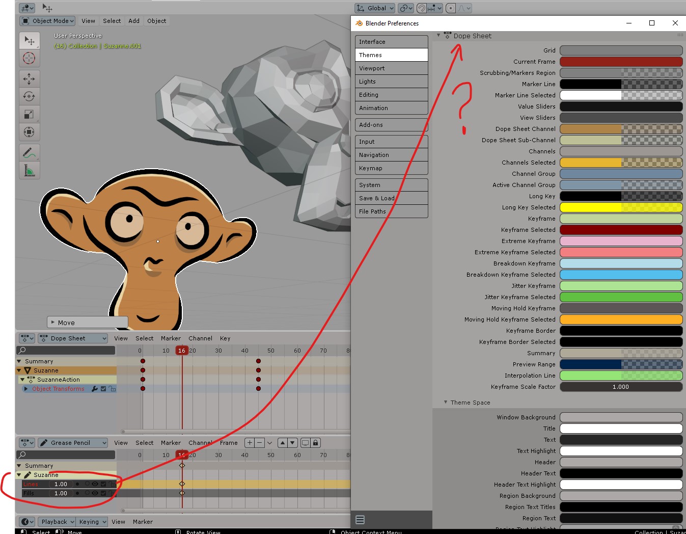
Now track colors in DOPESHEET are all congruent (actions have the same color across all track, graph, dopesheet editors) Colors were referenced from Softimage
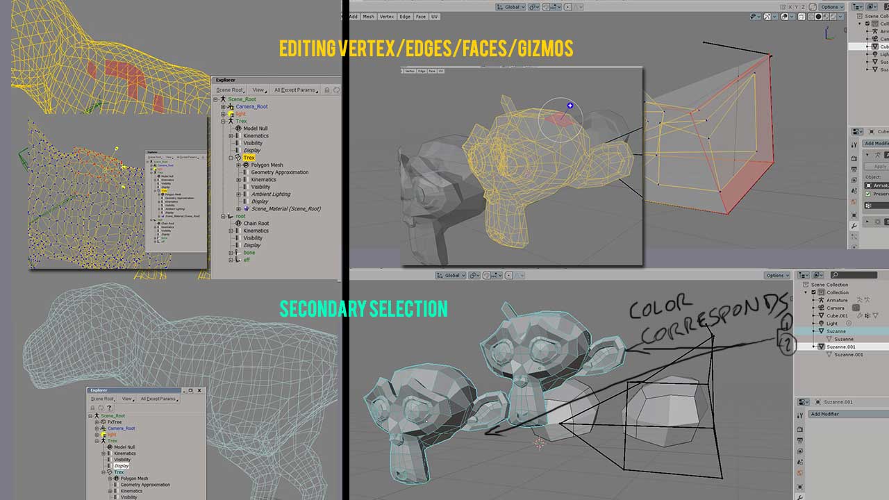
When you enter edit mode the mesh turns yellow (which is the color to indicate EDITING states). Please have this in mind, as this will also apply to keyframes’ poles in the graph editor.
Helping gizmos were coded blue as a harmony color principle (good contrast).
In Softimage SECONDARY selections (additional selections after an initial selecting state), turn CYAN. This is now reflected on Blender’s OUTLINER list objects. New users can finally figure out what was selected first and last in Blender.
Graph editor keyframe points were +1 in size, plus their poles were changed to white (selected), yellow for free pole adjustment.
Also note the text editor was fixed (System font for code: COURIER, System font for UI text: VERDANA). The original Softimage UI text is using TAHOMA, but for some strange reason Blender doesn’t detect it as a .ttf? I had to manually type “tahoma.ttf” from System>text, and it did input. Verdana is more universal. It would help the theme if preferences like this could be saved. (But I know Mac and Linux would not have it nice).
Notice how the outliner now corresponds with editing mesh as well as the UV editor. MATERIALS are shaded in Purple in the outliner, but there was no way for me to change that without changing the SHADER icon in the properties area of the objects. (Currently is set to orange because of the color coded ORANGE as the node for Output material, Image texture, UV coordinates, and World)
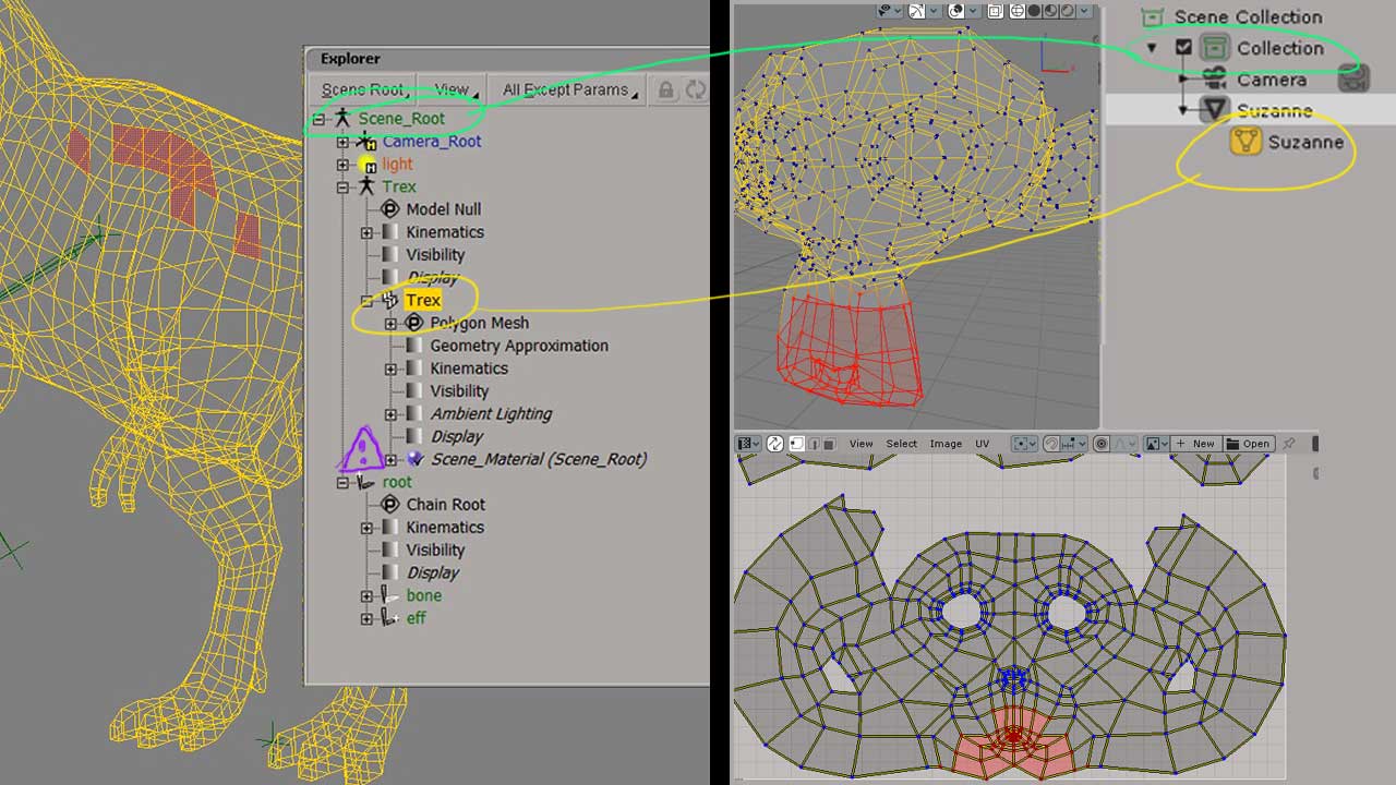
DOPE SHEET in XSI (Softimage) is coded with a pale olive yellow tone. I assigned that tone to the DOPESHEET Tracks, and also the ACTION Editor, which of course are also shown in the NLA track. This unified the visibility on how animation and actions contribute to Graph Editor, Dopesheet and NLA editor in Blender. This color correspondence must be addressed in all the themes shipping since, currently even the native dark and light themes have different colors even though it’s the same (action) track or same (dopesheet) channel.
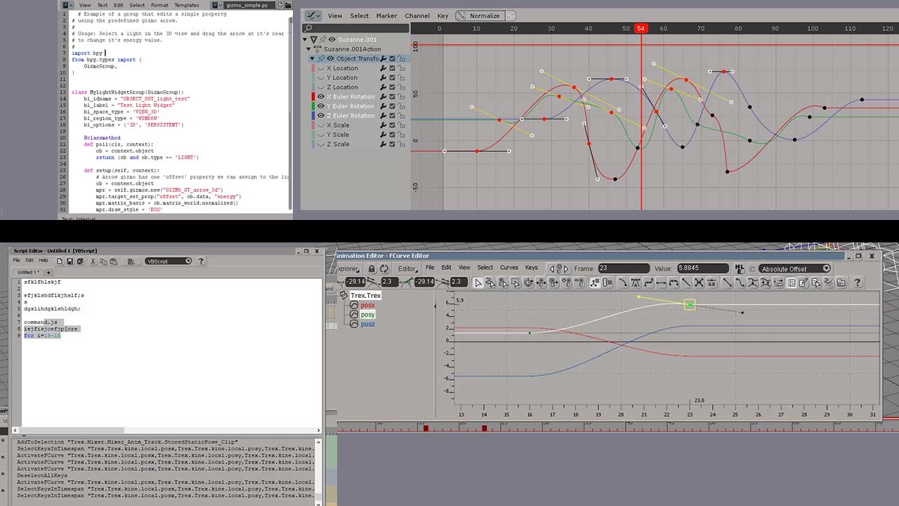
For now grease pencil action channels will have to wait, as it seems it’s hard coded and not available to change them from the Theme>Dopesheet options.
Ok, so I hope to deliver a lot of already late client work and have my hands free to post each picture 1 by 1 everything I did comparing it to SOFTIMAGE.
Please consider the name, since everyone knew this was the name of the software. We are using “MAYA, MODO”, so I guess it’s time to evolve the XSI theme to “SOFTIMAGE” theme.
Thank you for your consideration.
Here’s the THEME file for Blender 2.83:
UPDATE May 2
Complete blog post with image comparisons between Softimage/Blender:
*** UPDATE April 19***
(Purple icons for shaders in outline and tabs): xsi_283_v02.xml (43.5 KB)
Original file:
XSI_theme_283_v1.xml (43.5 KB)
4 Likes
Believe me guys, I’m not doing this because I want to and just because " it is lovely."
I am doing full-time research to accommodate workflow and view flow in the UI so that can it be further extended into Blender, so the users can speedily work.
So, please address the issues with the theme with captures and respectfully. Thanks!
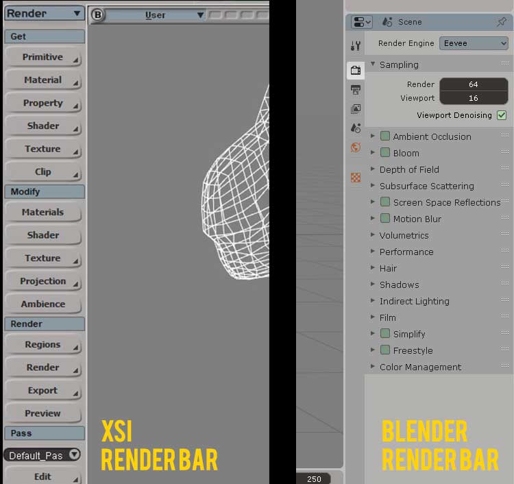
Also, whenever you complete a 3d animation you adjust the RENDER settings on the RENDER tab in SOFTIMAGE. This is important, since ICE and the RENDER tab in Softimage were probably one of the most displayed modules when you completed production. There for, this was the color selected for the property bar where you can also tweak materials, passes, image formats, etc… just like in the Softimage counterpart.
](https://files.fm/u/h36em8kj!%5BGrey%7C690x388%5D(upload://aL1VR7itRF7zOpqLtGiMbuF8dQb.jpeg))
4 Likes
Will test and commit this in a few days. Until then, what is the point of ‘XSI Blender theme comparison dark’? It’s not clear to me why you posted that image.
Because in Blender different themes (including native light and dark) have the NLA, Dopesheet and Graph editor: Action channels, and selected (armatures, objects) in different colors. Normally they all should have their equivalent colors in different workspaces as good UI practice.
1 Like
Ah, interesting. I didn’t really do something like that while making my theme, the goal was just to have a similar palette of 2.79 (the 3d view background is the same as an example) while making it really comparable to the default ones.
Yours is indeed more “medium” To me it lacks a bit of contrast between ui elements, but it’s a matter of preferences I guess.
1 Like