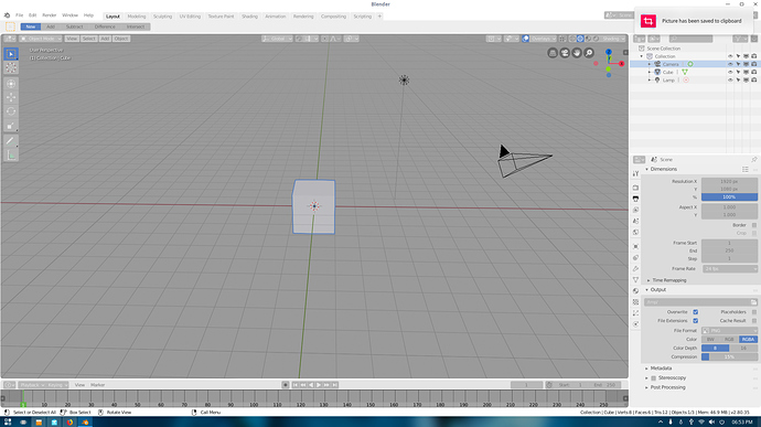
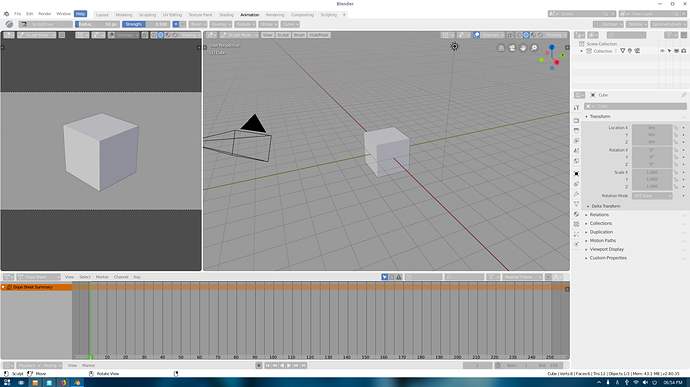
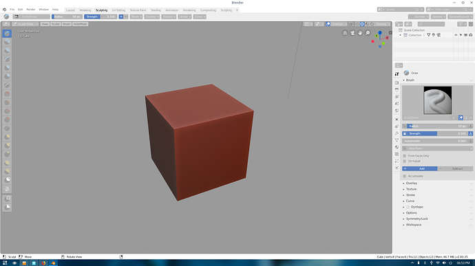
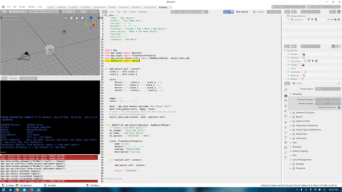
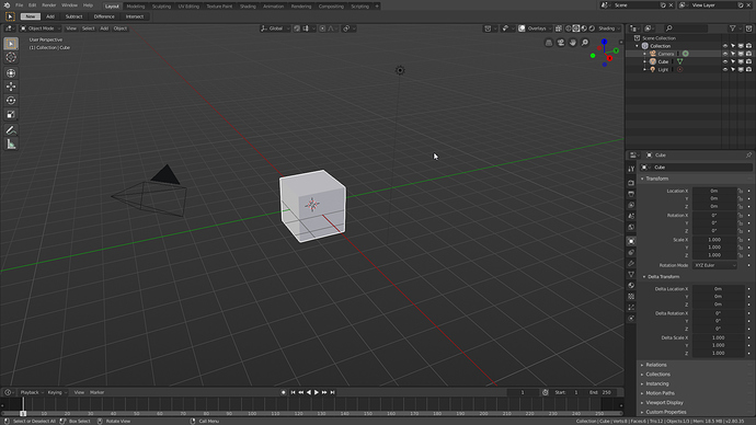
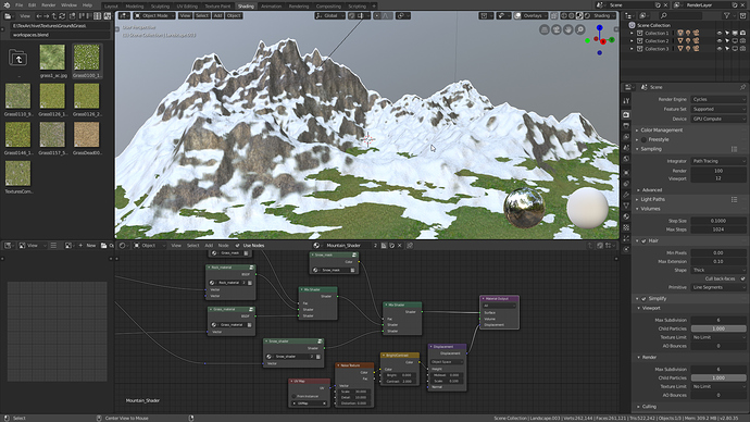
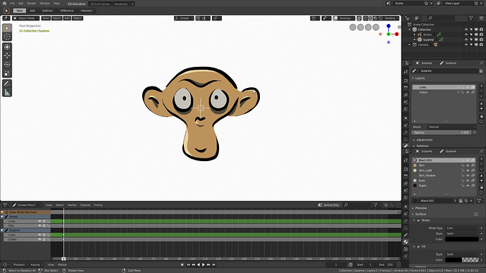
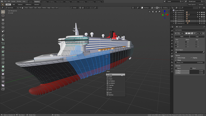
Okay, I updated my post with the new renamed .xml file. (Google drive link)
I actually agree with you - I would like to swap out Dark Minimal with Blender Pro, but Dark Minimal got many more votes so I was swayed by that.
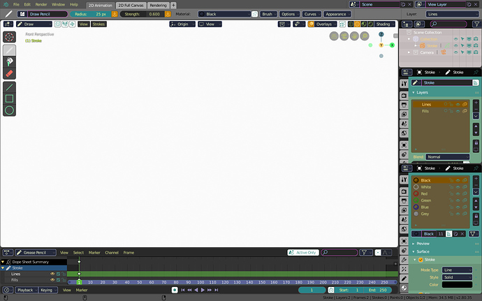
The ‘White’ theme I actually think is rather excellent - it makes Blender look very different, which is the point of themes anyway.
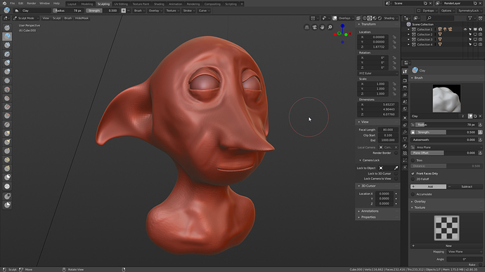
i would call it “Red Clay” much more appropriate 
Thank you! The cyan looks great and clearly indicates that you’re in edit mode. I’ll update the theme soon!
When they will start shipping?
Renamed pro3 to Base Coat
Started with 2.79 default flat theme I created as the base originally, which has been tweaked for years
It is also using closely similar syntax highlight colors from base16 tomorrow dark
Maybe add another slot so the Modo theme can make it? It’s the best! (way better than dark minimal- cough, cough)
really sad that you removed the XSI theme, is it possible to put a link after the theme ? like "Get more themes " in last and a page comes up that regroup other themes voted by the community
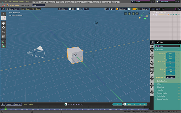
I like the fact that the chosen themes are on the original side, not trying to copy XSI, Modo or whatever. Those types of “fan” themes can be downloaded anywhere separately.
also a slightly modified theme version for win10 win10.xml (40.0 KB)
I do believe that the point of themes should be functionality more than their perceived uniqueness or popularity. The amount of people that will actually be swapping themes in the settings will be power users / enthusiasts in my point of view. Blender is a 3D software for artists. When you’re creating, you dont want the UI to influence or be in the way of your work, neither cause eye strain.
I’d consider more alternatives to be bundled along with 2.8, preferably low-high contrast dark themes that can fit along the current default.
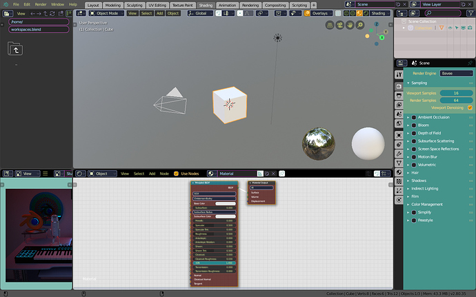
I feel like I’m a bit late to the party, but here is another one. Yet another dark theme - I tried to make a theme that gets out of your way and is as “unflashy” and neutral as possible.
Edit: Axis Gozmo colors are better readable now than they are in the screenshots
grey_elegance.xml (41.3 KB)
Updated: Blender Pro Theme
Where are the themes in the beta?
I already have this theme as my default in 2.8. i hope it will be added in blender’s themes
- This theme is easy on the eyes even when i’m working in the night.
- The dark background of the viewport allows the brain to concentrate of the model.
- The dark grading of the entire theme blends well and emphasizes the white text for easy readability, even when im not close to the monitor
I will keep following the progress of this theme. Thanks for the update.
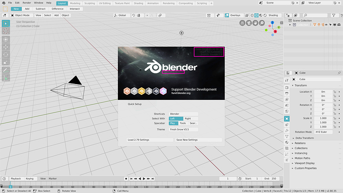
Using a bright theme makes it difficult to see the version information displayed on the splash screen.
The text color of this part needs to be constant regardless of the theme.
Hey, anyone know if there is any way to change the color of the grid on the node editor?
Great job Felipe. It feels like home. Ah I miss when 3ds Max worked. It was a great program back then. The 1990s were great all around.
I think removing the xsi theme is a mistake. IMHO the best theme here.
