So typical Friday night. I come home from work and continue doing what I was doing at work and mess around with 3d software. I thought I’d spend the evening trying out some of the themes from this thread.
MOST of the ones I’ve tried have made the text and background in the new left side tabs of the Preferences editor completely black and unreadable. The same with the text in the splash screen.
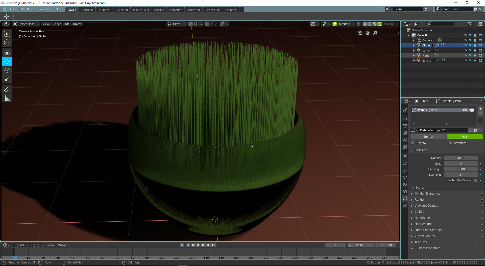
I’m really enjoying this theme, but if the active selection is black, your active vertex looks like it’s not selected at all if it weren’t for the edge gradient.
Edit: and with the active edge, it looks like there is no selection at all.
Amazing unless you’re in edit mode, though. I really like the blueprint look in some of the editors. The warm colors of the top bar balance out the cool colors of these editors and the active tools nicely.
Fantastic XSI Theme !!! really impressed, instant donwloaded !! Tnx David you really make us happy here. I personal worked 20 years with Softimage, and i was also a certified trainer… i think i can cry now!! haha.
Hating Autodesk more and more, we really thank you a lot !!
I just created a small variation from the default theme, because when I think Blender, I think orange. Also tried to give a more flat look to the buttons and everything. What you think?
I want to tell you something about our softimage beloved “Q” render region for Blender.
Nice reading this at 3 am.
I don’t know about how I made you cry. I’m sorry. hahhah. all right, back to business. 2.8 beta is here so I can post the new XML file because at the moment the user prefs look ugly. I want to fix that since they have added new stuff on themes.
Awesome you had SI certification. I couldn’t ever contact Autodesk for a certification… those mmmmmffgg…
All right, back to sleepy here.
MOST of the ones I’ve tried have made the text and background in the new left side tabs of the Preferences editor completely black and unreadable. The same with the text in the splash screen.
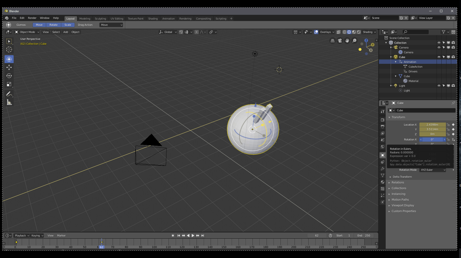
The new Preferences editor (whose Preferences tab, by the way, is still called “User Preferences”) is now employing the Region Text and Navigation Bar Background options for the left bar. I set a purple color on every color option that I haven’t identified a function for, and it showed up there as soon as I updated to Beta.
Still haven’t figured out which setting the splash screen’s “Version 2.80 Beta” is using.
What if the only themes shipped with Blender were the new standard Dark and Light themes, and all these other “approved” ones were hosted on blender.org somewhere with a nice screenshot / download page?
You could curate the current promoted theme collection independently from Blender releases, and you could set a much lower bar for inclusion on that page than for bundling with the software and include a lot more of them as a result.
The Theme choice Preference in Blender could have associated with it a “Get more themes…” link that would take you to the blender.org page.
Myself I really don’t feel a big need for a bunch of additional themes to be included with the software since they’re easily acquired and installed from elsewhere. I think there’s some value in discouraging new users from spending a lot of time messing around with themes, and pushing them towards starting out with the very excellent default themes until later when they discover that there are other alternatives.
Also hosting the themes externally makes them “somebody else’s problem” and core development doesn’t have to worry about maintaining all of them.
I like the idea of having a link to the website to get additional themes, but Blender needs to ship with a handful so that users know what’s possible with themes.
I tried my hand at a deuteranopia adapted theme. I’m not color blind myself and the only topic I was able to find on blender artists is few years old, so I’ve based this first attempt on the simulation I got from Photoshop and the following palette…
…and I probably messed up (more than) something along the way.
Still I believe blender should be accessible to the larger population possible, and (once perfected and tested) I’d love to see it shipped with such a theme.
Of course it’s very much a work in progress, and I’d love some feedback.
Pastel green for both day- and nightime. Text is bright, BG dark (better readable than opposite), Editor outline is white for better distinguishability of different windows, yet not blinding, since it’s so thin. Timecursor strong green. Properties tabs enhanced visibility. Topbar contrast enhanced.
As said, selection is not very visible. Face dots almost invisible. Other than that, this is within my top 3. Looking forward for improvements. Nice job!
This is my first posting here, but I thought some may find this useful. The intent of this theme was to get new users used to the different sections of the screen. My 2 kids have found it useful in acclimating to the 2.8 design. Once familiar, a user could easily switch to another theme.
I called it “Tutorial” since it is a good way to separate the areas of the main viewport to help users understand the layout. The top and status bars are also colorized to help them stand out and make tabs more visible.
@billrey the XSI proposal originally had 60+ votes. I based the designed off the original software UI colors which was concealed with a whole army of design experts in their field back in the day.
This XSI theme extensively shows the areas where this was improved (not only on 3D viewport but in many other workspace areas as well). Not only did it serve other users to think about what is really important when viewing vertex on UV layouts or tracks on NLA, but it also is easy on the eyes. First time users find it easy locating important things and experienced users quickly fly through color coded ui by muscle memory (they associate what comes first and what comes after on every step of their 3D tasks).
Please re-consider including the theme. I don´t understand how @LudvikKoutny comes and states that “it´s a 90’s interface” but doesn´t clearly states why it doesn´t work -regarding UIX-. Because I can post lots of people (including Blender presentations) where it was CRUCIAL for first-time-users to identify things on the UI the way it is on the XSI theme.
From a UIX design point and many other design reasons, the XSI theme has stood the test of time being LEGIBLE in colors as well as long exposed hours in the monitor, identifying crucial elements quickly.
XSI MOD theme was the first one posting this SHADE OF GRAY for the UI way before all the other themes were posted. How can it be removed as -redundant-? The theme was posted, meeting the community guidelines, and was legitimately voted as desired theme to be included.
Agree with David, having the Xsi theme really helps me get a usefull overview and interaction with the Gui.
For us Xsi users having taken away the Xsi Theme is really a blow : /


 hahhah. all right, back to business. 2.8 beta is here so I can post the new XML file because at the moment the user prefs look ugly. I want to fix that since they have added new stuff on themes.