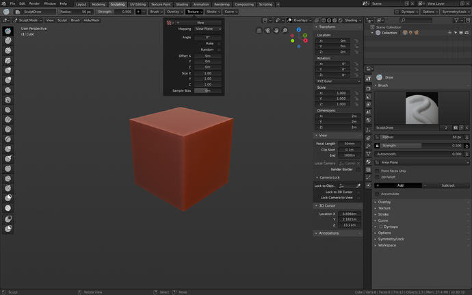
So here is my latest and final update on my rather unexciting dark theme which intends to fix functional issues of the default one.
To summarize:
Like I elaborated on before it fixes
- the chaotic visual hierarchies by introducing brightness cascades that emphasize menu structures (higher in the hierarchy = brighter / visually more prominent).
- it introduces subtle gradients to clearly distinguish buttons and inputs from other UI elements.
- it avoids decorative color in the interface entirely as it is important for a design-application to provide a neutral environment / canvas to work in (I went into greater depth on this here).
Theme: okapi-dark.xml (51.3 KB)
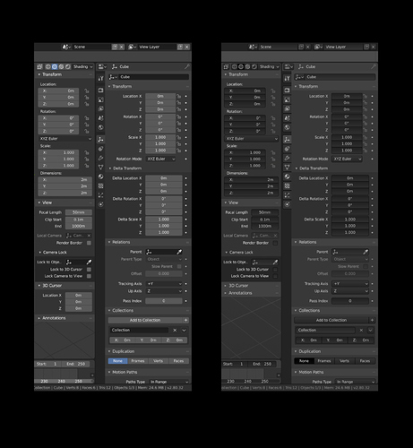
Here is a comparison:

