Brush Assets Prototype - Feedback

We now have an early prototype of the brush assets project. While there is much work remaining, early feedback will be helpful to steer further development.

Download a build of the brush-assets-project branch for testing.

The most important things to know are:

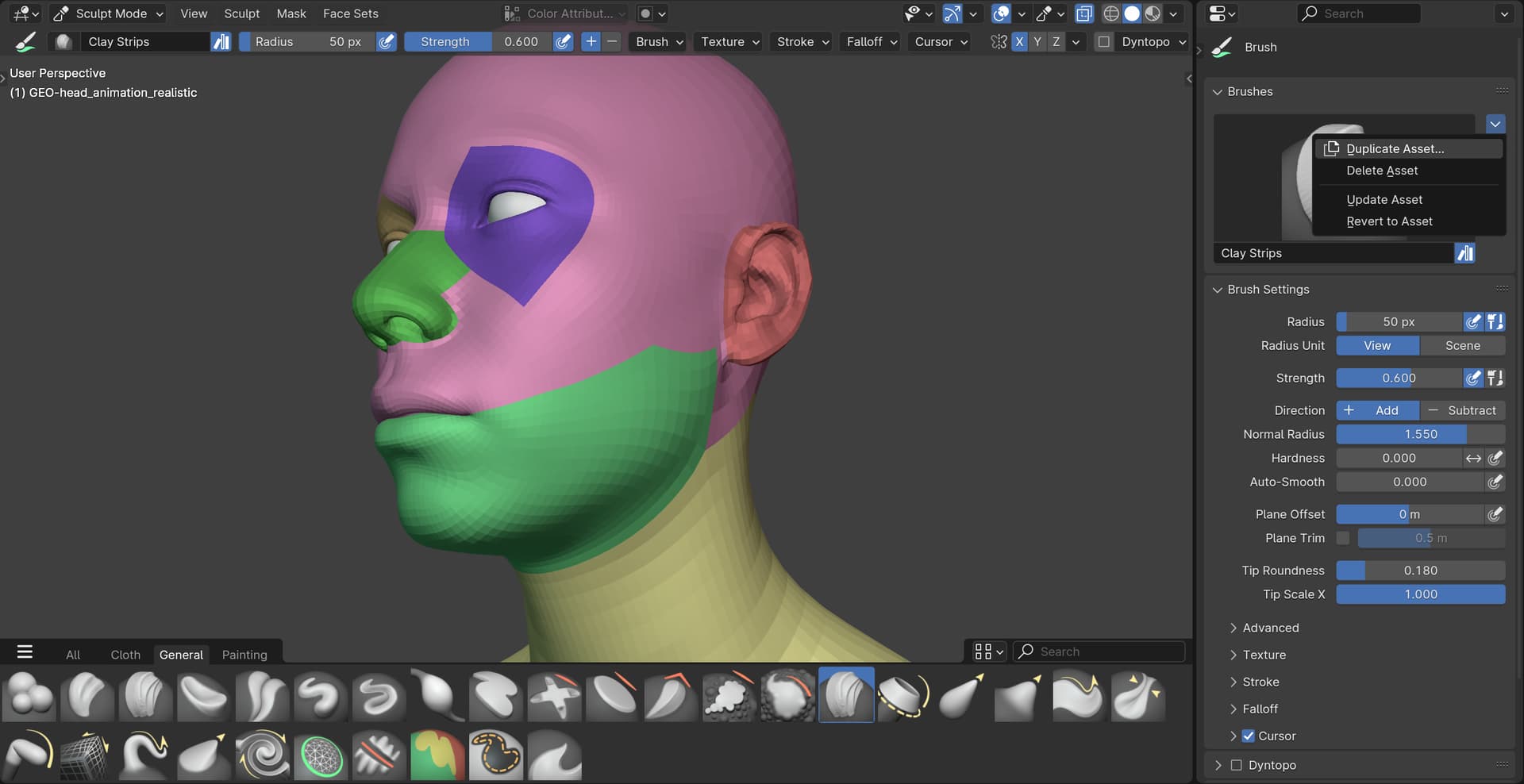
  • Brushes are stored in asset libraries instead of each .blend file. The built-in brushes are in the Essentials library shipped with Blender. User created brushes go to the User Library by default. Each brush is saved in its own .blend file.
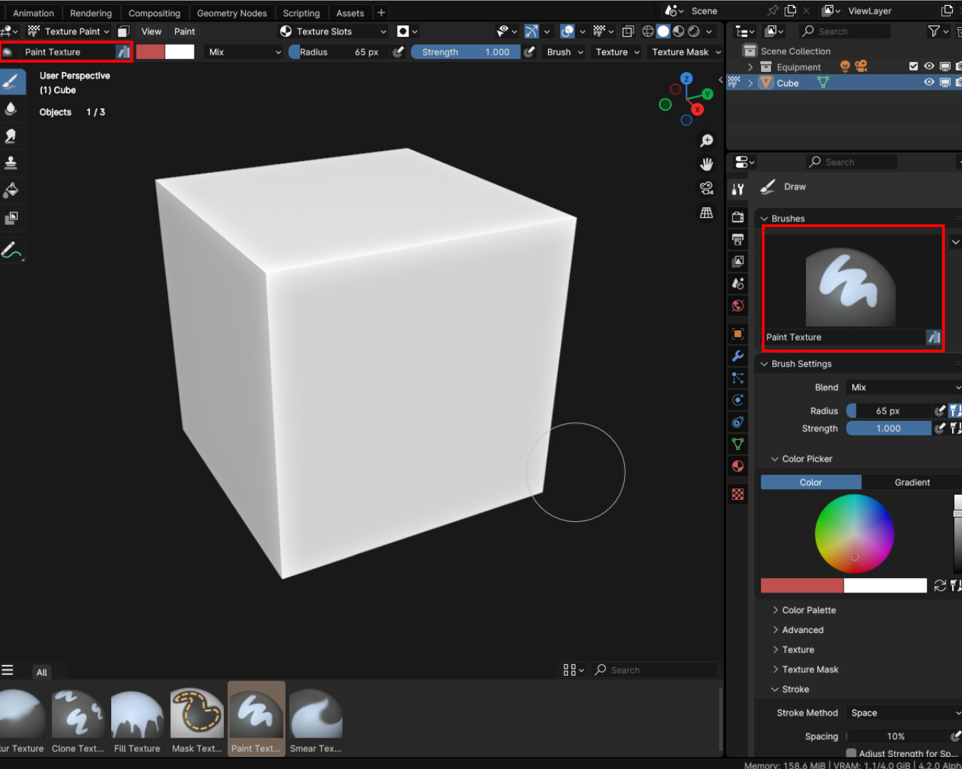
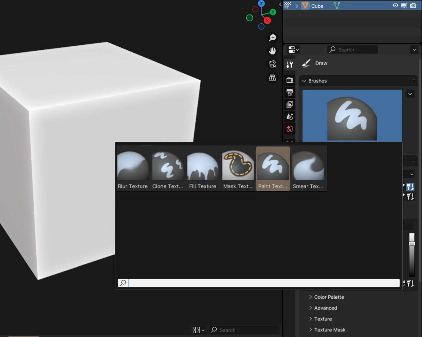
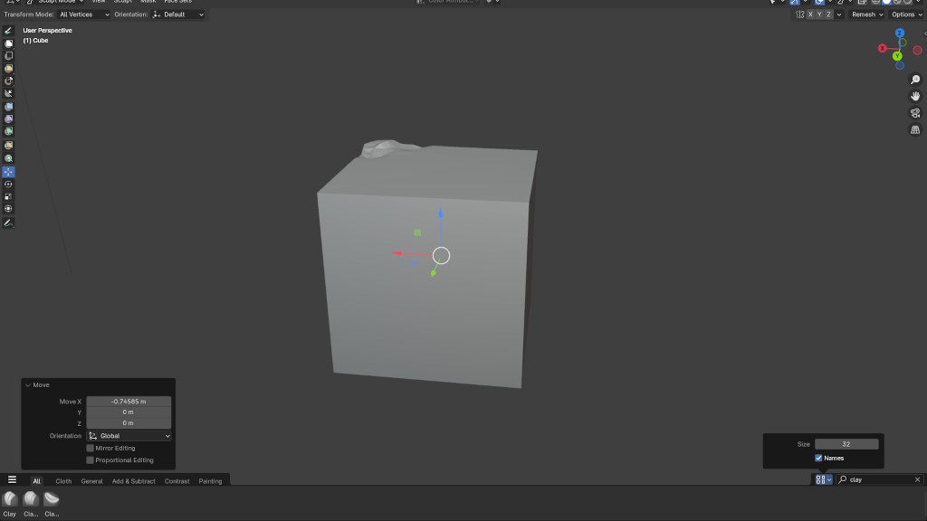
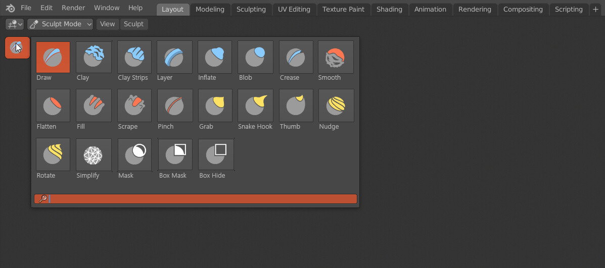
  • The asset shelf is the place to select brushes, instead of the toolbar. It appears horizontally across the bottom of the 3D viewport in sculpt and paint modes.

Limitations that we plan to address:

  • Default shortcuts for brushes are missing.
  • Built-in brushes can’t be edited or deleted.
  • Editing brush asset catalogs and other metadata is not convenient and limited still.
  • Not possible to select brushes without asset shelf. We are thinking to add a popup again for this.
  • This mainly works for sculpting, other modes are mostly untested.
  • See brush asset tasks for a complete list.

Some things we are looking for feedback on:

  • How well does the user interface work for selecting and working with brushes? Would a popup be helpful, and would it be enough?
  • How important are brush cycling and secondary brush shortcuts? If needed, how can they be made to work with assets?
30 Likes

I’m very very excited for this feature! I’ve been testing this today for couple of hours and I have a lot of positives to say.

First of all, I don’t miss toolbar AT all! I was skeptical and thought I would maybe add it back with addon, but working for an hour with this I didn’t even remember about it. It feels so natural and fast choosing brushes from shelf.

I advise everyone to give it a real try before you get your pitchforks out. Add enable “Names” in asset shelf to find brushes faster.

First to answer questions that you ask:

  1. Yes, popup will be very useful. With default brushes maybe its not needed, they’re just couple, but I (and probably everybody) plan to add whole lot of brushes, and even with many many catalogs and filtering its gonna be difficult to quickly choose a brush. Grid-type popup replacing Shift+Spacebar would be amazing. We can take inspiration from ZBrush’s “B” popup.

  2. I never liked them. In my startup file I replaced every paint.brush_select with wm.tool_set_by_id to avoid cycling between brushes. In this new design, where brushes are more decoupled from tools I don’t find a need for it at all (sorry Julien)

Additional feedback:

  1. Even though ordering by catalog + names are better, I still find that I have to wonder my eyes around to find correct brushes. And especially when we’ll have dozens of them, quickly finding important ones are gonna be necessary. You can still survive, switch between catalogs a lot, filter often, and etc. But fastest workflow would be if asset shelf supported favourites. Simply right-click > Favourite, and brush now has yellow star and appears at the front of all catalogs it belongs to.

This way you can stay in more general catalogs and have every brush shown, but more important ones like Grab and Clay strips always at the top, so that you know exactly where they are, and don’t need to search for them in between lines (that are always changing when adding/removing brushes)

Look at Substance Painters asset shelf for inspiration. I would also add Favourites catalog next to All horizontally.

  1. I dont like different asset shelf UI settings in different modes (thumbnail size and show names). Feels bad when it jumps around. Also when you want to update stuff for your startup file you need to do it for every mode, but if you make changes while working and switch mode it still jumps. It should be either per-workspace or per-editor settings. I found changing those to match very tiring.
5 Likes

One more idea I have for potential asset shelf alternatives is to better use brush selectors which are currently useless.

Especially in tight spaces, like Texture Space workspace, shelf can show only very few brushes and it feels claustrophobic with it on. And there’s a big area that goes to waste in brush selectors.

Those things are used to choose local brush in the active tool, but since basically theres one tool and every brush is under it it will be good if expanding it showed you all brushes available in the current mode. Basically All from asset shelf. When expanding you can start typing to filter in this menu and can be VERY quick way of finding brushes without calling asset shelf.

Also it appears in 3 places, so gives you way more places to change your brushes quickly and it appears in places where people coming from 2D software expect them.

6 Likes

That’s indeed how I imagine an asset shelf popup to work. To be available from the same places as before and still type to search, but bigger and with catalogs.

Good job, congratulations.

Totally agree with what Nickberckley said.

Here are some little problems but:

  • Crash when duplicating an asset.
  • When creating a Quick favorite, the menu shows it as “Select brush asset”, without any additional information about the asset itself. Plus, it doesn’t line up well with the rest of the favorites.
  • When you clean an asset and recreate it, it loses the thumbnail and becomes a gray plane.
1 Like

When user wants to reduce size of asset shelf, he just have to reduce size of thumbnails.
As a consequence, more brushes are visible. That is also designating amount of brushes visible.
But there is a limit of smaller size set to 32.
In comparison, we can minimize zoom in toolbar a lot more.
So, in theory, more brush assets could be displayed in toolbar taking less space.

Maybe, there could be work to create a vertical UI for asset browser. A switch from toolbar to asset shelf and/or a permutation could be envisaged.

There is also an obvious issue on the screen capture.
Filter is as the right corner. Brush assets are left aligned.
I am not proposing to break convention about display options on the right.
But I think that access to brush assets would be better ; if they could be centred when they are displayed less numerous than avoidable space.
(Ideally, if there is enough space, that would also be great to have names fully readable. But names are readable as tooltips, anyways. Centred brushes is the important part.)

An ability to build, on the fly, a catalog of favourites brush assets during sculpting or painting session, from asset Shelf, without entering Asset Browser, would be great. A popup showing favourites, too.

The utility of brush cycling is relative to how user builds his brush assets catalogs.
If user build them as catalogs of similar brushes, that does not make sense.
If user build them as catalogs of complementary brushes, that may make sense like select tools. But at condition that catalog is not big.
If popup for favourites exists and is faster, interest for cycling may be almost null.
So, interest may exist. But it is limited to small or filtered catalogs about brushes, that are not favourites.
Having filter applied per catalog could be interesting.

Ability to assign a shortcut to the most important brush of session is vital ; if it is one belonging to a big catalog. User will not appreciate to have to switch back between General catalog and catalog of hundreds of Textured assets. And each time, trying to retrieve The textured brush asset characteristic to model.
If a bunch of keys of kept available on keymap to be customizable for asset shelf, a right click menu procedure, similar to Collection Tags in Outliner, could be used to give shortcuts to favourites brushes.

That’s what i was expecting tbh. but when clicking on the “brush” button in the toolbar, like:

2 Likes

Could you give more precise steps? I’ll also ask the buildbots to make a new build, this is working locally for me.

Thanks, I committed an improvement for that: UI: Use "label tooltip" as a fallback for quick favorites menu text · 151e5f4fe2 - blender - Blender Projects

Asset thumbnails seem problematic right now in general. They should be packed in the file or so, but they currently just reference external images. So I often find them breaking in simple cases. Maybe others have better ideas though.

It’s possible to add shortcuts to specific assets already. I guess you are referring to a faster way of replacing existing shortcuts?

I find it odd to use the toolbar button for this. It looks like you’re switching a tool when you’re really just switching brushes.

1 Like

Love this!

I hopefully can speak on behalf from the sculpting community. This would be ideal, and easier for access and similar to a great sculpting app that starts with a Z & ends with a B.

1 Like

My two cents, mostly related with the new side bar, face set paint and edit face set could go inside the box face set dropdown instead of the asset, paint mask inside the box mask too, to me the paint should be the default option in these 2. the move, rotate, transform and scale could be packed in a dropdown too, and when you open the sculpt tab the active brush isn’t selected in the asset browser.

Thumbnails, like texture images should be packed in .asset.blend files, external images can’t be relied on in this cases, especially when shipping addons as asset bundles.

As a member of sculpting community I find that worst possible UI for brush picker

1 Like

You do realize, long-term if anyone installs, or comes out with brush packs. Or, if Blender comes out with potentially more brushes by install. It will be difficult to navigate them, right?

This functionality makes it easier to access, be it mouse, or tablet stylus pen.

Yes. That’s the UI we all want. :heart:


Btw, can I put the shelf on the right/left/top?

2 Likes

Its easier to go over tiny icon, press and hold, open pop-up window and select brush, instead of having 10-20 brushes always available (where you can scroll) and just pick one?

How many of you actually tried the workflow before dismissing it, I wonder.

2 Likes

Haven’t tested much but so far at a quick glance I really like this prototype, the only thing I’d have to say for now is that I second @nickberckley’s idea to have favorites, that would be awesome.

The interface works pretty good, but I think it could be useful to have the option to change the toolbar to be horizontal or vertical, in wide monitors the vertical space is reduced so a way to have the brushes on a vertical menu would be pretty handy.
And yes, a popup would be REALLY helpful. Also, if we get a popup to select brushes, could we set a custom shortcut to it?

A shortcut to cycle through brushes sounds pretty handy, though for me having a way to quickly access a popup that lets me search for the brush I need is more than enough.

Is this planned to work the same for paint and grease pencil brushes?

3 Likes

This is exactly what that UI picture design is demonstrating…lol

It’s not obvious to me where the disagreement about the popup is.

About the button that opens the popup. There are a few considerations:

  • For grease pencil currently and potentially other modes in the future, a brush can be combined with multiple tools in the toolbar. Besides freehand drawing, you can also have the brush applied along a line or other shape. So tying the brush to the tool is not ideal for that.
  • Press and hold is a bit slower than press and open immediately, because there needs to be some distinction with selecting the tool vs. opening the popup. Some people don’t care about this, but from experience others don’t like these small delays.
  • Does it really matter so much to have it be the toolbar button rather than another button?

Our plan is to have a popup with a list of brushes using new 3D icons, which is similar to ZBrush. This mockup on the other hand shows 2D vector icons, which at least in current Blender corresponds to tools rather than brushes.

Can you clarify if these are brushes or tools, and if the choice of 2D instead of 3D icons has any meaning?

Yes, it should definitely be accessible with a shortcut.

2 Likes

It can be “press and open immediately”, as long as it’s possible to choose the brush when releasing the mouse. (Basically how menus work in blender).

Not much, I think. It could be another button. The placement of the button is what matters the most, and top left is kind of the ideal place for that. Also, if the button icon could change based on the active brush, it would be handy.

Oh, I’m sorry, this mockup looks like that because I made it years ago for another topic here, but I posted because the idea still fits.
And no, the 2D icons has no real meaning there.
This popup palette is meant to show a iist of brushes. So if it were made today, it would be filled with the new 3D icons.

I am of the opinion that the new brushes shelf should have shortcuts for toggling its appearance and for immediately searching and picking brushes. Having it always be visible is nice and all, but I think it could become way more effective if it was possible to do this:

Press a shortcut in the 3D viewport to search the currently active brush category and making the shelf appear → type in the letters for the brush → highlight the current brush with the closest name to what you typed → auto-activate the brush highlighted when going back to the viewport → auto-hide the shelf after use.

This would streamline the brush picking process by allowing you to custom tailor your brush collections and by having shortcuts for every brush without the need to set a shortcut for a specific brush in one collection. For instance, one brush could be named “B1 Blob” and another “B2 Blob”. Same type of brush, but with different settings. Because of the naming it is simply possible to press the search shortcut (i.e. “F”) and then search for either “B1” or “B2” to activate those brushes when going back to the canvas.

With this workflow you could rapidly type F + B + 1 to select the “B1 Blob” brush without having to go through your list manually to select it, thus speeding things up for power users. The shortcuts would also be completely custom tailored to every user’s needs by simply having a good naming standard for your brushes in that specific collection. Not to mention that the different brush categories would allow you to reuse all the letters and not just a select few letters that are dedicated to only a small selection of brushes.

Besides those suggestions, it’s looking promising. If I have more suggestions I’ll write them some other time.

2 Likes