I just noticed that there is no operator for renaming your brush inside of the brushes shelf by R clicking. I know it’s possible elsewhere, but I would appreciate it if it was more direct.
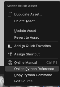
I just noticed that there is no operator for renaming your brush inside of the brushes shelf by R clicking. I know it’s possible elsewhere, but I would appreciate it if it was more direct.
What youre describing is basically modifier keys. And I know this debate has been had mulitple times with add menus but I mich prefer just typing names. Modifier keys include lot of remembering. Situation you described is very simple. But in more complex cases we end up with important brushes having worse keys than secondary ones because they come second alphabetically. You either have to do AAbrush names or something. Typing is much faster once you get used to it and lets you have proper names.
Tips for everyone:
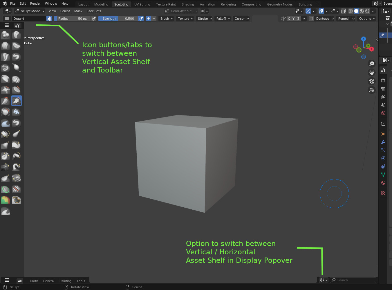
Asset shelf can be opened and closed with key just like sidebar. In View menu assign shortcut to asset shelf. I have PR that simplifies this a bit hopefully accepted but its already possible.
Hover over asset shelf press Ctrl F and start typing to search
I think vertical real state is more important, i would keep this shelf closed and use a favorites pop up if given the option.
Brush cycling is not good since you might cycle pass your selection, really slow. I would rather have a temporary brush while holding the brush’s specific key and back to the previous one when letting go of that key. The same way the smooth brush works now but with other brushes.
One small bug I found is that scrolling with the middle mouse button and a pen tablet it needs 1/2 a tile to scroll one way and 1 1/2 to scroll the other way. If only one row is visible this makes it impossible to scroll downwards.
I completely agree.
I don’t want 3d view to be narrowed up and down.
If pop ups were supported, I would hide the asset shelf and only use pop ups.
Hi everyone, If the pop up will look like this I’ll probably end up hiding the asset shelf like many others users. In this case it should be essential to display active brush icon.
I love this UI change.
Could we get a color option per folder of the asset libraries?
That way, we could more easily discern which group/folder of the asset library the Brush comes from and memorization kicks in faster. ![]()
It is still about typing the names. The difference is that you decide how stuff are named. Putting keywords on each brush name is one way to emulate shortcut keys without the need to assign any key besides the search function.
Ctrl+F didn’t work for me when using my own shortcuts. Do you think it would be possible to activate the search function in the viewport as well with some of the other suggestions I made? Would be pretty amazing. ![]()
To satisfy people annoyed by addition of Status bar that display too much useful info to be hidden, of Topbar and toolbar setting and now, horizontal Asset Shelf ; we could imagine a similar vertical alternative, where catalogs tabs stays as is, but assets are displayed vertically.
Advantage could be that Toolbar could be customizable and have its own catalogs list of tools created by users and/or automatically by addons.
Inconvenient from my quick mock-up will be that toolbar could not be displayed, at same time.
But we could imagine a third display of a column split in two parts. One showing tools and the other showing assets.
Video with the steps to crash Blender when duplicating an asset. It also crashes if it is duplicated directly.
blender-4.2.0-alpha+brush-assets-project.151e5f4fe249-windows.amd64-release
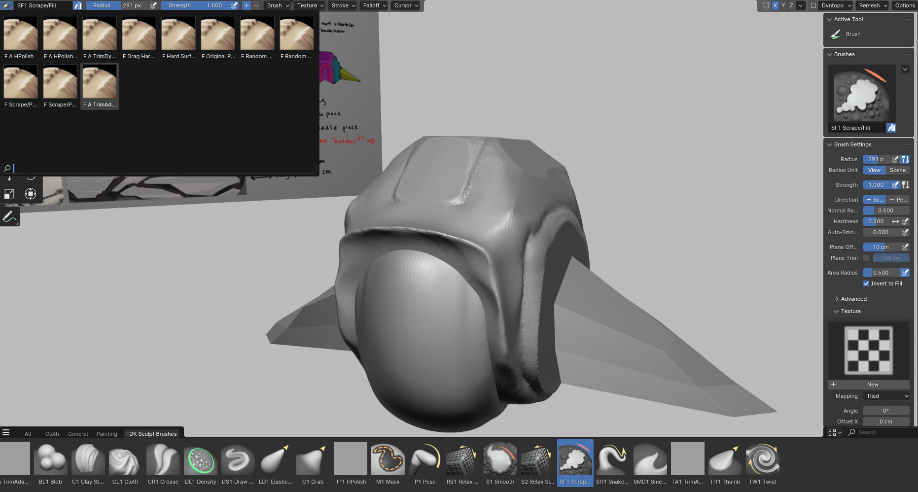
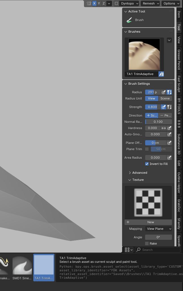
I found this weird bug where I imported brush settings from the old system into the new one. The new brush icons appear as grey squares if you save one of the imported brushes as a new brush asset. For the Scrape/Fill brush I had one called “A TrimAdaptive”, which I saved as “TA1 TrimAdaptive”.
Notice how the sidebar uses the old preview image, but it doesn’t appear as such in the brushes shelf (grey square).
Got some more feedback. I think there should be a way to replace the modifier shortcuts for brushes with other brushes. For instance, now when Smooth is just another brush on the list, does it make sense to have it be the only brush that is accessible when holding down shift? What if I prefer Slide Relax for smoothing over Smooth instead? I think it would be very convenient if ctrl, shift, and alt could be switched out so you could have up to 4 different brush types accessible at all times with modifier keys.
The alt key may be the most tricky to design this way because of every brush having alternative ways of brushing, but as a way to avoid such an issue there could be an option to override this setting by either having the default behaviour or having another brush take its place with either its primary or alternate brushing method active.
I never open the n panel, about the vertical space I commented earlier is not an issue when working full screen and with the status bar hidden. I like it now.
I just wish the icons could use a few more characters instead of the … three dots.
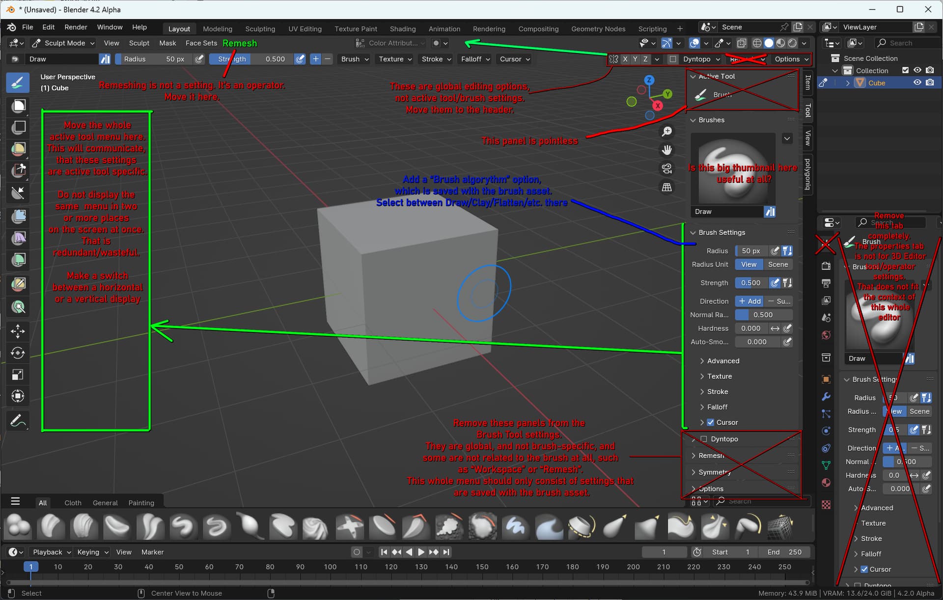
Remesh? Outliner got the axe? I understand the need for organization but…
I’ve written where “Remesh” should be for it to make the most sense, in the previous post. It’s still top-level access.
The outliner is in a different editor. You do not have to go full-screen on the 3D view editor if you don’t want to. You can also have the outliner maximised vertically, and not see the properties editor at all. The only reason to look at the properties editor when sculpting is to change the multi-resolution level. That could just be an operator in the 3D view.
and the brush textures.
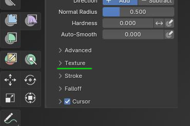
Here.
The “Texture” tab in the properties editor is an appendix back from the Blender Internal days and should eventually be removed. Needs to be rethought.
To open a texture you still need the properties panel but I agree all of this needs to be resolved, in the meantime we can’t get rid of it yet and I like having it all in one place.
All of it could fit in the “Texture” sub-panel, among the brush settings. (Note: All these sub-panels should probably be separated into different panels).
For textures, anything that is non-node-group functionality can be removed and then replaced with a Geometry nodes kind of modifier UI design, where the user gets to just adjust exposed node group inputs. Blender would come with a set of pre-made node groups for the most common texture for sculpting uses.
For anything more niche, there’s the texture node editor for custom node groups.